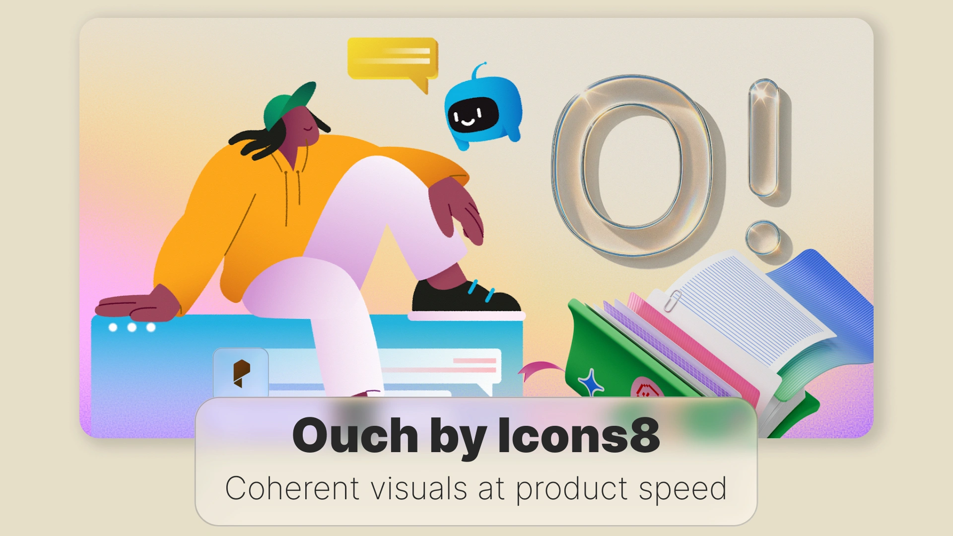
Ouch by Icons8: Coherent visuals at product speed
- Straight answer first
- What makes Ouch different from generic art sites
- The library at a glance
- Where it lives inside a design system
- Selection by evidence, not taste
- Daily workflow that actually scales
- Accessibility and inclusion
- Performance that survives production
- Role specific guidance
- Evaluation link
- Risks and mitigations
- Metrics that prove value
- Licensing and record keeping
- Bottom line
- Sources worth bookmarking
Straight answer first
What makes Ouch different from generic art sites
Vectors arrive as SVG for full control. Raster exports arrive as large PNGs for channels that dislike SVG. The files are clean, editable, and predictable. If you work in a design tool, you recolor quickly. If you work in code, you can inline SVG and bind colors to CSS variables.
The library at a glance
- Style families rather than isolated pictures
- Scenes in several states so a flow can show start, progress, success, or error
- Characters and props that recombine well inside the same style
- SVG for design and engineering control, PNG for dependable email and social
A catalog page is easy to browse by topic or use case. The search returns cohesive options rather than a random mix. That single choice removes hours of back and forth.
Where it lives inside a design system
Suggested folder map
/brand/visuals/
/ouch-style-alpha/
README.md
tokens.json
hero/
scenes/
spots/
backgrounds/
The README holds allowed crops and sizes, examples of good placement, and a short list of “never do” mistakes. The tokens file maps fills and strokes to your color variables so people do not invent new shades.
Selection by evidence, not taste
- Homepage hero
- Feature explainer
- Onboarding first step
- Empty state inside the product
Show both candidate styles to five non teammates. Ask each person for three adjectives. Keep the style that matches your brand voice. Archive the other. Decision done.
Daily workflow that actually scales
- One hero for the site or a major feature
- Two mid weight scenes for product or blog
- Three spots for empty, success, and error
- One subtle background for layout padding
Place the kit next to the components that render it. Name files by owning screen. Add a one page guide with do and do not rules. This prevents design reviews from turning into debates about crops.
Accessibility and inclusion
Alt decisions. If the image conveys information, write clear alt text that states the idea. If it is decorative, use empty alt so assistive tech skips it. Inline SVG should include a short <title> and, when helpful, a <desc>.
<svg role=”img” aria-labelledby=”t d” width=”512″ height=”256″>
<title id=”t”>Team setting analytics goals</title>
<desc id=”d”>Two colleagues arrange charts and notes while a third reviews results</desc>
<!– vector shapes here –>
</svg>
Contrast and state. When artwork contains essential text or uses color to signal success and error, follow WCAG 2.2 ratios. Tie fills and strokes to the same tokens your components use so meaning stays consistent.
Representation. Favor inclusive characters and neutral activities. Avoid clichés. When unsure, test with a small group that reflects your audience.
Performance that survives production
- Prefer SVG when texture is not required
- Export PNG only at the size you actually render
- Always set width and height to avoid layout shifts
- Lazy load below the fold
- Measure Largest Contentful Paint on the real page, not just in the lab
Minimal Next.js usage for a marketing PNG
import Image from “next/image”;
export default function Hero() {
return (
<Image
src=”/assets/ouch-hero.png”
alt=”Colleagues reviewing analytics”
width={1280}
height={720}
priority
/>
);
}
Inline SVG with theme variables
<style>
:root { –accent: #2563eb; }
@media (prefers-color-scheme: dark) { :root { –accent: #7c3aed; } }
svg [data-accent] { fill: var(–accent); }
</style>
<svg role=”img” aria-labelledby=”a b”>
<title id=”a”>Growth chart</title>
<desc id=”b”>Line rising across a grid with simple confetti</desc>
<path data-accent d=”M…” />
</svg>
Role specific guidance
Web and UX
Use imagery to clarify intent. Empty states should carry one action. Onboarding flows read best as start, progress, success with the same cast of elements. Turn SVGs into components in your design tool and map fills to color styles for quick theme flips.
Marketing and SMM
Plan for speed. Prepare square, vertical, and horizontal crops for each scene. Keep a recurring character or prop across a campaign to aid recall. For email, stick with PNG and compress. Many clients still limit SVG support.
Developers
Version artwork in the repo. Keep assets near the code that uses them. Inline SVG lets you respond to theme toggles without new exports. Do not put heavy images on the critical path. If motion is needed, animate vectors rather than shipping a large video.
Educators and institutions
Ouch works well in coursework. Students can learn hierarchy and rhythm by remixing scenes instead of drawing from scratch. Provide a style pack, a fixed palette, and three screens to design. Keep license receipts and attribution notes in the repo so portfolios are clean later.
Startups and small businesses
Pick one style and freeze it for a quarter. Apply it to site, deck, product, and store listing. That single choice gives cohesion while you move fast. Commission custom scenes later for signature features.
Evaluation link
Risks and mitigations
- Too many styles at once. Choose one, finish the release, then expand.
- Over illustrated layouts. Use a small spot instead of a busy scene in tight spaces.
- Color only signals. Pair color with a short label or symbol.
Email constraints. Test PNG sizes in your ESP before the full send.
Metrics that prove value
- Page weight assigned to hero art and trend after switch to SVG where possible
- LCP on the top landing page before and after the kit rollout
- Consistency score in design review. Count how often reviewers flag mismatched art
- Production time. Track hours between brief and first approved mock for a campaign
Licensing and record keeping
Bottom line
Sources worth bookmarking
- W3C WAI guidance for WCAG 2.2 on text alternatives and contrast
- MDN documentation for SVG accessibility and embedding
- Web.dev on responsive images and image performance
- NN Group research on imagery and comprehension in UX
- Design system guidance from Shopify Polaris and Google Material Design
Disclaimer : If you buy something through our links, we may earn an affiliate commission or have a sponsored relationship with the brand, at no cost to you. We recommend only products we genuinely like. Thank you so much.

Write for us
Publish a Guest Post on Pixflow
Pixflow welcomes guest posts from brands, agencies, and fellow creators who want to contribute genuinely useful content.
Fill the Form ✏