Best YouTube Thumbnail Design Tips for Higher Click-Through Rates (With Templates)
- Why Your Thumbnail Is the Most Important 5 Seconds on YouTube
- What Counts as a Good Click-Through Rate in 2026?
- Step 1: Research What Already Works in Your Niche
- The Anatomy of a High-CTR Thumbnail: 8 Design Principles
- Thumbnail Size, Resolution, and Technical Specs
- How to Design a Thumbnail Fast: Two Proven Workflows
- A/B Test Your Thumbnails Like a Pro
- Common Thumbnail Mistakes That Quietly Kill Your CTR
- Build a Repeatable Thumbnail System
- Conclusion: Turn Browsers Into Clicks
Your Video’s First Impression, Your Channel’s Future
The data backs this up. Roughly 90% of the best-performing videos on YouTube use custom thumbnails rather than auto-generated frames, and a single design change can move a video from a 3% to a 7% click-through rate on the same title, the same audience, and the same upload schedule. That is the difference between a video that quietly dies and one the algorithm pushes to thousands of new viewers.
This guide breaks down the exact thumbnail design tips that move the needle in 2026: the psychology, the data-backed design principles, the technical specs, two fast design workflows (one in Canva, one in Photoshop), and how to A/B test like a pro. Along the way, our Pixflow Photoshop YouTube templates will help you turn a tedious design chore into a repeatable, growth-driving system.
Why Your Thumbnail Is the Most Important 5 Seconds on YouTube
Here is why a click-worthy thumbnail is non-negotiable:
- CTR driver: YouTube favors videos that earn clicks when they are shown, so a strong thumbnail directly influences how far your video travels.
- First impression: Your thumbnail visually “sells” the content before the title is even read.
- Search and suggested visibility: Bold, relevant thumbnails help you stand out in search results, on the home feed, and in the suggested column.
- Brand identity: A consistent thumbnail style builds recognition and trust, so loyal viewers spot your videos instantly.
- Instant value signal: A great thumbnail communicates the “what is in it for me” in a split second.
In short, the thumbnail is the front line of your channel’s growth. If you want the bigger-picture strategy that this fits into, our pillar guide on how to start and grow a YouTube channel as a video editor covers the full system, and YouTube SEO for video editors explains how thumbnails and titles work together to win the click.
What Counts as a Good Click-Through Rate in 2026?
Step 1: Research What Already Works in Your Niche
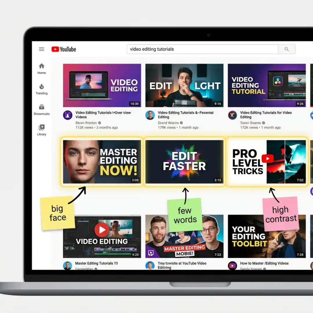
You will quickly spot patterns. Top thumbnails tend to share a handful of traits: a large human face showing emotion, very few words, high contrast, a single clear focal point, and often a before-and-after or side-by-side element that teases the payoff. Screenshot three to five of the best examples and use them as inspiration. The goal is not to copy, it is to model what clearly works and then make it your own.
This research habit pays off twice, because the same competitive analysis informs your titles and metadata too. It is the same mindset that powers an efficient, repeatable YouTube video editing workflow that saves you hours every week.
The Anatomy of a High-CTR Thumbnail: 8 Design Principles
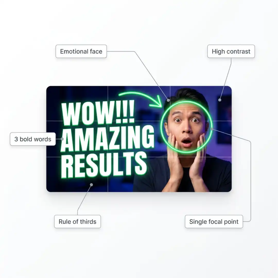
1. Lead with a face and real emotion
Humans are wired to connect with faces. Thumbnails featuring a clear human face with a genuine expression, surprise, excitement, curiosity, or concern, can lift CTR by 20 to 30%. The emotion should match the video’s promise. A shocked face on a tutorial feels dishonest, but it is perfect for a surprising result or transformation.
2. Use bold, high-contrast color
Contrast beats complexity. Your thumbnail competes against a busy, often white or dark interface, so it needs to pop. Bright, saturated backgrounds, complementary color pairings, and a clear separation between subject and background all help. Many creators find a single neon accent color (lime green, orange, or yellow) noticeably outperforms muted brand colors in testing, so do not be afraid to add a pop of color even if it is not your usual palette.
3. Keep text to four words or fewer
Thumbnail text should be glanceable, not readable. Thumbnails with fewer than four words tend to earn meaningfully higher click rates. Use big, bold, legible fonts, add a subtle drop shadow or outline so the text separates from the background, and never repeat your title word-for-word. The thumbnail text should add curiosity, not duplicate information.
4. Commit to one clear focal point
If everything fights for attention, nothing wins. Decide on the single most important element, usually a face or a key object, and make it dominant through size, contrast, and placement. Build a deliberate visual hierarchy: the eye should land on the focal point first, a secondary element second, and text last.
5. Use composition and diagonal energy
Static, perfectly horizontal layouts feel passive. Diagonal lines, a tilted head, an angled object, or a line running corner to corner, create tension and movement that reads as more interesting. Apply the rule of thirds to place your subject off-center, and leave breathing room so the image does not feel cramped.
6. Make the subject large
Key subjects should fill roughly 40 to 60% of the frame with sharp focus, and you can blur or simplify the background to push the subject forward. Remember that most of your audience sees this image very small.
7. Design mobile-first
Between 63% and 70% of YouTube watch time now happens on mobile, where your thumbnail may render barely 120 pixels wide. If your text and subject are not instantly legible at that size, you are effectively invisible to most of your audience. Always preview your design small before you publish.
8. Stay consistent with your brand
Consistency builds trust. Repeating a recognizable look, the same font, color accents, and layout style, helps returning viewers spot your videos instantly and improves CTR over the long term. This is exactly where a reusable template system shines, and it ties directly into broader YouTube channel branding and a consistent visual identity across your channel.
Thumbnail Size, Resolution, and Technical Specs
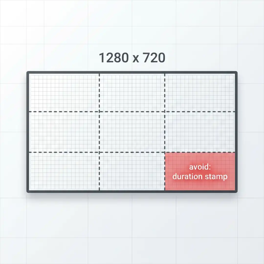
- Dimensions: 1280 x 720 pixels is the recommended minimum, at a 16:9 aspect ratio.
- Design bigger: Many pros design at 1920 x 1080 (Full HD) and export down. A higher-resolution thumbnail looks crisper on TV screens and gives YouTube more visual information to understand your content.
- File format: JPG, PNG, or GIF (only the first frame of a GIF is shown). If your thumbnail or supporting content starts as a Word document, you can use a Word to PDF converter to create a shareable PDF version while preserving the original formatting.
- File size: YouTube has raised its thumbnail upload limit from 2MB toward 50MB, which now enables true high-resolution and 4K-ready thumbnails.
- Safe zones: Keep critical elements away from the bottom-right corner, where the video duration stamp overlays the image, and away from the extreme edges that can get cropped in some layouts.
- Account requirement: You must verify your account (with a phone number) to upload custom thumbnails, per YouTube’s official thumbnail guidelines.
How to Design a Thumbnail Fast: Two Proven Workflows
Workflow A: The Canva method (beginner-friendly)
Canva is the fastest on-ramp for creators who are new to design.
- Start a YouTube thumbnail project: search “YouTube thumbnail” in templates to load a correctly sized 1280 x 720 canvas, and browse the pre-made layouts for one that matches your style.
- Set a bold background: add a gradient or a high-contrast color block instead of a flat, muted background, since flat backgrounds rarely pop in the feed.
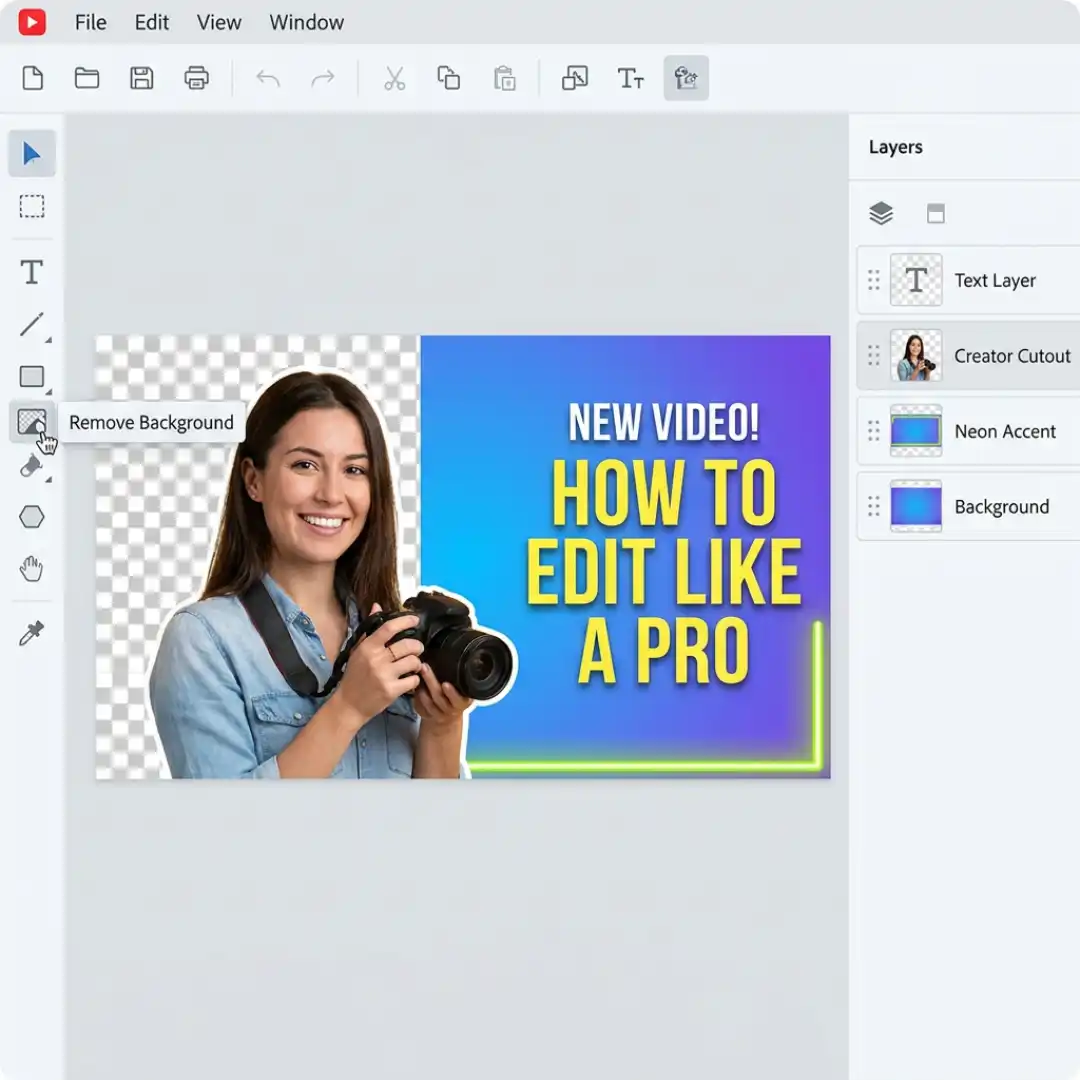
- Add your photo and remove the background: upload a clear photo of yourself, then use the one-click background remover (a Pro feature) to cut yourself out cleanly. Take a quick photo shoot in advance with a few useful poses: a shocked face, a pointing gesture, a confident arms-crossed look, so you always have options.
- Add short, bold text with a shadow: keep it to a few words, pick a heavy legible font, and apply a drop shadow so the text separates from the background.
- Layer in accents: small banners, arrows, or a neon highlight guide the eye, and the layers panel lets you send elements forward or backward.
- Mind the YouTube cutoffs: keep important elements inside the guide lines so nothing critical is cropped on the live player.
Workflow B: The Photoshop template method (fast, consistent, pro)
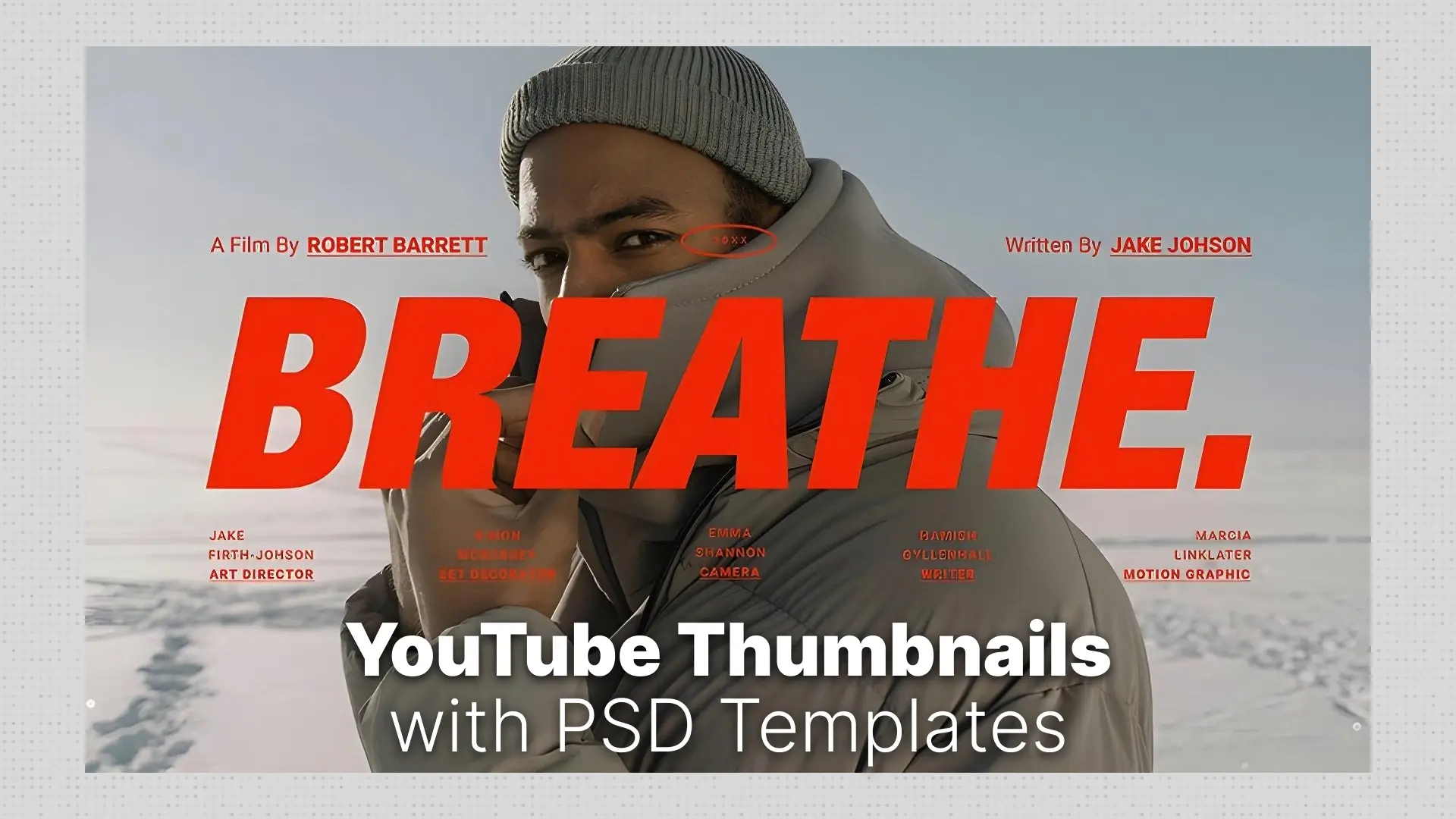
Designing manually from a blank canvas, choosing fonts, colors, placements, and testing compositions, can eat a full hour per thumbnail. That is unsustainable if you publish weekly. The smarter approach is to start from professionally designed, click-optimized templates. Our Pixflow Photoshop YouTube templates are built specifically for this:
- Pre-designed layouts created by professionals who understand YouTube psychology.
- Easy drag-and-drop editing through Smart Object layers, so you swap your image and headline in seconds.
- Built-in visual cues like arrows, highlights, and callouts that guide attention.
- Full Photoshop customization of fonts, colors, and branding to match your channel.
The quick process looks like this:
- Identify your video’s hook and pick a template that matches its tone (about 3 minutes).
- Download the .PSD file and open it in Photoshop (about 1 minute).
- Open the Smart Object layer and drop in your video still or custom photo, then edit the headline with a punchy, scannable phrase (5 to 10 minutes).
- Customize colors, fonts, and icons to match your brand palette, and add visual cues like arrows or outlines (3 to 5 minutes).
- Export with “Save for Web” as a JPG or PNG at 1280 x 720 (about 1 minute).
That is a professional, on-brand thumbnail in well under 15 minutes, every time.
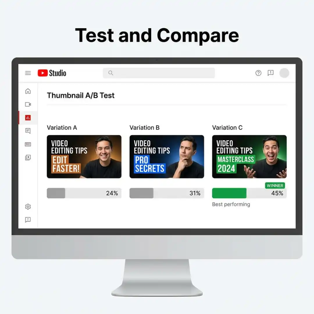
A/B Test Your Thumbnails Like a Pro
A few testing tips:
- Change one big variable at a time (background color, facial expression, or text) so you learn what actually drove the difference.
- Create your variations quickly by duplicating your design and swapping a single element.
- Note that YouTube selects the winning thumbnail based on watch-time share, not raw CTR, so the “winner” is the version that brings in viewers who actually stay.
- Apply what wins to future thumbnails so each test compounds into a sharper template over time.
Tracking these results is part of reading your channel data well. Our upcoming guide on YouTube analytics for video editors breaks down which metrics actually matter and how to act on them.
Common Thumbnail Mistakes That Quietly Kill Your CTR
- Muted, on-brand colors that do not pop: natural, earthy palettes may look elegant, but they rarely stop the scroll. Test a brighter accent even if it feels outside your usual style.
- Too much clutter: cramming in multiple subjects, several lines of text, and busy effects creates visual noise. Simplify until one idea dominates.
- Low-quality images: webcam or laptop-camera screenshots look soft. Use your phone camera or a proper photo, which captures far more detail.
- Too many words: more than four words turns a glance into a reading task, and viewers will not do it.
- Title and thumbnail saying the same thing: let the thumbnail and title work as a team, each adding information the other does not.
- Ignoring mobile: a design that looks great at full size can be illegible at 120 pixels wide.
- Mismatched promise: a thumbnail that overpromises gets the click but tanks watch time, which hurts you more than a lower CTR would. Honest, curiosity-driven thumbnails keep viewers watching, which supports strong retention editing once they arrive.
Build a Repeatable Thumbnail System
This is the real strategic payoff of templated design: faster turnaround, higher and more predictable CTR, professional consistency, less creative fatigue, and easy A/B testing. For creators serious about growth, a thumbnail template library is not a nice-to-have, it is core infrastructure, just like a dialed-in editing workflow or a clear channel brand.
Conclusion: Turn Browsers Into Clicks
With Pixflow’s Photoshop YouTube templates, you can save hours of design time, build a strong and recognizable visual identity, and ship click-worthy thumbnails in minutes instead of an hour. Pair that with the habits in this guide, and your videos can go from unseen gems into click magnets. Explore the templates, design your next thumbnail fast, and start turning more impressions into views.
Disclaimer : If you buy something through our links, we may earn an affiliate commission or have a sponsored relationship with the brand, at no cost to you. We recommend only products we genuinely like. Thank you so much.



Write for us
Publish a Guest Post on Pixflow
Pixflow welcomes guest posts from brands, agencies, and fellow creators who want to contribute genuinely useful content.
Fill the Form ✏