Wicked Film Series: Exploring the Visual Connection to The Wizard of Oz
The Story Behind Wicked: A New Perspective on Oz
What makes Wicked particularly fascinating from a filmmaking perspective is how it takes a story we thought we knew and completely reframes it. The “villain” becomes the hero, and we discover that the history of Oz is far more complex than Dorothy ever realized. This narrative inversion required filmmakers to create a visual language that could stand on its own while maintaining clear connections to the iconic 1939 film.
Visual Storytelling: How Wicked Honors The Wizard of Oz
The Emerald City Reimagined
The Wizard of Oz introduced audiences to the Emerald City as a gleaming, monochromatic green metropolis. Wicked expands on this vision, presenting a more textured and layered interpretation. The filmmakers maintain the signature green palette but add depth through varied shades, lighting techniques, and architectural details that suggest a living, breathing city with its own history and social structure.
For video editors working on fantasy projects, this approach demonstrates how to build on established visual motifs without simply copying them. The key is to identify the core visual elements (in this case, the color green as a symbol of Oz’s power and magic) and then explore how those elements can be expanded and recontextualized.
Color as Character Development
One of the most striking visual elements in both films is the use of color to represent character and emotion. In The Wizard of Oz, the transition from sepia-toned Kansas to technicolor Oz was revolutionary. Wicked takes this concept further by using color to track Elphaba’s emotional journey and social status.
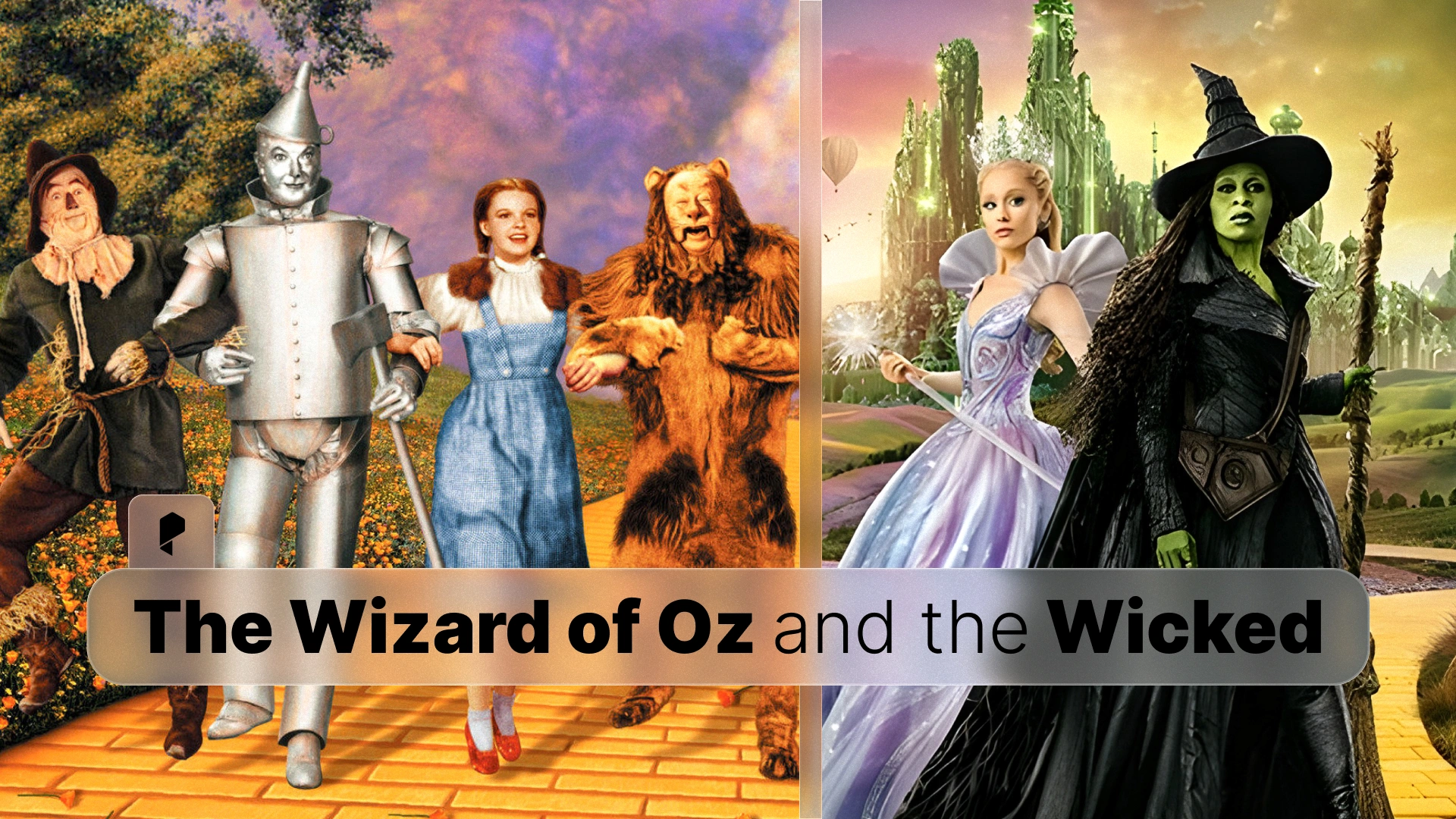
Elphaba’s green skin, which in the original film was simply a characteristic of wickedness, becomes a powerful symbol of otherness and prejudice in Wicked. The film’s color grading choices emphasize this by contrasting Elphaba’s green tones against the warmer, more socially acceptable colors worn by other characters, particularly Glinda’s pink.
Professional Color Grading LUTs
Color Grading Lessons from Wicked and Wizard of Oz
Establishing Color Palettes for Different Worlds
The Wizard of Oz used a dramatic shift from monochrome to color to signal the transition from reality to fantasy. Wicked employs a more nuanced approach, using different color temperatures and saturation levels to distinguish between various locations and emotional states within Oz itself.
Key Techniques:
- Temperature shifts: Cooler tones for scenes of political intrigue and conflict, warmer tones for moments of friendship and hope
- Saturation control: Highly saturated colors in musical numbers and moments of joy, desaturated palettes during dramatic confrontations
- Contrast management: High contrast in scenes emphasizing the divide between characters, softer contrast in intimate moments
Modern colorists can achieve similar effects using professional 3D LUTs for color grading, which allow precise control over color temperature, saturation, and contrast across your entire project.
Symbolic Color Usage
Both films use color symbolically, but in different ways:
The Wizard of Oz:
- Yellow brick road: Hope and journey
- Ruby slippers: Power and home
- Emerald City: Mystery and ultimate authority
- Green Witch: Evil and danger
Wicked:
- Green (Elphaba): Difference, strength, misunderstood power
- Pink (Glinda): Popularity, superficiality (initially), growth
- Emerald tones: Political power, corruption, complexity
- Earth tones: Authenticity, groundedness
The reversal of green from “evil” to “misunderstood hero” required careful color grading to ensure Elphaba’s green skin read as natural and sympathetic rather than threatening. This demonstrates how color context and surrounding palette choices can completely change how audiences perceive a character.
Cinematography Techniques That Bridge Both Films
Scale and Spectacle
The Wizard of Oz was renowned for its ambitious set design and practical effects. Wicked builds on this legacy with modern VFX capabilities while maintaining a sense of tangible, physical space. The filmmakers use wide shots to establish the scale of Oz, medium shots for character interaction, and close-ups during emotional peaks.
For your own projects, this hierarchy of shot composition helps guide audience attention and emotional investment. When color grading these different shot types, consider how your color choices can reinforce the intended emotional impact of each scale.
Lighting for Fantasy
Fantasy films require lighting that feels both magical and believable. The Wizard of Oz used high-key lighting to create its dreamlike quality. Wicked employs more varied lighting schemes, from the bright, almost theatrical lighting of musical numbers to the more naturalistic (yet still stylized) lighting of dramatic scenes.
The interplay between lighting and color grading is crucial. Even the most sophisticated LUT won’t save poorly lit footage, but when combined with thoughtful lighting, professional color grading tools can transform good footage into cinematic excellence.
Creating Your Own Fantasy Film Aesthetic
1. Establish Clear Color Rules
Define your color palette early and use it consistently. Wicked’s green-pink-emerald triangle creates instant visual understanding of character dynamics and power structures.
2. Use Color Temperature to Guide Emotion
Warm colors invite audiences in; cool colors create distance or tension. Shifting between these temperatures can guide emotional response throughout your narrative.
3. Consider Color History
If you’re working within an established universe (or even just genre conventions), understand the color associations your audience brings with them. You can either honor those associations or deliberately subvert them, but the choice should be intentional.
4. Balance Homage and Innovation
Wicked succeeds because it clearly references The Wizard of Oz while creating its own visual identity. When inspired by other work, identify the core visual elements worth preserving and the areas where you can innovate.
5. Invest in Quality Color Grading Tools
Professional color grading separates amateur projects from cinematic productions. Using high-quality LUTs designed for cinematic looks can help you achieve film-quality color in your own work, whether you’re editing in Premiere Pro, DaVinci Resolve, or Final Cut Pro.
Conclusion
For video editors and filmmakers, these films offer endless lessons in visual storytelling. The most important takeaway is this: color isn’t just decoration; it’s a fundamental storytelling tool. Whether you’re working on a fantasy epic or a simple corporate video, thoughtful color grading can elevate your work and enhance your narrative.
Ready to bring cinematic color to your own projects? Explore professional color grading LUTs that work universally across all major editing platforms. With the right tools and inspiration from films like Wicked and The Wizard of Oz, you can create visual magic that captivates your audience.
Disclaimer : If you buy something through our links, we may earn an affiliate commission or have a sponsored relationship with the brand, at no cost to you. We recommend only products we genuinely like. Thank you so much.


Write for us
Publish a Guest Post on Pixflow
Pixflow welcomes guest posts from brands, agencies, and fellow creators who want to contribute genuinely useful content.
Fill the Form ✏