No More Cropping Headaches: Adapt Your After Effects Videos Seamlessly for Any Platform (Horizontal, Vertical, Square & More!)

The Multi-Platform Video Challenge
Trying to adapt one horizontal video into square, vertical, and portrait formats is frustrating and time-consuming. You crop out important visuals, rework layouts endlessly, or even rebuild your video from scratch.
The result? You either spend hours tweaking designs manually or risk inconsistent visuals and missed engagement on key platforms.
This blog post explores the real challenges of managing aspect ratios in modern video production — and introduces a powerful solution: Pixflow’s After Effects templates, purpose-built for seamless multi-platform video adaptation. If you’ve ever asked how to change aspect ratio in After Effects without rebuilding everything, this is for you.
You can explore Pixflow’s full library of After Effects templates here.
The Aspect Ratio Abyss: Why It’s a Problem for Creators
Here’s what makes adapting them manually such a nightmare:
- Tedious Resizing: You have to manually create multiple compositions, adjust scales, and reposition elements for each version.
- Awkward Cropping: Key parts of your video — like text or subjects — might get cropped out in the process.
- Letterboxing & Pillarboxing: Black bars appear when the format doesn’t match the screen, making your video feel outdated or lazy.
- Duplicate Work: You often end up recreating much of the video multiple times.
- Loss of Visual Integrity: The aesthetic you carefully designed in 16:9 might fall apart in 1:1 or 9:16.
- Platform Penalties: Some social platforms prioritize content that fits their native aspect ratio — penalizing poorly adapted videos.
This is why responsive video design in AE (After Effects) is no longer a luxury — it’s a necessity.
If you’re aiming to boost visibility across formats, you might choose to buy Instagram likes as part of a broader strategy to support engagement once your content is optimized for each platform.
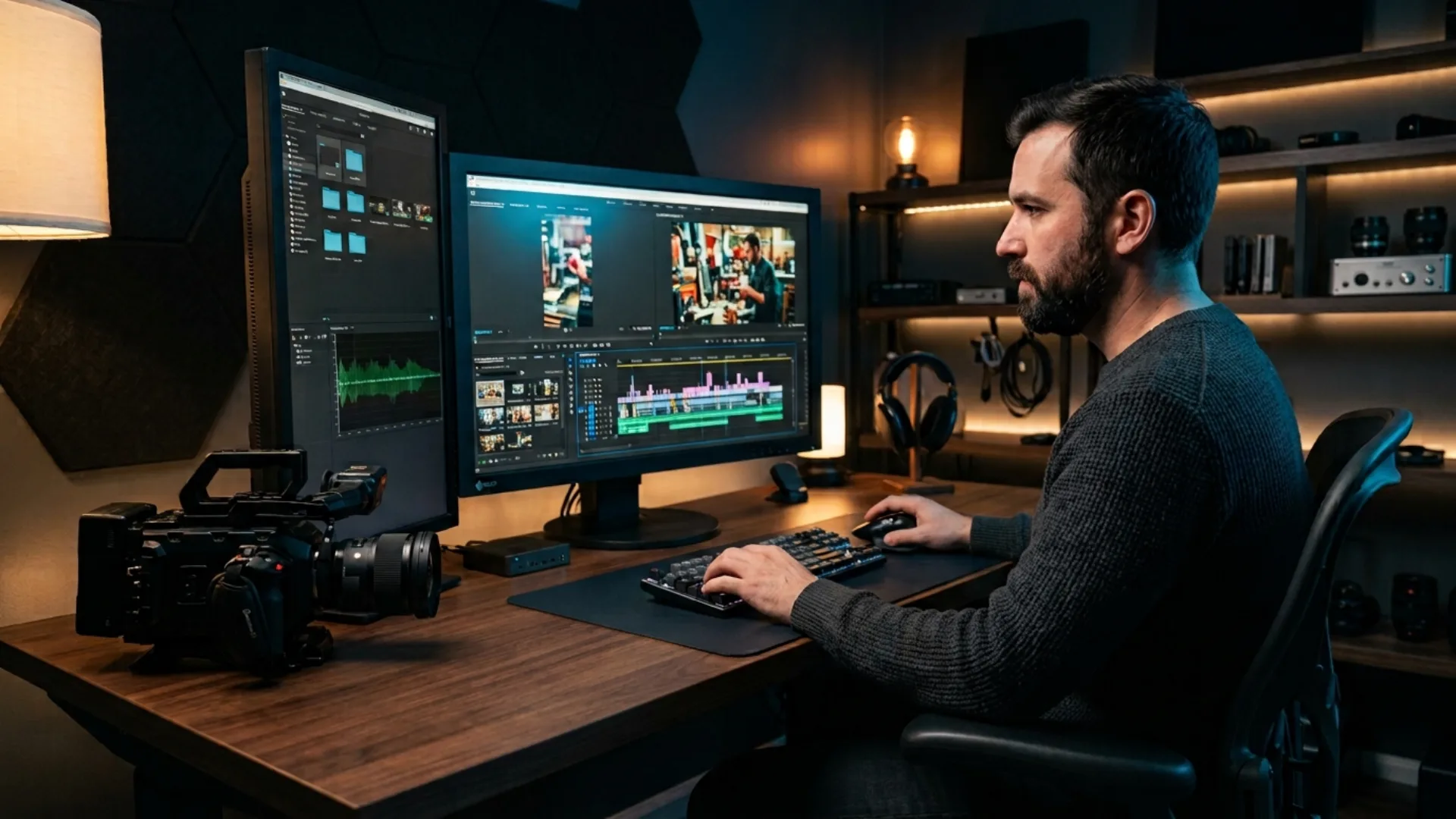
The Manual Struggle vs. The Smart, Responsive Solution
For creators managing a high content output, this becomes a workflow nightmare.
But what if your After Effects project could understand different aspect ratios? What if it could adapt automatically — no redundant work, no cropping stress?
That’s where Pixflow comes in.
Pixflow Templates: Your Responsive Video Powerhouse
🔗 Explore Pixflow’s After Effects templates to see how easy multi-format video can be.
Here’s how they make aspect ratio headaches disappear:
- Pre-Built Aspect Ratio Comps: Most templates come with ready-to-go compositions for 16:9, 9:16, 1:1, and even 4:5 — just insert your content once.
- Responsive Design Elements: These templates use smart expressions or layout rules so elements automatically reposition and scale based on comp size.
- Centralized Customization: Change your text, images, or brand colors once, and all formats update simultaneously.
- Optimized Safe Zones: Each template includes visual guides to ensure that essential content stays within visible boundaries, regardless of the crop.
- Streamlined Export: Just choose your format and render — no extra resizing or adjustment needed.
Professional After Effects Templates
Immediate Impact: Beyond Just Adaptability
- ✅ Massive Time Savings: No more duplicating your work. Save hours with templates built for responsiveness.
- ✅ Maximized Reach: Adapt videos for Instagram Reels, TikTok, YouTube Shorts, and more — all from the same project.
- ✅ Consistent Brand Image: Your visual style stays polished and on-brand across every channel.
- ✅ Increased Engagement: Native-looking videos perform better — viewers stay longer and interact more.
- ✅ Reduced Stress: No more worrying if your subject’s head will be cropped off in the vertical version.
- ✅ Beginner-Friendly: You don’t need to be a responsive layout wizard to get professional results.
Practical Applications for Seamless Adaptability
- 🔁 Social Media Campaigns: Use one design to create Reels, Shorts, and Facebook/LinkedIn videos.
- 📈 Marketing Videos: Push your explainer or product promo to every platform natively.
- 🏢 Corporate Communications: Ensure your internal or external content fits any screen — from mobile to conference monitors.
- 🎉 Event Promos: Tease your event across diverse digital screens with one master file.
- 🙋♂️ Personal Branding: Whether you’re a YouTuber, coach, or creative — keep your content professional everywhere.
And the best part? You don’t need to rebuild your project from scratch every time.
Conclusion
Thankfully, you don’t have to wrestle with this alone. With Pixflow’s intelligently crafted After Effects templates, you can skip the resizing drama and deliver seamlessly optimized video content to every platform.
Tired of wrestling with different video sizes?
Future-proof your content and conquer every platform with ease!
👉 Explore Pixflow’s collection of After Effects templates designed for seamless aspect ratio adaptability and deliver perfectly optimized videos every time!
Disclaimer : If you buy something through our links, we may earn an affiliate commission or have a sponsored relationship with the brand, at no cost to you. We recommend only products we genuinely like. Thank you so much.


Write for us
Publish a Guest Post on Pixflow
Pixflow welcomes guest posts from brands, agencies, and fellow creators who want to contribute genuinely useful content.
Fill the Form ✏