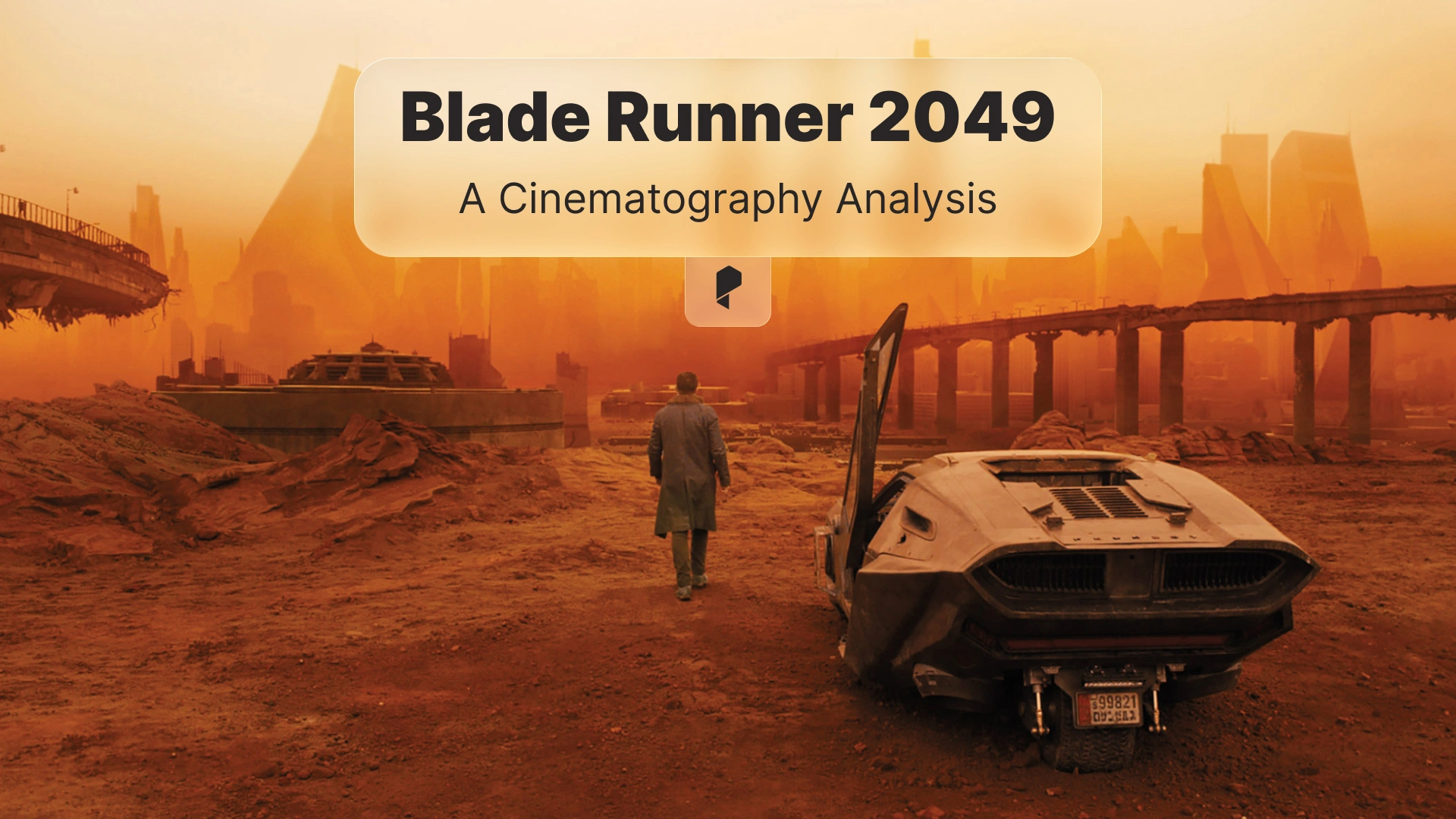
Analyzing Blade Runner 2049’s Cinematography: How to Recreate the Look
- Why Blade Runner 2049 still looks untouchable
- What makes Blade Runner 2049 cinematography so distinct
- How to analyze a scene like a cinematographer
- Recreating the look in camera
- Recreating Blade Runner 2049 color grade in Adobe Premiere Pro
- Creating atmosphere and light beams
- Editing choices that support the cinematography
- Speed up grading and review
- Recommended viewing and reading
- Common mistakes when recreating Blade Runner 2049
Why Blade Runner 2049 still looks untouchable
If you want to study the look scene-by-scene and then rebuild parts of it in your own footage, start by rewatching key sequences with intent. You can watch it again while taking notes on lighting and color transitions, then replicate those ideas in your next project.
A good viewing order is:
Watching them back-to-back makes it easier to spot what stayed consistent in the franchise (scale, silhouettes, reflective surfaces) and what evolved (cleaner contrast control, more deliberate palette shifts).
When you are ready to do hands-on recreation work, having a reliable NLE matters. This tutorial uses Adobe Premiere Pro for the grading workflow, because it is widely available and a lot of creators already cut in it.

What makes Blade Runner 2049 cinematography so distinct
Here are the elements to focus on when you analyze the film.
1) Composition that makes characters feel small without losing emotion
A lot of frames place the subject low in the frame with an overwhelming amount of negative space. The environment becomes a character. It can be fog, architecture, empty sky, or blown out windows. The trick is that the emotional beat is still readable because the subject is usually isolated by contrast, leading lines, or simple silhouettes.
Practical takeaway for your own shoots:
- Choose one dominant shape in the background (a wall, a window, a horizon) and simplify it.
- Keep the subject readable with either a clean rim light or a deliberate silhouette.
- Do not clutter the midground. If the midground is busy, your subject disappears.
2) Light that feels motivated, even when it is stylized
Most of the lighting feels like it comes from a believable source. The film uses massive soft sources through windows, practical fixtures, and volumetric haze to create light you can see. You get strong beams, but the exposure and direction stay grounded.
Practical takeaway:
- Pick a single “key source” direction per scene, then support it with bounce and practicals.
- If you want dramatic beams, add haze and backlight, not more brightness.
- Let shadows go deep. Part of the mood is what the camera does not show.
3) Controlled color palettes that shift by location and emotion
The film is not one LUT. It is a set of controlled palettes. Each environment has a dominant color family, and skin tones are managed carefully so they either harmonize with the palette or deliberately clash.
Examples to observe when you rewatch:
- Cool, desaturated blues and cyans for sterile interiors and rain-soaked exteriors.
- Warmer, sodium-like ambers and yellows for industrial or nostalgic spaces.
- Aggressive orange for the desert sequences, with crushed blacks and thick atmosphere.
Practical takeaway:
- Decide on a dominant hue for the environment.
- Keep that hue consistent in the highlights and midtones.
- Control saturation by luminance. Do not just “turn saturation down” globally.
How to analyze a scene like a cinematographer (a simple repeatable method)
Step 1: identify the story goal of the shot
Ask what the shot is trying to make you feel.
- Isolation
- Surveillance
- Awe
- Intimacy
- Threat
Your recreation will be more accurate when you match the emotional intent, not just the colors.
Step 2: break the frame into layers
Think in layers:
- Foreground: silhouettes, haze, glass, practical lights
- Midground: the subject and key action
- Background: dominant shapes, architectural lines, sky
Blade Runner 2049 often uses foreground occlusion (windows, reflections, haze) to add depth while keeping the subject clean.
Step 3: identify the exposure strategy
Look for:
- Are highlights clipped, or protected?
- Are blacks crushed, or lifted?
- Is the subject exposed “correctly” or underexposed?
A lot of the film embraces darkness, but it avoids noisy shadows by using big sources and careful exposure.
Step 4: identify the palette and the contrast curve
Two separate ideas:
- Palette: which hues dominate
- Contrast curve: how quickly the image rolls from shadow to midtone to highlight
You can match the palette and still miss the look if your contrast curve is different.
Recreating the look in camera (before you touch the grade)
Use soft sources and shaped shadows
Try:
- A large soft key through diffusion.
- Negative fill (black fabric) to deepen the shadow side.
- A controlled rim or edge light to separate your subject.
Add atmosphere for visible light
Volumetric light is one of the most recognizable qualities in the film. The key is subtlety.
Try:
- Light haze so beams appear when you backlight.
- Keep the haze consistent, because a changing haze level makes cuts feel inconsistent.
Expose for the mood
If your scene is meant to feel harsh or lonely, you might expose slightly lower than “standard”. The highlight rolloff will feel different, and the color will sit differently once you grade.
Recreating Blade Runner 2049 color grade in Adobe Premiere Pro
You can do the full process in Adobe Premiere Pro, using Lumetri Color. The exact sliders will vary, but the order of operations is consistent.
Step 1: normalize your footage
Start with neutral technical correction.
- Fix white balance.
- Set exposure so skin sits in a healthy range.
- Recover highlights if needed.
If you skip this, your stylized grade will fight your footage.
Step 2: build the contrast curve first
Blade Runner 2049 often has:
- Deep blacks
- Strong midtone separation
- Soft highlight rolloff (in many scenes)
In Lumetri:
- Use Basic Correction and Curves to set black point and midtone contrast.
- Avoid harsh clipping unless your reference shot clearly does it.
Step 3: establish a dominant hue
Pick one of the film’s families:
- Cool cyan
- Warm amber
- Dusty orange
Then push your shadows and midtones toward that family using:
- Color Wheels and Match
- Curves (Hue vs Hue, Hue vs Sat)
Tip: keep skin tones on a skin-tone line. If they drift too far, the grade becomes “music video” instead of cinematic.
Step 4: control saturation by luminance
A common Blade Runner 2049 trait is restrained saturation. But it is not flat. Highlights can carry color, and shadows can stay subdued.
In Lumetri:
- Reduce saturation in the shadow range.
- Keep selective saturation for practical lights, signage, and key accents.
Step 5: add texture carefully
The film has texture, but it is not noisy digital grain everywhere.
If you add grain:
- Keep it subtle.
- Match grain size to your footage resolution.
- Do not destroy skin detail.
Creating atmosphere and light beams (After Effects approach)
A practical approach:
- Add subtle fog layers with noise and soft masks.
- Use light wrap on bright practicals.
- Add gentle bloom to highlights.
You can do this in After Effects when you need more control than a simple grade, especially for shots with signage, holograms, or strong practicals.
Editing choices that support the cinematography
Try these editing choices:
- Let establishing shots breathe, even 1 to 2 seconds longer than you think.
- Use cuts to reveal scale. Hold wide shots long enough for the audience to read the world.
- Keep your cut points aligned with emotional beats, not just dialogue.
If you are grading and cutting inside Adobe Premiere Pro, keep your timeline organized. Use adjustment layers for global looks, and use clip-level corrections for fixes. This makes it easier to stay consistent across scenes.
Small workflow upgrade: speed up grading and review
A simple quality-of-life improvement is a dedicated keyboard cover for editing shortcuts. If you want a quick option, here is a shortcut cover you can reference: Premiere Pro shortcuts keyboard cover.
It is not required, but when you are learning, shortcut reminders reduce friction and help you stay focused on the image.
Recommended viewing and reading (to sharpen your eye)
Films to watch while analyzing frames:
- Blade Runner 2049 (4K Blu-ray or streaming)
- Original Blade Runner (Final Cut)
Books that help you decode the cinematography decisions:
- “The Art and Soul of Blade Runner 2049” (art book)
- Roger Deakins cinematography books (great for mindset and lighting approach)
- “Painting with Light” by John Alton (classic on contrast, shadow, and mood)
- “The Filmmaker’s Eye” by Gustavo Mercado (composition language you can apply immediately)
- “Cinematography: Theory and Practice” by Blain Brown (exposure, color, and practical technique)
Use the books like a checklist. Read a short section, then pause on frames and see if you can name what is happening (shape, contrast, color separation, and motivation).
Common mistakes when recreating Blade Runner 2049
Mistake 1: pushing teal and orange everywhere
The film is not a teal and orange preset. Many scenes are monochromatic, and the contrast is shaped carefully. If you apply a strong global complementary split, you lose the subtlety.
Mistake 2: making everything too clean
Perfectly clean images can look sterile. Blade Runner 2049 often has atmosphere, texture, and imperfect highlights. A little softness in the right places helps.
Mistake 3: ignoring production design
If your background is modern and cluttered, the grade will not magically make it feel like the film. Simplify your set. Control the color of practical lights. Reduce mixed lighting.
Conclusion
If you want to practice the process, pick one scene, recreate the lighting direction and palette, then grade it in Adobe Premiere Pro. That single exercise will teach you more than chasing presets.
Disclaimer : If you buy something through our links, we may earn an affiliate commission or have a sponsored relationship with the brand, at no cost to you. We recommend only products we genuinely like. Thank you so much.

Write for us
Publish a Guest Post on Pixflow
Pixflow welcomes guest posts from brands, agencies, and fellow creators who want to contribute genuinely useful content.
Fill the Form ✏