How Stanley Kubrick Uses Symmetry and One-Point Perspective
That hallway isn’t scary because of what’s in it. It’s scary because of how perfectly centered it is. Because every line converges to a single vanishing point in the distance, pulling your eye – and your dread – straight toward it.
That’s Stanley Kubrick at work. And once you understand his visual language, you’ll never watch his films the same way again. (Honestly, you might not watch any film the same way again.)
In this guide, we’re breaking down exactly how Kubrick used symmetry and one-point perspective across his career, what psychological effect these techniques create, and how the principles can inform your own work as a filmmaker or visual storyteller.
What Is One-Point Perspective?
One-point perspective is a compositional technique where all parallel lines in a scene appear to converge at a single point on the horizon, called the vanishing point. It’s rooted in the geometry of how we perceive depth: objects get smaller and lines get closer together the further away they are, until they seem to meet at one spot in the distance.
It’s different from two-point or three-point perspective, which use multiple vanishing points and are more common in everyday photography. One-point perspective is far more controlled, more deliberate, and far more rare in naturalistic filmmaking precisely because reality rarely lines up that neatly.
The technique has deep roots in Renaissance painting, where artists like Leonardo da Vinci and Raphael used it to create dramatic depth on a flat canvas. Classical architecture used it to make corridors and halls feel grand and imposing. Kubrick borrowed from both traditions and brought them into cinema with obsessive precision.
When a filmmaker uses one-point perspective, they’re essentially saying to the viewer: look here, follow this line, feel this depth. It’s a direct pipeline from the frame to the viewer’s nervous system.
Kubrick’s Background as a Photographer
At just 17 years old, he sold his first photo to Look magazine. By his early twenties, he was a staff photographer there, shooting portraits, street scenes, and photojournalism. He learned to see the world as a series of frames – to instinctively understand how light, geometry, and composition create meaning.
That training never left him. Every Kubrick film carries the DNA of a man who spent years thinking in two dimensions before he ever touched a movie camera. He approached every shot the way a photographer approaches a still image: with absolute control over every element in the frame.
His cinematographers over the years, including Gordon Willis and John Alcott, frequently noted how specific Kubrick was about lens choice, camera height, and placement. He wasn’t guessing. He was composing. And central to that composition was always the question: where is the center, and how do I make the viewer feel it?
The Psychological Effect of Symmetry
Because he weaponizes it.
Perfect symmetry in a real-world environment is unnatural. Rooms aren’t perfectly balanced. Hallways don’t frame you like a portrait. When Kubrick composes a shot with absolute geometric precision, something in your subconscious registers it as wrong, even if you can’t articulate why. The symmetry signals control, and too much control implies something sinister beneath the surface.
It’s a bit like a smile that’s too wide for too long. Technically correct. Deeply uncomfortable.
Kubrick also understood that symmetry places the subject at the center of the universe – literally and psychologically. When a character stands dead center in a symmetrical frame, the entire visual world is organized around them. That can read as power, as isolation, or as madness, depending on context. He used all three across his career.
And when he breaks from symmetry? That’s deliberate too. The moments of visual imbalance in his films carry weight precisely because they rupture an established order.
Film-by-Film Analysis
2001: A Space Odyssey (1968)
This is where Kubrick’s visual vocabulary reached a kind of cosmic scale. The corridors of the Discovery One spacecraft are among the most striking examples of one-point perspective in cinema history. Everything is centered, clinical, and infinite-feeling. The lines of the set draw the eye deep into the frame, and the characters moving through these spaces look almost irrelevant against the geometry surrounding them.
That’s entirely intentional. In 2001, human beings are small. The universe is vast. The ship’s perfect symmetry reflects the cold, indifferent logic of technology and space. And HAL’s red eye – always centered, always watching – is perhaps the single most economical use of a symmetrical composition to convey menace ever put on screen.
The Star Gate sequence takes this even further, using symmetry and forced perspective to create a sense of transcendence that feels genuinely alien.

A Clockwork Orange (1971)
Alex DeLarge lives in a world where he believes himself to be the protagonist of his own theatrical performance. Kubrick’s framing agrees with him. Throughout the film, Alex is repeatedly placed at the dead center of the frame, the visual anchor around which everything else orbits. The symmetry of shots like the Korova Milkbar scene – with its eerie, perfectly balanced interior – reinforces this sense of a staged, curated reality.
But the symmetry here also carries a satirical edge. The perfectly composed violence scenes feel like paintings. The control in the framing makes the chaos within the frame even more disturbing. You’re watching horror delivered in the visual language of order.

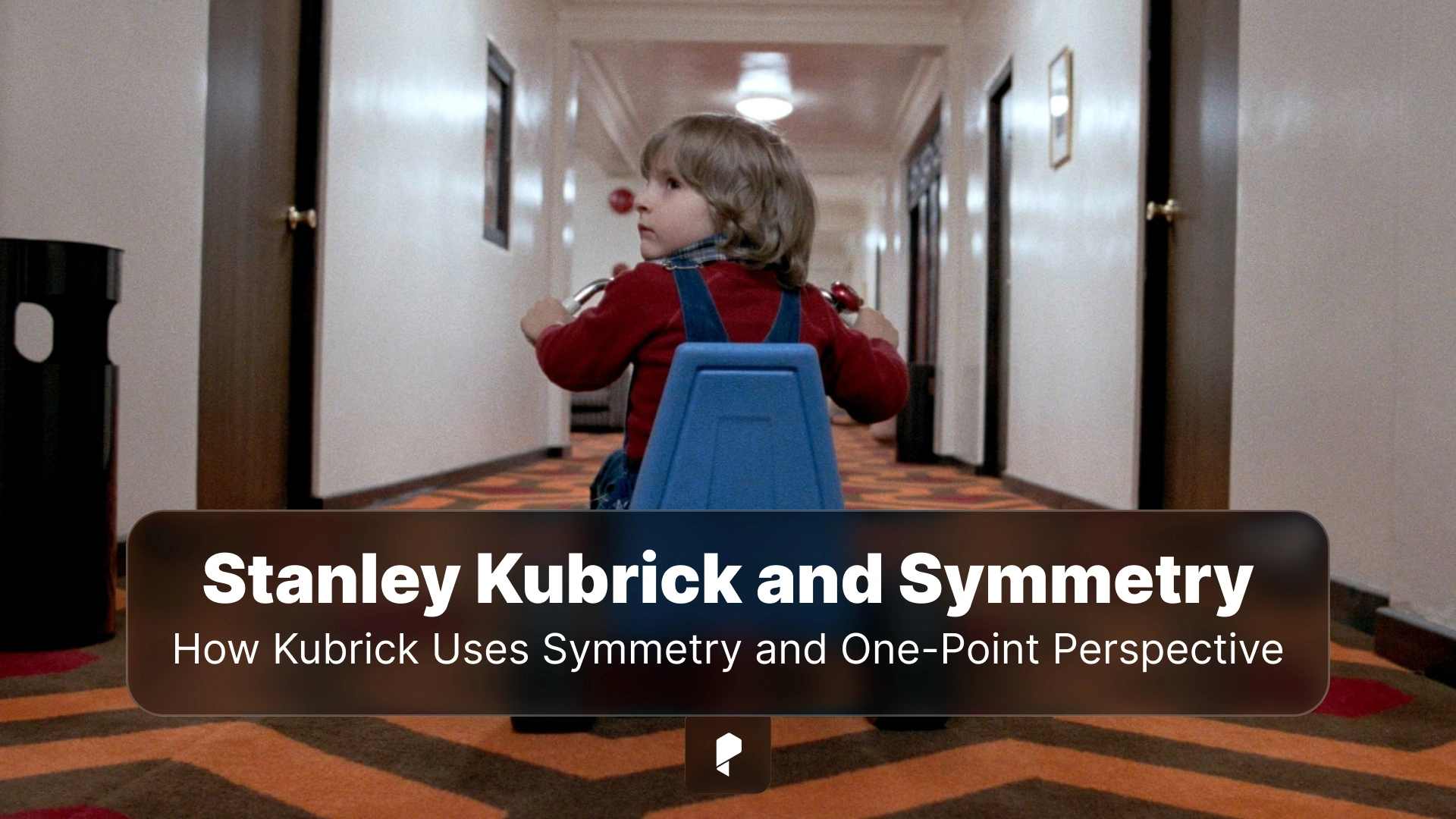
The Shining (1980)
This is arguably Kubrick’s masterclass in architectural symmetry as psychological terror. The Overlook Hotel was designed and shot as a place where every hallway leads somewhere it shouldn’t, and every centered composition creates a sense of inescapable geometry.
The famous shot of the two Grady girls standing at the end of the corridor is almost unbearably symmetrical. The girls are identical (and identically framed), the wallpaper is perfectly balanced, and the vanishing point is the darkness between them. Your eye has nowhere to go but toward them.
As Jack Torrance descends into madness, the hotel’s rigid geometry begins to feel like a trap. The symmetry isn’t comforting – it’s inescapable. The hedge maze, rendered in top-down shots that mirror its labyrinthine floor plan, literalizes this. Kubrick uses one-point perspective to make the maze feel both vast and inescapable.
")
Full Metal Jacket (1987)
The film’s first half is set almost entirely in military barracks and training facilities – environments built for uniformity. Kubrick leans into this completely. The barracks shots are textbook one-point perspective: rows of beds, rows of recruits, everything aligned to a single vanishing point. The visual effect is dehumanization rendered in architecture.
What makes this particularly effective is what happens in Part 2, when the film moves to the chaos of Vietnam. The symmetry dissolves. The framing becomes messier, more fragmented. The visual order of institutional life gives way to the visual chaos of war, and Kubrick uses the contrast between the two halves to make a point about what military training actually produces.

Eyes Wide Shut (1999)
Kubrick’s final film uses symmetry in a softer, more dreamlike way. The controlled framing here reflects the altered psychological state of Dr. Bill Harford – a man moving through a world that feels slightly too choreographed to be real. The ritual scenes at the mansion are among the most formally composed in the film, using symmetry to convey exclusivity, power, and secrecy.
The film feels like a dream partly because it looks like one – and Kubrick uses centered compositions and one-point perspective to create that quality of hyper-real strangeness throughout.

How Kubrick Achieved These Shots – The Technical Side
First, lens choice. Kubrick favored wide-angle lenses, particularly the legendary Zeiss 24mm, which exaggerates depth and pulls the background further away from the foreground. This amplifies the one-point perspective effect dramatically, making corridors feel longer, ceilings feel higher, and vanishing points feel more remote.
Second, camera placement. Kubrick was notoriously precise about where the camera went. He would spend hours adjusting position by inches, always seeking the exact center point from which the geometry of the set would align correctly. His crew famously had to exercise enormous patience during this process.
Third, production design. Kubrick didn’t just frame existing spaces – he designed spaces specifically for the camera. Working closely with production designers like Ken Adam (2001, A Clockwork Orange) and Roy Walker (The Shining, Full Metal Jacket), he built environments where the architecture itself enforced the visual geometry he was after. Sets were constructed with forced perspective in mind. Hallways were built to exaggerate their own length.
The result was a total integration of camera, lens, and environment – every element working toward the same compositional goal.
Influence on Contemporary Cinema and Filmmakers
Wes Anderson is the most obvious inheritor. His films take Kubrickian symmetry and push it into a fully stylized aesthetic universe, where every frame feels like an illustration and every composition is perfectly centered. The symmetry in Anderson’s work is warmer and more whimsical than Kubrick’s, but the debt is clear.
Denis Villeneuve’s Arrival and Blade Runner 2049 use one-point perspective to create the same sense of overwhelming scale that Kubrick achieved in 2001. The alien structures, the wide corridors, the centered figures dwarfed by their environments – it’s a direct line of influence.
In horror, Ari Aster’s Hereditary and Midsommar use Kubrickian framing to deeply unsettling effect. The centered, symmetrical shots in Hereditary in particular feel like a direct homage, using perfect geometry to make domestic spaces feel like traps.
The technique has also moved well beyond narrative cinema, into music videos, commercials, and visual design. The grammar Kubrick established – symmetry as control, one-point perspective as psychological pressure – has become a shared visual vocabulary for anyone working in image-making.
How to Apply These Principles in Your Own Work
Start with storyboarding. Before you ever pick up a camera, sketch your shots. Identify which scenes would benefit from strong geometric composition and plan your centerline deliberately. Symmetry is much easier to achieve when you’ve thought it through in advance.
Think about what your location is already giving you. Architecture is full of natural one-point perspective: hallways, staircases, tunnels, long tables. Instead of fighting your environment, look for the angles where the geometry naturally aligns and then position your camera to exploit it.
Choose your lenses carefully. A wide-angle lens will exaggerate perspective and make your one-point compositions feel more dramatic. A longer lens will flatten the image and reduce the depth effect. If you want that Kubrickian pull-toward-the-horizon feeling, go wider.
And perhaps most importantly: know when not to use it. Symmetry is a tool, not a default. Used in every shot, it loses its power. Used selectively, at moments of maximum psychological weight, it hits hard. Kubrick understood this instinctively – even in his most formally composed films, the perfectly symmetrical shots are chosen moments, not wallpaper.
The goal is intentionality. Every compositional choice you make is communicating something to your audience, whether you’re aware of it or not. Kubrick was always aware of it. That’s what made him Kubrick.
Conclusion
Understanding that grammar doesn’t just help you appreciate his films more deeply (though it absolutely does that). It makes you a more intentional creator. Every time you set up a shot, you’re making a series of choices that will either communicate something specific or communicate nothing in particular. Kubrick always chose the former.
Next time you watch The Shining or 2001, try watching with the sound off for a few minutes. Just look at the geometry. You’ll see the film inside the film – the one Kubrick was composing frame by frame, long before a single line of dialogue was spoken.
Disclaimer : If you buy something through our links, we may earn an affiliate commission or have a sponsored relationship with the brand, at no cost to you. We recommend only products we genuinely like. Thank you so much.

Write for us
Publish a Guest Post on Pixflow
Pixflow welcomes guest posts from brands, agencies, and fellow creators who want to contribute genuinely useful content.
Fill the Form ✏