How to Take Better Product Photos for Your Online Store
That is exactly what we are going to fix here. We will give you product photography tips for building a visual storefront that will make your products stand out in a crowded online marketplace.
Why High-Quality Product Photography Pays Off: 3 Benefits for Online Stores
1. Shoppers Judge Your Product by the Photo Before Reading Anything Else
67% of eCommerce shoppers evaluate product images before reading any description. On mobile, that number goes even higher.
Even when you are scrolling through Amazon or Etsy, you don’t read every title. You look at the photo first. If the photo doesn’t stop your thumb, nothing else on that listing gets a chance. Your product could be incredible. If the photo doesn’t show that in about two seconds, nobody will stay around long enough to find out.
2. Bad Photos Actively Drive Customers Away
This is the part that hurts the most. Nearly 8 in 10 shoppers chose not to buy a product specifically because the images looked poor or incomplete.
That is not “slightly fewer conversions.” Those are people actively deciding your product isn’t worth their money, based entirely on how you photographed it. The product could be better than every competitor on the page. They will never know.
3. Inaccurate Photos Create Returns That Eat Your Margins
22% of online product returns happen because the item looked different in person than it did in the photos. And that is not a shipping problem. That is a photography problem.
When the color is off in the photo, or a different angle makes it look bigger than it is, the customer feels misled when the package arrives. You have already paid for the acquisition. Now you are paying for the return, too.

11 Product Photography Tips That Will Make Your Online Store Harder to Ignore
Phase 1: How to Set Up a Product Photoshoot That Looks Professional on a $50 Budget
1. Use Natural Window Light Instead of Buying Expensive Studio Lighting
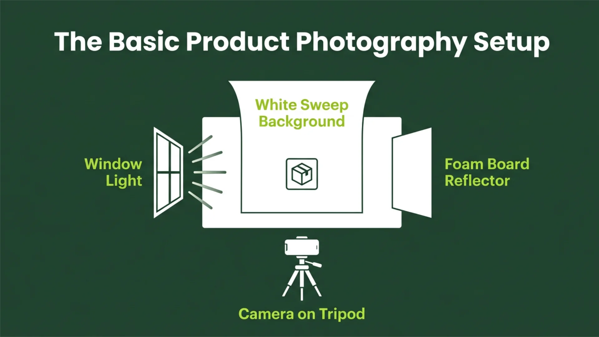
Natural light (or soft light) from a window is soft and even. It wraps around your product without creating the harsh shadows that a direct flash or artificial light source produces. Professional product photographers actually spend money on softboxes to recreate what a north-facing window does for free.
The color temperature from window light is also more accurate than most artificial setups, which means your whites stay white and your product colors look true to life.
- Set up your shooting area within 3–4 feet of a large window – if direct sun is hitting the product, hang a white bedsheet over the window to diffuse the light
- Place a white foam board as a fill light on the opposite side of the product from the window to bounce light back and fill in shadows – this $3 piece of foam does the same job as a $200 reflector
- Shoot between 9 AM and 2 PM when daylight is strongest – overcast days actually give the most flattering and even light for product photos
2. Build a Clean White Background With Poster Board and Tape
A white background is what Amazon requires and what Shopify recommends. It makes your product the only thing a shopper’s eye focuses on. And it makes editing photos dramatically easier because you don’t have to mask out an untidy desk or a wrinkled sheet in post.
- Tape a large sheet of white poster board to a wall so it curves down onto your table in a smooth sweep or portrait mode setup to create a fine “infinity” look
- For small products like jewelry or cosmetics, prop white foam board inside a cardboard box to create a mini lightbox that softens light from every direction. A simple DIY light tent helps spread light evenly
- Keep a few backup sheets ready. Poster board gets scuffed fast, and a crease in the background will show up in every single photo until you swap it out. This setup becomes even more important when you use Shopify with dropshipping, because most sellers rely on supplier-provided products and need clean, consistent visuals to make their store look trustworthy and branded. Tools like Printify can also help streamline this process by allowing you to create and manage custom product listings with ready-made mockups, making it easier to maintain visual consistency across your store even without holding physical inventory. Don’t forget the floor under your setup. A scuffed or dusty floor shows up in wide shots just as easily as a creased background, so it’s worth keeping clean before you start shooting. Commercial floor care services can keep it shoot-ready between sessions
3. You Don’t Need a DSLR — Your Phone Camera Is Good Enough
If your phone is from the last four years or so, the rear camera can produce high-quality images that look completely professional on a product listing. The reason most phone-shot product photos look bad isn’t the hardware. It is the settings.
Auto-flash and digital zoom are for casual snapshots, not professional product photography. Turn both off, and the quality difference is immediate.
- Always use the rear camera – the front camera has a lower resolution and a wider lens that distorts products, especially anything with straight edges
- Tap on the product before shooting to lock focus and exposure. If you don’t, the smartphone camera setting will keep readjusting, and you will get inconsistent brightness
- Turn off flash in your settings and leave it off permanently – flash kills color accuracy and creates harsh and unflattering shadows that no amount of editing fully fixes
Pro Tip: Clean your phone’s camera lens before every product photography session. A lens can collect fingerprints and pocket lint throughout the day, which creates a soft haze that reduces sharpness and contrast. Wipe it with a microfiber cloth before shooting, and compare the results side by side.
4. Use a $15 Tripod to Eliminate Every Blurry Shot Instantly
Hand-holding your phone adds small shakes that show up as softness when you zoom in on a laptop. The image can be fine on your phone screen, but your customers will definitely see it on a product listing. A tripod with a mobile grip keeps the camera perfectly still and lets you maintain the same framing from one product to the next.
- Get any basic phone tripod with an adjustable mount. Use your phone’s 3-second timer or a Bluetooth remote shutter so you don’t have to touch the phone when it fires
- Mark the tripod position and the product position with tape. This lets you swap products without reframing, so every shot becomes identical
- Set your phone to the aspect ratio you will use before shooting – square for Shopify and Instagram, 4:3 for Amazon and eBay
Phase 2: How to Shoot High-Quality Product Photos That Make a $20 Item Look Like a $200 One
5. Cover All Five Angles a Shopper Needs to Feel Confident Buying
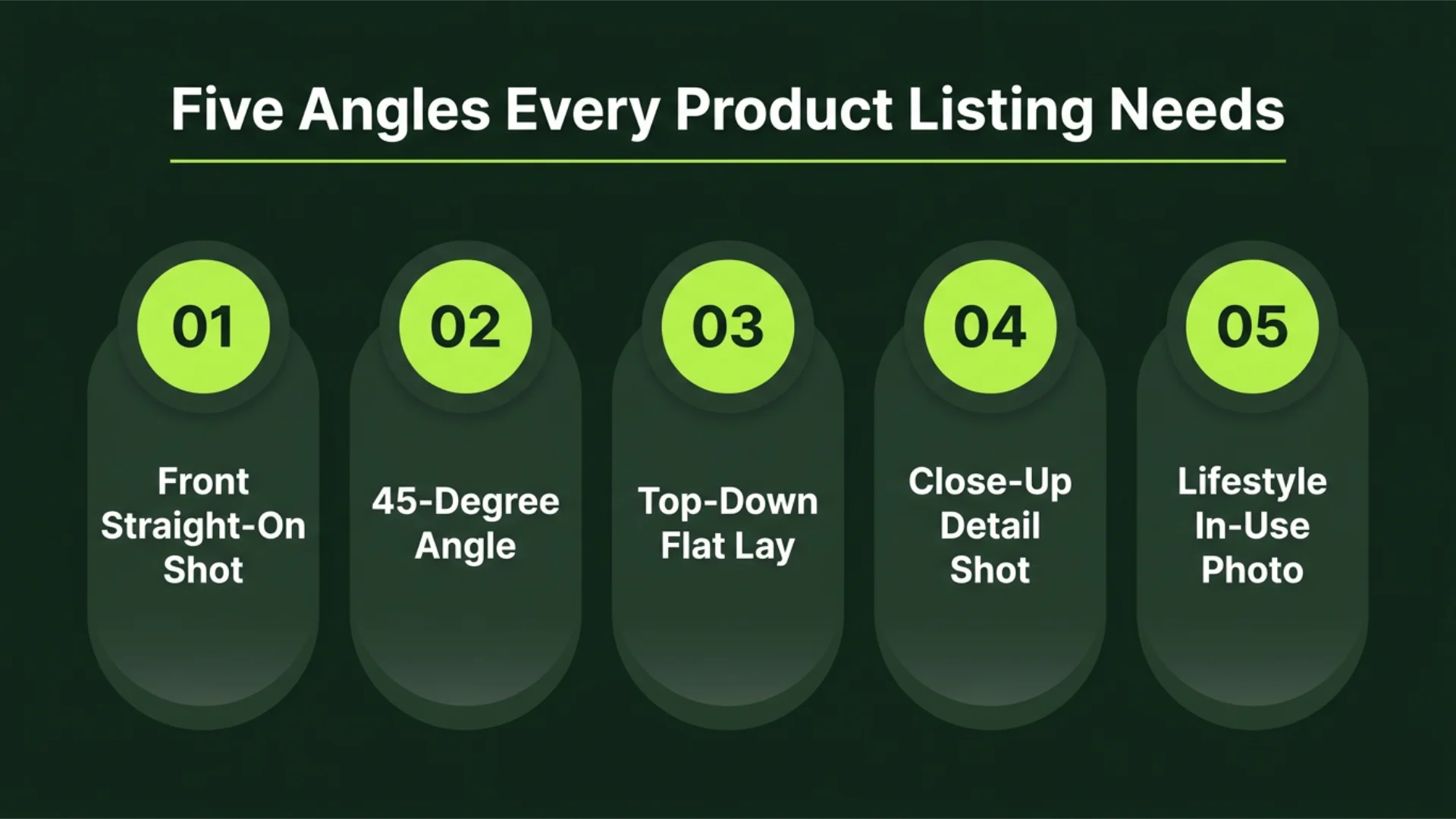
- Shoot these five in order: straight-on front first, then a 45-degree camera angle. Follow with a direct top-down flat lay. Then, a close-up detail shot of one key feature. Finish with a lifestyle shot showing the product in use
- Keep the camera setup at the same height for the front and 45-degree shots – eye-level framing shows products the way someone would naturally look at them sitting on a table
- For the top-down shot, hold your phone directly overhead using the timer or mount it on a tripod with a horizontal arm
6. Get Close Enough to Show the Texture and Build Quality
Detail product shots take a “this could be anything” photo and turn it into something that is clearly well-made. Online shoppers can’t touch the fabric or feel the weight. And there is another much bigger reason. Over 25% of adults experience some form of visual impairment. That means they rely more heavily on clear images that make important product details easier to see.
A close-up of the stitching or the grain shows quality in a way that a wide shot can’t. And if you are willing to show the product up close, it tells the shopper the product holds up under scrutiny.
- Get within 6–8 inches of the product and tap to lock focus directly on the detail you want to be sharp. Use your phone’s macro lens for very small items like jewelry or watch faces
- For fabric or leather, shoot the texture at a slight angle so the key light hits the surface and brings out the grain. A straight-on flat shot makes all materials look identical
- Include at least one “in-hand” close-up where someone is holding the product. This gives shoppers an instant sense of scale that no dimension listing can match
7. Shoot Every Product the Same Way So Your Store Looks Like a Real Brand
Go look at any premium brand’s online store. Glossier. Aesop. Apple. Every photo looks like it belongs in the same family. Same lighting technique. Same background. Same crop for the hero image. That consistency is what makes a store look professional. And it applies to your social media content just as much as your product listings.
- Pick one hero angle (the 45-degree or straight-on front) and use it as the first image for every single product
- Batch your product photography shooting. Do all products from one category on the same day with the same window and background. And keep the tripod in the same position
- Write a one-page style guide for background color and crop ratio. Include product placement in the frame and the number of photos per listing. Follow it every time without exception
Pro Tip: Track if consistency is actually improving performance (not just looking good). Use the OKRs Tool to set and measure goals around metrics such as product page conversion rate, return rates caused by product mismatches, average time spent on product pages, and the percentage of listings that fully follow your photography style guide. Review the data each month to identify whether your standardized photography process is producing measurable business results.
8. Add One Lifestyle Shot That Helps the Shopper Picture Owning It
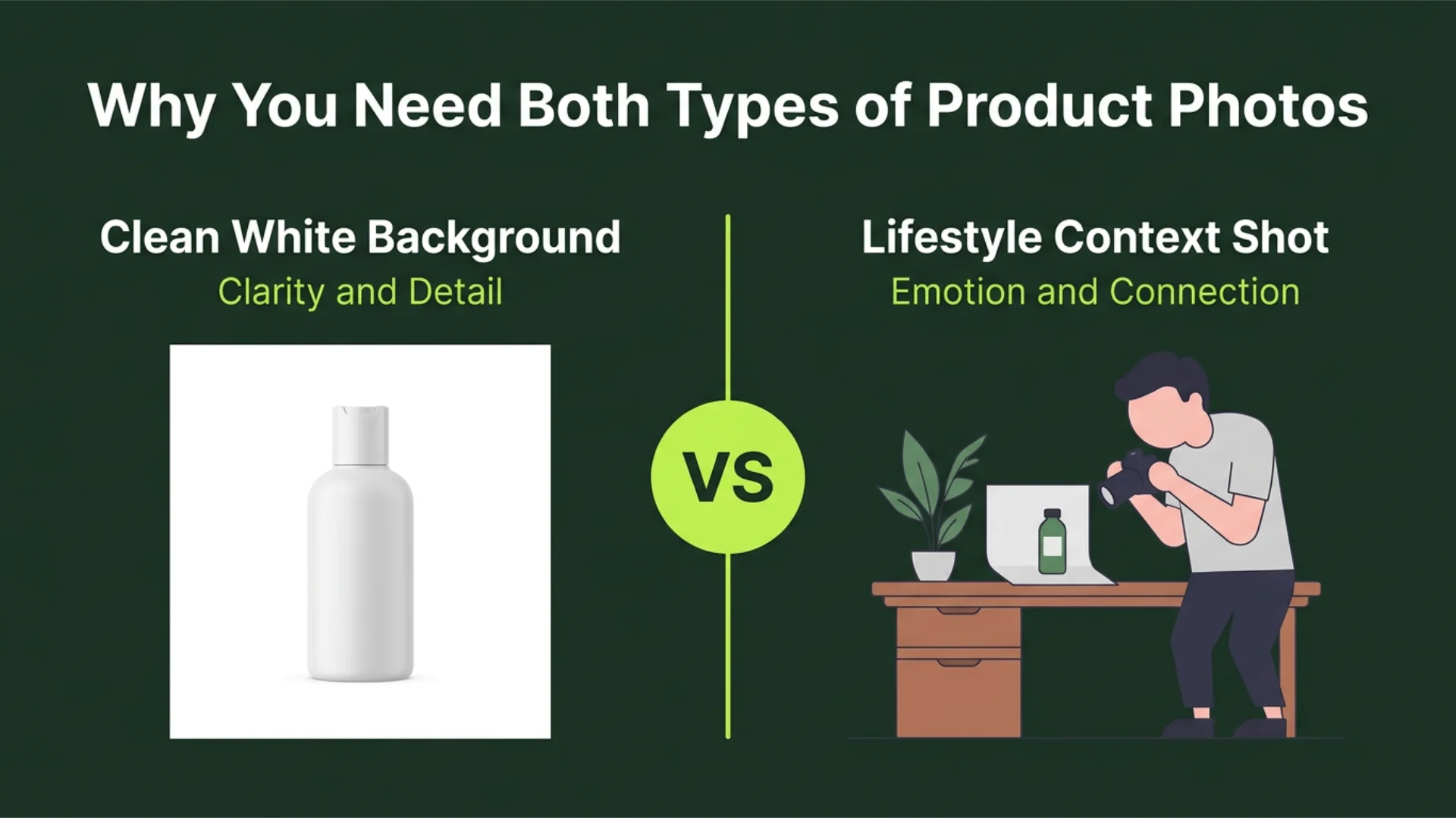
In fact, brands using original (non-stock) product photos see a 35% increase in conversions. Lifestyle shots are the most “original” type of photo you can take.
- Use natural settings that match your target customer’s life – a coffee mug on a real wooden desk, a candle on a bathroom shelf, a tote bag slung over someone’s shoulder
- Keep the product as the clear, sharp focus. The background adds context but shouldn’t compete for attention, and the product should fill at least 40% of the frame
- Match the lifestyle photo’s color palette to your brand. If your brand is minimal and neutral, a loud colorful kitchen background will be mismatched, even if the photo is technically well-shot
Phase 3: How to Edit Product Photos So They Look Polished Without Looking Fake
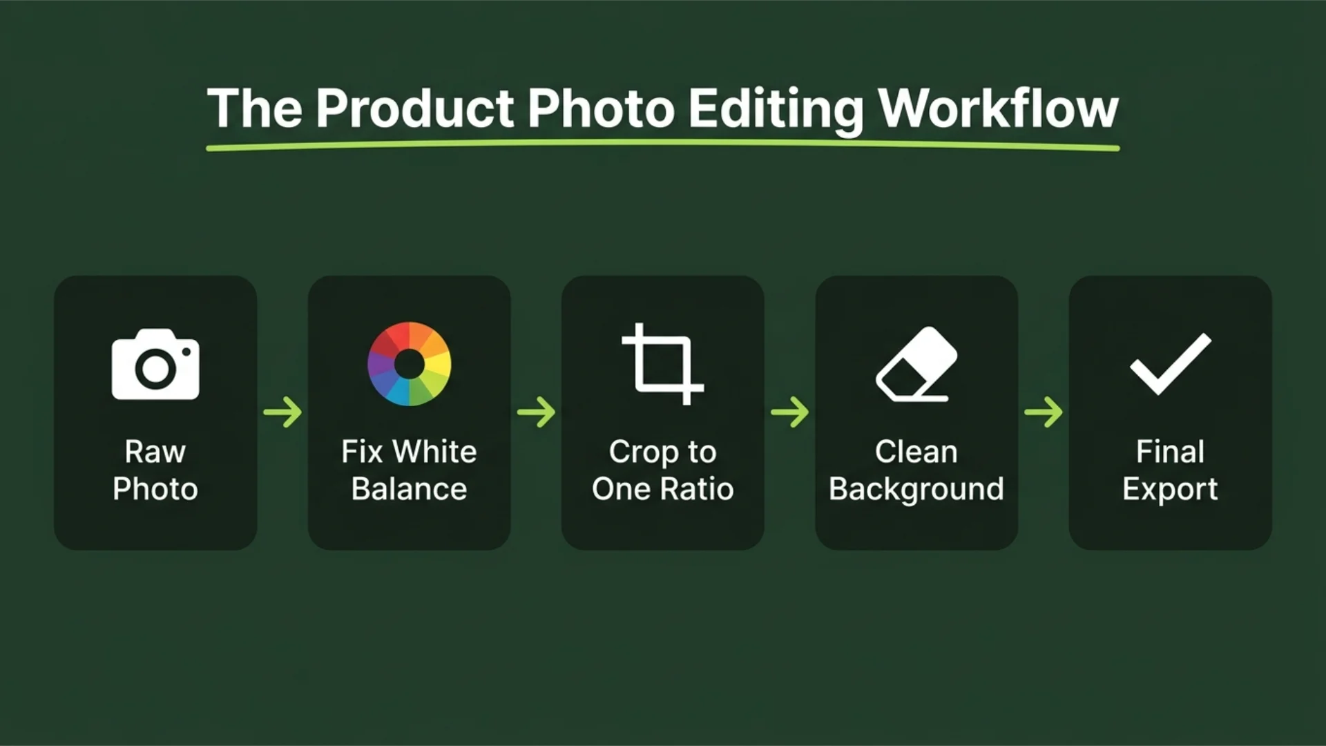
9. Correct White Balance First, So the Colors on Screen Match the Product in Your Hand
White balance is the single most important edit. If it is not right, whites look yellow and blues look grey. That nice sage green product you are selling looks like muddy olive. The customer orders expecting one color and gets another. That is a return.
Most photos shot near a window have a slightly warm cast. And fixing it during post-production takes about 10 seconds in any photo editing software.
- Use the white balance eyedropper tool and click on something that should be pure white in the photo, and the app will correct the entire color cast in one click
- After correcting, hold the physical product next to your screen and compare — if the colors don’t match what is in your hand, change the temperature slider until they do
- Batch-apply the same white balance correction to all photos from one session. If the lighting setup didn’t change between shots, the fix should be the same for every image
10. Crop Every Photo to One Ratio So Your Store Grid Doesn’t Look Messy
Nothing makes an online store look more thrown together than a product grid where every image is a different shape. One is a landscape. The next is a portrait. It makes browsing overwhelming. Consistent cropping takes two minutes per image. Most platforms display thumbnails in a grid, and when every image has the same ratio, that grid looks like a real store.
- Pick one ratio and use it for every product – 1:1 works for Shopify and Instagram. Go with 4:3 if you are primarily on Amazon or eBay
- Center the product and leave about 10–15% padding on all sides as breathing room, so it doesn’t look crammed to the edges
- Set up a crop preset in your editing app. Lightroom and Adobe Photoshop both let you save custom crop ratios. Even Canva supports this
Alternatively, VistaCreate is an excellent, user-friendly option that allows you to quickly batchresize and format your product images to perfectly match any e-commerce or social media dimension.
Pro Tip: Before finalizing your crop ratio, test it across actual storefront placements instead of just in your editing tool. Open your product grid on mobile, desktop category pages, and “related products” sections, then check how much of the product remains visible in thumbnail view. Some ratios look clean in editing software but cut off key product details in grid previews.
11. Clean Up the Background Without Over-Processing the Product
Background removal tools have become incredible in the last two years. Remove.bg and Photoshop’s built-in feature can isolate a product in seconds. But a removed background only looks natural if the original photo was shot cleanly.
If the lighting is uneven or the edges are soft, a background removal looks like a bad cutout. The smarter move for most people: shoot cleaner so you need less editing.Tools like LUTs in Photoshop can also speed up your color correction once the background is sorted.
- If your white background looks slightly grey, increase the exposure of just the background area using masking tools rather than removing it entirely
- When you do use background removal, zoom to 200% and check the product edges for fringing (colored halos). Clean these with the refine-edge tool before exporting
- Save two versions of every image: one with the original background for your records and one with the cleaned version for the listing
3 Product Photography Examples Every Store Owner Should Analyze
1. Brondell
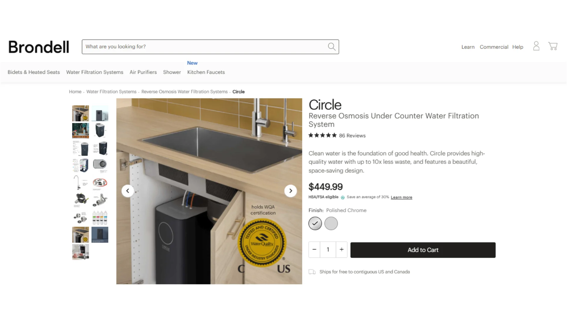
What stands out is how they control distraction without removing context. The space is real, but visually simplified. You will see the unit positioned slightly off-center so you can clearly see the inlet/outlet connections. That small shift makes the technical function instantly readable without needing a diagram.
Another detail is how they use scale anchoring. For countertop filters, they include a faucet and sink edge in the same shot, so the product doesn’t feel abstract in size. Even when lighting is flat and neutral, the environment does the heavy lifting.
What you can take from this:
- Shoot at least one “installed position” photo instead of only isolated product shots
- Keep the surrounding environment visible but controlled (pipes, sink edges, wall tiles)
- Use adjacent fixtures to communicate scale instead of adding measurement graphics
- Prioritize clarity of connection points over perfect centering
2. Nootropics Depot
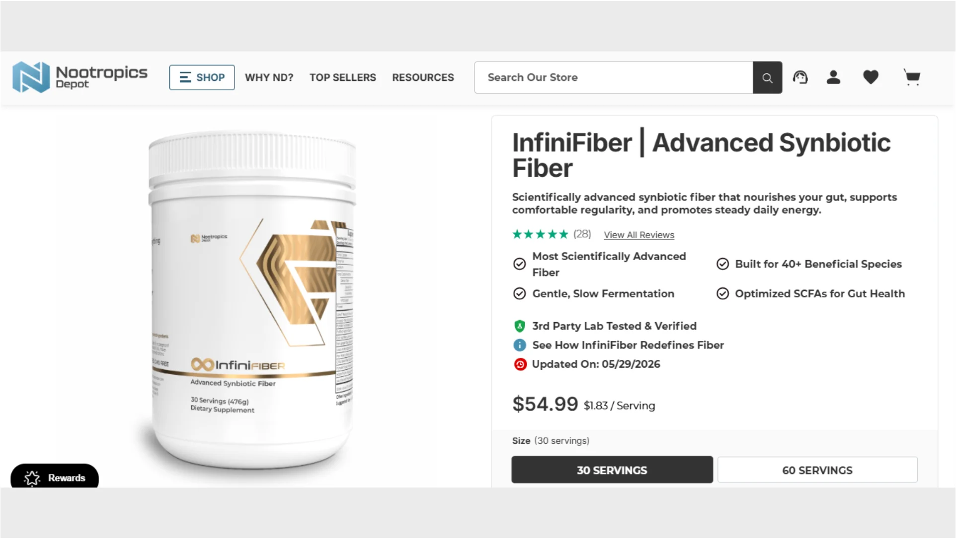
What is very specific here is how consistent their bottle spacing is. Whether it’s capsules, powders, or tablets, the products are always placed with identical vertical alignment and equal spacing between items. That creates a “catalog discipline” effect where your eye reads the lineup like a structured inventory, not a retail shelf.
Another subtle detail is their use of reflective control. The plastic and glass containers show almost no glare, which tells you they are using very diffused lighting from multiple angles. The goal is not mood, it is legibility – every milligram value and ingredient line remains readable at thumbnail size.
What you can take from this:
- Always shoot packaging dead-on so labels are never angled or skewed
- Maintain identical spacing between products when showing collections or variants
- Reduce reflections aggressively so text stays readable even in small previews
- Treat typography on packaging as the hero element, not the container shape
3. Fellow Products
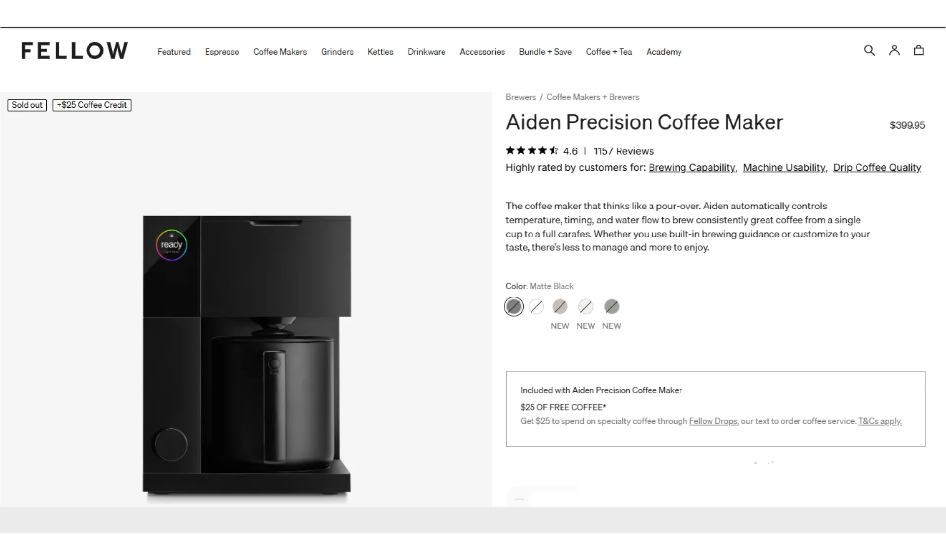
Instead of evenly lit product shots, they use angled lighting that highlights curves and texture transitions. For example, the matte finish on a kettle body is kept slightly underexposed while the metallic spout catches a narrow highlight line. That contrast is intentional. It defines shape without needing extra objects in the frame.
Another distinctive detail is their use of “single-object isolation with cinematic spacing.” A kettle might be in the lower third of the frame with a large empty space above it, which draws attention to the silhouette and proportion rather than detail overload.
What you can take from this:
- Use directional lighting to define edges instead of flattening the entire product
- Let shadows remain part of the composition instead of removing them completely
- Keep significant negative space in the frame to emphasize the product silhouette
- Focus on material differences (matte vs metallic) as a visual storytelling tool
Conclusion
So to make the most of these helpful tips, focus on consistency before complexity. Build a repeatable process. Review your images the same way a customer would. Small improvements made across dozens of product pages using different photographic techniques produce results that far exceed one-time design changes or promotional campaigns.
At Pixflow, we build tools that help creators produce professional-quality visuals faster. Our library includes over 8,000 premium templates for video and motion graphics – plus a full collection of cinematic LUTs for Photoshop that let you color-grade product photos in a single click instead of manually tweaking every slider.
If you are batch-editing product images and want consistent color correction across hundreds of SKUs without spending 20 minutes per photo, our LUT packs handle that in seconds. Everything ships with a commercial license, so you can use it across client work and your own store for building brand identity with no restrictions. See what Pixflow offers.
Disclaimer : If you buy something through our links, we may earn an affiliate commission or have a sponsored relationship with the brand, at no cost to you. We recommend only products we genuinely like. Thank you so much.
Blog Label:



Write for us
Publish a Guest Post on Pixflow
Pixflow welcomes guest posts from brands, agencies, and fellow creators who want to contribute genuinely useful content.
Fill the Form ✏