Teal and Orange Color Grading: Why It Works and When It Fails
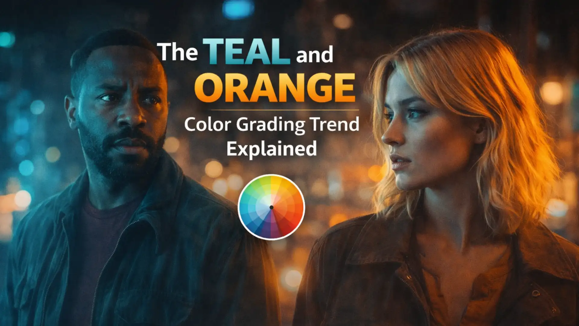
Teal and orange is arguably the most dominant color grade in modern visual media. And yet, for something so ubiquitous, it’s surprisingly misunderstood – applied by many, but genuinely understood by far fewer.
Here’s the thing: this isn’t just a trendy filter or a one-click LUT aesthetic. It’s a look rooted in color science and human perception. When you understand why it works, you stop copying it blindly – and start using it (or consciously rejecting it) with real intention.
In this article, we’re breaking down the full picture: the science, the history, the craft, and – crucially – the situations where this grade does more harm than good.
What Is Teal and Orange Color Grading?
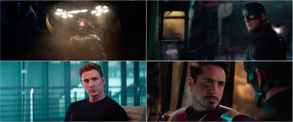
The result is a high-contrast, visually striking image where subjects – particularly people – are separated from their environments by hue rather than just brightness.
In practice, colorists achieve this through a combination of:
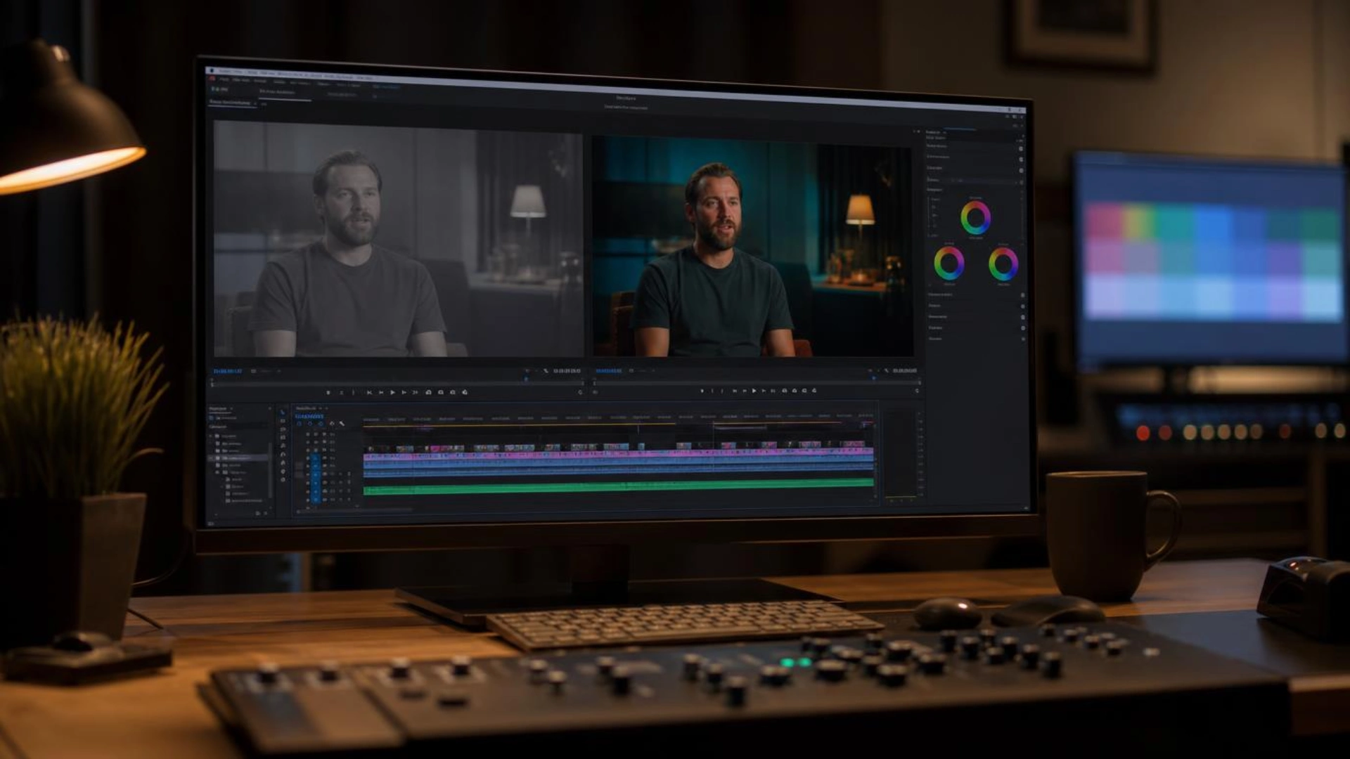
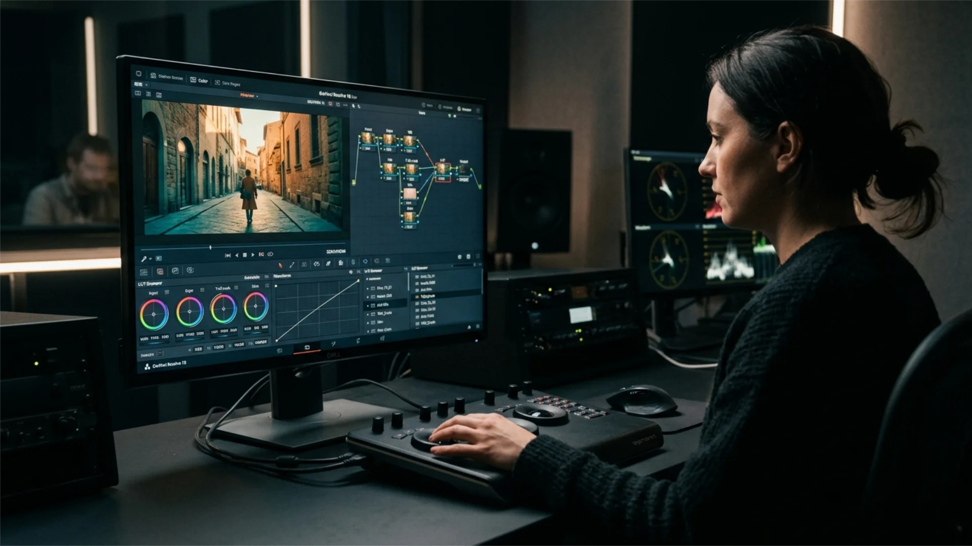
- Color wheels: Lifting shadows toward teal and nudging highlights/midtones toward orange in tools like DaVinci Resolve’s Color Wheels or Premiere Pro’s Lumetri Color panel
- HSL Secondaries: Isolating specific hue ranges (especially skin tones) and shifting them independently
- Creative LUTs: Applying a base look that already bakes in the teal-orange split, then refining on top
- Saturation targeting: Boosting the orange and teal channels while pulling back competing hues like greens and magentas
It sounds deceptively simple. But like most things in color grading, the difference between a grade that sings and one that screams is entirely in the subtlety of execution.
The Science Behind Why It Works
Color wheel contrast. Teal (a blue-green) and orange sit almost directly opposite each other on the color wheel, making them near-complementary colors. Complementary pairings create the highest possible color contrast – they vibrate against each other visually, commanding attention and creating energy in the frame. Your eye is literally being stimulated.
Skin tone physics. Human skin – across a wide range of ethnicities – registers in the orange-to-amber range on a vectorscope. This isn’t cultural, it’s biological: melanin and hemoglobin in the skin produce warm reflectance values. When you push the surrounding environment toward teal, you’re maximizing the contrast between the subject and their world. The person pops without you having to increase exposure or add artificial light.
Psychological resonance. Orange and amber are psychologically coded as warmth, energy, danger, and humanity. Teal and cyan read as distance, coolness, technology, and the unknown. Together, they create a subconscious narrative tension – the warm, human subject existing against a cool, indifferent world. It’s why the look became so dominant in action and thriller genres specifically. The palette feels dramatic.
Separation without luminance. Traditional ways of separating subject from background rely on depth of field, lighting contrast, or exposure differences. The teal-orange grade achieves subject isolation using hue alone – meaning you can create a sense of depth and cinematic dimension even in footage that wasn’t shot with separation in mind.
Why Hollywood Adopted It: A Historical Context
Certain film stocks – particularly those used in high-budget productions from the 1980s and 1990s – naturally produced cool shadows and warm highlights as part of their response curves. Kodak Vision stocks, for example, had a characteristic warmth in the midtones that colorists learned to amplify. Early digital grading in the late 1990s and early 2000s was largely an attempt to replicate and intensify what film stocks did organically.
By the mid-2000s, digital cinema had given colorists unlimited control. And what did many of them do with that control? They pushed the teal-orange split further than film ever could. Films like Michael Bay’s Transformers series (2007 onward) essentially codified the hyper-saturated teal-orange look as the default blockbuster aesthetic. Mad Max: Fury Road (2015) used it with far more craft and intentionality, as did John Wick and countless others.
Streaming platforms accelerated the spread. When thumbnail culture took over on YouTube, creators discovered that teal-orange thumbnails are eye-catching at small sizes on bright screens. The look migrated from cinema to content creation almost overnight.
Today, it’s the default starting point for a huge portion of video work – which is exactly where the problems begin.
When Teal and Orange Color Grading Works Best
Action and thriller content. The dramatic color tension is perfectly aligned with the emotional stakes of action filmmaking. Fast cuts, intense compositions, and the psychological contrast of warm vs. cool all reinforce each other.
Urban and night cinematography. City environments – neon signs, streetlights, wet pavement reflections – already contain natural teal and amber light sources. Grading in this direction feels coherent with the environment rather than imposed on it.
Portrait and hero shots. When your primary goal is making a person look compelling and present on screen, teal-orange delivers. The skin tone enhancement is real and significant, particularly in footage shot under neutral or slightly cool lighting.
Commercial and brand video. Many brands consciously associate the look with premium, cinematic production value. If the brief calls for “cinematic,” teal-orange is a reliable communicator of that quality signal.
Golden hour and warm-source footage. When the source material already skews warm – sunset light, tungsten interiors, candlelight – enhancing the orange and cooling the shadows feels like a natural extension of the light that was already there. The grade and the footage work in the same direction.
Professional Color Grading LUTs
When Teal and Orange Color Grading Fails
Diverse skin tones. The teal-orange grade was historically calibrated around a fairly narrow range of lighter skin tones. When applied aggressively to deeper skin tones, the orange push can make skin appear oversaturated, almost caricatured, while simultaneously losing detail in the shadows. The grade doesn’t treat all skin equally – and a colorist who doesn’t account for this isn’t grading with care, they’re just applying a preset.
Genre mismatch. Teal and orange carries specific emotional weight. Apply it to a romantic drama and you undercut the warmth and intimacy the story needs. Apply it to a period piece and it immediately reads as anachronistic. Apply it to a documentary and it signals aesthetic manipulation – the last thing a doc filmmaker usually wants.
Overuse and visual fatigue. When every shot in a piece, and every piece in a reel, carries the same teal-orange signature, the grade stops communicating anything. It becomes wallpaper. The contrast that once created energy now creates monotony. Audiences increasingly associate the look with generic, low-effort production – the opposite of what it used to signal.
Poor source footage. Color grading amplifies whatever is already in the image. Flat, underexposed, or poorly white-balanced footage doesn’t suddenly become cinematic under a teal-orange grade – it just becomes a flat, poorly exposed image with a color shift applied. The grade needs something to work with.
Narrative palette conflicts. Some stories require emotional palettes that are fundamentally incompatible with teal-orange. A film about grief, intimacy, childhood memory, or natural landscapes may need desaturation, warm analog feel, or cool steel tones. Forcing teal-orange onto these stories is a failure of craft – choosing aesthetic convenience over narrative service.
Environmental inaccuracies. Forests go teal and lose their vitality. Oceans look chemically altered. Grass looks like it belongs in a sci-fi film. When the environment in your frame is heavily green or naturally cool, the teal shift can tip from interesting to outright wrong. Viewers may not consciously identify the problem, but they feel the dissonance.
How to Use It Without Overdoing It
Nudge, don’t hammer. The most effective applications of teal-orange are ones where you can’t quite name what you’re looking at – you just feel the image has presence. If someone watches your grade and immediately says “oh, that’s the teal-orange thing,” you’ve probably gone too far.
Grade selectively across your timeline. Not every shot needs the same treatment. Hero shots and close-ups can carry the full grade. Wide establishing shots might benefit from a lighter touch. Varying the grade across a sequence adds visual rhythm and prevents fatigue.
Blend with your story’s emotional palette. Consider what other hues need to live in your image. A slight warmth in the greens, a more neutral shadow lift – small adjustments can soften the archetypal teal-orange look into something that feels more specific to your project.
Check on multiple displays. A grade that looks restrained on a calibrated monitor can look aggressive on a phone screen or a consumer TV. Always QC on at least two screens with different characteristics, especially if your content will be consumed on mobile.
Ask what the story needs. Before reaching for any look, ask: does this serve the emotion of the scene? Color grading is a storytelling tool first. The best colorists are invisible – you feel the mood without noticing the grade.
Alternatives Worth Considering
- Cool/desaturated grades (the Nordic noir or thriller aesthetic – think Sicario or No Country for Old Men): lower saturation, pulled-back contrast, slate-blue shadows. Powerful for tension and realism.
- Warm analog/film emulation: Lifted blacks, halation, grain, gentle color crossover from warm midtones to cool shadows – but organically, not aggressively. Reads as nostalgic and tactile.
- Scene-specific natural palettes: Taking a cue from the actual lighting and location in your footage and enhancing what’s already there, rather than imposing a predetermined look. Often results in the most original and story-appropriate grades.
- Complementary pairs beyond teal-orange: Consider green and magenta, or gold and blue-violet. Same underlying principle – complementary contrast – but with completely different emotional registers.
Conclusion
But “it works” doesn’t mean “it always works.” The most important skill in color grading isn’t learning how to apply a look. It’s learning when not to. Knowing that a story calls for something different, that your subject’s skin tones deserve more careful handling, or that the overused aesthetic will actually cheapen your work rather than elevate it – that’s the real craft.
The best colorists don’t reach for teal and orange by default. They understand the principles behind it, and they use those principles to make intentional decisions – whether the result looks like a blockbuster, a documentary, a memory, or something entirely their own.
Experiment with it. Study it. Break it apart. Just don’t apply it without thinking. Your footage – and your audience – deserve better than that.
Disclaimer : If you buy something through our links, we may earn an affiliate commission or have a sponsored relationship with the brand, at no cost to you. We recommend only products we genuinely like. Thank you so much.
Blog Label:



Write for us
Publish a Guest Post on Pixflow
Pixflow welcomes guest posts from brands, agencies, and fellow creators who want to contribute genuinely useful content.
Fill the Form ✏