The Color Palette of Amélie: How Color Creates a Dreamlike World
Directed by Jean-Pierre Jeunet and shot by cinematographer Bruno Delbonnel, Amélie did not just look beautiful. It used color as a narrative instrument – the same way a composer uses melody, or a novelist uses sentence rhythm. Every hue was chosen to tell you something about the world you were entering, and about the woman at its center.
This post breaks down how that palette works: what the key colors are, what they mean, how they were technically achieved, and what filmmakers, colorists, and editors can learn from them.
The Signature Color Language of Amélie
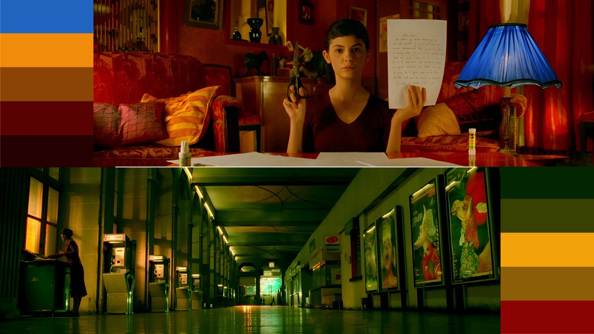
Amélie is built around four dominant hues: deep red, warm yellow and amber, muted green, and cool shadow blue. These are not random. Together, they form a carefully managed split-complementary scheme – one that creates visual tension and harmony at the same time.
But what makes the palette truly distinctive is not which colors are present. It is which colors are absent. The film’s digital grade deliberately pulls down the blues and cyans in the image – the kinds of tones that appear in daylight, sky, and shadow under natural conditions. By suppressing those cool frequencies, the reds and greens become unnaturally vivid. The image reads as warmer and more saturated than reality, even when the overall saturation level is moderate.
The result is a world that feels like a slightly idealized version of Paris – recognizable, but filtered through the imagination of someone who sees life as more beautiful than it probably is. That is, of course, exactly how Amélie herself sees things.
Red: The Color of Desire, Energy, and Amélie Herself
Her coat is red. Her lips are red. The lamp in her apartment casts a deep red glow. The tomatoes she squeezes at the market are red. The alarm clock by her bed is red. This is not coincidence – it is visual characterization. Red follows her the way a musical theme follows a protagonist.
Psychologically, red is one of the most loaded colors in the human visual system. It signals urgency, heat, passion, and vitality. In Amélie’s case, it also signals something more specific: desire held just below the surface. Amélie is a character full of longing – for connection, for love, for belonging – but she is also someone who acts on that longing indirectly, through small acts of invisible intervention. Red captures that contradiction perfectly. It is the color of intensity, worn by someone who expresses that intensity in quiet, sideways ways.
Red also functions as a compositional anchor. In scenes where the frame is complex – busy market streets, crowded café interiors – the eye naturally migrates to the warmest, most saturated point in the image. By consistently placing that point on Amélie, Jeunet and Delbonnel ensure the viewer always knows where to look, even without cutting to a close-up.
Pay attention to the final sequence of the film – Amélie and Nino’s reunion. As the emotional temperature rises, so does the saturation of the reds in the frame. It is subtle, but it is there.
Professional Color Grading LUTs
Yellow and Amber: Nostalgia, Warmth, and the Glow of Memory
The interiors of the Café des 2 Moulins – Amélie’s workplace and one of the film’s central spaces – are bathed in warm tungsten light. Walls, tabletops, the faces of the regulars: everything is lit amber. This is not simply a stylistic choice or a reflection of the café’s actual lighting conditions. It is an emotional declaration. The film uses warmth to signal safety, comfort, and belonging.
Yellow and amber are also the colors of memory and nostalgia in Western visual culture – the warm tones of old photographs, of candlelit rooms, of evenings that feel too good to last. Amélie is, at its core, a story about someone who is more comfortable in her fantasy of connection than in actual connection. The amber palette literalizes that: her world looks like a memory, even while it is happening.
This use of warmth becomes especially meaningful in contrast. In the few moments where the film allows coolness into the frame – grey skies over Paris, the blue-tinged exterior world that Amélie watches from her window – the warmth of her interior world becomes something almost painful. You feel, without being told, that she is safer inside the amber glow than out in the world beyond it.
Green: The Earthy Counterbalance
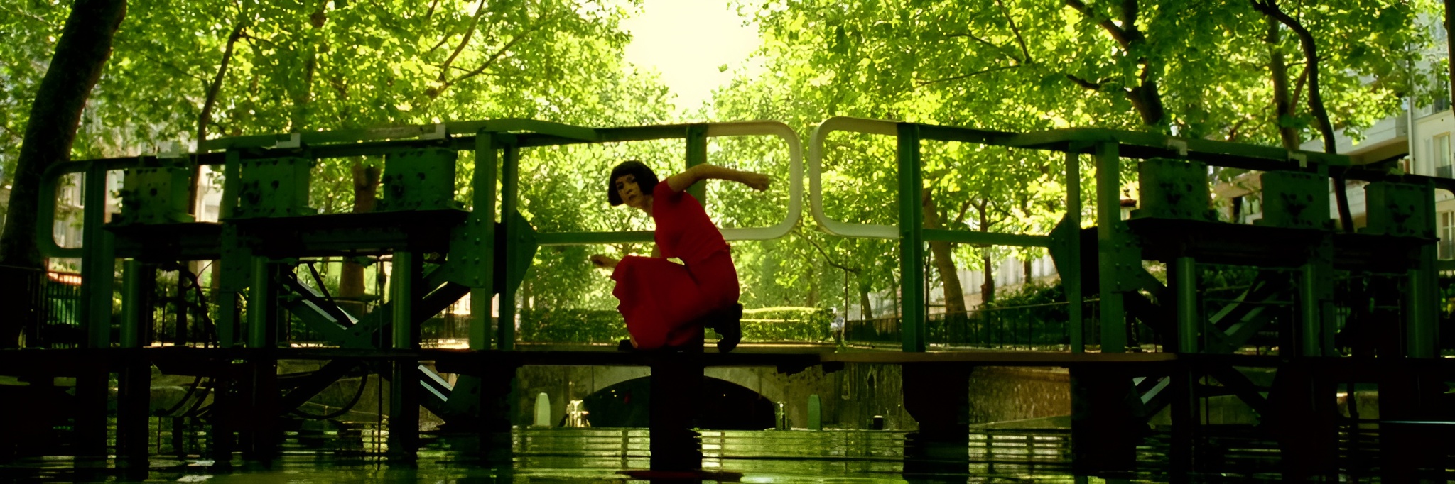
While red announces itself and amber envelops you, green works quietly in the background: the walls of Amélie’s apartment, the vegetables at the market, the plants on windowsills, the garden scenes. It is the color of the organic, the everyday, the real.
In color theory terms, red and green are complementary – they sit directly opposite each other on the color wheel. Placing them together creates maximum contrast without visual discord, provided they are balanced correctly. In Amélie, green serves as the counterweight that keeps the reds from becoming garish. It grounds the palette in something natural, something rooted, even as the overall image tips toward the fantastical.
The red-green relationship also carries subtle symbolic weight. Red, as established, belongs to Amélie’s inner life – her desire, her identity. Green, in its earthiness, belongs to the world as it actually exists. Their constant interplay in the frame mirrors the tension at the center of the story: between Amélie’s rich imaginary world and the real one she is slowly learning to inhabit.
How the Color Grade Was Achieved: A Technical Breakdown
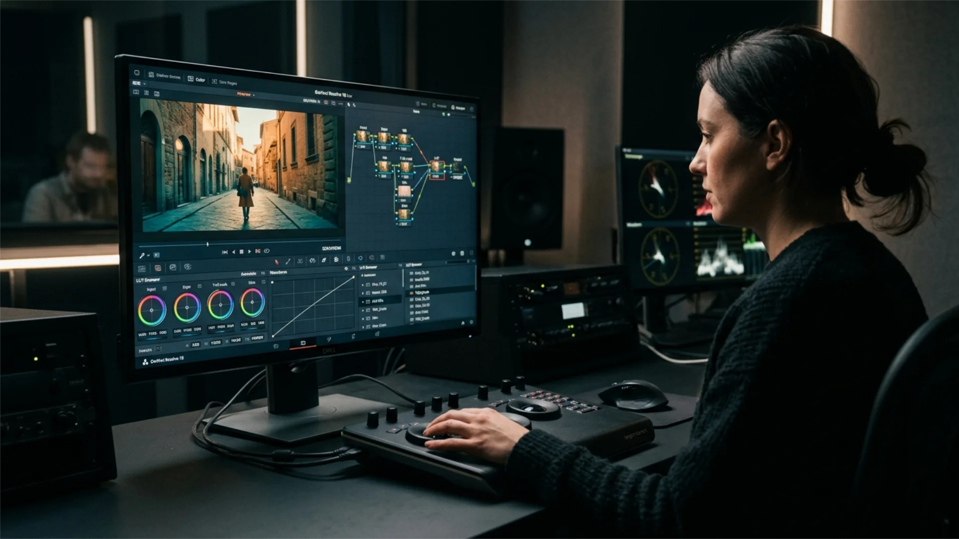
The core technique involved selective color manipulation. Rather than applying a uniform filter or LUT across the image, Delbonnel and the color team worked hue by hue:
- Blues and cyans were desaturated and shifted slightly toward green/teal, reducing the “cold” presence in shadows and daylight exterior shots.
- Reds were boosted in both saturation and luminance, making warm tones punch forward out of the frame.
- Yellows and ambers were preserved and slightly enhanced, reinforcing the tungsten warmth of interior scenes.
- Greens were kept organic and slightly muted – present but never competing with the reds.
The overall effect resembles what is sometimes called a bleach bypass aesthetic: boosted contrast, slightly compressed midtones, and a sense that the image has been filtered through a warm, slightly aged process. The blacks are deep, the highlights are controlled, and the midtones lean warm.
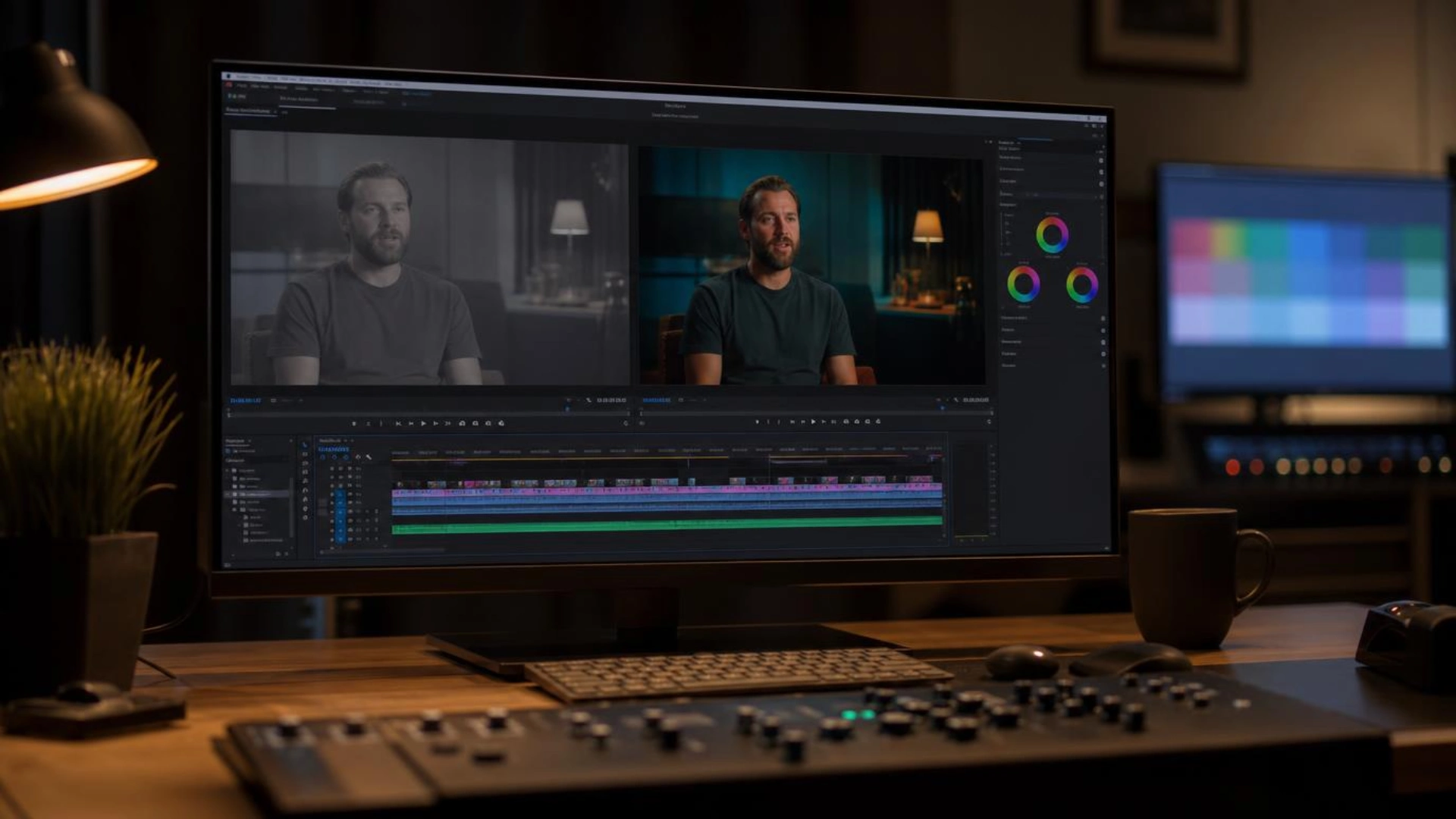
For editors and colorists working in DaVinci Resolve today, this look is achievable through a combination of hue vs. saturation curves (pulling down the blue/cyan range), a warm lift in the shadows, and careful saturation management that favors the red-orange-yellow range over the blue-green one. The key discipline is restraint: the Amélie grade never feels overdone because every adjustment serves the image rather than competing with it.
Color as Character: What the Palette Tells Us About Amélie
For most of the film, the palette is warm, vivid, and slightly heightened. This is Amélie’s world as she experiences it: full of meaning, beauty, and possibility. But in moments of doubt or isolation – when she retreats from the brink of connection, when she imagines a future without Nino – the palette cools almost imperceptibly. It is not a dramatic shift. There is no sudden desaturation. But the warmth recedes slightly, and with it, the sense that the world is a safe and manageable place.
This is color doing the work of interiority. Rather than a voiceover explaining Amélie’s fear, or a close-up holding on her expression, the frame itself tells us something has changed. Viewers feel it before they consciously register it.
This approach is worth comparing to Jeunet’s later film, A Very Long Engagement (2004), also shot by Delbonnel. That film uses a similarly desaturated, selective-color grade – but here, the warmth is harsher, more sepia, more exhausted. It is the palette of a world that has been through a war. The technical vocabulary is almost identical; the emotional meaning is entirely different. Same tools, different truth.
Lessons for Filmmakers and Colorists
1. Restrict your palette and commit to it. Amélie works with three or four dominant colors and holds to them rigorously across 122 minutes. A broad, unsystematic palette would have made the film feel busy rather than cohesive. The constraint creates identity.
2. Use color to define character, not just mood. Assigning a color to a character – and then keeping that association consistent – is one of the most powerful tools available to a visual storyteller. The audience learns the code without being taught it.
3. Selective desaturation is more powerful than uniform saturation. The Amélie look does not come from turning up the saturation slider. It comes from removing color in specific ranges so that others feel more intense by comparison. Subtraction is often more effective than addition.
4. Warm vs. cool contrast can carry emotional weight without a word of dialogue. The shift between warm interior and cool exterior, between amber safety and grey uncertainty, does real narrative work in this film. Temperature is a storytelling tool.
A practical exercise: before your next color grade, write a short “color script” – a scene-by-scene plan for how temperature and saturation will shift to reflect the emotional arc. Amélie almost certainly had one, whether written down or not.
Conclusion
The next time you watch Amélie – or any film – try watching it on mute for a few minutes. Notice where your eye goes, what you feel, how the temperature of the image changes. Chances are you will find a conversation happening entirely in color, underneath everything else.
For editors, colorists, and motion designers, that is the real lesson: color is always speaking. The question is whether you are directing what it says.
Disclaimer : If you buy something through our links, we may earn an affiliate commission or have a sponsored relationship with the brand, at no cost to you. We recommend only products we genuinely like. Thank you so much.



Write for us
Publish a Guest Post on Pixflow
Pixflow welcomes guest posts from brands, agencies, and fellow creators who want to contribute genuinely useful content.
Fill the Form ✏