How to Use Vintage Photos in Modern Graphic Design
Still, using old photos successfully is not just about adding a sepia image to a composition. The result has to feel intentional. A strong design balances nostalgia with clarity, atmosphere with readability, and texture with structure. When done well, vintage imagery adds depth without making the project look outdated.
In this guide, we will look at why vintage photos work so well, how to choose the right ones, how to blend them into contemporary layouts, and where they fit best in real design projects.
Why Vintage Photos Work in Modern Design
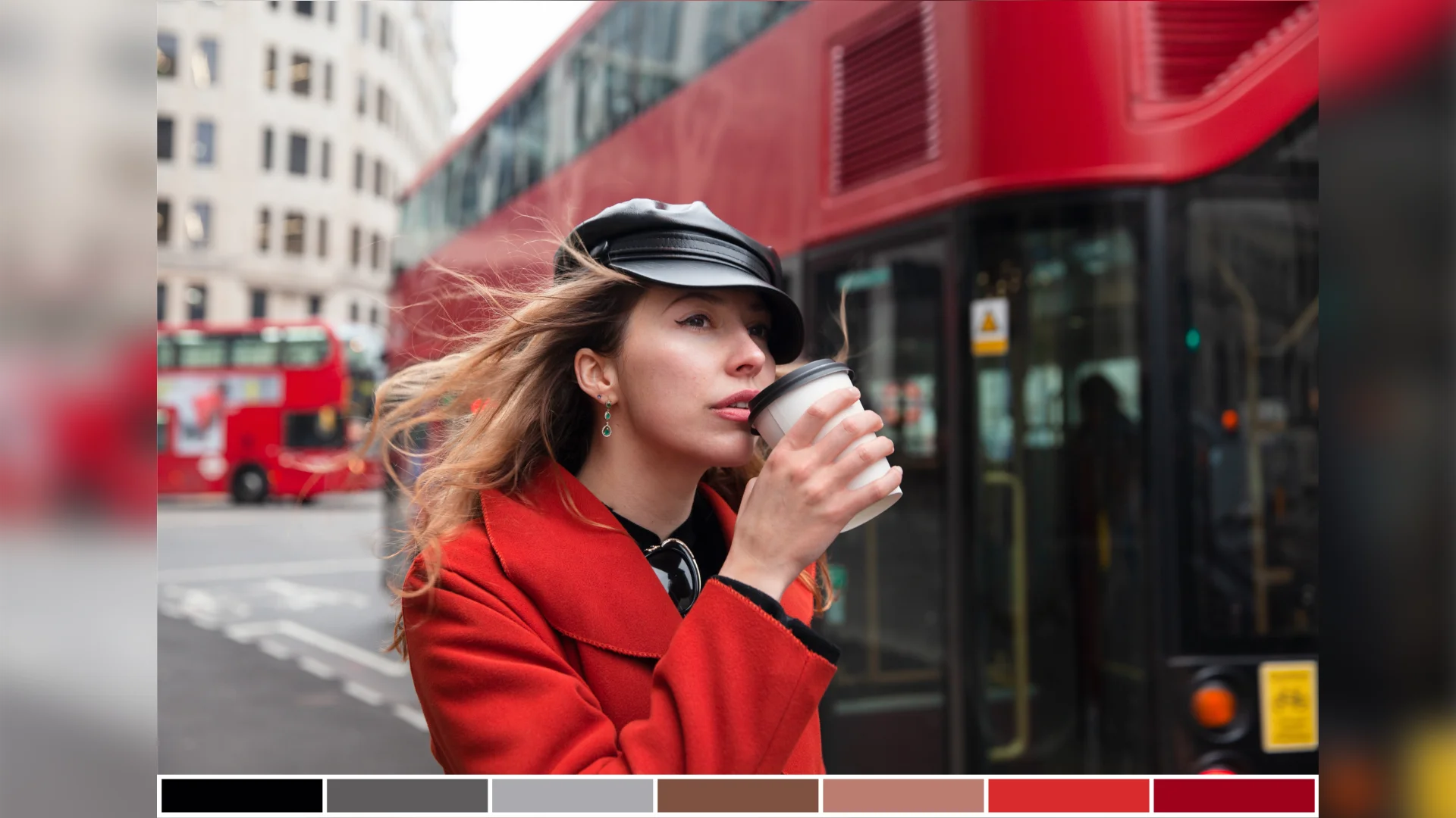
They also create strong contrast. Modern design often relies on clean typography, organized grids, and minimal interfaces. Placing a vintage photo within that structure creates a fresh mix. The photo adds mood, while the layout keeps everything clear and relevant.
Another advantage is storytelling. A single old image can suggest a time, a personal memory, or a cultural mood in seconds. That makes vintage photography useful in projects that need emotional impact quickly.
Nostalgia Makes Design More Memorable
People often respond to vintage visuals because they feel familiar, even when the photo itself is unknown. That sense of nostalgia can make branding or editorial design feel warmer and more personal.
Imperfection Adds Character
Not every flaw is a problem. Often, a bit of grain or fading helps the image feel authentic. The trick is knowing which imperfections support the design and which ones distract from it.
Choosing the Right Vintage Photos
Next, consider tone. A quiet family portrait, a dramatic city scene, and a playful candid image all communicate different things. The mood of the photo should match the purpose of the design.
Quality matters too. Many old images come with scratches, fading, blur, or low contrast. If the photo is visually strong but technically weak, restore it before you build the final composition. If the original file does not have the right quality, it is natural to improve it in a photo restoration program so the image looks cleaner while still keeping its vintage charm.
What to Look For
When choosing a vintage photo, check for:
- clear focal point
- usable resolution
- flexible crop options
- visual mood that fits the concept
- enough space for layout elements
- texture that enhances rather than overwhelms
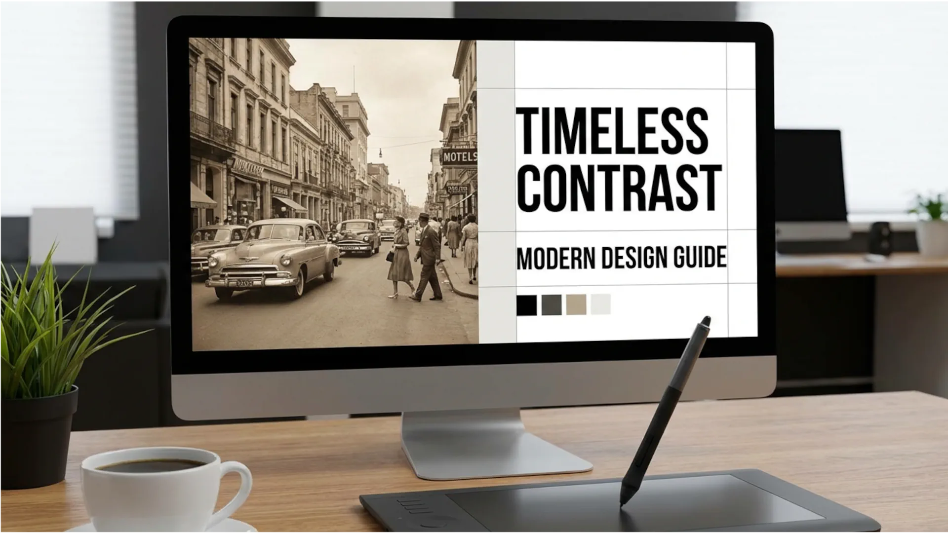
Balancing Old and New
Typography is one of the easiest ways to create balance. Clean sans serif fonts often pair well with old photography because they bring contrast and readability. A modern grid also helps. Even if the image is soft or irregular, the layout can still feel controlled.
You can also modernize the composition with spacing, scale, and bold hierarchy. A vintage image inside a clean, minimal structure usually feels more contemporary than a layout full of extra retro effects.
Do Not Overuse Retro Effects
A real vintage photo already contains enough texture. If you add fake dust, tape, paper overlays, and extra grain on top of it, the design may start to feel forced.
Let Contrast Do the Work
Often the best solution is simple: old image, modern type, clean composition. That contrast creates interest without making the design too busy.
Working with Color and Texture
One approach is to preserve the original palette for authenticity. This works well in editorial design, storytelling projects, and mood-driven branding. Another option is to adjust the image so it feels more current. You might increase contrast, neutralize yellowing, or build a palette around selected tones from the original photo.
Texture should be treated the same way. Keep the texture that creates mood. Remove the texture that reduces clarity. A bit of grain can feel cinematic. Heavy damage across the subject may only make the design harder to read.
Build the Palette from the Image
Instead of forcing unrelated brand colors onto the composition, sample tones from the photo itself. Skin tones, shadows, clothing, and paper backgrounds can all help shape a natural color system.
Keep Readability in Mind
If text sits on top of a highly textured or low-contrast photo, readability can suffer fast. Use overlays, solid blocks, or careful placement to keep the message clear.
Where to Use Vintage Photos
In branding, they can suggest heritage, authenticity, and personality. In poster design, they create instant mood. In editorial work, they add narrative and visual richness. On social media, they stand out because they break the rhythm of overly polished content.
They can also be effective in web design, especially in hero sections, campaign pages, or about pages. The key is moderation. One strong vintage image can elevate a page; too many can make the interface feel cluttered.
Best Use Cases
Vintage photos work especially well in:
- posters
- editorial layouts
- album covers
- packaging
- brand storytelling
- social campaigns
- website hero sections
Where to Find Vintage Photos
Public domain archives are useful when you want authentic historical visuals. Personal collections can feel even more unique, especially for storytelling-focused work. Stock platforms are the fastest option when you need convenience and better file quality.
No matter where the image comes from, always check rights and usage terms before publishing anything commercially.
Common Mistakes to Avoid
The second is over-editing. Too many artificial retro effects can make the design feel inauthentic.
The third is ignoring readability. If typography becomes lost in the texture or tonal range of the photo, the design stops working.
The fourth is skipping cleanup. Some defects add charm, but others simply weaken the image. Use restoration carefully to improve quality without removing all character.
Conclusion
Choose a photo with the right mood. Restore it when needed. Pair it with modern typography and a clear layout. Use color and texture with restraint. And let the contrast between old and new become the main visual idea.
When treated as a storytelling tool rather than just a decorative trend, vintage photography can give branding, editorial design, posters, packaging, and digital content a timeless edge.
Disclaimer : If you buy something through our links, we may earn an affiliate commission or have a sponsored relationship with the brand, at no cost to you. We recommend only products we genuinely like. Thank you so much.
Blog Label:

Write for us
Publish a Guest Post on Pixflow
Pixflow welcomes guest posts from brands, agencies, and fellow creators who want to contribute genuinely useful content.
Fill the Form ✏