How to Create Stunning Infographics in Adobe Illustrator
Infographics in Illustrator
In this guide, you’ll learn how to create an infographic in Illustrator from start to finish. We’ll walk you through every step, from outlining your story and using the Illustrator Graph Tool, to designing custom icons and exporting your final work for web and print. Whether you’re looking for free infographic templates for Illustrator, building charts, or crafting custom elements, this guide has you covered.
Want to skip the tedious part? Check out these free Adobe Illustrator infographic templates—they include timelines, charts, icons, and more, ready to customize.
Professional Illustrator Templates

Step 1: Planning Your Infographic’s Story and Layout
Defining Your Narrative and Key Data Points
Every infographic should tell a story. Whether you’re illustrating statistics, explaining a process, or comparing data sets, define the main message you want your audience to take away. Highlight the most important data points and supporting facts. This will guide every design decision, from chart types to layout.
Ask yourself:
- What is the core idea I’m communicating?
- Which facts or figures best support this message?
- Who is my audience, and how much do they already know?
Sketching a Visual Hierarchy
With your story and data ready, start sketching your layout. A strong visual hierarchy makes the infographic easy to scan and digest.
Consider:
- Top-to-bottom or left-to-right flow for logical sequences.
- Zig-zag layouts to maintain viewer attention on long scrolls.
- Grouping related data into sections using color blocks or icons.
Use a quick wireframe to map out where each chart, infographic element, and block of text will live. This step saves time once you’re inside Illustrator.
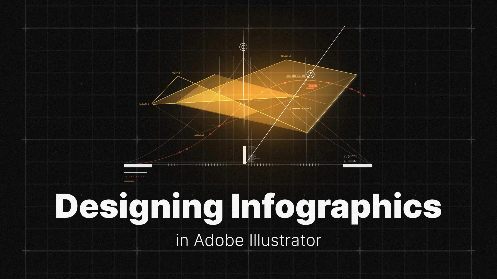
Step 2: Using the Illustrator Graph Tool for Data Visualization
How to Use the Bar Chart Tool
- Select the Bar Graph Tool from the toolbar (hidden under the Column Graph Tool).
- Click and drag to draw the graph area on your artboard.
- A spreadsheet window will open. Enter your data manually or paste it from Excel.
- Click the checkmark icon to generate your bar chart.
This is the fastest way to create a bar chart in Illustrator that aligns with your layout and design style. The tool is ideal for comparing categories or tracking progress.
How to Use the Pie Chart Tool
- Select the Pie Graph Tool from the same dropdown.
- Draw your chart area and input your data in the spreadsheet.
- Hit apply and your Illustrator pie chart is ready.
Use pie charts to show proportions or parts of a whole—just keep it simple (no more than 5–6 slices is ideal for clarity).
The Pro Tip: How to Edit and Style Your Graphs
Here’s where many designers struggle: graphs in Illustrator are “live objects,” meaning you can’t easily style or edit them until you ungroup them.
To customize your graph:
-
- Select the chart.
- Go to Object > Ungroup. Illustrator will warn you that you’re about to break the link to the original data. Click OK.
- Now, each bar, wedge, or label becomes a standard vector shape. You can change colors, round corners, use gradients, or even animate them.
⚠️ Important: Once ungrouped, you can’t edit the data through the Graph Tool anymore. Only ungroup once you’re happy with the values.
Looking for ready-made, editable infographic elements and charts? Check out these Illustrator infographic templates and HUD elements to save time and boost your design quality.

Step 3: Designing Custom Infographic Elements
Creating a Cohesive Icon Set
Icons help communicate ideas quickly and visually. When designing an infographic, it’s essential that your icons feel like part of a family.
Here’s how to make them cohesive:
- Stick to a consistent stroke weight or fill style.
- Use a limited color palette (ideally matching your brand).
- Keep the design minimal and avoid unnecessary detail.
Use Illustrator’s Shape Builder Tool and Pen Tool to create your own infographic icons. These tools offer full flexibility for creating clean and scalable vector graphics.
How to Create a Timeline Infographic
Timelines are perfect for illustrating historical data, company growth, or process steps. In Illustrator:
- Use the Line Tool (\) to draw your main timeline.
- Add circles or markers using the Ellipse Tool.
- Use Text Boxes to place dates, milestones, or descriptions along the timeline.
- Align everything with the Align panel to keep it structured.
Step 4: Finalizing Layout, Typography, and Exporting
Establishing a Clear Typographic Hierarchy
Typography guides your viewer through the data. Use font size, weight, and spacing to establish a clear reading order.
A simple type system might look like this:
- Headline: 36–48 pt
- Subheading: 24–32 pt
- Body Text: 14–18 pt
- Data Labels: 10–12 pt
Stick with 1–2 fonts and use consistent formatting throughout. Consider pairing a bold sans-serif for headers with a clean serif or modern geometric font for body text.
Assembling Your Final Layout
Place all your designed elements—charts, icons, labels, and text—onto a single Illustrator artboard.
Tips for final layout:
- Use guides and rulers to align elements precisely.
- Group related items and add consistent spacing.
- Make use of white space to avoid visual clutter.
Remember, a clean and organized layout boosts comprehension and makes your infographic more engaging.
Exporting Your Infographic for Web and Print
To export your infographic:
- For web:
File > Export > Export As > JPG or PNG. Choose 150–300 ppi depending on platform requirements.
- For print:
File > Save As > PDF. Use CMYK color mode and select “High Quality Print” preset.
Bonus Tip: Save a working .ai file so you can make edits later or repurpose elements for future designs.
Conclusion
Now it’s your turn: find an interesting dataset and challenge yourself to design a professional infographic using these techniques. For extra polish, check out our tutorials on crafting icons with the Shape Builder Tool and precision drawing with the Pen Tool.
Happy designing!
Disclaimer : If you buy something through our links, we may earn an affiliate commission or have a sponsored relationship with the brand, at no cost to you. We recommend only products we genuinely like. Thank you so much.

Write for us
Publish a Guest Post on Pixflow
Pixflow welcomes guest posts from brands, agencies, and fellow creators who want to contribute genuinely useful content.
Fill the Form ✏