Adobe Illustrator Tutorial: The Complete Guide for Designers and Motion Artists

- TL;DR: the short answers
- What is Adobe Illustrator used for?
- Illustrator or Photoshop? And where do Figma and After Effects fit?
- Is Illustrator hard to learn, and how long does it actually take?
- How do I set up a new document so I do not regret it later?
- Which tools do I actually need to start?
- How do I practise the Pen Tool until curves stop fighting me?
- Should I trace images or draw from scratch?
- How do I make a logo in Illustrator?
- How do I change the shape of text in Illustrator?
- How do I get color right, on screen and in print?
- Does Illustrator have AI tools now, and should I use them?
- Why does my Illustrator export look blurry or pixelated?
- Which file format should I export, and when?
- How do I get Illustrator artwork into After Effects?
- Why is Illustrator so slow, and what actually helps?
- Can I use Illustrator for free, and what are the alternatives?
- Where does Illustrator fit into real client work?
- What mistakes cost beginners the most time?
- Where should I go next?
- How we tested and wrote this guide
- Conclusion
Here is the thing about learning Illustrator: most people do not struggle with the software, they struggle with the order. They open a 90 tool interface, poke at the Pen Tool for ten minutes, decide they are bad at curves, and go back to Photoshop. (We have all been there.)
So this guide is built around the questions people actually type into Google and ask in forums, in the order they tend to hit you. Every heading below is a real question, and each one gets a direct answer plus the setting or menu path that solves it. We make and sell vector and motion template packs for a living, so the fixes here are the ones we use on production files, not theory. If you learn faster by taking something apart, our Illustrator templates are fully editable vector files you can open and reverse engineer.
TL;DR: the short answers
- Illustrator is for artwork that must scale or print: logos, icons, illustration, lettering, packaging, technical flats, and vector assets destined for animation. Photos stay in Photoshop.
- It is not hard, it is unfamiliar. Most people are comfortable in 10 to 20 focused hours. The Pen Tool is the only part with a genuine learning curve.
- Learn six tools first: Selection (V), Direct Selection (A), Pen (P), Shapes (M, L), Shape Builder (Shift + M), Type (T). Ignore the other 70 for now.
- Set the document up before you draw. RGB and pixels for screen, CMYK and millimetres or inches for print, bleed 0.125 inches (3 mm) for anything that gets trimmed.
- Blurry PNG exports are almost never a resolution problem. Export at the exact pixel size you need, set anti-aliasing to Art Optimized, and check Document Raster Effects Settings.
- Format follows destination: SVG for web, PNG for transparency, PDF or EPS with bleed for print, layered AI for After Effects, AI as your master.
- Illustrator has generative AI built in now (text to vector, generative shape fill, sketch to vector, Recolor). It is useful for exploration, not for final client marks.
- There is no free version, only a trial and then a subscription. Inkscape is the genuinely free alternative, Affinity Designer the one time purchase option.
Professional Illustraitor Templates
What is Adobe Illustrator used for?
- Brand identity: logos, icon sets, wordmarks, and the variant packs clients need for every placement.
- Illustration: editorial art, characters, line work, and anything that has to survive being scaled or recoloured.
- Print production: packaging, business cards, posters, apparel graphics, anything heading to a trimmed physical deliverable.
- Type and lettering: custom headlines, badges, logotype, and type effects that would be destructive in a raster app.
- Technical drawing: garment flats, diagrams, infographics, floor plans, cutaways.
- Motion assets: layered artwork built specifically to be animated in After Effects.
The common thread is not the subject matter. It is that the output needs to be resized, reprinted, recoloured or animated later without rebuilding it.
Why does my logo look blurry when I scale it up, and how does vector fix that?
Vector artwork stores the instruction instead of the result: anchor points, the curve between them, a stroke weight, a fill. The file is rendered at whatever size you ask for, which is why Adobe describes vector graphics as resolution independent, and why the same logo works on a business card and an outdoor billboard.
Three consequences that matter on real jobs:
- One master file covers every size, so there is no “can you send a bigger version” email.
- Every element stays editable months later. Colors, weights and shapes change without a rebuild.
- Placed photos are still raster. Illustrator can hold and trace them, but it cannot add detail that was never captured.
If you want a broader tour of what vector artwork makes possible before you touch the tools, our guide to creating vector art in Illustrator covers the creative side in more depth.
Illustrator or Photoshop? And where do Figma and After Effects fit?
Which one should I learn first?
If your goal is graphic design, branding or print, start with Illustrator, because it teaches construction, alignment and type discipline that transfer everywhere. If your goal is photo work or social content, start with Photoshop. If your goal is product or app design, start with Figma and treat Illustrator as your asset factory.
The full decision breakdown, including file format handling, pricing structure and which skills carry over, is in our comparison of Illustrator, Photoshop and Figma.
Is Illustrator hard to learn, and how long does it actually take?
Realistic timelines, based on how long it takes the people we work with to become useful:
- 2 to 3 hours: you can navigate, make shapes, set type, and save a file without panicking.
- 10 to 20 focused hours: you can build a simple logo, combine shapes deliberately, and export the right format for the job.
- 1 to 3 months of regular project work: you are confident with type, color systems, print prep and export, and you stop googling basics.
- 6 months plus: speed. Shortcuts become muscle memory and you stop thinking about the software at all.
The Pen Tool is the only genuinely steep part, and it responds far better to 15 minutes daily than to one three hour session. Everything else is vocabulary.
What should I learn in my first week, and in what order?
This is the sequence we would teach sitting next to you, and the rest of this guide follows it:
- Document setup, because the wrong color mode ruins work you have not made yet.
- Navigation, so you stop losing your artwork off screen.
- Selection and Direct Selection, the difference between moving a thing and editing a thing.
- Shapes, because most professional vector art is built from primitives.
- Combining shapes with Shape Builder or Pathfinder.
- Type, including outlining.
- The Pen Tool, practised deliberately rather than avoided.
- Export, matched to the destination.
One thing worth saying plainly: recreating existing designs is the fastest way to learn, and it is what experienced designers actually recommend to beginners. Opening a finished, well built file and taking it apart teaches structure that no tutorial can. Our guide to working from Illustrator templates covers that approach and the habits worth copying from production files.
How do I set up a new document so I do not regret it later?
- Destination and color mode. Web and Mobile presets give you RGB and pixels. Print presets give you CMYK and millimetres or inches. Converting color mode later shifts your colors, and rich RGB blues and oranges are the worst offenders. For apparel and product-development projects, getting these specifications right from the beginning is equally important. A structured ai techpack can help keep design specifications, measurements, materials, and other production details organized alongside the visual artwork.
- Artboard count. Illustrator holds many artboards in one document, which is how you keep a logo, its variants and its social crops together rather than in five files.
- Bleed. For anything that will be printed and trimmed, set 0.125 inches (3 mm) on all sides now. Adding it later means re extending every element that touches an edge.
Worth doing on day one as well: name layers as you create them, and save your panel arrangement with Window then Workspace then New Workspace so a crash never costs you your layout. “Path 47” tells you nothing at 11pm before a deadline.
How do I move around the canvas without getting lost?
Five controls handle almost all navigation:
- Zoom: Z, or hold Alt and scroll
- Pan: H, or hold Space at any time to grab the canvas temporarily
- Rotate view: Shift + H, for drawing at a comfortable angle
- Fit artboard in window: Ctrl/Cmd + 0, the panic button when artwork vanishes
- Outline view: Ctrl/Cmd + Y, which shows paths only and is the fastest way to find stray points and invisible objects
Speed compounds from here. Keyboard driven work is roughly twice as fast as menu driven work once it is automatic, and our Illustrator keyboard shortcuts cheat sheet is built to be printed and stuck next to your monitor.
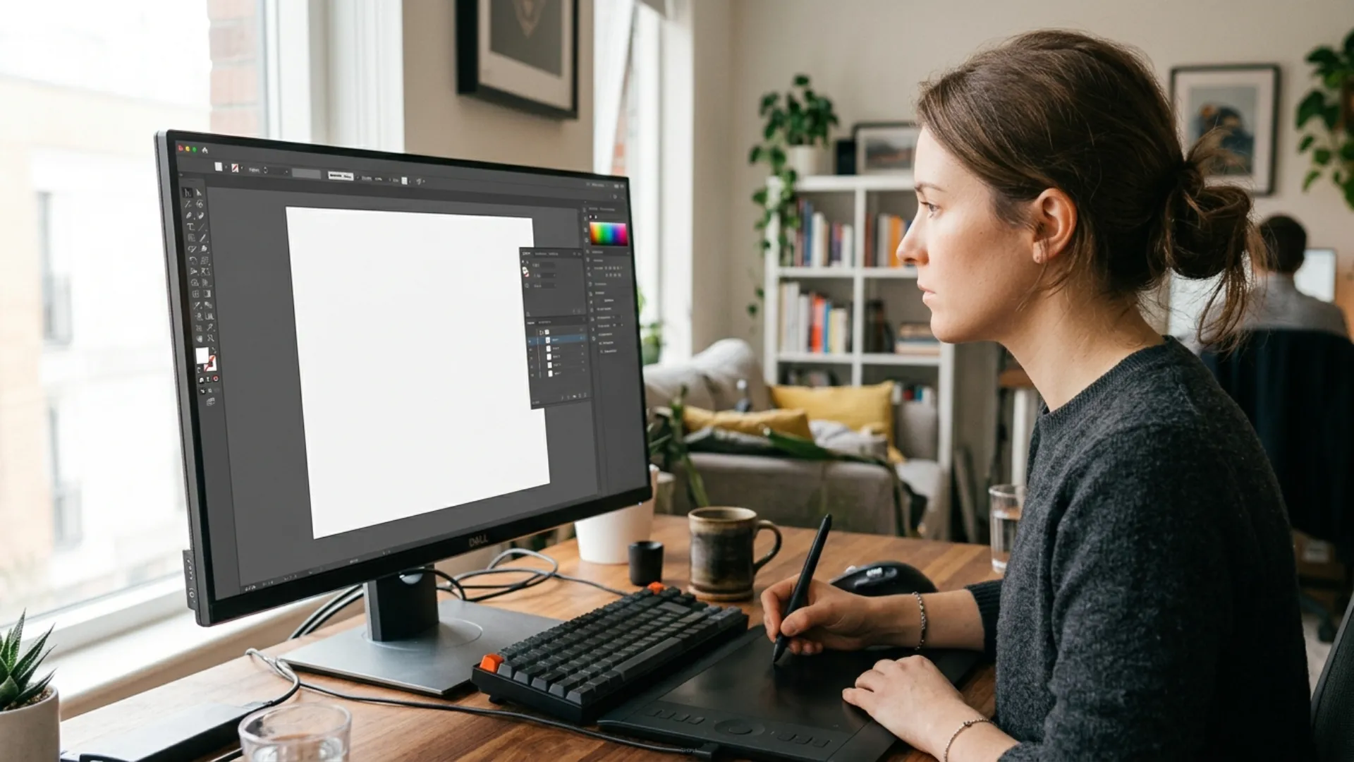
Which tools do I actually need to start?
How do I select and move things without breaking them?
The Selection Tool (V) moves, scales and rotates whole objects and groups. Hold Shift while scaling to keep proportions, Alt while dragging to duplicate.
The Direct Selection Tool (A) selects individual anchor points and path segments. This is where vector editing actually happens: nudging one corner, adjusting a single curve, fixing an anchor that sits one pixel off.
If your selections keep grabbing the wrong thing, you are almost certainly inside a group. Double click to enter it, Escape to leave.
How do I draw precise shapes?
Rectangle (M), Ellipse (L), Polygon and Star. Hold Shift for perfect squares and circles, and drag the round corner widgets inward to round corners non destructively, which means you can change your mind later.
Most polished vector artwork is primitives that have been combined and trimmed, not freehand drawing. That is genuinely how professionals work, and it is good news if you cannot draw.
Do I have to learn the Pen Tool?
Eventually yes, but not on day one, and that is the part nobody tells beginners. Illustrator has a Curvature tool that lets you build smooth curves by clicking points and dragging segments, with double click converting a corner to a smooth curve, as Adobe’s tutorial on drawing and editing curves in Illustrator shows. For organic shapes, it gets you working results in minutes instead of days.
That said, the Pen Tool (P) is the precision instrument, and the mechanics are simpler than the reputation:
- Click once to place a corner point.
- Click and drag to place a smooth point with curve handles.
- Hold Alt and drag a handle to break its symmetry and change direction sharply.
- Place anchor points at the extremes of a curve, never in the middle of it.
Our beginner’s guide to mastering the Pen Tool goes through the progressive exercises that build the habit properly.
How do I combine two shapes into one?
Two routes, and they suit different moments. The Shape Builder Tool (Shift + M) lets you drag across regions to merge them, or Alt click a region to delete it, which is ideal for exploratory construction. The Pathfinder panel (Window then Pathfinder) does the same work through named operations like Unite, Minus Front and Intersect, which is more predictable when precision matters.
Our complete guide to the Shape Builder Tool covers the edge cases where it behaves unexpectedly, usually caused by open paths or stray anchor points.
How do I add text?
The Type Tool (T) creates point text when you click once, and area text when you click and drag a box. Point text suits headlines and logos, area text suits paragraphs that need to wrap. Choosing wrong is why text sometimes refuses to reflow the way you expect.
Two more tools worth adding in month one: the Brush Tool (B) for expressive strokes, covered in our deep dive into Illustrator brushes, and the Blend Tool (W) for generating smooth steps between shapes and colors, which is how a lot of modern gradient and line art is really made. See mastering the Blend Tool for that technique.
How do I practise the Pen Tool until curves stop fighting me?
- New document, 1000 x 1000 pixels, RGB.
- Draw a circle with the Ellipse Tool (L), holding Shift. Set no fill and a 4pt black stroke so the path is clearly visible.
- Switch to the Direct Selection Tool (A) and click the bottom anchor point. Drag one of its two handles and watch how only that side of the curve changes.
- Now rebuild that circle with the Pen Tool. Place four anchor points at top, right, bottom and left, dragging each perpendicular to your direction of travel. Four points is all a circle needs, and understanding why is the whole lesson.
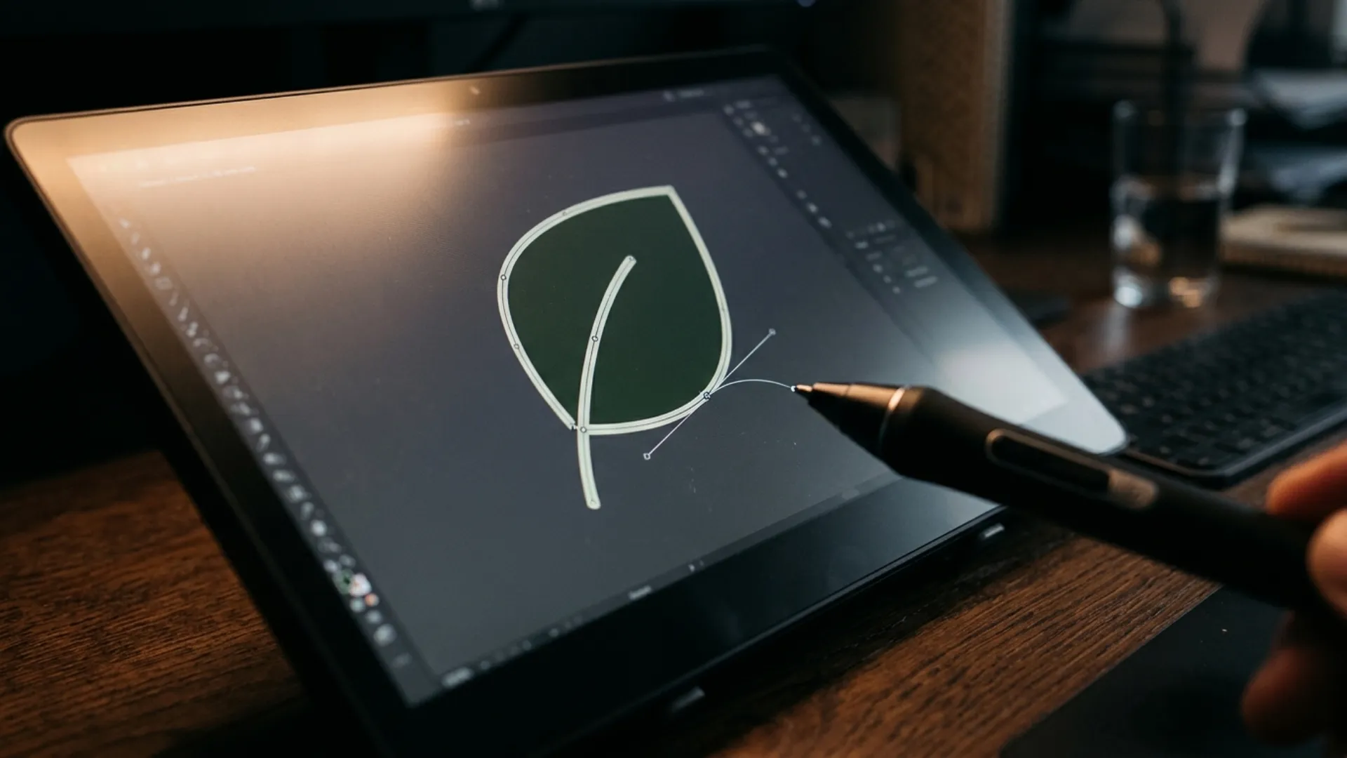
- Draw a leaf: click once at the tip, click and drag at the widest point, then close the path on the first anchor. Two points, one curve each side.
- Select both shapes and try Unite, Minus Front and Intersect in the Pathfinder panel. Undo, then do the same with Shape Builder to feel the difference.
- Save as .ai and keep it. Repeat the leaf from memory tomorrow.
What that teaches is the core loop of all vector work: fewest points possible, control the curve with handles, combine simple shapes into complex ones. If your curves look lumpy, the cause is almost always too many anchor points rather than an unsteady hand. Object then Path then Simplify will clean up existing artwork.
Should I trace images or draw from scratch?
Trace when you have a clean, high contrast source: a pen and ink sketch, a flat logo you are rebuilding, a high resolution photo with clear edges. Image Trace with the right preset gets you 80% of the way in seconds, and Illustrator also has a Convert sketch to vector quick action that turns a hand drawn sketch into editable paths, one of the AI features Adobe lists for Illustrator.
Draw from scratch when the source is low resolution, noisy or low contrast, when you need a specific number of clean paths, or when the artwork has to be animated later. Tracing a compressed JPEG produces hundreds of ragged paths that are slower to clean up than redrawing would have been.
Our practical rule after rebuilding a lot of client logos: if you will spend more than ten minutes cleaning the trace, redraw it. Our guide to how to vectorize an image compares the presets and shows where manual tracing wins.
How do I make a logo in Illustrator?
- Sketch first, on paper or roughly on screen. Illustrator is for execution, not for deciding.
- Set up the document in the correct color mode, with guides or a grid so alignment is intentional.
- Build the mark from primitives where possible, using the Pen Tool only for genuinely custom curves.
- Clean up with Shape Builder or Pathfinder so the final mark is as few closed paths as possible.
- Set the wordmark with the Type Tool and adjust kerning by eye. Default spacing is what makes amateur logos look amateur.
- Build variants on separate artboards: full color, single color, reversed for dark backgrounds, icon only.
- Export a delivery pack: SVG for web, PNG with transparency, EPS or PDF for print, layered AI as the master.
The full build, including grid construction, color variants and what belongs in a client handoff folder, is in our step by step guide to creating a logo in Adobe Illustrator.
How do I change the shape of text in Illustrator?
The catch: outlined text cannot be retyped. Before you outline, duplicate the text onto a hidden layer named “live text”. Every designer learns this the hard way once, usually via a typo discovered after outlining a headline.
Why does my type look unprofessional even with a good font?
Spacing, almost always. Four controls fix it:
- Kerning: space between two specific characters. Adjust by eye on logos and headlines, never numerically.
- Tracking: spacing across a whole block. Slightly loose on small caps reads as deliberate, tight on body copy reads as cramped.
- Leading: vertical space between lines. 120% to 145% of type size is a sane starting range for body text.
- Alignment and optical margins: hanging punctuation and true optical alignment are what separate set type from typed type.
Once spacing is under control, type becomes the most enjoyable part of Illustrator. Type on a path builds badges and circular lockups, and Envelope Distort warps live text into any shape while keeping it editable. Our walkthrough of advanced Illustrator text effects and typography tricks covers ten techniques you can apply the same afternoon.
How do I get color right, on screen and in print?
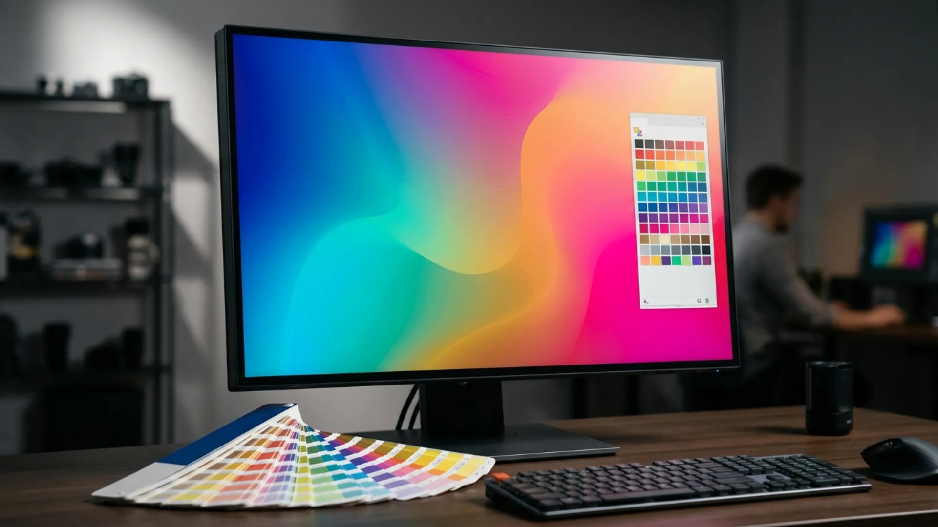
- Swatches panel: your project palette. Save brand colors as global swatches so editing one swatch updates every object using it.
- Color Picker: exact HEX, RGB or CMYK values. Type values in rather than sampling by eye when matching a brand.
- Gradient Tool (G): linear, radial and freeform gradients, with control over angle, position and per stop opacity.
- Recolor Artwork (Edit then Edit Colors then Recolor Artwork): remaps an entire illustration’s palette at once. This is the biggest single time saver when a client asks for “the same thing in our brand colors”.
Two things that trip people up. First, a gradient that looks rich in RGB can flatten noticeably once converted to CMYK, so soft proof before committing print artwork. Second, palettes built on relationships beat palettes built on favourites, which is why our explainer on analogous color schemes is a useful starting point if color theory has always been the vague part of your process.
When flat gradients are not enough, Gradient Mesh places a grid of color points across a shape and blends between them, which is how photorealistic vector shading is built: glass, fabric, fruit, skin. It is also the fastest way to make a file crawl, so our introduction to the Gradient Mesh Tool covers both technique and performance discipline.
Does Illustrator have AI tools now, and should I use them?
Where we actually find them useful:
- Exploration. Generating twenty rough directions in a minute beats staring at an empty artboard.
- Filler and background elements. Patterns, textures and secondary props that nobody will scrutinise.
- Bleed rescue. Expanding artwork to fill a bleed area on a file that was not set up for print.
- Recolor exploration, which is faster by prompt than by swatch swapping.
Where we do not use them: final client marks, anything that needs to be defensible as original work, and anything where path structure matters, because generated paths are frequently messier than hand built ones and need cleanup before animation.
The broader question of what this means for working illustrators is worth its own read, and we covered it honestly in are AI image generators going to replace illustrators.
Why does my Illustrator export look blurry or pixelated?
- Export at the exact pixel size you need. A PNG stays crisp when it is generated at the dimensions it will be displayed at, or at a clean multiple such as 2x. Exporting at an arbitrary size and then resizing in another app is what produces soft edges.
- Set anti-aliasing to Art Optimized in the export dialog, and use at least 300 PPI for print or 150 PPI and above for screen use.
- Check Document Raster Effects Settings (Effect then Document Raster Effects Settings). If it is on the 72 PPI default, every drop shadow, glow and feather in your file renders at screen resolution regardless of your export settings. This one setting explains a huge share of “blurry” exports.
- Turn on Pixel Preview (View then Pixel Preview). If the artwork already looks soft on screen, the problem is in the file, not the export.
- Look for placed raster images. A 1080 pixel photo placed into a poster sized document will be soft no matter what you export. Window then Links shows you the real resolution of everything placed.
- Check whether anything got rasterised earlier. An applied Rasterize effect or a flattened paste from Photoshop bakes pixels into a vector file permanently.
- Export SVG instead, where the destination allows it. For icons and logos on the web, SVG removes the question entirely because there are no pixels to soften.
If export settings are the part of your workflow that still feels like guesswork, our ultimate guide to exporting files from Adobe Illustrator goes format by format with the dialog settings that matter.
Which file format should I export, and when?
Preparing Your File for Print
Before exporting a print project, take these essential steps to avoid common issues at the printer.
Outline all text: Fonts may not transfer correctly to a print shop. Select all text and press Ctrl+Shift+O (Cmd+Shift+O on Mac) to convert it to vector outlines. This locks in your typography exactly as designed, regardless of which fonts the printer has installed.
Embed raster images: If your design includes photos or textures, make sure they are embedded rather than linked. Go to Window then Links, select any linked images, and choose Embed from the panel menu. This packages everything into a single file so nothing goes missing.
Export a print-ready PDF: Go to File then Save As, choose Adobe PDF, and select the High Quality Print preset. Under Marks and Bleeds, check “Use Document Bleed Settings” to carry your bleed area into the final file. This gives the printer a clean, self-contained PDF ready for production.
Setting Up Bleed and Safety Margins for Print
Color mode and resolution alone won’t guarantee a clean print. Two additional settings are critical for any project that will be physically cut and trimmed.
Bleed area: Bleed is the extra space around your design that extends beyond the trim line. It prevents unwanted white edges if the cut shifts slightly during production. When creating a new document, go to File then New and set the Bleed value to 0.125 inches (3 mm) on all sides. Any background colors, images, or design elements that reach the edge of your artwork should extend into this bleed zone.
Safety margins: Even with bleed set correctly, keep all essential content (text, logos, key graphics) at least 0.125 inches inside the trim line. This inner boundary acts as a buffer so nothing important gets clipped during trimming.
Raster effects resolution: If your design uses Illustrator effects like drop shadows or glows, go to Effect then Document Raster Effects Settings and set the resolution to High (300 PPI). This ensures those effects render at print quality rather than the default screen resolution.
These three steps, combined with CMYK color mode, form the foundation of a truly print-ready Illustrator file.
How do I get Illustrator artwork into After Effects?
Before you import:
- Name every layer meaningfully. Layer names carry into After Effects, and “Layer 12” is useless once you are animating.
- Separate anything that moves independently onto its own layer. An arm, a wheel, a letter, a highlight: if it animates alone, it lives alone.
- Set the artboard to your final output resolution, or use Object then Artboards then Fit to Artwork Bounds.
- Expand Illustrator specific appearances (Object then Expand Appearance), because After Effects will not read them.
- Convert strokes to outlines if stroke weight should scale with the artwork rather than stay fixed.
- Save as .ai, not SVG or PDF, for the cleanest layered import.
Then in After Effects: import as Composition with Retain Layer Sizes, and enable Continuously Rasterize on every vector layer so artwork stays sharp above 100% scale. For path level animation, right click the layer and choose Create then Create Shapes from Vector Layer, which converts paths into native shape layers you can animate with trim paths. That conversion is one directional, so keep the Illustrator file as your master.
The whole pipeline, from layer prep to trim path animation, is in our Illustrator to After Effects workflow guide. And when a deadline does not allow building every animated element from scratch, our ready made template library gives you editable vector and motion files you can retheme in minutes.
Why is Illustrator so slow, and what actually helps?
- Gradient meshes and blends. These are the heaviest objects in Illustrator. Build the mesh as coarsely as the artwork allows, and expand blends only when you have finished adjusting them.
- Live effects stacked on complex art. Drop shadows and glows on hundreds of objects recalculate constantly. Expand them when the look is final.
- Large embedded images. Embedding is correct for print handoff, but during design work linking keeps the file light.
- Excessive anchor points, usually from a trace. Object then Path then Simplify often halves the point count with no visible change.
- Too many artboards in one document. Split a 40 artboard monster into a few files.
On hardware, Adobe’s guidance on Illustrator RAM and GPU performance is that Illustrator takes advantage of available RAM, with 8 GB a reasonable baseline and more helping if you run several applications at once, and that GPU acceleration offloads compute intensive operations from the CPU on both macOS and Windows. If the app is slow across every document, check that GPU Performance is enabled in Preferences before buying anything.
Repetitive work is a different kind of slow, and that is where scripting pays off. Our roundup of the best Illustrator plugins and scripts covers the automation worth installing.
Can I use Illustrator for free, and what are the alternatives?
If a subscription is not an option:
- Inkscape is free and open source, genuinely capable for SVG and path work, and the best way to learn vector drawing at zero cost. It is weaker for CMYK print production.
- Affinity Designer is a one time purchase that handles vector and raster in one document and is a realistic professional substitute for most illustration and print work.
- Canva covers fast social graphics but will not produce original scalable brand assets.
One honest caveat: if you intend to work with agencies, print shops or studios, they will expect .ai and print ready PDFs. Alternatives can produce those, but compatibility friction is real, and it is worth knowing before you commit a workflow.
Where does Illustrator fit into real client work?
Illustration and character work. Vector illustration scales across every format a client will ask for, and character work in particular teaches construction discipline. Start with our beginner’s guide to character design in Illustrator.
Apparel and technical flats. The fashion industry runs on Illustrator for garment sketches and production files, covered in using Adobe Illustrator for fashion design, while the print side of apparel is in how to design t-shirts in Adobe Illustrator.
Data and information design. Charts, diagrams and icon systems are vector work by nature. See how to create stunning infographics in Adobe Illustrator.
Surface and pattern design. Illustrator’s pattern tools turn one motif into a repeating surface, as shown in how to create a seamless pattern in Illustrator.
Dimensional artwork. The 3D and Materials panel handles extrusion, revolve, inflate and material mapping without leaving the app, covered in our guide to the 3D and Materials tools.
Web assets. Illustrator is not a prototyping tool, but it is a strong asset factory, as our modern Illustrator web design workflow explains.
UI/UX Design with Illustrator
While dedicated apps like Figma lead the pack for collaborative interface design, Illustrator’s powerful vector tools make it a surprisingly strong choice for UI/UX work, especially in the early visual design stages.
Why it works:
- Vector precision: UI elements like icons, buttons, and input fields scale perfectly across screen sizes, staying crisp at any resolution.
- Creative flexibility: When a project demands a custom, heavily illustrated visual style, Illustrator gives you more artistic control than most UI-specific tools.
- One-app workflow: If you’re already fluent in Illustrator, you can handle wireframes, UI components, and high-fidelity mockups without switching software.
The practical workflow: Start by setting up artboards for each screen (use the Artboard Tool, Shift+O), then build low-fidelity wireframes with simple grey shapes and placeholder text to nail your layout and hierarchy. Once the structure is solid, replace wireframe elements with polished UI components, and convert frequently used elements like buttons and nav bars into Symbols so updates propagate automatically across every screen.
When to switch tools: Illustrator lacks built-in prototyping, real-time collaboration, and developer handoff. Use it for wireframing, creating visual assets, and building mockups, then export artboards as PNG or SVG and import into Figma or InVision when you need interactivity and team feedback.
For a complete step-by-step walkthrough covering wireframes, reusable UI kits, and high-fidelity mockups, see our full Practical Guide to UI/UX Design in Adobe Illustrator.
What mistakes cost beginners the most time?
- Starting in the wrong color mode. Building a print job in RGB shifts colors on conversion. Set CMYK at document creation.
- Leaving Document Raster Effects Settings at 72 PPI. Every shadow and glow in the file renders at screen quality. Set it to 300 PPI for print work.
- Too many anchor points. Over clicking with the Pen Tool creates curves that are miserable to edit. Points at extremes only.
- Outlining type with no backup. Duplicate live text to a hidden layer first.
- Leaving raster images linked at handoff. The print shop opens your file and the photo is missing. Window then Links, then Embed.
- Ignoring layers. A 200 object file on one layer is unworkable and it breaks the After Effects handoff entirely.
- Scaling with strokes locked. Resize a shape and the stroke weight stays put. Enable Scale Strokes and Effects.
- Treating Illustrator as a photo editor. Heavy raster effects on placed images bloat files and render slowly. Do pixel work in Photoshop and place the result.
- Never learning shortcuts. The quiet one that costs the most hours over a year.
Where should I go next?
How we tested and wrote this guide
- Who wrote it: the Pixflow design team. We build and sell vector and motion template packs, which means we produce Illustrator files for print, web and After Effects handoff every week, and we receive client files that arrive broken in the same handful of ways. The troubleshooting steps here are the ones we run on real jobs.
- How the structure was chosen: we researched what people actually ask about Illustrator, using Google suggestions and People Also Ask, Adobe’s own Common Questions page, learning threads on r/AdobeIllustrator, and Adobe Community threads on blurry and pixelated exports. Each heading is one of those questions. The answers are written from our own workflow rather than paraphrased from the search snippets, because a page of restated snippets helps nobody.
- What we verified against primary sources: Illustrator’s purpose and resolution independence, the generative AI feature list, RAM and GPU guidance, trial and subscription behaviour, multi artboard export limits, and the Curvature tool workflow all come from Adobe’s own documentation, linked inline where they appear.
- What we deliberately did not claim: exact prices, because they vary by region, term and promotion; benchmark numbers we have not measured ourselves; and features we do not use in production.
- What could still be wrong: Adobe ships changes continuously, and menu paths occasionally move between versions. If a path here does not match your build, the feature has almost certainly moved rather than disappeared. Tell us and we will correct it.
Last reviewed: September 2026.
Conclusion
Pick one project this week rather than one more tutorial. Rebuild a logo you admire, design a business card you would actually print, or take one vector illustration all the way into After Effects and animate it. Finished work teaches faster than anything else. (Your portfolio will also thank you.)
And when a deadline is tighter than your learning curve, our Illustrator templates are fully editable vector files you can open, take apart and make your own.
Disclaimer : If you buy something through our links, we may earn an affiliate commission or have a sponsored relationship with the brand, at no cost to you. We recommend only products we genuinely like. Thank you so much.



Write for us
Publish a Guest Post on Pixflow
Pixflow welcomes guest posts from brands, agencies, and fellow creators who want to contribute genuinely useful content.
Fill the Form ✏