The Evolution of Color in Star Wars Movies: A Visual Journey Through Iconic Palettes and Symbolism

Since the franchise’s inception, filmmakers have used carefully curated color palettes to enhance storytelling. George Lucas and later directors like Rian Johnson and J.J. Abrams leveraged color theory and advanced cinematographic techniques to craft visually distinct trilogies that reflect their respective narratives. But how exactly did they do it? How has the use of color evolved across the decades of Star Wars films?
In this article, we’ll take a deep dive into the colors of Star Wars—how they shape mood, influence symbolism, and contribute to one of the most visually striking sagas in cinematic history.
Want to refine your own cinematic color grading? Check out this collection of professional color LUTs designed for filmmakers and editors.
The Role of Color in Star Wars Storytelling
What Are the Colors of Star Wars?
The Star Wars saga is filled with instantly recognizable colors, each carefully chosen to reflect its characters and themes. The most iconic include:
- Blue – Symbolizing hope, peace, and the Jedi Order. Most Jedi wield blue lightsabers, and the sky of Tatooine often bathes the characters in calming hues.
- Red – Representing power, aggression, and the Sith. From the crimson lightsabers of Darth Vader and Kylo Ren to the eerie red glow of Emperor Palpatine’s throne room, red signifies danger.
- Green – Linked to wisdom and nature. Yoda’s home on Dagobah is lush and green, while Luke Skywalker’s green lightsaber in Return of the Jedi marks his evolution into a true Jedi.
- Yellow & Gold – Associated with balance, as seen in Rey’s yellow lightsaber in The Rise of Skywalker.
- Black & Gray – Representing control, authority, and the Empire. The Death Star and Darth Vader’s armor feature stark monochromatic palettes to emphasize oppression.
Why Are Colors Important in Star Wars?
Color isn’t just a visual tool in Star Wars—it helps shape mood, emotion, and character development.
- Red vs. Blue – The classic clash of Sith vs. Jedi is visually reinforced through lightsaber colors.
- Dark vs. Light – Scenes are often color-coded; for example, Luke’s duel with Vader in The Empire Strikes Back is shrouded in deep blues, while the fiery duel on Mustafar in Revenge of the Sith is dominated by orange and red.
- The Use of Warm and Cool Tones – The original trilogy leans toward warm, natural tones to convey a lived-in universe, while the sequels use striking contrasts (such as deep reds in The Last Jedi’s throne room) to enhance dramatic tension.
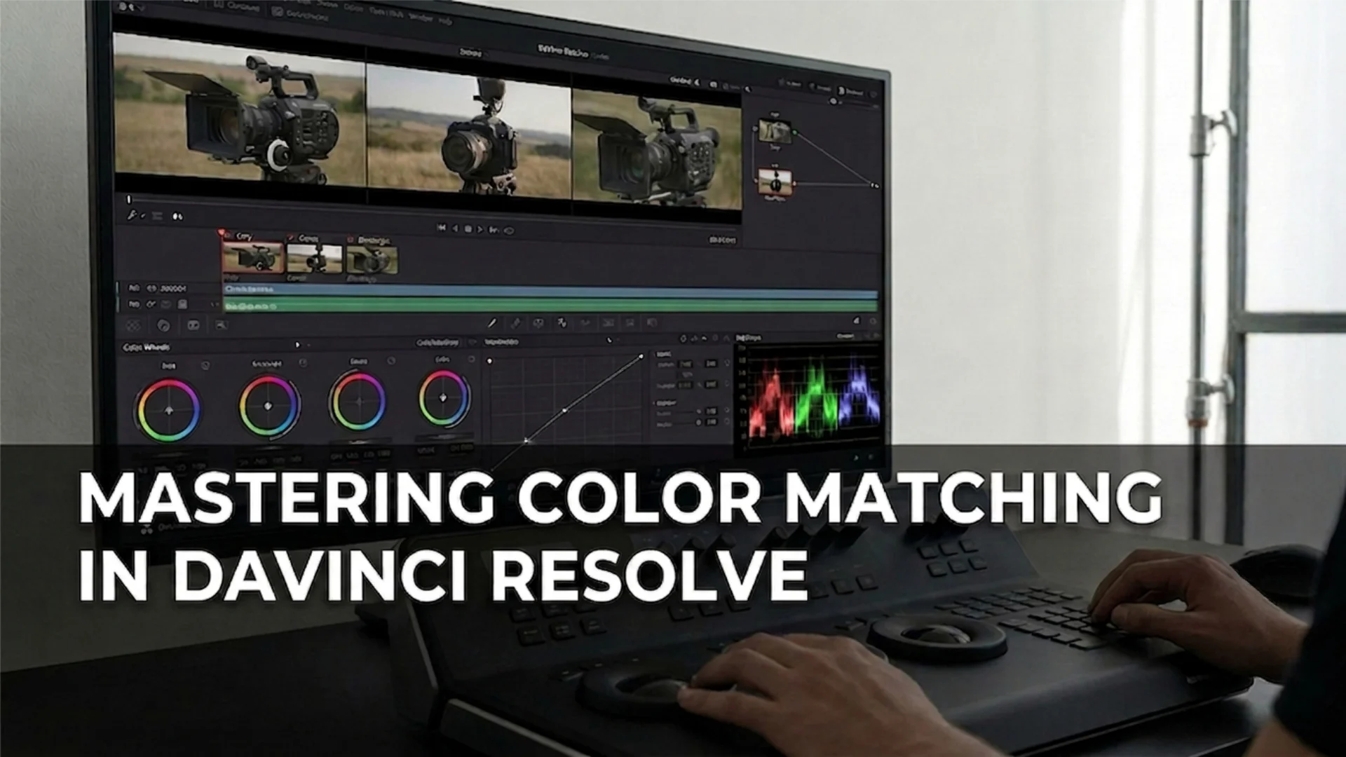
The use of color grading and lighting in Star Wars directly impacts how we perceive each scene. The rise of digital color grading has given filmmakers even more control over how colors influence the storytelling process. You can read more about how color grading works in modern films in this Rec. 709 color space guide.
The Evolution of Color Across Star Wars Trilogies
Original Trilogy (1977–1983)
The original trilogy, shot on film, features a relatively muted and natural color palette. The desert landscapes of A New Hope, the icy blues of The Empire Strikes Back, and the earthy greens of Return of the Jedi reflect the practical, real-world settings used for filming. The limited color grading at the time resulted in a raw and authentic look.
Prequel Trilogy (1999–2005)
With the transition to digital cinematography, the prequel trilogy introduced a much more vibrant color scheme. Coruscant’s neon-lit skyline, the lush greens of Naboo, and the deep reds of Mustafar showcased a wider range of hues. This reflected the political complexity of the era, as well as the growing tensions that led to the fall of the Republic. Additionally, the shift from shooting on film to digital meant the prequel trilogy used different approaches to encoding and displaying color. Many of these films relied on log color profiles, which allowed for greater flexibility in color grading, especially when integrating CGI-heavy environments. This shift also contributed to the visual difference between the prequels and the original trilogy. For more on how different color profiles impact filmmaking, check out this breakdown of RAW, Log, and Rec. 709 footage.
Sequel Trilogy (2015–2019)
The sequel trilogy took a more stylized approach to color, often using strong contrasts to evoke emotion. The Last Jedi is particularly notable for its bold reds, seen in Snoke’s throne room and the salt plains of Crait. These choices reflect themes of sacrifice, power, and destruction.
One of the most striking examples of color in the sequels is the juxtaposition of Rey and Kylo Ren’s fights, where blue and red light blend together, visually reinforcing their ideological conflict.
Iconic Color Palettes in Star Wars
The Rebel Alliance vs. The Empire
The Rebel Alliance is often associated with warm, earthy tones—tan uniforms, orange flight suits, and green forest bases—representing their organic and diverse nature. The Empire, in contrast, is starkly monochromatic, with cold grays, blacks, and whites, symbolizing its authoritarian rule.
Lightsaber Colors and Their Meanings
Lightsaber colors are a direct reflection of a character’s role in the galaxy:
- Blue – Traditional Jedi, representing justice and bravery.
- Green – Jedi who focus on wisdom and force mastery.
- Red – Sith and dark side users, created through synthetic or “bled” kyber crystals.
- Purple – Rare, symbolizing a balance between light and dark (e.g., Mace Windu).
- Yellow – Guardians of knowledge, seen in Jedi Temple guards and Rey’s final lightsaber.
Planetary Color Schemes
Each Star Wars planet has a distinctive color scheme:
- Tatooine – Sun-scorched yellows and oranges.
- Hoth – Stark whites and icy blues.
- Endor – Deep greens, emphasizing nature.
- Mustafar – Fiery reds, symbolizing chaos and destruction.
- The Death Star – Industrial grays, evoking a cold and lifeless structure.
The Cultural Impact of Star Wars’ Color Choices
How Did Star Wars Influence Pop Culture?
The Star Wars color palette has influenced everything from fashion to interior design. The contrast of light and dark has become a common theme in graphic design, while the red vs. blue dynamic is frequently used in video games and branding.
Fan Interpretations and Tributes
From cosplayers replicating Star Wars characters with precise color-matching to digital artists creating concept art inspired by the films, the franchise’s color choices have inspired an entire creative movement.
Crafting the Star Wars Color Palette
George Lucas’ Vision
George Lucas understood the importance of color as a storytelling device. By establishing strong visual contrasts (light vs. dark, red vs. blue), he ensured that Star Wars would remain visually compelling even in silent viewing.
Modern Filmmakers’ Approach
Directors like Rian Johnson (The Last Jedi) and J.J. Abrams (The Rise of Skywalker) have expanded on Lucas’ color philosophy by incorporating modern digital tools and techniques. Advances in color grading allow for more refined tones, ensuring that the Star Wars universe remains visually distinct in each new installment.
Conclusion
Next time you watch Star Wars, pay attention to the colors—you might discover a whole new layer of storytelling.
Disclaimer : If you buy something through our links, we may earn an affiliate commission or have a sponsored relationship with the brand, at no cost to you. We recommend only products we genuinely like. Thank you so much.
Blog Label:
- cinematic colors
- color film history
- Color grading
- color grading cinematography
- color in film
- color movies history
- colors of star wars
- colors of the rebel alliance
- film coloring
- filmmaking
- grading movies
- history of color movies
- history of colour in film
- star wars color palette
- star wars color scheme
- star wars colored
- star wars colors
- star wars theme colors
- the last jedi color palette
- what's color grading

Write for us
Publish a Guest Post on Pixflow
Pixflow welcomes guest posts from brands, agencies, and fellow creators who want to contribute genuinely useful content.
Fill the Form ✏

