How to Analyze a Movie Color Palette Step by Step
- Why Analyzing a Film Color Palette Matters
- The Building Blocks - Hue Saturation and Brightness
- Step 1 - Identify the Dominant Colors
- Step 2 - Determine the Color Scheme Type
- Step 3 - Decode the Color Symbolism
- Step 4 - Examine How Color Supports the Narrative
- Step 5 - Analyze the Full Film Color Arc
- Going Deeper - Computational Color Analysis
- Conclusion
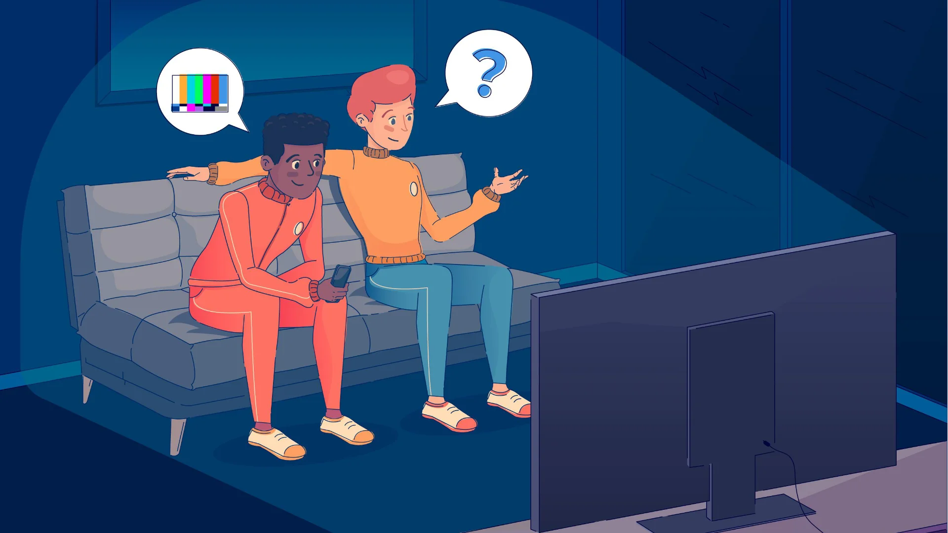
If you’re already familiar with the basics of film color theory and palettes, this guide is your next step: a hands-on, practical walkthrough for breaking down the color palette of any movie or scene. Whether you’re a filmmaker, a film student, or just a curious viewer who wants to understand why Wes Anderson’s frames look like candy, we’re covering everything from visual intuition to computational analysis. And if you ever want to apply the palettes you discover to your own projects, Pixflow’s Color LUTs library makes it surprisingly easy to get that cinematic look.
Why Analyzing a Film’s Color Palette Matters
Think of it this way: building a color palette (choosing what colors to use in your own film) is one skill. Analyzing an existing palette (understanding why those colors were chosen) is a completely different one. Both are valuable, but analysis sharpens your creative eye in a way that nothing else can. It’s the difference between knowing the notes of a song and understanding why the composer arranged them that way.
Whether you’re writing a film essay, planning your next short, or just trying to impress someone at a movie night (hey, no judgment), color analysis gives you a toolkit for reading cinema on a deeper level.
The Building Blocks: Hue, Saturation, and Brightness
Hue is the color itself: red, blue, green, yellow. It’s the most obvious attribute and usually the first thing you notice when looking at a scene.
Saturation refers to the intensity or purity of that color. A highly saturated red is vivid and punchy. A desaturated red looks muted, washed out, almost gray. Filmmakers adjust saturation constantly to control mood: vibrant palettes feel energetic, while desaturated ones create a sense of bleakness or realism.
Brightness (also called value or luminance) is how light or dark a color appears. A bright blue feels optimistic. A dark blue feels heavy or mysterious. Together, these three properties give you a precise vocabulary for describing what you see on screen, and that vocabulary is essential for any serious color analysis.
As StudioBinder explains, “A well-designed movie color palette evokes mood and sets the tone for the film. When choosing a particular color, remember that there are three main components: hue, saturation, and brightness.” Getting comfortable with these three components is the first real step toward reading color like a filmmaker.

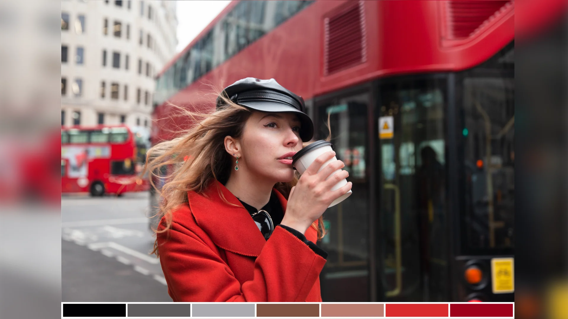
Step 1: Identify the Dominant Colors
Here’s a practical trick that sounds silly but genuinely works: squint at the screen. When you squint, details blur and your brain naturally groups the image into its primary color blocks. You’ll quickly spot whether a scene leans warm (reds, oranges, yellows) or cool (blues, greens, purples).
For individual scenes, take a screenshot and drop it into a tool like Adobe Color or Coolors. These tools extract dominant colors automatically and display them as a swatch palette. It takes about ten seconds and gives you a clean visual reference.
For full films, the process is a bit different. You’ll want to sample frames across the entire runtime to see how the palette evolves over time. We’ll get into the technical side of that in the computational analysis section below, but even manually grabbing screenshots at the beginning, middle, and end of a film can reveal a lot.
Matrix Education offers a helpful framework for this stage: “What colors are in the scene? Hue? Saturation? Brightness? Are the colors harmonious or discordant? What does the color palette represent?” These questions give you a solid analytical checklist every time you sit down with a new scene.
A good starting question: are these colors warm, cool, or a mix? Is the palette mostly one color family, or is there a clear contrast between two opposing tones? These observations set the foundation for everything that follows.
Step 2: Determine the Color Scheme Type
Here are the main color scheme types you’ll encounter in films:
Monochromatic
A single base hue extended through tints, shades, and tones. Think of the muted greens of The Matrix or the sepia warmth of a period drama. Monochromatic color schemes create powerful unity and are often used to lock audiences into a specific emotional state.
Complementary
Two colors opposite each other on the color wheel. The most famous example in modern cinema is the teal-and-orange combo you see in countless blockbusters. This pairing creates strong visual contrast and makes subjects (especially skin tones) pop against the background.
Analogous
Colors that sit next to each other on the wheel. These palettes feel naturally harmonious and are often used to evoke calm or cohesion. Wes Anderson loves analogous palettes with pastels to build his signature storybook worlds.
Triadic
Three colors evenly spaced around the wheel. Less common in live-action film, but when done right (like in certain animated features or superhero films), the result is vibrant and dynamic.
Discordant
Colors that clash intentionally. This is a deliberate disruption, a visual signal that something is wrong, unexpected, or about to change. A splash of red in a cold blue scene? That’s discordant, and it’s almost certainly telling you something important.
Identifying the scheme type gives you a framework for understanding the filmmaker’s visual approach. It also helps you articulate your analysis clearly, which is essential if you’re writing film essays, creating mood boards, or studying cinematography.

Step 3: Decode the Color Symbolism
Red signals danger, passion, or power. Blue suggests isolation, calm, or sadness. Green often hints at envy, sickness, or the supernatural. But here’s the important part: symbolism isn’t universal. Context matters enormously.
Red in Schindler’s List (the girl’s coat) symbolizes innocence and hope amid devastation. Red in Kubrick’s The Shining represents violence and madness. Same color, completely different meaning.
When analyzing symbolism, consider these angles:
- Character associations: Does a character consistently appear with a certain color? In Her, Theodore is almost always surrounded by warm reds and pinks, mirroring his emotional vulnerability and romantic longing.
- Cultural context: Western and Eastern cinema may use colors very differently. White symbolizes purity in many Western films, while in several East Asian traditions, it’s the color of mourning.
- Emotional cues: What do the colors make you feel? Trust that gut reaction first, then dig into why the filmmaker might have chosen that response.
Developing an eye for color symbolism is one of those skills that, once you have it, you genuinely can’t unsee. Every rewatch becomes richer.
Step 4: Examine How Color Supports the Narrative
Associative Color
A specific color is tied to a character, theme, or idea throughout the entire film. In Amelie, warm yellows and greens follow the protagonist everywhere, creating a visual signature that’s instantly recognizable. When the palette shifts away from those tones, you know something significant has changed in her world.
Transitional Color
The palette evolves alongside the story. A film might start with muted, desaturated tones and gradually introduce warmth as the character’s situation improves (or the reverse as things fall apart). Breaking Bad is a masterclass in transitional color: Walter White’s wardrobe literally darkens as he descends into villainy.
Discordant Color
A sudden color disruption signals a turning point. Imagine a mostly blue and gray scene where a single object is bright red. Your eye goes right to it, and the filmmaker knows it. This technique forces attention and creates narrative emphasis without a single word of explanation.
When you analyze how color supports the narrative, you’re connecting the visual layer to the story layer. Ask yourself: does the color palette reinforce what’s happening in the plot? Does it contrast with the action (maybe to create irony or tension)? This is where analysis moves from observation to genuine insight.
If you’re inspired to experiment with similar color approaches in your own footage, exploring cinematic LUTs can help you achieve specific palette moods quickly in your color grading workflow.
Step 5: Analyze the Full Film’s Color Arc
Start by sampling key moments: the opening shot, the inciting incident, the midpoint, the climax, and the resolution. Compare the dominant palettes at each point. Does the film get warmer over time? Cooler? More saturated? Does a new color appear in the third act that wasn’t there before?
Movie Barcodes
One of the most effective (and visually stunning) ways to see a full film’s color journey is through movie barcodes. The concept is beautifully simple: take one representative color from each frame (or every Nth frame) and compress it into a thin vertical strip. Line up all the strips chronologically, and you get a “barcode” that represents the entire film’s color progression at a glance.
Movie barcodes are incredibly revealing. You can immediately see if a film has a consistent palette, where major shifts happen, and how the opening compares to the ending. Mad Max: Fury Road’s barcode is a wild ride of oranges and blues. The Grand Budapest Hotel shows clear palette shifts between its nested timelines. These visualizations make patterns visible that you might never catch through normal viewing.
Going Deeper: Computational Color Analysis
Python and KALMUS
KALMUS is an open-source Python package built specifically for computational color analysis of films. It lets you extract color data from video files, generate movie barcodes, and compare palettes across different films with quantitative precision. It’s the go-to tool for academic and professional-level film color research.
Color Spaces: RGB, CIELAB, and LCH
While RGB is the default color space in digital media, it isn’t always ideal for perceptual analysis. As the Computational Film Analysis project details, CIELAB (also called Lab color) is designed to approximate human vision, making it more reliable for measuring how “different” two colors actually look to a viewer. LCH (Lightness, Chroma, Hue) is a cylindrical representation of CIELAB that’s even more intuitive for color comparisons. When you’re doing serious computational work, converting from RGB to CIELAB or LCH gives you more meaningful distance metrics.
Frame Sampling
Analyzing every single frame of a two-hour feature film is computationally expensive and often unnecessary. Common approaches include sampling every Nth frame (e.g., every 24th frame gives you one sample per second) or extracting frames at fixed time intervals. The sampling rate depends on your goals: narrative analysis needs fewer samples, while precise color measurement benefits from denser sampling.
Dominant Color Extraction with K-Means Clustering
Once you have your sampled frames, K-means clustering is the standard technique for identifying dominant colors. Here’s a simplified Python example:
from sklearn.cluster import KMeans
from PIL import Image
import numpy as np

# Load a frame
img = Image.open("frame.jpg")
pixels = np.array(img).reshape(-1, 3)

# Find 5 dominant colors
kmeans = KMeans(n_clusters=5, random_state=42)
kmeans.fit(pixels)
dominant_colors = kmeans.cluster_centers_.astype(int)

print("Dominant colors (RGB):", dominant_colors)
This basic approach gives you the top N colors in any frame. Scale it across hundreds of sampled frames and you’ve got a quantitative color profile of the entire film. From there, you can visualize trends over time, compare films numerically, and even run statistical analyses on color distributions.
Building Movie Barcodes Programmatically
With your sampled frames and dominant color data, generating a movie barcode is straightforward. For each frame, take the single most dominant color (the largest K-means cluster) and render it as a vertical strip. Concatenate all strips left to right in chronological order, and you’ve built a barcode that compresses the entire film’s color story into one image.
For those who prefer visual tools over code, DaVinci Resolve’s color scopes and Adobe Color’s extraction features offer solid alternatives without the programming overhead. And for quickly applying the palettes you discover to your own projects, Pixflow’s Color LUTs collection offers professionally crafted looks that capture iconic cinematic styles.
Conclusion
The process comes down to five core steps: identify the dominant colors, determine the scheme type, decode the symbolism, connect color to narrative, and zoom out to see the full film’s color arc. If you’re technically inclined, computational tools like KALMUS and Python clustering give you data-driven precision that takes the analysis even further.
The more films you analyze, the sharper your eye becomes. And whether you’re writing essays, building mood boards, planning your next project, or refining your color grading with professional LUTs, this analytical foundation will serve you well.
Now go rewatch your favorite film. You’ll be amazed at what you’ve been missing.
Disclaimer : If you buy something through our links, we may earn an affiliate commission or have a sponsored relationship with the brand, at no cost to you. We recommend only products we genuinely like. Thank you so much.
Blog Label:

Write for us
Publish a Guest Post on Pixflow
Pixflow welcomes guest posts from brands, agencies, and fellow creators who want to contribute genuinely useful content.
Fill the Form ✏