From Film Noir to Modern Cinema: How Monochromatic Color Schemes Create Atmosphere in Films

From the dramatic black-and-white contrasts of film noir to the eerie blue-green tones of modern psychological thrillers, monochrome aesthetics have been used to create distinct moods and atmospheres. But what makes these color choices so effective? How do they influence storytelling, and why do some of the most visually memorable films embrace limited color palettes?
In this article, we’ll explore how monochromatic color schemes in films shape atmosphere, evoke emotions, and define entire genres. We’ll also examine classic and modern examples, discussing how filmmakers use lighting, color grading, and cinematography to craft unforgettable cinematic experiences. But if you want to explore easy-to-implement coloring tools, there is no other place more diverse and professional than Pixflow Color LUTs store.
The Power of Monochromatic Color Schemes in Films
Filmmakers use monochromatic colors to establish mood, enhance themes, and guide the viewer’s emotional response. Whether it’s the stark black-and-white contrasts of film noir, the chilling blue tints in psychological thrillers, or the warm sepia tones in nostalgic dramas, monochrome color schemes are powerful tools of visual storytelling.
Some of the most iconic films in history have leveraged monochromatic color palettes to great effect. Movies like Schindler’s List (1993), Sin City (2005), and The Lighthouse (2019) use carefully curated color restrictions to create striking atmospheres. These films demonstrate how limiting a color palette can actually enhance visual storytelling rather than restrict it.
Film Atmosphere Through Color – How Monochrome Creates Mood
For example, cool monochromatic tones, such as blues and grays, often evoke feelings of loneliness, isolation, or unease. This is commonly seen in sci-fi films, psychological thrillers, and dystopian dramas, where a detached, cold aesthetic enhances the storytelling. On the other hand, warm monochromatic schemes, like sepia or deep reds, create a sense of nostalgia or intensity, often used in romantic dramas or historical films.
Film noir, one of the earliest cinematic movements to heavily utilize monochromatic lighting, exemplifies this principle. Movies like Double Indemnity (1944) and The Maltese Falcon (1941) rely on stark contrasts between light and shadow to heighten suspense and create an air of mystery. The use of high-contrast monochromatic lighting in film noir defined the genre’s signature aesthetic, making it one of the most visually recognizable styles in cinematic history.
Cinematic Color Palettes and Monochromatic Lighting in Cinematography
Warm vs Cool Color Schemes in Film
- Warm monochromatic palettes (reds, oranges, sepia) create a sense of warmth, passion, or nostalgia.
- Cool monochromatic palettes (blues, purples, greens) enhance feelings of coldness, melancholy, or suspense.
For example, the film Drive (2011) employs neon-pink and blue tones to create a sense of isolation and modern noir aesthetics. Similarly, The Matrix (1999) uses a green-tinted monochrome scheme to symbolize the artificiality of its simulated world.
Monochrome lighting techniques are also widely used in horror films. Shadows and limited color choices intensify fear and unease, as seen in The Witch (2015) and The Lighthouse (2019). These films demonstrate how monochromatic palettes enhance storytelling by reinforcing tone and emotion.
Practical Lighting Techniques for Monochromatic Scenes
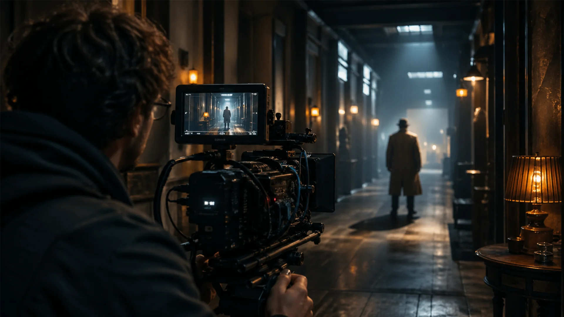
How to Light a Monochromatic Scene on Set
Understanding warm and cool palettes is the starting point, but achieving a convincing monochromatic look begins with deliberate lighting choices during production, not just in post.
Shape Your Key Light Through Diffusion
A large, soft key source pushed through diffusion fabric creates the even, painterly quality that defines many monochromatic films. The softness reduces harsh highlights and lets a single color temperature dominate the frame. Position the diffused source to one side of the subject so that light falls off gradually, preserving the tonal unity of your chosen palette.
Use Negative Fill to Deepen Shadows
Place black fabric or a black flag on the opposite side of your key light to absorb bounce and carve deeper shadows. In monochromatic setups, shadow depth is what creates contrast within a single-hue image. Without negative fill, ambient bounce can flatten the frame and weaken the mood you are building.
Add a Controlled Rim or Edge Light
A narrow rim light placed behind and slightly above the subject creates separation from the background without introducing a competing color. Keep the rim light gelled to match or complement your dominant palette. This technique is especially effective in cool monochromatic schemes, where a subtle edge of the same blue family lifts the subject out of dark backgrounds.
Introduce Atmosphere for Visible Light
Volumetric light, where beams and shafts become visible in the frame, is one of the most recognizable qualities of cinematic monochromatic scenes. Add light haze to the set so that backlight or sidelight creates soft, visible beams. Keep the haze level consistent between takes, because shifting density makes cuts feel disjointed. The goal is subtlety: just enough atmosphere for the light to have shape, without turning the scene into a fog machine demo.
Color Theory in Film – The Art of Monochrome Storytelling
How to Use Monochromatic Color Schemes in Indie Films and Short Films
For independent filmmakers working with limited budgets, monochromatic palettes offer a cost-effective yet powerful way to create a unique visual identity. Using a carefully chosen color scheme can enhance storytelling without requiring expensive set designs or elaborate CGI.
For example, a filmmaker might use a deep blue color palette to evoke sadness or a sense of mystery, while a monochromatic red palette could symbolize intensity, love, or danger. The key is understanding the psychology behind colors and how they influence the audience’s perception of a scene.
The Symbolism of Color in Movies and How It Enhances Themes
Many filmmakers use monochromatic palettes to reinforce their film’s central themes. A few notable examples include:
- Green – Often used to symbolize technology, artificiality, or unease (The Matrix, Oldboy).
- Blue – Represents sadness, detachment, or tranquility (Moonlight, The Revenant).
- Red – Conveys passion, anger, or danger (The Sixth Sense, Schindler’s List).
- Sepia – Evokes nostalgia, memory, or historical themes (The Grand Budapest Hotel, O Brother, Where Art Thou?).
By strategically selecting a dominant color, filmmakers can guide the audience’s emotions and enhance the subtext of their narrative without relying heavily on dialogue or exposition.
Best Monochromatic Films and Their Color Grading Techniques
Some of the best monochromatic films are defined by their meticulous color grading techniques, which enhance the mood and tone of the film. For instance:
- Mad Max: Fury Road (2015) – Although highly saturated, its dominant orange hues create a sense of heat and intensity.
- Sin City (2005) – A black-and-white film with selective splashes of red, yellow, and blue to highlight key elements.
- Schindler’s List (1993) – Primarily black and white, with the iconic red coat symbolizing innocence amidst destruction.
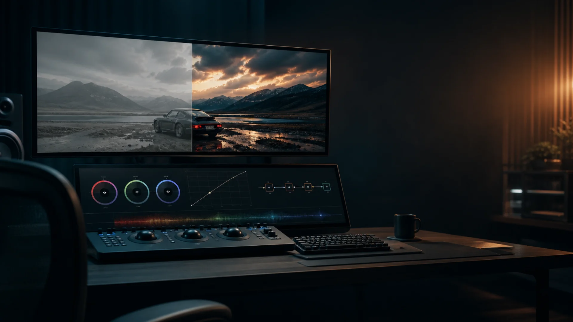
Filmmakers achieve these effects using advanced color grading techniques, which allow them to enhance or desaturate specific hues in post-production. Tools like our Color LUTs help filmmakers experiment with different palettes before finalizing their visual tone.
Color Grading Techniques in Movies – Crafting a Monochrome Aesthetic
How Directors and Cinematographers Achieve Stunning Monochromatic Visuals
Cinematographers use several techniques to create a compelling monochromatic aesthetic:
- Desaturation – Reducing colors to near grayscale while retaining slight hints of a dominant hue (The Road, The Mist).
- Single-color tinting – Applying a color overlay to an entire film for a surreal effect (The Matrix’s green tint).
- Contrast manipulation – Enhancing highlights and shadows to achieve a dramatic look (The Lighthouse, Nosferatu).
Examples of Monochromatic Color Palettes in Horror Movies
Horror movies often use dark, high-contrast monochromatic color schemes to amplify fear and unease. Some examples include:
- The Witch (2015) – Uses desaturated brown and gray tones to create a raw, historical feel.
- The Lighthouse (2019) – Shot in black and white, using high contrast to enhance claustrophobia and psychological tension.
- The Ring (2002) – Employs a blue-green tint throughout, reinforcing the eerie and supernatural elements of the film.
Monochrome horror aesthetics rely heavily on shadow play, fog, and lighting techniques, making them an essential element of suspense-driven storytelling.
For those interested in understanding the technical aspects of color grading, Rec. 709 Color Space is an industry-standard color profile used for balancing tones and enhancing film visuals.
Visual Storytelling Through Color – Monochrome in Modern Cinema
How Directors Use Color to Create Emotion and Atmosphere
Today’s directors use monochromatic schemes for various reasons:
- To create a dreamlike or surreal experience (The Neon Demon, Only God Forgives).
- To enhance emotional depth (Joker, Moonlight).
- To build tension and unease (Prisoners, No Country for Old Men).
By carefully choosing a dominant color, modern filmmakers guide audiences through the emotional journey of a film without needing excessive dialogue or exposition.
The Evolution of Monochromatic Color Schemes from Film Noir to Digital Cinema
What started as a necessity in black-and-white cinema has evolved into a deliberate artistic choice in modern filmmaking. Directors now use monochromatic grading to create visually unique and memorable films.
For example:
- Blade Runner 2049 (2017) uses deep oranges and yellows to depict a dystopian wasteland.
- The Grand Budapest Hotel (2014) employs pink and pastel color grading to enhance its whimsical narrative.
- Roma (2018) embraces black-and-white cinematography to evoke a sense of nostalgia and realism.
Blade Runner 2049 as a Case Study in Controlled Monochromatic Palettes
What makes Blade Runner 2049 (2017) stand out in the evolution of monochromatic filmmaking is that it does not rely on a single color grade applied across the entire film. Instead, cinematographer Roger Deakins and director Denis Villeneuve built a distinct monochromatic palette for each location, shifting color families to match the emotional temperature of every sequence.
Sterile interior environments sit inside cool, desaturated cyan tones that reinforce detachment and corporate control. Industrial and nostalgic spaces shift into warm, sodium-like ambers that carry a sense of fading memory. The desert sequences push into aggressive, deep orange with crushed blacks, creating a sense of overwhelming heat and desolation. Each environment operates within its own tightly controlled color family rather than borrowing from a shared palette.
This approach represents a significant evolution from earlier monochromatic techniques. Where classic film noir used a single high-contrast black-and-white look across an entire film, and later digital films often applied one dominant tint throughout, Blade Runner 2049 treats monochromatic grading as a modular system. The film moves between multiple restricted palettes, each one monochromatic on its own, but collectively creating a visual language where color shifts signal changes in place, mood, and narrative tension. It is one of the clearest modern examples of how monochromatic color grading has grown from a single-palette technique into a sophisticated, scene-by-scene storytelling tool.
Filmmakers continue to explore the impact of monochromatic color grading, using tools like different color spaces to further expand how much they can manipulate color. For a deep dive, check out our blog on RAW vs LOG vs Rec. 709 color spaces to refine your creative vision.
Conclusion
By understanding color theory in film and applying monochromatic lighting and grading techniques, directors and cinematographers manipulate audience emotions in subtle yet impactful ways. Whether you’re an indie filmmaker experimenting with color palettes or a film enthusiast analyzing how directors use color to create emotion, the world of monochromatic cinema offers endless inspiration.
For filmmakers looking to refine their color grading techniques, exploring industry tools like Colorify and Rec. 709 Color Space can provide valuable insights into crafting visually compelling monochrome aesthetics.
Disclaimer : If you buy something through our links, we may earn an affiliate commission or have a sponsored relationship with the brand, at no cost to you. We recommend only products we genuinely like. Thank you so much.
Blog Label:
- Best monochromatic films
- Cinematic color palettes
- cinematic colors
- Color grading
- color grading examples
- color in film
- color scheme movies
- Color theory in film
- Film atmosphere through color
- filmmaking
- How color creates mood in movies
- Monochromatic color
- Monochromatic color schemes in films
- Monochromatic lighting in cinematography
- Monochrome aesthetic in cinema
- movie color
- Psychology of color in film

Write for us
Publish a Guest Post on Pixflow
Pixflow welcomes guest posts from brands, agencies, and fellow creators who want to contribute genuinely useful content.
Fill the Form ✏

