DaVinci Resolve Color Grading for Beginners: Nodes, Wheels, and Curves Explained
- Color Correction vs Color Grading
- Setting Up the Color Page in DaVinci Resolve
- Read Scopes Before You Touch Anything
- Nodes - The Building Blocks of Grading
- Primary Color Wheels - Lift Gamma Gain and Offset
- Custom Curves and HSL Curves
- Step-by-Step Mini Project - Grading a Shot from Flat to Cinematic
- Secondary Grading Basics (Qualifier, Power Windows, Tracking)
- Using LUTs in DaVinci Resolve the Right Way
- Matching Shots Across a Scene
- Free vs Studio: What's Paid?
- Common Beginner Mistakes to Avoid
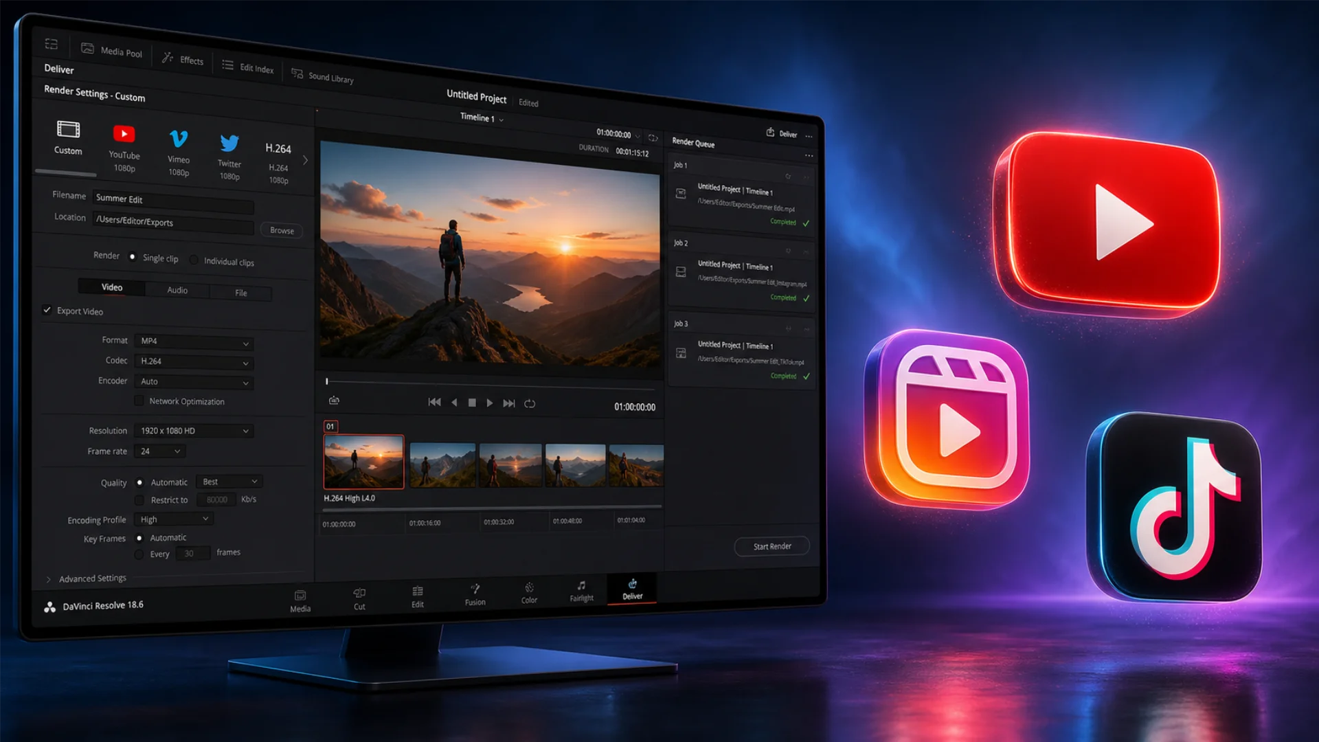
- Exporting Your Graded Timeline
- Conclusion
This guide is written for beginners using the latest version of DaVinci Resolve. It covers both color correction (making footage look right) and color grading (making footage look intentional), walks through a full mini project from flat log to cinematic finish, explains when a feature is Studio-only, and ends with the common mistakes that keep beginners stuck. By the end, you will be fully capable of grading inside Resolve with a clean, repeatable workflow.
Let’s start at the beginning, because color correction and color grading are not the same thing, and the order you tackle them in matters more than any individual slider.
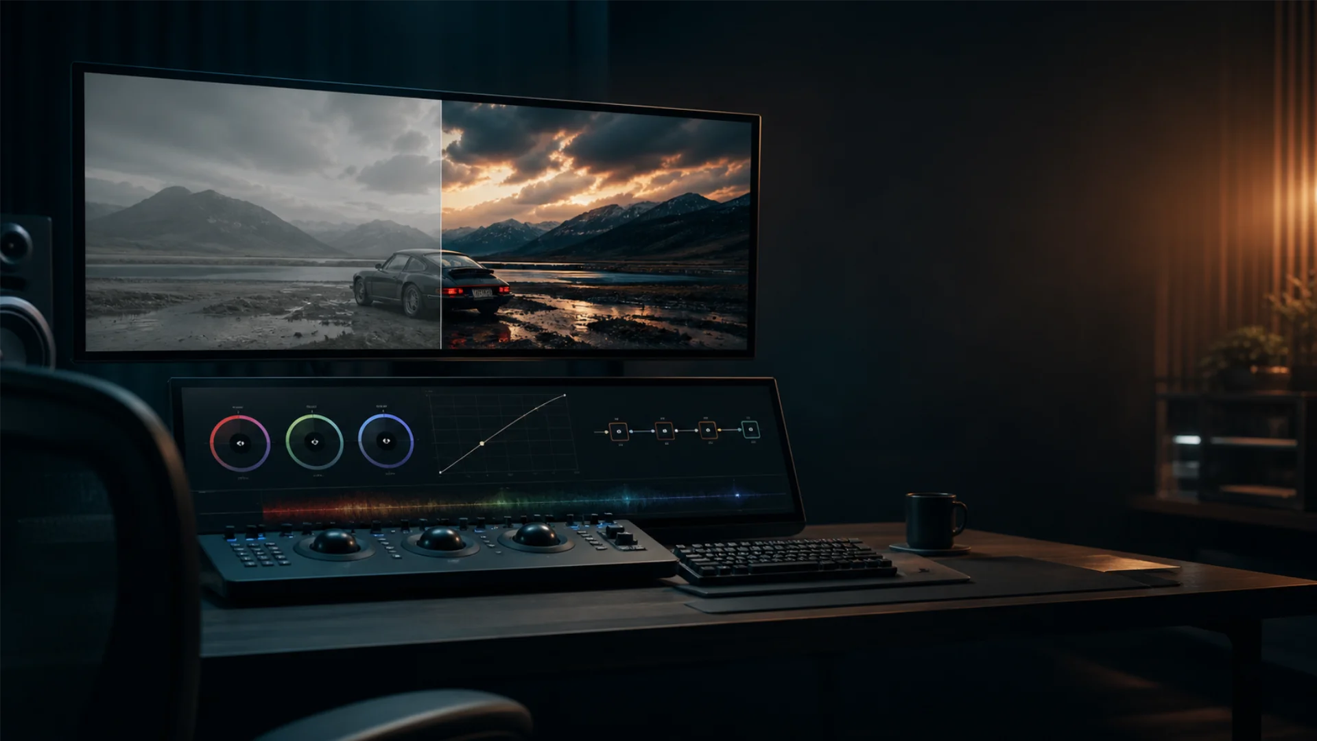
Color Correction vs. Color Grading (and Why Order Matters)
- Color correction is technical. You are fixing the image so it looks the way a human eye saw it on set. White should be white, skin tones should be natural, exposure should be balanced, and shadows should not be crushed. Correction is invisible when it is done well.
- Color grading is creative. With a balanced image in front of you, grading is where you inject mood: a cold teal for a thriller, a warm golden wash for a wedding film, high-contrast muted greens for a sci-fi look. Grading should be felt, not noticed.
If you skip correction and jump straight to a creative look, every problem in the footage (green cast, clipped sky, muddy shadows) gets baked into your final grade. That is why professionals always correct first, then grade.
Here is a clean side-by-side:
Setting Up the Color Page in DaVinci Resolve
Open Project Settings
Click the small gear icon in the bottom right corner of Resolve. Inside, the Color Management tab is where the important settings live.
For a beginner starting with standard camera footage (h.264, h.265, ProRes, or similar), the safest defaults are:
- Color science: DaVinci YRGB
- Color processing mode: SDR Rec.709
- Timeline color space: Rec.709 Gamma 2.4
- Output color space: Rec.709 Gamma 2.4
If you are working with log footage (Sony S-Log, Arri LogC, Blackmagic Film, Canon C-Log, and so on), you have two common paths:
- Apply an input LUT to each clip on the first node (beginner-friendly and visual).
- Switch to DaVinci YRGB Color Managed and set the timeline and output to Rec.709 while keeping your input as the camera’s log space (more automated, scales to multi-camera jobs).
For your first few projects, the first path is easier to reason about. You can learn Resolve Color Management later once the basics feel natural. If you need a refresher on getting white to actually look white before you even hit the Color page, the white balance in video guide covers the on-set and in-post steps side by side.
Know the Color Page UI
Spend a minute mapping the layout so you are not hunting for buttons mid-grade.
- Viewer: top-center, your live preview.
- Scopes: bottom-right by default, your source of truth.
- Node editor: top-right, where your grade is built.
- Palettes: bottom-left, houses primaries wheels, curves, qualifiers, and more.
- Timeline and thumbnails: top strip, so you can jump between clips fast.
The Color page is dense, but you only need to master a handful of panels to grade at a professional level.
Read Scopes Before You Touch Anything
Open scopes from the three-dot menu above the viewer (or View > Video Scopes). The four you will actually use as a beginner:
- Blacks sit around level 0 to 64 on the waveform without crushing flat against the bottom.
- Whites peak around 920 to 1000 without clipping into a flat line at the top.
- On the Parade, the bottoms of R, G, and B align in shadows and the tops align in highlights (this gives you neutral whites and blacks).
- On the Vectorscope, skin tones sit along the I-line (the diagonal line between red and yellow).
If any of those feel off, fix them with corrections, not grading. Do not try to style a shot that is still broken.
Nodes: The Building Blocks of Grading
Think of a node as a stage on a factory conveyor belt. Your image enters on the left, passes through each stage where something is added or adjusted, and exits on the right as the finished grade. Each node is one step. You can stack as many as you want, you can split the signal into parallel paths, and you can isolate parts of the frame inside specific nodes.
Node types you will actually use
- Alt+S (Option+S on Mac) to add a serial node
- Alt+P for parallel
- Alt+L for layer
- Alt+O for outside
A clean beginner node tree
Professional graders do not use one giant node with every adjustment piled in. They split the work into clearly named stages. A reliable beginner structure looks like this:
- Node 1, Balance: exposure and white balance only, using the primaries wheels and offset.
- Node 2, Contrast: shape the tonal range, usually with a custom curve.
- Node 3, Color: push saturation and overall color intention.
- Node 4, Secondaries: isolated work with qualifiers or power windows (skin, sky, a specific object).
- Node 5, Look: creative pass, LUTs, vignettes, film emulation, final polish.
Name your nodes (right-click, Node Label). Future-you and anyone else opening the project will thank you. A tidy tree is easier to tweak, easier to copy-paste between shots, and easier to troubleshoot when something looks wrong.
Primary Color Wheels: Lift, Gamma, Gain & Offset
- Lift: shadows. Use this to set your black point and to neutralize color casts in darker regions.
- Gamma: midtones. Lifts or lowers the middle of the image. Skin tones live here.
- Gain: highlights. Sets your white point and controls brightness of bright areas.
- Offset: moves all three tonal regions at once, like a pedestal. Great for quick white balance.
The small master ring under each wheel controls luminance for that range. The ring itself shifts color balance. Drag the puck inside the wheel toward a hue to push that tonal region toward that color.
Primary vs Log vs HDR wheels (and which to pick)
Resolve gives you three sets of wheels, and beginners often do not know they exist.
Wheel-to-problem cheat sheet
Custom Curves & HSL Curves
Custom curves (Luma and RGB)
The Custom curve shows the image’s tonal response. The bottom-left point is shadows, the top-right is highlights. Pull a point on the line to push that tonal value up (brighter) or down (darker).
- For classic cinematic contrast, a gentle S-curve (lift the highlight shoulder, drop the shadow toe) adds punch without crushing.
- Switch to R, G, or B individually to fix or create color casts with more precision than the primaries wheels give you.
- Right-click the curve to enable Soft Clip, which pulls extreme values back into legal range.
HSL curves (the secret weapon)
The six HSL curves let you target specific colors without masks. You pick a color on the image and then bend a specific property of it.
Curves vs Wheels: when to use which
- Wheels are fast and intuitive for broad balance and creative pushes.
- Curves are precise and perfect for contrast shaping and isolating a single color.
- A common pro workflow is wheels first, curves second. Wheels set the foundation, curves refine the details.
- If a correction needs to target one color only, curves beat wheels almost every time.
- If the whole image needs a shift, wheels beat curves.
Step-by-Step Mini Project: Grading a Shot from Flat to Cinematic
Step 1: Set up the project and import footage
- Create a new project with the settings from the Setting Up section above.
- Import your clip on the Media page and drop it on a new timeline.
- Click the Color page.
- In Project Settings, confirm your timeline and output color space match your delivery target (usually Rec.709 for web and social).
Step 2: Build the node tree
On your first clip, right-click in the node editor and choose Reset Grade. Then build the five-node tree from the Nodes section:
- Balance
- Contrast
- Color
- Secondaries
- Look
Name each node. Leave them empty for now.
Step 3: Primary correction (exposure, white balance, contrast)
Select the Balance node.
- Open the RGB Parade. Your goal is to align the bottoms (shadows) and tops (highlights) of the three channels so blacks and whites look neutral.
- Use Offset to shift the overall white balance until the Parade lines up.
- Use Lift’s master ring to set the black point. Aim for shadows just above zero unless the scene is supposed to be very dark.
- Use Gain’s master ring to set the white point. Aim for bright highlights peaking around 920 to 1000 without clipping.
- Use Gamma’s master ring to adjust midtone brightness so skin looks correctly exposed.
- Check skin tones on the Vectorscope. They should lean on the I-line.
If you are unsure what counts as a correct white balance before you start, the white balance in video guide walks through the on-set principles that make Resolve’s corrections much faster.
Move to the Contrast node. Add a subtle S-curve on the Custom curve. Do not over-push. You are shaping, not stylizing.
Step 4: Curves pass
Select the Color node.
- Boost overall saturation slightly if the image looks flat (typically 55 to 60 from the default 50, on log-to-709 footage).
- Move to HSL curves. On Hue vs Sat, you can pull skin tone saturation down a touch so faces do not compete with the background.
- On Hue vs Lum, consider darkening blown skies slightly if your shot has a lot of sky.
- On Lum vs Sat, pull down saturation in the deepest shadows. This is a classic filmic trick that adds subtle depth.
At this point, the image should look like a well-corrected, slightly cleaned-up version of reality. That is exactly what you want before the creative pass.
Step 5: Creative look (LUT + final polish)
Move to the Look node. This is where grading (not correction) happens.
Two popular approaches:
- Apply a creative LUT as the Look node’s starting point, then dial back its intensity with the Key palette’s Output Gain slider until it feels natural (often 40 to 70 percent strength). Pixflow’s cinematic LUT pack works well here because the LUTs are designed as bases to grade on top of, not destinations.
- Build a look by hand using the Log wheels: cool shadows + warm highlights is the classic teal-and-orange, desaturated mids + crushed blacks gives you a thriller feel, warm highlights + neutral shadows gives you a lifestyle or wedding look.
The color palette of a film is part of the language of the story. If you want inspiration for how a single palette can define a mood, read how The Color Palette of Amélie uses green, yellow, and red to build a specific emotional register.
Finish with a light vignette on a Power Window inside the Look node (lower Gain around the edges by 5 to 15 percent). Your shot is graded.
Secondary Grading Basics (Qualifier, Power Windows, Tracking)
Qualifier
The Qualifier is a color-key tool. You pick a color with the eyedropper, refine the hue, saturation, and luminance ranges until only that color is selected, and then every correction on that node affects only the qualified area.
- View your key by clicking the Highlight button in the viewer (mode: Difference or B/W Matte).
- Tighten the Hue range first, then Saturation, then Luminance.
- Use Blur and Denoise on the key to soften harsh edges.
- Follow a qualifier node with an Outside node to grade everything except the selection.
Power Windows
Power Windows are shape-based masks, rectangle, circle, polygon, curve, or gradient. Use them for areas defined by shape rather than color (a face framed in a window, a sky cut by a horizon line, a subject that needs to be slightly brighter than the background).
Tracking (and the Studio note)
Once a Power Window is placed, you can track it so it follows movement across the shot. Resolve Free includes excellent motion tracking. The tracker handles most handheld, panning, and subject-movement shots without issue.
Magic Mask, the AI-driven mask that isolates people, objects, or features, is a DaVinci Resolve Studio feature. It is powerful but not necessary to learn everything in this guide. Standard Power Window tracking gets you 95% of the way there.
Using LUTs in DaVinci Resolve the Right Way
Two kinds of LUTs to keep straight:
- Input LUT (technical): converts log footage to Rec.709 so you can see what you are working with. Apply on Node 1.
- Creative LUT (stylistic): adds a look on top of a corrected image. Apply on the Look node, late in the tree.
How to apply a LUT in Resolve
- Place the LUT in the right folder so Resolve sees it: Project Settings > Color Management > Lookup Tables > Open LUT Folder. Drop .cube files in, click Update Lists.
- On the node where you want the LUT, right-click, choose LUTs, and pick your file.
- Lower its strength with the Key Output Gain slider or by following it with corrections that push it back.
A LUT is a starting point, not the grade. If you stop there, your footage will share the exact same look with everyone else using that LUT pack. Push the primaries wheels, bend a curve, adjust contrast on top of it. That is how you get a look that is yours.
Pixflow’s professional color grading LUTs are built to work with Resolve Free or Studio, come in Rec.709 and Log variants, and are designed as bases you can grade on top of. If you want a deeper walkthrough on how LUTs plug into an editing workflow beyond Resolve, the Pixflow guide on using LUTs for color grading and editing covers .cube formats, Lumetri in Premiere, and generic best practices.
Matching Shots Across a Scene
- Use the Gallery (left palette) to save stills from your hero shot. Right-click a clip in the viewer and choose Grab Still.
- On your next clip, right-click the still in the Gallery and choose Wipe to compare side by side.
- With the wipe active, match tonal values on the waveform (blacks, mids, whites) before touching color.
- Once luminance matches, align the RGB Parade so white balance matches.
- Only then touch saturation and creative adjustments.
A simple trick to keep looks consistent: apply your base correction and look nodes to all shots first (copy-paste a grade with middle-mouse drag on the thumbnail bar), then fine-tune each individual shot. This ensures the scene reads as a scene, not a collection of separate grades.
Free vs Studio: What’s Paid?
Common Beginner Mistakes to Avoid
- Over-saturating. Saturation is seductive. On a neutral image, bumping saturation feels great, and then a week later you watch it back and the skin tones are radioactive. Keep a check-monitor open and compare before and after often.
- Crushing blacks and clipping whites. If the waveform flat-lines at 0 or 1023, you have permanently lost detail. Use Soft Clip on the Custom curve if you need to contain extremes.
- Stacking LUTs. Two creative LUTs in a row rarely look better than one well-dialed-in LUT followed by manual corrections. LUT layering bakes in weirdness that is very hard to undo.
- Not using scopes. Your eyes will lie. The scopes will not. If there is a disagreement, trust the scopes.
- One giant node with everything in it. Your future self will not understand what you did. Split the work into labeled nodes.
- Grading without correcting first. Every unbalanced pixel becomes part of the look. You will fight the footage for hours instead of shaping it in minutes.
- Judging the grade on the wrong display. If possible, calibrate your monitor. At minimum, avoid grading in a bright room with a cheap laptop screen and expect the result to hold up everywhere.
- Ignoring clip timing. If your clip changes exposure over time (a dimming sun, someone turning a light on), a single static grade will not hold. Use keyframes on the node (right-click, add a keyframe in the Keyframes panel) to adapt over time.
Exporting Your Graded Timeline
- Format: MP4 for social and web (h.264 or h.265), ProRes or DNxHR for archival and client delivery.
- Resolution and framerate: match your timeline exactly unless you have a reason not to.
- Color space tags: make sure the output color space matches your timeline (Rec.709 for standard SDR delivery). This is the step beginners most often forget, and it causes washed-out or oversaturated video when played back on web players.
- Quality: data rate matters more than format alone. Aim for 15 to 25 Mbps for 1080p social delivery, higher for 4K.
If you are choosing between codecs and containers and not sure which is which, the codec vs container breakdown clarifies what .mp4, .mov, h.264, h.265, and ProRes actually mean. And if you are stuck between variable and constant bitrate on export, the VBR vs CBR guide covers when each one makes sense for online delivery.
Conclusion
The fastest way to learn is to do. Open Resolve, drop in a clip, and build the five-node tree from this guide: Balance, Contrast, Color, Secondaries, Look. Grade one shot today, a scene tomorrow, a full short the week after. Each pass gets faster, and each grade gets more confident.
When you are ready to speed up the creative pass without giving up control, Pixflow’s professional color grading LUTs are built exactly for this workflow: drop one on the Look node, dial it back, refine on top. You keep the craft, the LUT just gives you a head start.
Disclaimer : If you buy something through our links, we may earn an affiliate commission or have a sponsored relationship with the brand, at no cost to you. We recommend only products we genuinely like. Thank you so much.

Write for us
Publish a Guest Post on Pixflow
Pixflow welcomes guest posts from brands, agencies, and fellow creators who want to contribute genuinely useful content.
Fill the Form ✏