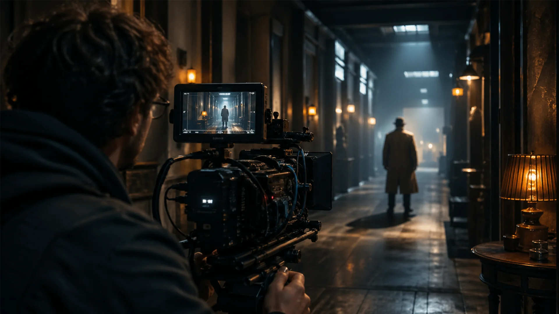
How Filmmakers Use Color Psychology to Transform Characters and Stories

Filmmakers carefully select color palettes to create an emotional connection with viewers, using hues to reinforce themes, enhance character arcs, and even foreshadow events. From the vibrant saturation of Technicolor classics to the stylized teal and orange grading of modern blockbusters, color theory in film has evolved into an essential aspect of cinematic storytelling.
If you’ve ever wondered why some movies feel visually striking or emotionally intense, the answer often lies in the deliberate use of color. Explore different movie color palettes and their impact with Pixflow Color LUTs, which helps analyze how colors are used across various films.
The Power of Color Theory in Film: Why It Matters
How Color Psychology in Film Influences Emotions
- Red: Often associated with passion, danger, or intensity. Think of the overwhelming red in The Shining or Schindler’s List’s iconic red coat.
- Blue: Represents calmness, sadness, or detachment. Films like Drive and Blade Runner 2049 use blue tones to create an introspective mood.
- Yellow: Can signify warmth and happiness but also caution or insanity, as seen in Kill Bill and The Grand Budapest Hotel.
- Green: A symbol of growth and renewal, but also unease and eeriness, as seen in The Matrix and The Joker.
- Teal and Orange: A commonly used modern color palette that balances warm and cool tones for high visual contrast.
How Filmmakers Use Color to Shape Narrative and Character Development
Filmmakers don’t just pick colors randomly; they use them strategically to define a character’s journey. For example, in Breaking Bad, Walter White’s wardrobe evolves from beige and neutral tones to dark greens and blacks as his character becomes more morally ambiguous. Similarly, in The Wizard of Oz, the transition from sepia tones to vibrant Technicolor signals a shift from reality to a magical world.
From setting the tone to symbolizing deeper themes, color in film symbolism plays a crucial role in storytelling. Understanding color meaning in film allows viewers to appreciate movies on a deeper level, uncovering hidden layers that enhance the cinematic experience.
Symbolism and Color Meaning in Film: Decoding the Visual Language
Understanding Color Symbolism in Movies
Each color carries distinct symbolism that can vary depending on the context, genre, and cultural influences. Some of the most common interpretations include:
- Black: Mystery, death, or power (The Dark Knight, John Wick).
- White: Purity, innocence, or sterility (Mad Max: Fury Road, A Clockwork Orange).
- Purple: Royalty, ambition, or spirituality (Black Panther, The Grand Budapest Hotel).
- Gray: Detachment, depression, or neutrality (Joker, The Girl with the Dragon Tattoo).
Filmmakers manipulate these associations to either reinforce or subvert expectations. For instance, in The Handmaid’s Tale, the use of red symbolizes oppression instead of its usual passionate connotation.
How Colors in Filmmaking Shape Characters and Narratives
Filmmakers often assign specific colors to characters to represent their personalities, struggles, and transformations. Consider these examples:
- Joker (2019): Arthur Fleck starts in muted tones, representing his isolation, but transitions to bold greens and purples as he embraces his chaotic identity.
- Inside Out (2015): Each emotion is visually represented by a distinct color—Joy (yellow), Sadness (blue), Anger (red), Disgust (green), and Fear (purple).
- The Godfather (1972): The strategic use of darkness and low lighting emphasizes Michael Corleone’s descent into moral corruption.
These deliberate choices guide audiences toward an emotional connection with the characters and their journeys.
Cinematic Colors and Their Psychological Impact on Storytelling
Blue Color Meaning in Film: Calmness or Coldness?
Blue is one of the most versatile colors in cinema. While it often conveys tranquility and introspection, it can also create a sense of detachment or melancholy.
- In Titanic, the deep blue ocean reflects the film’s tragic and somber tone.
- Blade Runner 2049 bathes its futuristic world in blue hues, reinforcing a feeling of loneliness and existential questioning.
- Animated films like Finding Nemo use blue as a calming backdrop, reinforcing themes of adventure and self-discovery.
What Emotion Does Yellow Represent? The Psychology of Warmth and Caution
Yellow is an interesting color in filmmaking because it carries both positive and negative connotations.
- In La La Land, yellow represents hope and optimism, as seen in Mia’s bright dresses.
- In Breaking Bad, the heavy use of yellow tones suggests decay and danger, particularly in scenes set in Mexico.
- Horror films like The Shining use yellowish lighting to create an unsettling, sickly atmosphere.
Green Cinematography: What Mood Does the Color Green Symbolize?
Green is a color that often carries dual meanings—growth and renewal, but also unease and corruption.
- The Matrix uses a green-tinted world to signal artificiality and control.
- The Great Gatsby’s green light symbolizes unreachable dreams.
- Joker leans into green to emphasize chaos and psychological instability.
Understanding these cinematic choices can deepen the appreciation of a film’s visual storytelling, as colors subtly shape the audience’s emotional response.
The Evolution of Color in Movies: From Technicolor to Modern Color Palettes
What Was the First Film with Color? A Look at the History of Color Filmmaking
The earliest films were black and white, but filmmakers quickly began experimenting with color. Some of the first color films used hand-tinted frames, where individual sections were painted by hand.
- Kinemacolor (1908): The first successful color process that used a red-green system.
- Technicolor (1930s-1950s): The most famous early color process, producing vibrant hues in films like The Wizard of Oz (1939) and Gone with the Wind (1939).
- Modern Digital Color Grading (2000s-present): Today, filmmakers use digital color correction to fine-tune the look of a film, giving it a signature aesthetic.
For those looking to experiment with colors for digital media, Pixflow’s Rec 709 color space guide explains how this color profile works in professional media production.
How Does Color Film Work? The Technology Behind Cinematic Colors
Color film works by capturing different wavelengths of light using layered film stocks or digital sensors. Older films used dye-transfer processes, while modern movies rely on digital color grading to manipulate tones precisely.
The Teal and Orange Color Palette in Film: Why Do Filmmakers Love It?
One of the most popular modern trends is the teal and orange color palette, which enhances contrast between warm and cool tones. You’ll see this color scheme in countless blockbusters, including Mad Max: Fury Road, Transformers, and The Dark Knight.
Why is this combination so effective?
- Skin tones naturally fall in the orange spectrum, making them pop against a teal background.
- Teal enhances shadows and depth, creating a more cinematic look.
- High contrast makes scenes visually striking, guiding the audience’s focus.
Why Is Mexico Yellow in Movies? The Cultural and Stylistic Reasons
Have you ever noticed that scenes set in Mexico or the Middle East often have a yellowish, dusty hue? This is a stylistic choice meant to create an atmosphere of heat, dryness, and sometimes even danger. Films like Sicario and Breaking Bad use this grading technique to signal a shift in location and mood.
While this choice adds visual identity, it has also been criticized for reinforcing stereotypes by consistently associating certain regions with harsh, gritty aesthetics.
The Role of Color Grading in Film: Crafting Mood and Atmosphere
How Movie Color Palettes Are Designed
Creating a cohesive movie color palette involves several steps:
- Choosing a Base Color Scheme – Filmmakers decide on a dominant color or palette that fits the film’s theme.
- Using LUTs (Look-Up Tables) – LUTs are preset filters that apply specific color adjustments to footage.
- Fine-Tuning Shadows, Highlights, and Midtones – Editors tweak brightness, saturation, and contrast to achieve the desired look.
For filmmakers and video editors looking to experiment with color palettes, tools like Pixflow color LUTs can help create cinematic color schemes used in films.
Color Grading Examples: Transforming Raw Footage into Cinematic Art
Raw footage often looks flat and dull before color grading. By adjusting colors, filmmakers can completely change the mood of a scene.
For example:
- Horror movies use desaturated blues and greens to create an eerie atmosphere (The Conjuring, Hereditary).
- Romantic films favor warm tones like soft pinks and golds to create a dreamy effect (La La Land, Call Me by Your Name).
- Sci-fi movies often use high-contrast neon blues and purples for a futuristic feel (Tron: Legacy, Blade Runner 2049).
The Difference Between RAW, LOG, and Rec 709: Why It Matters
Understanding different color formats is crucial for filmmakers:
- RAW Footage: Contains unprocessed data straight from the camera, offering the most flexibility in color grading.
- LOG Footage: A flat, desaturated format that preserves details for better post-production control.
- Rec 709: A standardized color space that delivers final, vibrant visuals, often used for TV and online streaming.
For a deeper dive into color grading formats, check out Pixflow’s guide on RAW, LOG, and Rec 709 footage.
Conclusion
Key takeaways:
- Every color has meaning – From red’s intensity to blue’s calmness, filmmakers use colors to evoke emotions.
- Color grading transforms a film’s look – Modern films rely heavily on digital color correction to enhance storytelling.
- Trends like the teal and orange palette create striking visuals – High-contrast color schemes have become a hallmark of modern cinema.
By understanding the psychology of color, audiences can gain a deeper appreciation for the artistry behind filmmaking. The next time you watch a movie, pay attention to the color choices—you might uncover hidden layers of meaning woven into the story.
Disclaimer : If you buy something through our links, we may earn an affiliate commission or have a sponsored relationship with the brand, at no cost to you. We recommend only products we genuinely like. Thank you so much.
Blog Label:
- Cinematic color palettes
- cinematic colors
- color evolution in movies
- Color grading
- color grading examples
- color in film
- color in film symbolism
- color meaning in film
- color palette movies
- color symbolism in movies
- Color theory in film
- colors in filmmaking
- film color meaning
- filmmaking
- movie color
- Psychology of color in film

Write for us
Publish a Guest Post on Pixflow
Pixflow welcomes guest posts from brands, agencies, and fellow creators who want to contribute genuinely useful content.
Fill the Form ✏

