How to Design T-Shirts in Adobe Illustrator (A Pro’s Guide)
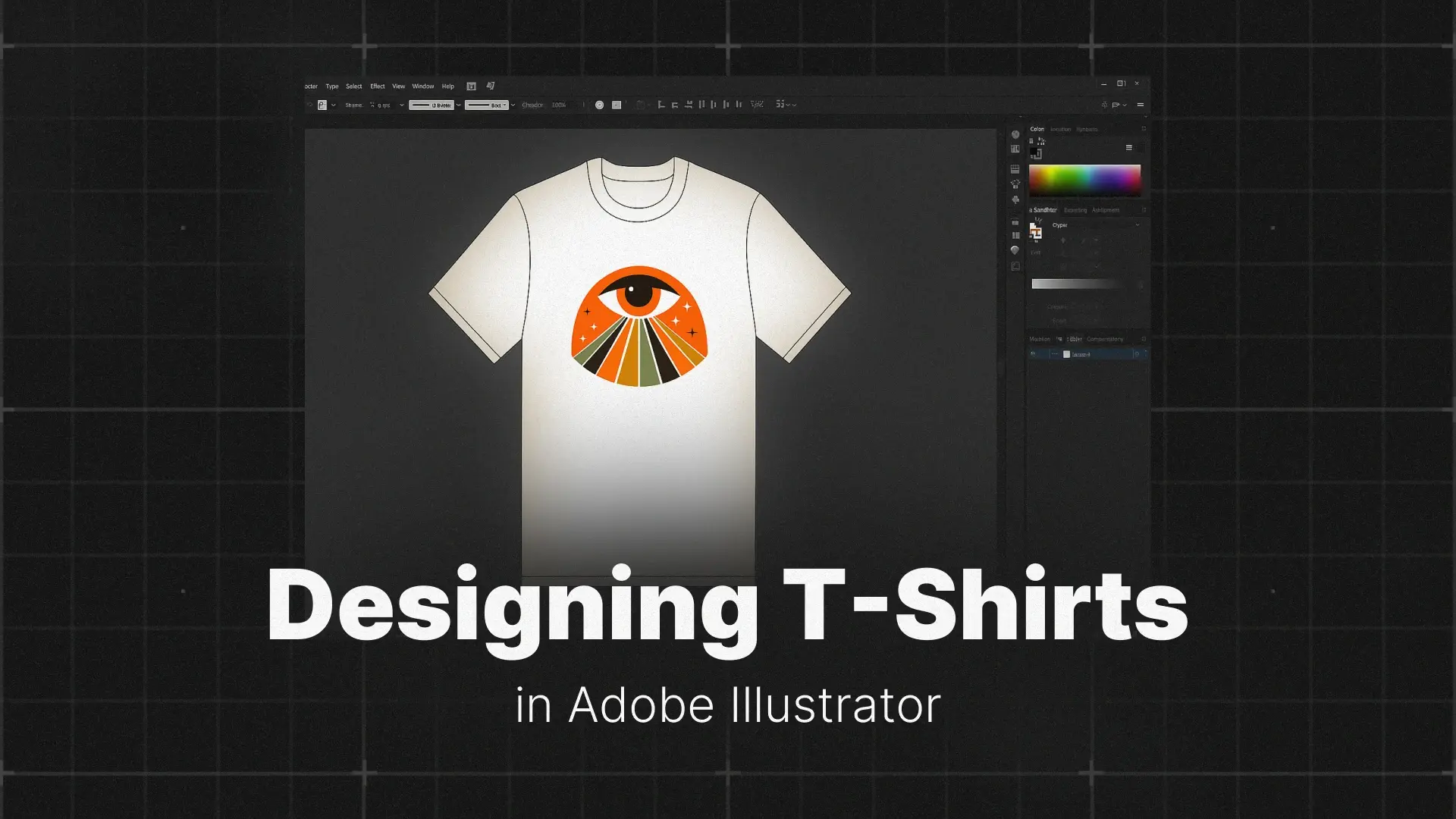
This is your complete guide on how to design a shirt in Illustrator. We’ll walk you through every stage — from setting up the right canvas size and color modes to exporting a flawless, print-ready file. Whether you’re designing for screen printing, print-on-demand, or just experimenting with style, this tutorial will get you there.
Professional Illustrator Templates

Step 1: Setting Up Your Document for Printing
What’s the Best Size for a T-Shirt Design?
Before you dive into drawing, it’s important to set up your artboard with the correct dimensions. For a standard full-front t-shirt design, the recommended canvas size is 12″ x 16″ (or 3600 x 4800 pixels if you’re thinking digitally). This size fits most adult t-shirts and gives your artwork enough room to breathe without overwhelming the garment.
If you’re creating designs for smaller placements like the pocket, sleeve, or back tag, adjust your Illustrator t-shirt template accordingly.
Color Mode: CMYK and Spot Colors
Start by switching your Adobe Illustrator document to CMYK color mode, which reflects how inks behave in the real world. It’s the safest option when preparing files for print.
If you’re planning a screen printing Illustrator setup, take it a step further with spot colors. These are solid, pre-mixed inks (like Pantone colors) used in screen printing to ensure perfect color reproduction. Using spot colors also makes it easier to separate colors for printing later on, a crucial step we’ll get to soon.
Setting Up Bleed and Safety Margins for T-Shirt Prints
Bleed and safety margins are not just for business cards and brochures. If your t-shirt design includes background fills, edge-to-edge patterns, or all-over prints that extend to the boundaries of the printable area, setting up bleed correctly prevents unwanted white edges caused by slight misalignment during printing.
What Is Bleed and Why It Matters
Bleed is an extra strip of your design that extends beyond the final trim or print boundary. When the printer cuts or applies the design, that extra margin gets trimmed away, leaving a clean edge with no gaps. Without bleed, even a tiny shift during production can expose unprinted areas along the border of your artwork.
How to Set Bleed in Illustrator
- Go to File > New (or File > Document Setup if your file is already open).
- Set your artboard dimensions to the print area your vendor specifies (for standard full-front designs, that is typically 12″ x 16″).
- Under Bleed, enter a value on all four sides. A common starting point is 0.125 in (3 mm), but always confirm the exact bleed requirement with your print provider, as all-over and sublimation printers may ask for more.
Once bleed is set, Illustrator displays a red outline around your artboard. Make sure any background color, pattern, or graphic that touches the edge of the design extends all the way to that red line.
Safety Margins: Protecting Key Elements
Safety margins work in the opposite direction from bleed. Instead of extending outward, a safety margin sits inside the trim line. Keep all critical elements, such as text, logos, and focal points of your illustration, at least 0.25 in (6 mm) away from the artboard edge. This buffer ensures nothing important gets cut off or lands awkwardly close to a seam or fold on the garment.
Raster Effects Resolution
If your design uses any Illustrator effects that rasterize on export (drop shadows, glows, blurs, or texture overlays), set the raster effects resolution to 300 ppi. Go to Effect > Document Raster Effects Settings and choose High (300 ppi). This keeps those elements crisp at full print size instead of appearing pixelated on the finished shirt.
Step 2: Creating Your T-Shirt Graphic
Finding Inspiration and Sketching Your Concept
Every great t-shirt starts with a killer concept. Browse styles online or check out curated design libraries like Pixflow’s Illustrator assets for inspiration. Popular themes include vintage t-shirt designs, bold typography, hand-drawn illustrations, and cartoon graphics.
Before touching your keyboard, sketch a few concepts by hand or with a tablet. This helps you work through ideas, shapes, and layout before diving into digital creation.
Turning Your Hand Sketch into Editable Vectors
A pencil sketch on paper is a raster image (made of pixels), which means it loses quality when you scale it up for a large t-shirt print. Illustrator’s Image Trace converts those pixels into clean, infinitely scalable vector paths in a few steps.
- Scan your sketch or take a clear, well-lit photo of it. Go to File > Place and select the file to bring it onto your artboard.
- With the placed image selected, open the Image Trace panel (Window > Image Trace) and choose the Sketched Art preset. This preset is tuned for pencil and ink drawings, so it picks up line weight and organic strokes better than the default trace.
- Once the preview looks right, click the Expand button in the top control bar. This converts the trace into real vector paths you can select, recolor, and reshape with the Direct Selection Tool.
- The trace often produces more anchor points than you need, which can make outlines look rough. Select your expanded artwork and go to Object > Path > Simplify. Drag the slider until the lines look smooth without losing the character of your original drawing.
After these four steps your hand-drawn concept is a fully editable vector, ready to refine with the tools covered in the next section.
Building Your Artwork with Vector Tools
Once your concept is ready, fire up Illustrator and begin bringing it to life using vector tools:
- Use the Pen Tool (P) for custom shapes and paths.
- The Shape Builder Tool makes combining and subtracting basic shapes intuitive.
- Typography shirt designs are massively popular — try experimenting with bold fonts, curve paths, and tracking adjustments.
If you’re new to these tools, we recommend reviewing our full tutorial on how to master Adobe Illustrator for design precision.
Typography and Color Tips for T-Shirt Design
Lettering on a t-shirt is read from several feet away, not at arm’s length like a screen or a business card. That changes how you handle spacing, font weight, and color.
Kerning and Tracking for Readable Shirt Text
- Tracking (letter-spacing across an entire word): Open the Character panel (Window > Type > Character) and increase the Tracking value for uppercase or wide display fonts. A slight bump (25 to 75 units) prevents letters from looking cramped when the design is printed at full chest size.
- Kerning (spacing between individual letter pairs): Switch Kerning to Optical in the Character panel for a balanced starting point, then click between any pair that still looks uneven (common culprits: AV, WA, To) and nudge the value manually. Tight kerning that looks fine on screen can blur together on fabric, so err on the side of a little extra space.
- Font weight: Thin and light weights tend to disappear on textured fabrics. Stick to medium, bold, or heavy weights unless you are printing on smooth, light-colored garments with a high-detail method like DTG.
Plan for Outlines Early
Once your type looks right, keep in mind that you will need to convert all text to outlines (Type > Create Outlines) before sending the file to a printer. This is covered in detail in Step 4, but it helps to choose fonts and spacing knowing that the final file will be pure vector paths, not live text.
Choosing a T-Shirt Color Palette
- Start with color psychology: Blue signals trust and calm, red communicates energy and urgency, green suggests nature or wellness, and yellow grabs attention fast. Pick a palette that matches the mood your design should convey when someone sees the shirt across a room.
- Limit your colors for screen printing: Most screen print jobs charge per ink color. Two to four well-chosen colors will keep costs down and force stronger design decisions. If you are using DTG or sublimation, you have more freedom, but a focused palette still reads better on fabric.
- Test against the shirt color: Use the Swatches panel to set your artboard background to the garment color (black, navy, heather gray) and check contrast. Light designs on dark shirts and dark designs on light shirts are the safest combinations. If you plan to print on multiple shirt colors, create a color variation for each.
Shape Builder Tool: Three Moves for Building T-Shirt Graphics
The Shape Builder Tool lets you merge, subtract, and extract shapes by clicking directly on overlapping paths instead of navigating through panel menus. Select all the overlapping shapes first, then press Shift+M to activate the tool.
- Merge (click and drag): Draw a line through the regions you want to unite. Illustrator combines them into a single shape. This is the fastest way to build badge outlines, cloud forms, or any icon made from overlapping circles and rectangles.
- Erase (Alt/Option + click): Hold Alt (Windows) or Option (Mac) so the cursor shows a minus sign, then click or drag over the parts you want to remove. Use this to trim excess overlap from layered letterforms or cut a window out of a shape for a stencil-style design.
- Extract an intersection (single click): Click on any enclosed overlap area without dragging. Illustrator turns just that region into its own independent shape, leaving everything else untouched. This is handy for pulling a specific element out of a complex overlap, such as the center of a Venn diagram graphic or the overlap between two banner ribbons.
If the tool seems to ignore small gaps between your shapes, double-click its icon in the toolbar and enable Gap Detection. This tells Illustrator to treat near-touching edges as closed boundaries so your merges and subtractions stay clean.
Pen Tool Quick-Start for Custom T-Shirt Shapes
The Pen Tool builds every shape from two elements: anchor points (the dots you place) and handles (the lines that extend from each dot to control how the path curves between points). Knowing just a few moves is enough to draw most t-shirt graphics from scratch.
- Straight segments: Click once to place an anchor point, then click somewhere else to place a second one. Illustrator draws a straight line between them. Keep clicking to outline angular shapes like geometric badges, block letters, or banner ribbons.
- Smooth curves: Instead of clicking, click and drag to pull out handles. The further you drag, the wider the curve. This is how you draw flowing outlines such as script lettering, wave shapes, or organic silhouettes.
- Sharp corners after a curve: Hold Alt (Windows) or Option (Mac) and click the last anchor point before placing the next one. This breaks the handles so you can change direction sharply, which is essential for shapes that mix rounded and angular edges, like a shield outline or a stylized skull.
- Closing the shape: Hover over your very first anchor point until a small circle appears next to the cursor, then click. This seals the path into a closed shape you can fill with color.

Adding Repeating Patterns to Your Design
Not every t-shirt graphic is a standalone illustration. Stripes, geometrics, florals, and abstract repeats are some of the most popular t-shirt styles, and Illustrator’s built-in Pattern Maker tool lets you create them without manually duplicating anything.
Create Your Pattern Tile:
- Design the vector elements you want to repeat (shapes, icons, motifs) and select them all.
- Go to Object > Pattern > Make. Illustrator opens the Pattern Options panel and automatically saves a new swatch in the Swatches panel.
Customize the Repeat in Pattern Options:
- Tile Type: Choose how the tile repeats. Grid works for clean, uniform layouts. Brick by Row or Brick by Column offsets each row or column for a more organic feel, which is great for floral or scattered motif designs.
- Width and Height: Increase these values for an airy, spaced-out pattern or decrease them to pack motifs tightly together.
Edit in Real Time:
While Pattern Mode is active, every change you make (moving, resizing, rotating, or deleting elements inside the blue tile boundary) updates the entire repeat preview instantly. This lets you fine-tune spacing and flow before committing.
Save and Apply:
Once you are happy with the layout, click Done at the top of the screen. Your pattern is now stored as a swatch. To use it, draw any shape on your artboard, open the Swatches panel, and click your new pattern swatch to fill the shape. If the scale looks too large or too small, right-click the shape, choose Transform > Scale, uncheck “Transform Objects,” check “Transform Patterns,” and adjust the percentage.
Using the Blend Tool for Color Fades and Retro Text
Beyond solid shapes and patterns, many popular t-shirt styles rely on smooth color transitions or vintage-looking layered typography. Illustrator’s Blend Tool handles both of these without any manual duplication.
Smooth Color Mode (Gradient-Style Fades Between Shapes):
- Create two shapes with different fill colors, for example a warm orange circle and a deep red circle placed a short distance apart on your artboard.
- Select both shapes, then go to Object > Blend > Make.
- Open Object > Blend > Blend Options and set Spacing to Smooth Color.
Illustrator fills the gap between the two shapes with a seamless color transition. This is useful for creating soft color fade effects across your design, such as a sunset gradient behind a silhouette or a two-tone color wash behind lettering.
Specified Steps Mode (Retro Morphing Text):
- Type a word, then duplicate it and place the copy slightly behind and offset from the original. Give each copy a different color.
- Select both text objects, then go to Object > Blend > Make.
- In Blend Options, set Spacing to Specified Steps and choose a number (5 to 15 steps works well for a visible layered look).
This creates a stacked, dimensional text effect that is one of the most recognizable retro t-shirt styles. The intermediate copies morph between the front and back text, producing a vintage 3D typography look without manually duplicating anything.
Step 3: Using a T-Shirt Mockup Template
Why You Need a T-Shirt Mockup
Creating a t-shirt mockup in Illustrator helps you visualize the final product. You can preview how your design looks on different shirt colors, materials, and placements. If you’re planning to sell online, mockups are a must for generating product images that look professional and polished.
How to Use an Illustrator T-Shirt Template
Most Illustrator t-shirt templates come with clearly labeled layers — typically including a “Design” layer and a “Shirt” layer. Simply drag and drop your vector design into the right layer and scale it accordingly.
Need a mockup to get started? Try downloading a free Adobe Illustrator t-shirt template online — many resources offer them. Or check out collections like Pixflow’s graphic templates for creative extras such as stickers, labels, and icons to spice up your layout.
Getting More Out of Your Mockup Template
Step 4: The Most Important Step – Preparing Your File for Print
Convert All Text to Outlines (Ctrl+Shift+O)
Fonts are notorious for causing issues at the print shop. To prevent any mismatch, convert all text to outlines. This ensures your typography remains exactly as you designed it — no font substitution errors, even if the printer doesn’t have your font installed.
Expand All Strokes
Illustrator treats strokes as visual effects. For consistent results, especially in screen printing, you must expand all strokes into shapes. Go to Object > Expand and check both “Stroke” and “Fill” — this converts strokes into editable vector paths.
How to Separate Colors for Screen Printing
Screen printing typically requires each ink color on its own layer. Here’s how to separate them:
- Select all elements of one color.
- Move them to a new layer named after the color (e.g., “Red Layer”).
- Repeat for every color in your design.
This method is essential if you’re submitting artwork for professional screen printing, as it helps printers create accurate screens for each color.
Choosing the Right Export Format
For vector t-shirt design, always export in formats that retain scalability:
- .AI (Adobe Illustrator native file)
- .PDF (Preserves vector paths and fonts)
- .EPS (Printer-friendly and widely supported)
Avoid raster formats like PNG or JPG unless specifically requested — they lose quality when scaled and don’t support color separation.
Embed All Linked Images Before Sending: If your design includes raster images (such as a photo texture or background), make sure they are embedded in the file, not just linked. Go to Window > Links, select any linked image in the panel, and choose Embed from the panel menu. This prevents missing-file errors when your printer opens the artwork, since linked images reference an external file path that may not exist on their system.
Export a Print-Ready PDF: For the most reliable handoff to any print shop, save your final file as a PDF. Go to File > Save As, choose Adobe PDF as the format, and select the [High Quality Print] preset. In the dialog that appears, navigate to Marks and Bleeds and check “Use Document Bleed Settings” so your bleed area is included automatically. This single PDF will preserve your vectors, embedded images, and bleed in one portable file.
Conclusion
So, start sketching your next t-shirt idea today! When you’re ready to bring it to life, revisit this guide for every step. And if you want to level up your Illustrator skills, check out our full guide:
👉 Mastering Adobe Illustrator: A Comprehensive Guide
Disclaimer : If you buy something through our links, we may earn an affiliate commission or have a sponsored relationship with the brand, at no cost to you. We recommend only products we genuinely like. Thank you so much.

Write for us
Publish a Guest Post on Pixflow
Pixflow welcomes guest posts from brands, agencies, and fellow creators who want to contribute genuinely useful content.
Fill the Form ✏