How to Guide Viewer Attention with Colors in Film: A Cinematic Guide to Color Grading and Storytelling

Understanding Color Psychology in Film
What is Color Psychology in Film and How Does It Influence Emotions?
Color is more than just a visual element in film; it has the power to evoke emotions, establish mood, and guide the viewer’s attention. Filmmakers have long understood the psychological impact of color and use it strategically to reinforce the story, connect with the audience emotionally, and subtly direct focus.
The concept of color psychology in film revolves around how different colors trigger specific emotional responses. For instance, warm colors like red, orange, and yellow often elicit feelings of warmth, passion, or urgency, while cool colors like blue and green tend to evoke calmness, detachment, or even mystery. These emotions can shape how a viewer experiences a scene, making color an essential tool in visual storytelling.
Warm vs Cool Colors: Emotional Impact
- Warm Colors: Red, orange, and yellow are commonly associated with strong emotions—passion, love, danger, and excitement. These colors grab attention and can heighten tension or urgency in a scene. Example: In The Grand Budapest Hotel, Wes Anderson uses soft pastel tones to evoke a whimsical and nostalgic atmosphere, contrasting with the intense emotions of the plot.
- Cool Colors: Blue, green, and purple tend to create a sense of calmness, tranquility, and detachment. These colors are ideal for scenes where emotional distance or mystery is desired. Example: In The Matrix, the film uses green to represent the simulated world, imbuing it with a sense of detachment and artificiality.
Understanding how filmmakers use these colors in their films allows us to connect emotionally to the scenes on a deeper level. By applying color psychology with intention, filmmakers can enhance their storytelling and guide the audience’s emotional journey.
For filmmakers aiming to elevate their storytelling with color, one essential tool is color grading. Color grading can help bring out the emotional tone of a scene, whether you’re enhancing the warmth of a romantic moment or deepening the coldness of a dystopian setting.
To explore how LUTs (Look-Up Tables) play a role in color grading and adjusting the emotional tone of your film, check out the color LUT options available at Pixflow LUTs.
Techniques for Guiding Viewer Attention with Color
How Can Filmmakers Use Color to Direct Focus in a Scene?
Colors aren’t just used to set a mood—they can also direct the viewer’s attention. This is especially important in action sequences or scenes where multiple elements are present. The contrast between colors can make certain parts of a scene pop, guiding the viewer’s eyes to the most critical areas.
One common technique for guiding attention is through color contrast. By juxtaposing colors that differ significantly in hue, filmmakers create focal points that draw the viewer’s gaze. High contrast between colors can make specific objects stand out, whereas colors with low contrast will blend together more seamlessly, allowing other elements to fade into the background.
Saturation and Brightness Saturated colors tend to catch the viewer’s eye first, while desaturated or muted colors recede into the background. For example, in Schindler’s List, the red coat of a young girl stands out against the otherwise muted black-and-white background, symbolizing innocence amidst tragedy. This deliberate use of color contrast draws the audience’s attention to the girl and emphasizes her importance to the story.
Complementary Colors: The Art of Balance Another powerful technique for directing focus is the use of complementary colors—colors that are opposite each other on the color wheel, such as blue and orange. The contrast between these two hues creates a visually pleasing balance while also directing the viewer’s eye toward specific areas. Filmmakers often use this technique in blockbuster films, where the warm tones of skin or the setting sun are contrasted with the cool blues of the sky or shadows, creating a dynamic, engaging visual experience.
For an example of how color contrast in cinematography can guide the audience’s focus, consider the use of blue and orange tones in many contemporary films, like The Dark Knight. The warm tones of the characters’ faces or key objects stand out against the cold, atmospheric background, drawing attention to the action or emotions on-screen.
Color Grading and the Role of Color Spaces To achieve precise control over color, filmmakers use color grading and understand the role of different color spaces like REC. 709, which is the standard for HD television. Understanding color spaces is critical for ensuring that the color contrast and harmony you intend in your film are effectively represented across various platforms. If you’re working on color grading for your next film, check out this article on the REC. 709 Color Space to get more insights into how this color space works and how it affects your visuals.
The careful application of saturation, brightness, and complementary colors allows filmmakers to subtly yet powerfully guide the viewer’s focus. By using these techniques in tandem with color psychology, you can craft a cinematic experience that resonates emotionally and visually with your audience.
Applying Film Color Theory to Visual Storytelling
Understanding the Emotional Impact of Color
Color plays a pivotal role in how a story is perceived by the audience. In filmmaking, it’s not just about making a scene look beautiful—it’s about using color as a storytelling tool that conveys emotion, mood, and meaning. The colors you choose for your footage can subtly influence how the audience feels and interprets the story, adding depth to the narrative without a single word being spoken.
For example, warmer tones like reds, oranges, and yellows often evoke feelings of warmth, passion, and intensity. These colors can be used to heighten emotions during dramatic or intimate scenes. On the other hand, cooler tones like blues, greens, and purples can create a sense of calm, sadness, or even mystery. A cold color palette can be used to evoke tension or to signal that something is wrong, especially in thriller or horror genres.
By aligning your color choices with the story’s emotional arc, you can enhance the viewer’s experience and create a stronger connection to the characters and the narrative. For instance, a character’s journey might be reflected through the color palette: a transition from warm, vibrant colors in the beginning (symbolizing hope or joy) to cooler, muted colors later (signifying loss or despair).
Color as a Symbolic Tool
Beyond emotion, color can also function symbolically in visual storytelling. Filmmakers have long used color to symbolize different themes or motifs. For instance, the color red has been used in many films to symbolize danger, love, or sacrifice, while green can represent envy, nature, or sickness.
Take the iconic example of the red dress in Schindler’s List—a single splash of color in an otherwise black-and-white film. This use of red not only draws attention to the character but also signals a deeper meaning, highlighting innocence lost and the tragedy of the Holocaust.
In the context of film color theory, it’s important to use color purposefully to guide the audience’s interpretation of the story. When a color is repeated across different scenes, it can serve as a visual motif that reinforces themes or character development. For example, if a character consistently wears a certain color, it may reflect their inner state or the role they play in the story.
The Role of Contrast in Visual Storytelling
In addition to color selection, contrast is another critical element in visual storytelling. High contrast can amplify tension or drama, drawing attention to specific elements in the frame. A scene with stark differences between light and dark can create visual interest and reinforce the emotional highs and lows of the story. Conversely, low contrast creates a softer, more subtle visual effect, often used for intimate or quiet moments in a film.
The interplay between colors and contrast can direct the viewer’s attention to key aspects of the scene. For example, in a romantic scene, soft, warm tones combined with low contrast can evoke a dreamy, nostalgic feel. In an action scene, high contrast and saturated colors might enhance the intensity and fast-paced nature of the moment.
Ultimately, applying film color theory to your color grading process helps you craft a more immersive and emotionally resonant experience for your audience. It’s more than just the colors you use—it’s about using color to tell a story visually and to evoke powerful responses that words alone cannot express.For more on how different color profiles impact filmmaking, check out this breakdown of RAW, Log, and Rec. 709 footage.
Tools and Tips for Effective Color Grading
What Tools and Techniques Can Filmmakers Use for Professional Color Grading?
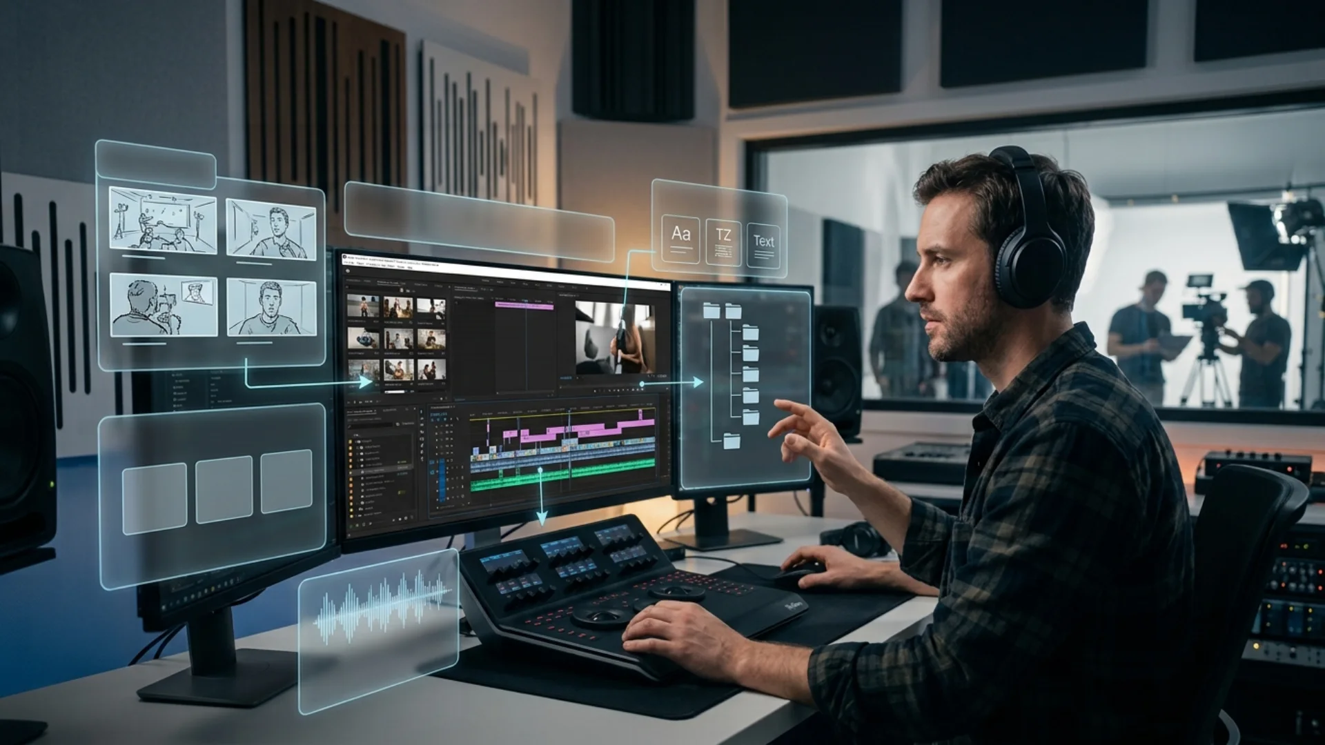
Color grading is an essential part of the post-production process, allowing filmmakers to enhance the mood, tone, and visual style of their projects. Whether you’re working on an independent film or a big-budget production, having the right tools and understanding how to use them effectively is crucial for achieving professional results.
Popular Color Grading Software
There are several color grading software options available, each catering to different skill levels and budgets. The most commonly used tools include:
- DaVinci Resolve: Widely regarded as one of the best color grading software programs, DaVinci Resolve offers a powerful suite of tools for both color correction and grading. Its advanced features allow for precise adjustments to color balance, contrast, saturation, and more. The free version also offers many high-quality features, making it accessible to beginners and professionals alike.
- Adobe Premiere Pro: While primarily a video editing software, Premiere Pro offers an extensive range of color grading features through its Lumetri Color panel. Premiere Pro is often favored for its seamless integration with other Adobe products, making it a great choice for editors who are already using tools like After Effects or Photoshop.
- Final Cut Pro: Apple’s professional video editing software comes with built-in color grading tools that are intuitive and user-friendly, especially for Mac users. With Final Cut Pro, filmmakers can adjust color balance, apply LUTs, and experiment with different looks to achieve the desired cinematic effect.
Beginner-Friendly Tips for Effective Color Grading
When starting out with color grading, it’s easy to feel overwhelmed by the range of options available. However, there are a few essential practices that can help ensure your results are polished and professional:
-
Start with a Consistent Color Palette
One of the first things to establish in your project is a consistent color palette. This serves as the foundation for the entire grading process. Choose your base colors thoughtfully—these can help unify the visuals across scenes, ensure visual harmony, and evoke the desired emotional tone. Consider the film’s theme and narrative when selecting your colors.
-
Use LUTs (Look-Up Tables) for Quick Adjustments
LUTs are pre-set color grading filters that can be applied to your footage to quickly transform the overall look. They can be especially helpful when you need to achieve a specific cinematic style or when working with footage from different cameras. LUTs can be a great time-saver, especially for beginners, as they allow you to apply professional-grade looks with just a few clicks. If you’re working with specific color spaces like Rec. 709, make sure to choose a LUT designed for that standard to ensure proper color grading.
-
Masking and Tracking for Precision
Once you’ve established a base grade, the next step is to fine-tune specific elements within the frame. Advanced techniques like masking and tracking allow you to make precise adjustments to certain areas of the image without affecting the rest of the frame. For example, if you want to brighten the skin tones of a character while keeping the background neutral, you can mask the character and apply the color correction selectively. Tracking, on the other hand, allows you to apply changes to moving subjects or objects, ensuring the grading remains consistent as they move across the screen.
Color Correction Techniques
While color grading focuses on enhancing the creative aspect of the footage, color correction is the process of fixing color imbalances and ensuring that your footage looks natural and consistent. This step is crucial for footage shot under different lighting conditions or from multiple cameras. The primary color correction techniques include adjusting white balance, exposure, and contrast.
Tools like DaVinci Resolve’s “Lift, Gamma, Gain” sliders or Premiere Pro’s “Basic Correction” panel can help correct these elements. Once you’ve corrected the footage to look true to life, you can proceed to creative grading to enhance the emotional and aesthetic impact of your scenes.
By mastering both color grading and color correction, filmmakers can elevate their projects, ensuring they have the right look and feel for each scene, while also maintaining a high level of professionalism and consistency across the entire film.
Common Mistakes to Avoid in Film Color Grading
What Are the Most Common Mistakes in Color Grading for Movies?
Color grading is a powerful tool that can drastically enhance the visual storytelling of a film. However, it’s easy to get carried away with all the available options, especially when you’re aiming for that cinematic look. To ensure your color grading enhances the narrative and doesn’t detract from it, here are some of the most common mistakes filmmakers should avoid:
1. Over-Saturating Colors, Leading to Unnatural Visuals
One of the most common errors in color grading is over-saturating the colors in your footage. While it can be tempting to pump up the saturation to make the visuals “pop,” too much saturation can result in an unrealistic, garish look. This can pull the audience out of the story, making the visuals feel disconnected from the narrative tone. The key is to find a balance where the colors feel vibrant and dynamic but still natural.
When using color grading to enhance mood, remember that mood enhancement through color is about supporting the atmosphere of the film. For example, a desaturated, muted palette may be more appropriate for a melancholic scene, while a brighter, more saturated palette could work for an action-packed sequence. Always consider how color choices align with the emotional direction of the story.
2. Ignoring the Narrative Purpose of Color Choices
Every color used in a film has a purpose—whether it’s to evoke a specific emotion, establish a setting, or convey a character’s state of mind. A common mistake is to treat color grading purely as an aesthetic decision without considering the narrative purpose. Colors should never be chosen arbitrarily. For instance, warmer tones might suggest comfort and intimacy, while cooler hues can create feelings of coldness or alienation.
The most successful color grading choices align with the story, enhancing the mood and deepening the viewer’s emotional connection to the narrative. This is where mood enhancement through color becomes essential, as color choices help tell the story without the need for words.
3. Failing to Maintain Consistency Across Scenes
Consistency is key when it comes to color grading. Failing to ensure that the color grade remains consistent across scenes can lead to a disjointed viewing experience. For instance, if the color temperature shifts drastically from one scene to another, the audience may notice it, and it can disrupt the immersion.
This is particularly important when working with multiple cameras or footage shot in different lighting conditions. Ensuring that the overall color grading style is uniform helps create a seamless flow and keeps the audience engaged without distractions. Using tools like DaVinci Resolve’s color match feature or Premiere Pro’s color wheels can help maintain consistency throughout the project.
Conclusion
Ready to experiment with color in your next project? Start by analyzing your favorite films and identifying how they use color to tell stories. Explore how different color schemes shape your perception of the narrative, and apply those insights to make your own work stand out.
Disclaimer : If you buy something through our links, we may earn an affiliate commission or have a sponsored relationship with the brand, at no cost to you. We recommend only products we genuinely like. Thank you so much.
Blog Label:
- Cinematic Color Techniques
- cinematic colors
- Color Contrast in Cinematography
- color film history
- Color grading
- color grading cinematography
- color in film
- color movies history
- Color Palette in Movies
- color psychology in film
- Emotional Impact of Colors
- film coloring
- filmmaking
- grading movies
- Guiding Viewer Attention with Color
- history of color movies
- history of colour in film
- Visual Storytelling with Color
- Warm vs Cool Colors in Film
- what's color grading


Write for us
Publish a Guest Post on Pixflow
Pixflow welcomes guest posts from brands, agencies, and fellow creators who want to contribute genuinely useful content.
Fill the Form ✏