Mastering Digital Color Grading: Techniques, Tools, and Tips for Stunning Visuals in 2025

Overview of Color Grading:
Color grading is the art and science of adjusting the color properties of an image or video to enhance its visual appeal, convey emotion, and create a specific aesthetic. In digital media, it’s the final touch that transforms good visuals into great ones. It’s what gives a film its unique “look,” makes a product video stand out, or helps photographers bring out the best in their shots. Whether you’re working on film color grading, video color grading, or even color grading in photography, understanding how to manipulate colors is essential for achieving stunning visuals.
What is Color Grading?
Definition
Color grading is the process of enhancing or altering the color properties of a video, image, or film to achieve a desired aesthetic or mood. Unlike color correction, which aims to fix issues such as exposure, white balance, and contrast, color grading focuses on the creative aspect—adjusting hues, saturation, and luminance to bring a scene to life or match a specific visual style. While color correction ensures that the image is technically correct, color grading is all about crafting the final look and feel of the footage.
In simpler terms, color grading is the “polishing” phase, where your visuals are given that cinematic, polished look, whether you’re working with film color grading or video color grading.
Importance in Visual Media
Color grading plays a pivotal role in visual media by enhancing storytelling and creating a compelling atmosphere. In film and video, colors can set the tone, evoke emotions, and influence how an audience perceives a scene. For example, warm tones may invoke feelings of comfort or nostalgia, while cooler hues can create a sense of unease or sadness.
In addition, color grading is essential for achieving visual consistency across different shots. A well-graded video or film ensures that all footage looks cohesive, even if it was shot in different locations or under varying lighting conditions. Whether it’s used for film color grading or video color grading, the technique helps maintain a polished, professional look, ensuring that the visuals align with the narrative or brand image. For photographers, color grading enhances the visual appeal of the images and allows for creative expression, bringing out the essence of each shot.
In short, color grading is a powerful tool that not only improves the aesthetics of your project but also aids in conveying the right mood and tone to your audience. Understanding color spaces is crucial for effective grading; read our blog post on Rec. 709 color space to learn more about this important standard for video production.
The Basics of Color Grading
Color Theory
At the heart of color grading lies color theory, which is essential for creating visually striking and harmonious compositions. In filmmaking and cinematography, color theory refers to how colors interact with each other and how they can influence mood and storytelling. Key concepts in color theory include:
- Primary Colors: Red, blue, and yellow. These colors form the basis for creating all other colors.
- Complementary Colors: Colors opposite each other on the color wheel, such as red and green or blue and orange. These pairs create dynamic contrast and can be used strategically in color grading to make visuals pop.
- Analogous Colors: Colors that sit next to each other on the color wheel, like blue, green, and teal. These combinations are harmonious and help to create a more cohesive and balanced visual experience.
- Warm vs. Cool Colors: Warm colors (reds, yellows, oranges) tend to evoke feelings of warmth, energy, and intensity, while cool colors (blues, greens, purples) can create a calming, subdued effect.
In color grading, filmmakers and video creators use these principles to direct the viewer’s emotional response and enhance the storytelling. For example, adding a teal tint to shadows while warming up highlights with orange can create a cinematic “teal and orange” look often seen in action films.
Tools and Software
Color grading requires specialized software designed to give you complete control over your footage’s visual elements. Here are some of the most popular color grading tools used by professionals:
- DaVinci Resolve: Known as one of the best video grading software, DaVinci Resolve offers an extensive set of features, including professional-grade color grading panels, and is suitable for both beginners and advanced users.
- Adobe Premiere Pro: A popular video editing software that also integrates powerful color grading tools. It allows for precise control over color balance, contrast, and saturation.
- Final Cut Pro X: Apple’s professional video editing software includes a range of built-in color grading features that are especially useful for users in the Apple ecosystem.
- Pixflow LUTs: A library of color LUTs to enhance your color grading workflow and give your footage a cinematic touch.
- Filmora: A more beginner-friendly option for video color grading, Filmora offers easy-to-use color correction and grading tools for those just starting out.
- Color Finale: A plugin for Final Cut Pro X that brings advanced color grading tools and professional features to the software.
For those looking for free video color grading software, options like HitFilm Express and Lightworks provide a robust set of tools that cater to both beginner and intermediate users.
Techniques
Now that you have a basic understanding of color theory and the tools available, let’s look at some fundamental color grading techniques that can dramatically improve your footage:
- Contrast Adjustment: Contrast is the difference between the light and dark areas of an image. By adjusting the contrast, you can add depth to your footage, making it feel more dynamic. Increasing contrast can also make colors more vibrant, while reducing it can create a more subtle, flat look.
- Color Balance: Color balance involves adjusting the overall color tone of your image to correct any color imbalances. The goal is to achieve a neutral, true-to-life look or a creative effect that suits the mood of your scene. The three primary channels—red, green, and blue—are adjusted to ensure the image looks natural or stylized in a desired direction.
- Saturation: Saturation refers to the intensity of colors. Increasing saturation makes the colors more vivid and vibrant, while reducing saturation can give the image a more muted, vintage, or even black-and-white feel. Saturation plays a big role in setting the mood and energy of your visuals.
- Shadows, Midtones, and Highlights: A crucial technique in how to color grade is manipulating these three tonal regions. Shadows can be deepened for drama, midtones can be adjusted to balance the scene, and highlights can be brightened to give the image a sense of realism or stylized brightness.
These fundamental techniques form the backbone of color grading tutorials and are essential in achieving professional-looking color grading examples. Mastering these elements will allow you to create more dynamic, polished, and visually consistent footage. If you’re working with different camera formats, it’s important to know the differences between footage types. Our guide on the Difference Between Raw, Log, and Rec. 709 Footage will help you understand these variations and how they impact grading.
Advanced Color Grading Techniques
Cinematic Look
Achieving a cinematic color grading involves several steps, from balancing contrast to applying stylized hues. A popular technique is using a teal and orange color scheme, where the shadows are tinted teal and the highlights are warmed with orange tones. This look is associated with blockbuster films and enhances visual appeal. Additionally, subtle film grain, slight desaturation, and adjusting the contrast for deeper blacks can help color grading to look like film, giving footage a classic, timeless quality. Film color grading focuses on creating a distinct atmosphere, often through tonal shifts and the deliberate use of specific colors.
Mood and Atmosphere
Colors have the power to influence emotions and set the tone of a scene. For instance, cooler tones (blues and greens) can evoke sadness, isolation, or tension, while warmer tones (reds, oranges, yellows) may create feelings of warmth, intimacy, or urgency. In color grading cinematography, you can shift these hues to match the desired narrative. For example, in a thriller, desaturated tones with cooler hues might enhance the suspense, while a romantic scene might benefit from soft, warm tones. Color grading photography follows similar principles, adjusting saturation and contrast to heighten the emotional impact.
Before and After Examples
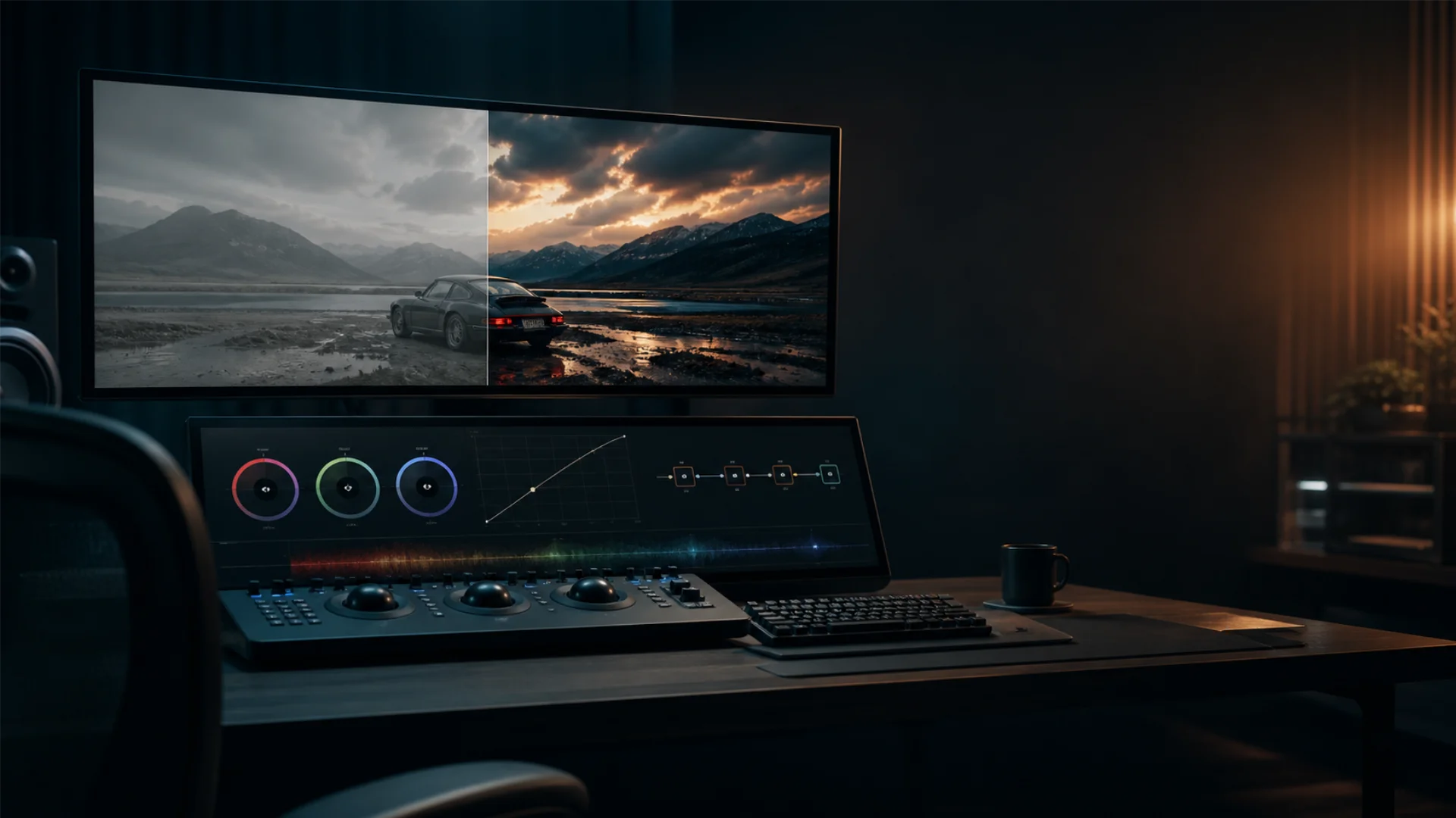
Seeing the transformation in action is key to understanding color grading before after results. In a colour grading example, a raw clip might have washed-out colors or inconsistent lighting. After grading, the image can have richer colors, better contrast, and a more polished look. Adjusting shadows, highlights, and midtones can significantly change the mood of the footage. These color grading samples show how subtle tweaks can make a dramatic difference, turning ordinary footage into something visually stunning.
Practical Applications
In Photography
Color grading in photography plays a significant role in transforming still images by enhancing the color palette and improving visual storytelling. While color grading photography shares some similarities with video grading, the primary difference is that photos are static, which allows for more intricate, detailed adjustments.
In photography, color grading can be used to correct tones, enhance mood, or even give an image a vintage or stylized look. For example, applying a warm filter can evoke nostalgia, while desaturating certain colors can create a moody, artistic feel. With tools like Adobe Lightroom or Capture One, photographers can adjust the hues, contrast, saturation, and shadows to give their images more depth and emotion. Grading pictures isn’t just about making colors pop; it’s about visually guiding the viewer’s attention and reinforcing the intended message of the photo.
In Video Editing
Video color grading takes on an even greater importance because it helps maintain visual consistency across multiple shots, especially when scenes are shot in different lighting conditions. In video editing software like Adobe Premiere Pro and DaVinci Resolve, color grading can significantly enhance the production quality of a project.
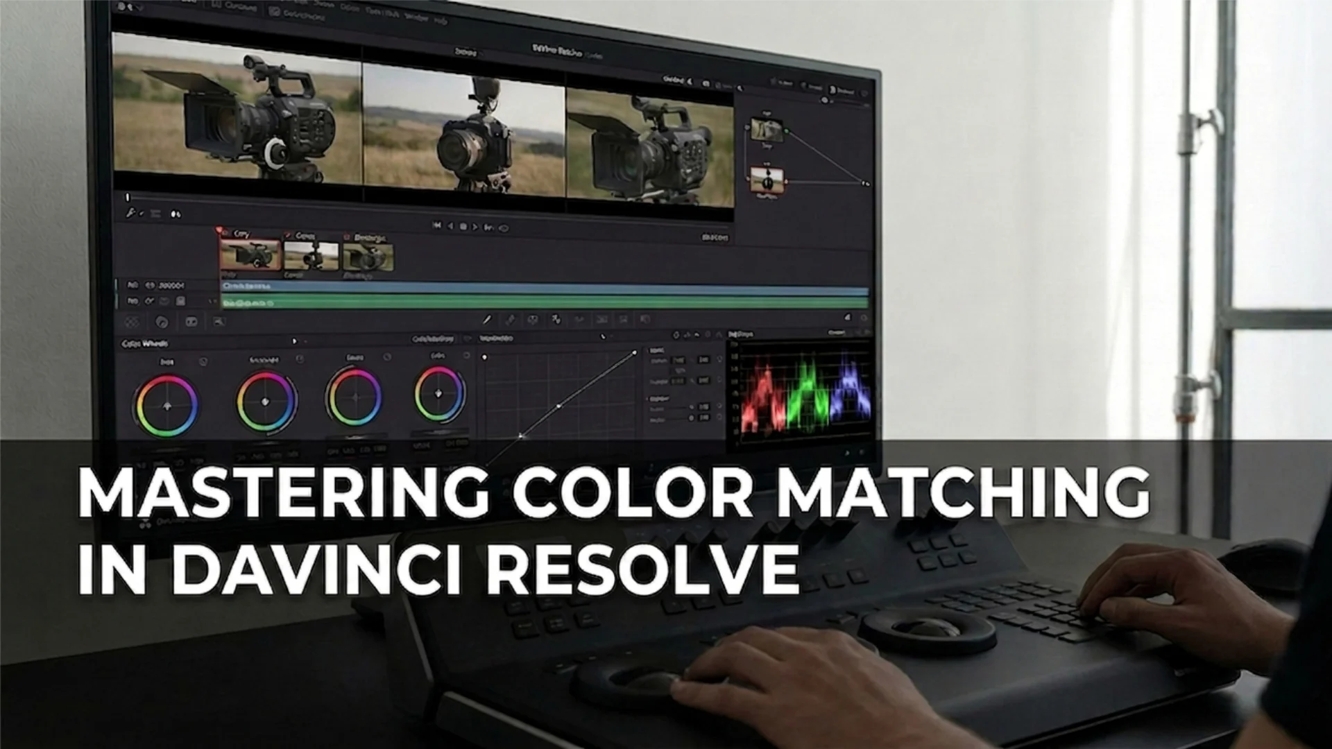
- In Da Vinci Resolve color grading, users can take advantage of advanced tools such as the color wheels, curves, and scopes, allowing for precise control over individual color channels and tonality. This software is often used for high-end professional color grading, offering everything from basic corrections to advanced color manipulation techniques.
- In Adobe Premiere Pro, users can easily apply color grading to multiple clips with features like the Lumetri Color panel, which provides access to powerful grading tools such as color wheels, basic corrections, and LUTs. These tools enable editors to adjust the overall mood of a scene, from creating vibrant, energetic colors to more muted, dramatic tones.
By mastering color grading in these tools, editors can take their footage from flat and unpolished to cinematic and professionally finished, ensuring that the video aligns with the desired visual style and storytelling approach.
Case Studies
Real-world film color grading can drastically impact the visual storytelling of a movie. Consider the film “Mad Max: Fury Road” – the intense, desaturated desert tones were expertly crafted using color grading, helping the film convey its gritty, dystopian setting. The filmmakers used color grading to separate different areas of the film visually, using warm tones for the scenes set in the desert and cooler tones for the more ominous, nighttime scenes, all of which enhanced the overall emotional impact of the film.
Another example is “The Revenant”, where movie color correction and color grading were key in delivering the film’s harsh, raw atmosphere. The natural light and earthy colors of the wilderness were carefully balanced with the film’s stark, cold lighting, emphasizing the brutal journey of the protagonist.
These case studies highlight the importance of understanding and applying color grading effectively in both photography and video. By taking a color grading course, you can learn how to manipulate colors to evoke the right emotions, ensure visual consistency, and elevate the overall production quality of your work.
Tips and Best Practices
Common Mistakes
When starting with color grading, beginners often make a few key mistakes that can hinder their progress. Understanding how color correction works is essential for establishing a strong foundation before diving into grading. One common mistake is treating color correction vs color grading as the same thing. Color correcting involves fixing exposure, white balance, and other technical issues, while color grading focuses on creating the artistic look and feel of the project. Skipping the correction stage can result in unnatural-looking footage that is difficult to grade effectively.
Another mistake is over-grading footage. While it’s tempting to apply strong color effects, overly intense grading can make footage look unnatural. Start with subtle adjustments and gradually enhance the colors to avoid a jarring result. Also, failing to use scopes (like RGB Parade or Histogram) can lead to inaccurate color balance and crushed blacks or blown-out highlights.
Color correcting meaning and color grading are both powerful tools, but they need to be used in the right order to achieve the best results. Take time to understand their differences and ensure you’re applying each step correctly.
Workflow Optimization
To get the best results with color grading, workflow optimization is key. Whether you’re working on a color grading class project or a professional video, having a streamlined process can save time and improve the quality of your work.
- Use LUTs (Look-Up Tables): Applying LUTs can save a lot of time when grading. Many software tools, including free video color grading software, come with built-in LUTs that can provide a good starting point. You can tweak these LUTs for your specific project, reducing the time spent on manual grading.
- Create a Consistent Color Pipeline: Establish a standard color grading workflow that works for you, and stick to it. This might include doing initial color correction, followed by applying secondary color grades. Having a consistent process for working with your footage will help you stay organized and avoid mistakes.
- Batch Processing: If you’re working on a project with multiple clips that require the same grade, batch processing is a huge time saver. You can apply the same color grading settings across multiple clips, ensuring consistency and reducing the need to repeat adjustments.
- Invest in Color Grading Software: While there are free options like DaVinci Resolve, investing in more advanced tools (especially in professional settings) can help improve efficiency and results. Consider enrolling in a color grading course to learn how to master your chosen software and get the most out of its features.
By following these best practices and avoiding common mistakes, you can significantly improve your color grading skills and ensure that your footage always looks its best.
Conclusion
Now that you have a solid foundation, it’s time to put these techniques into practice. Experiment with color grading in your own projects, whether it’s editing a photo or video. Try out different software and techniques, and see how small adjustments can transform your visuals. Share your experiences and results with us – we’d love to see your progress and help you further refine your skills.
Disclaimer : If you buy something through our links, we may earn an affiliate commission or have a sponsored relationship with the brand, at no cost to you. We recommend only products we genuinely like. Thank you so much.
Blog Label:
- Cinematic Color Techniques
- cinematic colors
- Color Contrast in Cinematography
- color film history
- Color grading
- color grading in video
- color grading meaning
- color grading photoshop
- color in film
- color movies history
- Color Palette in Movies
- color psychology in film
- Emotional Impact of Colors
- film color grading
- film coloring
- filmmaking
- grading movies
- Guiding Viewer Attention with Color
- history of color movies
- how to color grade
- video color grading
- Visual Storytelling with Color
- Warm vs Cool Colors in Film
- what is color grading
- what's color grading

Write for us
Publish a Guest Post on Pixflow
Pixflow welcomes guest posts from brands, agencies, and fellow creators who want to contribute genuinely useful content.
Fill the Form ✏

