The Green Color Scheme of The Matrix: Symbolism, Impact, and How It Was Created

The green hue, particularly the matrix green color, is deeply tied to the film’s depiction of a simulated world, echoing the digital landscapes of early computer monitors and coding interfaces. It sets a cold, artificial tone, immediately immersing the audience in the concept of a fabricated reality controlled by machines.
In this blog, we will explore the symbolism behind the green color scheme, the technical aspects of how it was achieved, and its lasting impact on pop culture and filmmaking.
The Symbolism of Green in The Matrix
A Connection to Technology and the Digital World
The green matrix code that rains down the screen is reminiscent of early monochrome computer displays, particularly those with green phosphor screens used in the 1980s and 90s. By giving the entire simulated world a green tint, the filmmakers emphasized that everything within the Matrix is part of a programmed illusion. The color subtly reminds the audience that what they see isn’t real—it’s simply lines of code forming a digital prison.
Illusion vs. Reality
In contrast to the matrix green tint within the simulated world, the real world—where humans struggle to survive outside the Matrix—has a colder, more desaturated look. This visual contrast reinforces the film’s central theme: the difference between perception and reality. Green represents the controlled, manipulated environment of the Matrix, while the real world lacks this artificial hue, emphasizing its authenticity.
A Subtle Sense of Oppression and Control
Green is not a traditionally warm or inviting color in film—it often carries an eerie, unnatural quality when used in excess. In The Matrix, this works to its advantage, creating a sense of unease and surveillance. The tint serves as a constant reminder that the characters are trapped in a fabricated reality, unknowingly monitored by the system that governs them.
The use of color in The Matrix set a precedent for future sci-fi films, influencing how digital realities and cyberpunk aesthetics are visually represented. If you’re interested in how color is manipulated in filmmaking, tools like our LUT packs help filmmakers explore striking color combinations and unconventional pairings.
How Was the Green Tint Achieved?
1. Color Grading and the Matrix Green Hex Code
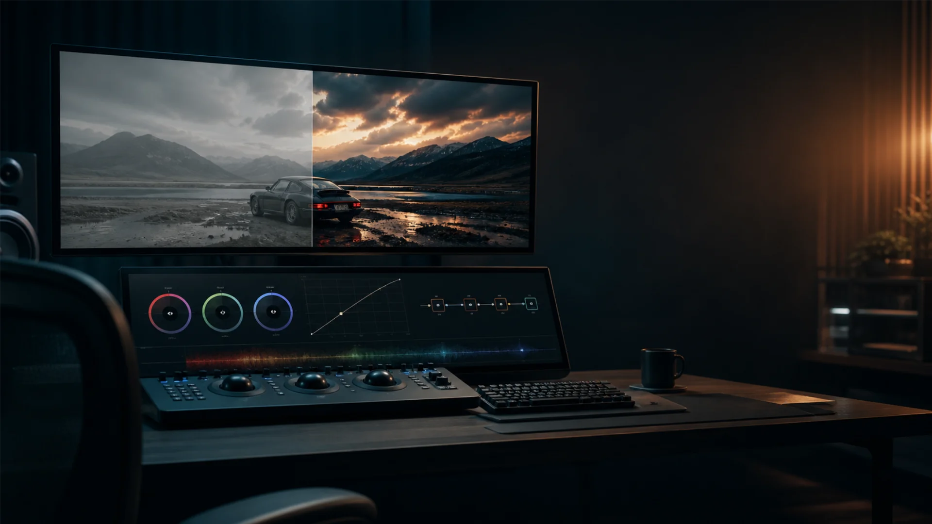
One of the most essential steps in achieving the matrix green look was color grading. In post-production, the filmmakers used techniques to manipulate the color balance of the footage, pushing the highlights and midtones toward green while desaturating other colors. This process helped remove warm tones, reinforcing the eerie, digital aesthetic.
The exact matrix green hex code isn’t officially defined, but a close approximation is #00FF00, which is the same bright green seen in early computer screens and digital text. However, the film’s tint is more muted, resembling shades of green closer to #1B4D3E or #2C6E49 when adjusted for cinematic depth.
2. Desaturation and the Dystopian Look
To make the green tint more pronounced, the filmmakers also desaturated the overall color palette. This technique helped strip away the richness of reds and blues, giving the world inside the Matrix a sterile, lifeless quality. This is a stark contrast to the real-world scenes outside the Matrix, which feature a cooler but more naturally balanced color scheme.
A similar color treatment is often used in dystopian films to evoke a sense of oppression. For example, movies like The Road and Children of Men employ desaturated tones to highlight bleakness. You can learn more about the differences between RAW, Log, and Rec. 709 color spaces here.
3. The Green Screen Matrix Effect
Beyond grading, some of the film’s most iconic visuals—such as the green matrix code—were created using green screen technology. This effect was achieved by layering digital elements over practical footage, allowing the filmmakers to integrate glowing symbols and digital distortions seamlessly. The use of green screen also helped create the illusion of Neo seeing the code of the Matrix, reinforcing the theme of breaking through digital illusions.
The green tint, combined with advanced post-production techniques, helped define The Matrix’s signature look, setting it apart from other sci-fi films of its time. If you’re interested in how modern filmmakers achieve similar effects, check out this deep dive into Rec. 709 color space, which explains how industry-standard grading techniques enhance cinematic storytelling.
The Iconic Green Code: Decoding Its Meaning
1. What Does the Green Code Represent?
The green matrix code is essentially the visual representation of the simulated world within The Matrix. Just as lines of programming create a functional software environment, the characters in the film exist within a virtual construct generated by machines. The glowing code is a reminder that nothing inside the Matrix is real—it is simply a program running in the background.
Interestingly, the symbols used in the code were inspired by Japanese katakana characters, mirrored and arranged into cryptic sequences. This subtle design choice adds to the cyberpunk aesthetic of the film, reinforcing its futuristic and digital themes.
2. How the Green Code Became a Cultural Symbol
Since the release of The Matrix, the green digital rain has become an iconic representation of hacking, virtual worlds, and cyberpunk aesthetics. The imagery has been widely referenced in pop culture, appearing in everything from tech branding to memes.
Even outside of the film industry, the matrix green code is frequently used in visual effects, especially in projects that reference artificial intelligence, digital landscapes, or futuristic themes. Video games, marketing campaigns, and even modern-day coding tutorials often use this color scheme to evoke a sense of digital mystery.
The way The Matrix used color coding to reinforce its themes of illusion and control remains one of the most influential aspects of its design. If you want to experiment with this effect, check out our tutorial video on it below.
Comparison with the Color Palettes of Other Films
1. The Matrix vs. Blade Runner: Green vs. Blue/Orange
Ridley Scott’s Blade Runner (1982) and Blade Runner 2049 (2017) are prime examples of films that use a highly stylized color palette to reinforce their themes. Unlike The Matrix, which leans heavily into green to represent artificiality, Blade Runner makes use of a blue and orange contrast. The neon blues of the cityscape emphasize a futuristic, cold, and tech-driven world, while the warm orange hues provide contrast to human elements like fire, sunset, and the desert wasteland.
In contrast, The Matrix’s choice of green creates a sense of digital entrapment, reinforcing the idea that its world is entirely computer-generated. The green hue feels sickly and unnatural, enhancing the audience’s awareness that something is “off” about the world Neo inhabits.
2. Desaturated Dystopias: The Matrix vs. Mad Max: Fury Road
Another notable example of color manipulation in film is Mad Max: Fury Road (2015), which embraces a high-contrast orange and teal palette. Unlike the desaturated look of The Matrix, Mad Max features heavily saturated desert landscapes, where scorching oranges and deep blues create a visually striking dystopian world. The intense contrast in Mad Max makes the environment feel harsh and extreme, while The Matrix uses desaturation to convey a bleak, artificial reality.
3. Sin City’s Black-and-White with Splashes of Color
Another film that uses color to striking effect is Sin City (2005). Unlike The Matrix, which commits fully to its matrix green tint, Sin City is primarily black-and-white, with selective use of red, yellow, and blue to highlight specific characters or objects. This technique draws from classic film noir while modernizing it for a graphic novel aesthetic.
The main difference between The Matrix and Sin City is their approach: while Sin City removes most color for stylistic contrast, The Matrix immerses the viewer in a single dominant hue to reinforce its world-building. Both techniques are effective, proving that color is one of the most powerful tools in cinematic storytelling.
4. The Matrix vs. Wicked: Two Faces of Green
Few films lean into green as boldly as The Matrix and Wicked (2024), yet the color carries an entirely different weight in each. In The Matrix, green is a world-level device—a digital tint that blankets every frame inside the simulation, signaling artificiality and machine control. It is cold, pervasive, and inescapable, turning the environment itself into a symbol of entrapment.
Wicked flips this logic. Green is a character-level device, concentrated almost entirely on Elphaba. Her emerald skin marks her as an outsider from birth—a visible sign of otherness that invites prejudice long before she becomes the so-called “Wicked Witch.” Rather than coating an entire world, green isolates a single person within it. The film’s color palette reinforces this through a deliberate green-pink contrast: Elphaba’s cool green tones clash against Glinda’s warm pinks, mapping the tension between social exclusion and popularity directly onto color.
What makes the comparison especially compelling is how each film inherits and reinterprets green’s cultural baggage. The Matrix draws on the legacy of monochrome computer monitors—green as the language of machines. Wicked draws on The Wizard of Oz (1939), where green meant villainy, and reverses it: the green character is not evil but misunderstood, and the color grading is carefully tuned to make her skin feel sympathetic rather than menacing. In both cases, the filmmakers bet that a single dominant hue could carry an entire thematic argument—and in both cases, the bet paid off.
Technical Insights on Tools and Techniques
1. Software Used for Color Grading
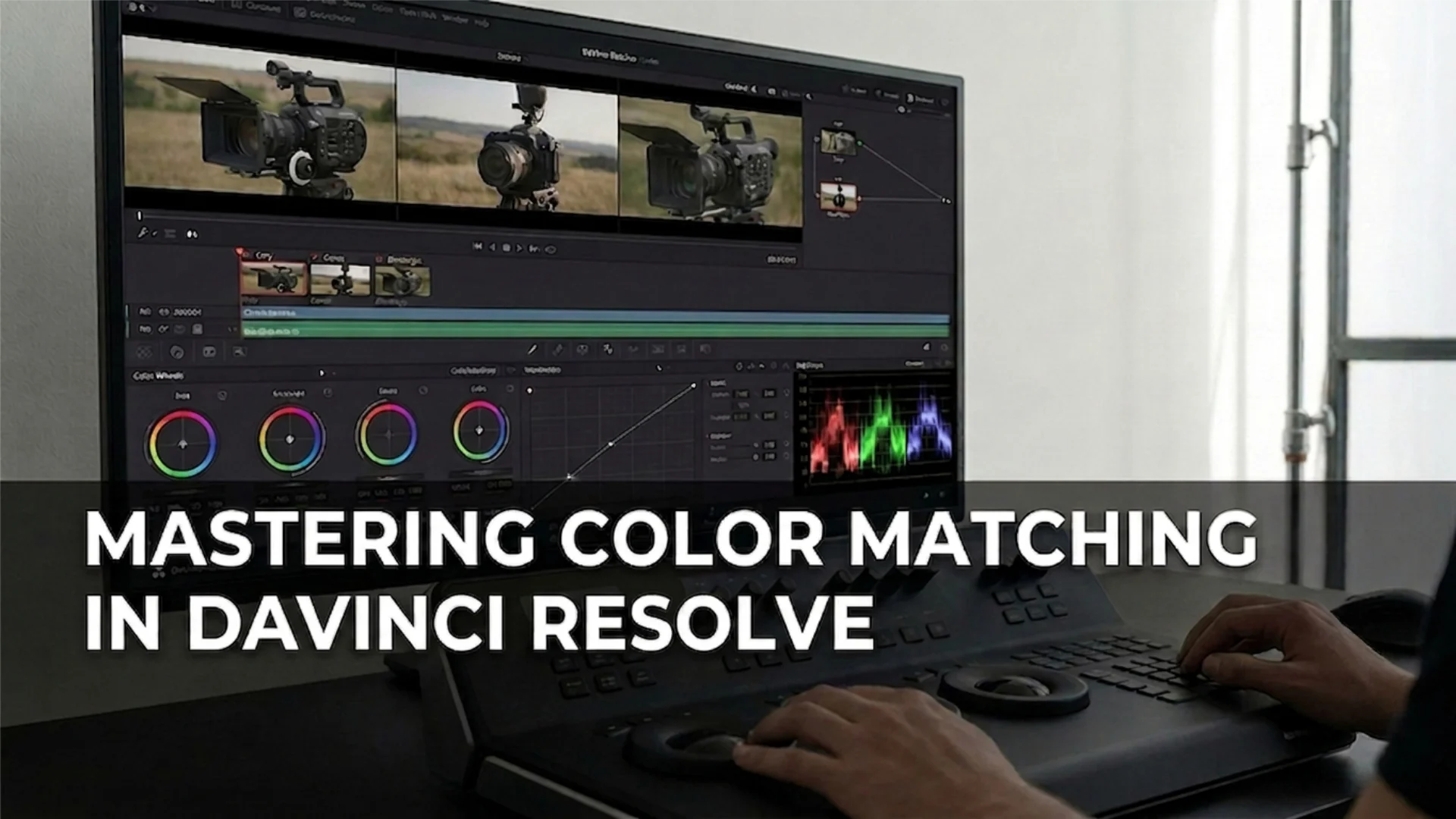
The color grading process for The Matrix was carried out in post-production using techniques that are still used today in professional filmmaking. Some of the industry-standard software tools for color grading include:
- DaVinci Resolve – One of the most powerful color grading tools, used for high-end film production. It allows for precise adjustments to color balance, contrast, and saturation.
- Adobe Premiere Pro & After Effects – Frequently used for color correction and visual effects, these tools help filmmakers achieve specific color aesthetics.
- Final Cut Pro – Often used in Hollywood and independent productions for its intuitive color grading features.
These tools enable filmmakers to manipulate color temperature, apply LUTs (Look-Up Tables), and fine-tune their visual storytelling.
2. Understanding the Matrix Color Graphics and Tint
The matrix tint was achieved by shifting the entire color spectrum toward green while desaturating other hues. This was done using a color correction matrix, a technique where specific colors are emphasized while others are subdued.
To break it down:
- The midtones and highlights were adjusted to lean toward green.
- Skin tones and reds were subtly desaturated to remove warmth.
- The overall contrast was increased, making the shadows deeper and the green more prominent.
This technique made the simulated world inside the Matrix feel artificially tinted, reinforcing the illusion of a machine-created environment.
3. The Role of Lighting in the Green Aesthetic
Beyond post-production, lighting played a crucial role in creating the matrix green look. The filmmakers used green filters on lights and carefully controlled the environment to ensure that green was the dominant hue even before color grading was applied.
- Practical lighting: Some scenes used real green-tinted lighting, especially in indoor environments, to make the green tones feel more natural.
- Gel filters: Colored gels were placed over lights to ensure a subtle green hue was present even before post-production adjustments.
- Digital enhancements: The green hue was intensified in post-production through digital color grading, reinforcing the film’s cyberpunk aesthetic.
These techniques combined to create one of the most recognizable visual identities in film history, proving that color is just as crucial to storytelling as dialogue and cinematography.
Cultural Impact and Legacy
1. Influence on Sci-Fi and Cyberpunk Aesthetics
Following the release of The Matrix, many sci-fi films and TV series adopted similar color grading techniques to create futuristic or dystopian settings. Movies like Equilibrium (2002) and Tron: Legacy (2010) incorporated digital-inspired color palettes, while cyberpunk media often reference the matrix green aesthetic.
Even modern color grading tools now include “Matrix-style” presets, allowing filmmakers to replicate the green-hued dystopian look. If you’re interested in experimenting with color grading, our LUT library has many movie-inspired color presets for you.
2. Memes, Parodies, and Pop Culture References
The green matrix code has been endlessly referenced, from tech-related memes to movie parodies. Even in non-sci-fi contexts, a green overlay on an image is often enough to evoke the concept of simulation, hacking, or digital control.
3. Impact on Future Matrix Films
The success of the original Matrix trilogy cemented the green aesthetic as a defining feature of the franchise. However, The Matrix Resurrections (2021) notably deviated from the traditional matrix green tint, opting for a more natural and vibrant color palette. This change reflected the new themes of the film while distinguishing it from its predecessors.
Despite these changes, the green matrix code remains an enduring symbol of digital reality, continuing to inspire filmmakers, designers, and digital artists.
Conclusion
This green aesthetic has since become one of the most recognizable in film history, influencing sci-fi and cyberpunk visuals for decades. Whether through its use in pop culture, film theory discussions, or modern digital art, The Matrix’s iconic color scheme continues to leave its mark.
Disclaimer : If you buy something through our links, we may earn an affiliate commission or have a sponsored relationship with the brand, at no cost to you. We recommend only products we genuinely like. Thank you so much.
Blog Label:
- analysis of the matrix
- Cinematic color palettes
- cinematic colors
- Color grading
- color in film
- color in film symbolism
- color meaning in film
- color psychology in film
- color storytelling
- Color theory in film
- color transitions in film
- colors in filmmaking
- digital rain
- film color meaning
- film coloring
- filmmaking
- green matrix code
- green screen matrix effect
- matrix color
- matrix green
- matrix green code
- matrix green hex code
- movie color
- Psychology of color in film

Write for us
Publish a Guest Post on Pixflow
Pixflow welcomes guest posts from brands, agencies, and fellow creators who want to contribute genuinely useful content.
Fill the Form ✏

