The Ultimate Guide to Wes Anderson’s Color Palette: Iconic Hues, Film Breakdowns & Creative Inspiration

His signature color technique involves carefully curated hues, pastels, and bold contrasts that transport viewers into visually immersive worlds. Whether it’s the warm yellows of Moonrise Kingdom or the vibrant pinks of The Grand Budapest Hotel, Anderson’s use of color is more than just a stylistic choice; it’s an integral part of his storytelling.
In this guide, we’ll explore the Wes Anderson color palette, break down the colors of his most iconic films, and provide insights into how you can draw inspiration from his unique approach to color grading in filmmaking.
Check out these color LUTs collections to transform your color grading.
The Signature Wes Anderson Color Palette
Key Elements of the Wes Anderson Color Palette
- Pastel and Muted Tones – Anderson favors soft pinks, pale yellows, and light blues that give his films a vintage, dreamlike quality.
- Bold Accents – Bright reds, deep blues, and earthy greens punctuate scenes, creating contrast and visual balance.
- Warm and Cool Pairings – His films often balance warm yellows and reds with cooler blues and greens to create a harmonious yet striking aesthetic.
Let’s break down the Wes Anderson color palettes from two of his most iconic films.
Moonrise Kingdom Color Palette
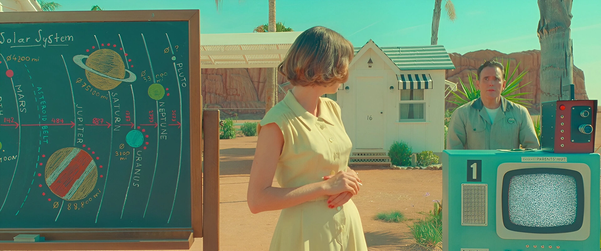
The Moonrise Kingdom color palette is characterized by warm, nostalgic hues that reflect the film’s coming-of-age story. Dominated by golden yellows, forest greens, and soft browns, the color scheme enhances the film’s retro summer camp aesthetic.
Key Colors:
- Wes Anderson Yellow (#FFC857) – Represents warmth, youth, and adventure.
- Muted Olive Green (#6B8E23) – Evokes nature and the outdoor setting.
- Soft Brown (#A67B5B) – Adds a rustic, vintage feel.
The Grand Budapest Hotel Color Palette
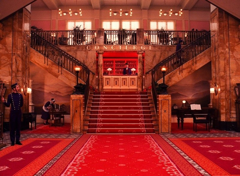
Perhaps Anderson’s most striking film visually, The Grand Budapest Hotel color palette is a perfect example of his love for pastel hues and contrasting tones. The film’s signature cotton-candy pink, deep purples, and rich reds create a storybook-like atmosphere.
Key Colors:
- Grand Budapest Pink (#F4A8B9) – Defines the hotel’s exterior and symbolizes elegance.
- Regal Purple (#8B5FBF) – Adds a sense of sophistication and mystery.
- Warm Red (#D9381E) – A bold contrast that enhances drama and intensity.
Anderson’s ability to pair precise colors with emotions and themes is what makes his visual storytelling so compelling. For filmmakers and designers seeking to emulate his look, using Wes Anderson color palette hex codes can be a great starting point.
Need to perfect your own color grading? Explore this collection of LUTs for cinematic color presets inspired by great filmmakers, including Wes Anderson. You can apply these LUTs in Adobe After Effects and Premiere Pro for a fast Wes Anderson inspired look.
How Color Grading Enhances Wes Anderson’s Films
The Role of Color Grading in Anderson’s Films
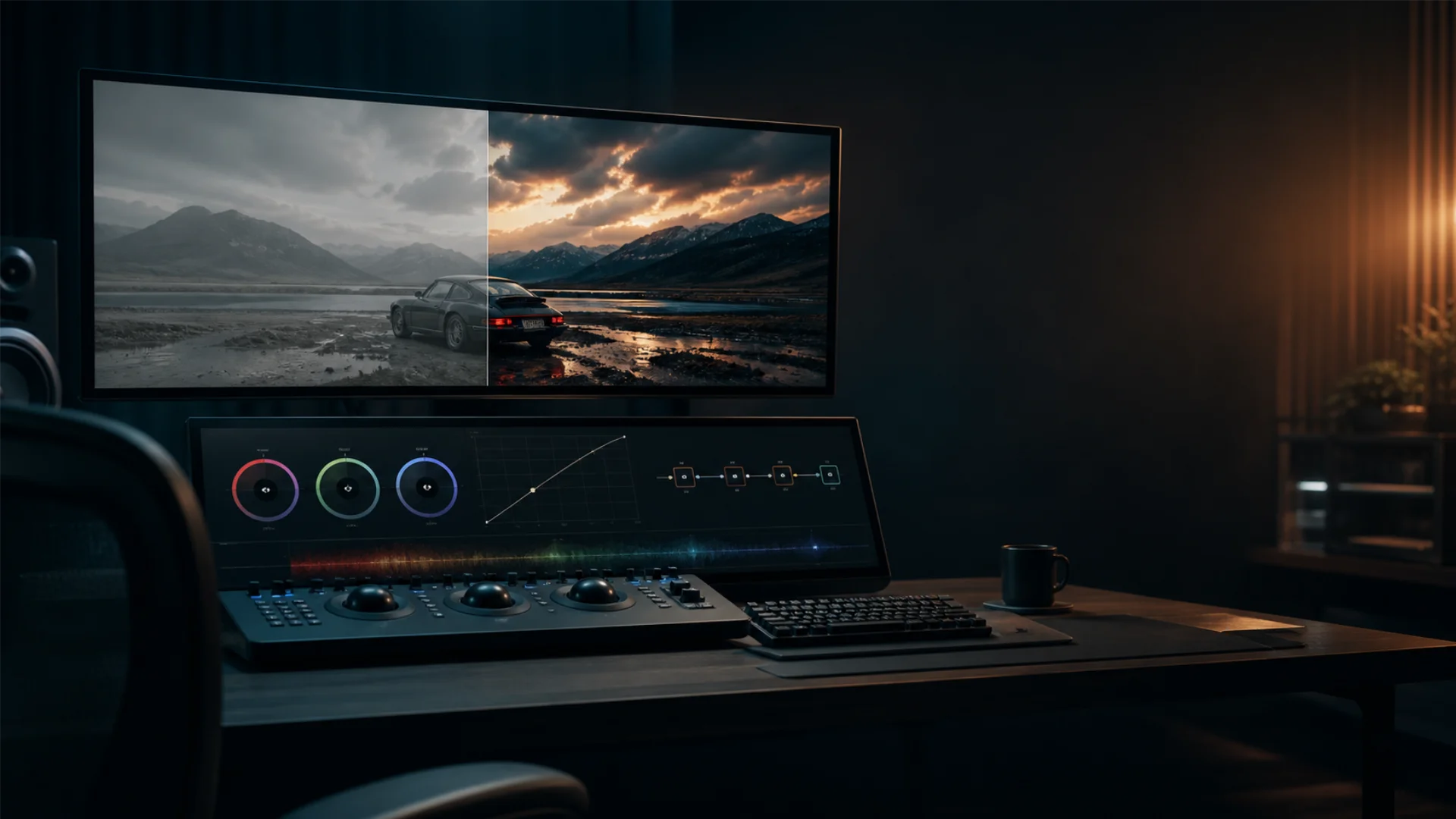
Color grading is the process of adjusting colors in post-production to achieve a specific look and feel. Tools like Adobe Premiere Pro and After Effects give you precise control over these hues. In Wes Anderson color grading, every scene is carefully calibrated to maintain a consistent visual theme that enhances the narrative.
How It Affects His Films:
- Mood & Emotion – Warm yellows in Moonrise Kingdom evoke nostalgia and youthful adventure, while the pastel pinks in The Grand Budapest Hotel create a whimsical, fairytale-like atmosphere.
- Visual Consistency – His films maintain a uniform color temperature, ensuring that each frame feels like part of a carefully designed painting.
- Enhanced Storytelling – Anderson uses color grading to emphasize themes—muted palettes in The Royal Tenenbaums reflect melancholy, while the bright saturation in The French Dispatch enhances its storybook-like aesthetic.
Tips for Filmmakers Inspired by Wes Anderson’s Color Grading
- Choose a Dominant Color Palette – Decide on a set of hues that define your film’s mood. Anderson often sticks to 3-5 key colors per movie.
- Maintain Color Harmony – Use complementary colors that balance each other without overwhelming the scene.
- Use LUTs for Consistency – Color Lookup Tables (LUTs) help standardize grading across different shots. Try these cinematic LUTs to experiment with color grading like Anderson.
- Control Saturation – Anderson avoids harsh contrast by keeping saturation levels controlled, ensuring a vintage, film-like softness.
- Think About Storytelling – Let color grading reflect the emotions and themes of your film. Bright, warm tones for optimism; cooler, muted hues for melancholy.
Most of these techniques are easy to test in Adobe Premiere Pro using Lumetri Color and LUTs. For a deeper dive into how raw footage transforms into Anderson’s signature look, check out this guide on RAW, Log, and Rec. 709 footage to understand the foundation of color grading.
Detailed Breakdown of Wes Anderson’s Color Palettes
Moonrise Kingdom: A Nostalgic and Warm Adventure
Primary Colors: Warm yellows, earthy greens, muted browns
The Moonrise Kingdom color palette perfectly captures the film’s nostalgic summer-camp setting and youthful adventure. Anderson uses golden yellows to evoke warmth and innocence, while earthy greens and soft browns reflect the natural, outdoor landscape. The entire film feels like a faded postcard, reinforcing its coming-of-age themes.
Key Colors:
- Wes Anderson Yellow (#FFC857) – Symbolizes youthful optimism and summer warmth.
- Olive Green (#6B8E23) – Reflects nature and adventure.
- Soft Beige (#D9B382) – Enhances the vintage aesthetic.
The use of warm, nostalgic hues makes Moonrise Kingdom feel like stepping into a childhood memory, making it one of Anderson’s most visually sentimental films.
The Grand Budapest Hotel: A Playful, Pastel Fairytale
Primary Colors: Soft pinks, deep purples, rich reds
The Grand Budapest Hotel color palette is arguably Anderson’s most recognizable, featuring an exquisite mix of cotton-candy pinks, regal purples, and deep reds. These colors create a storybook-like aesthetic that blends luxury with mystery. The pastel-dominated design of the Grand Budapest Hotel itself serves as a visual anchor, making the film feel like a whimsical European fable.
Key Colors:
- Grand Budapest Pink (#F4A8B9) – Represents elegance and charm.
- Royal Purple (#8B5FBF) – Adds sophistication and mystery.
- Deep Red (#D9381E) – Introduces contrast and drama.
By carefully balancing soft pastels with bold accent colors, The Grand Budapest Hotel achieves a playful yet sophisticated visual identity.
Fantastic Mr. Fox: Earthy, Autumnal Hues
Primary Colors: Warm oranges, deep browns, golden yellows
The Fantastic Mr. Fox color palette is distinctly earthy and autumnal, mirroring the film’s woodland setting and stop-motion animation style. Unlike Anderson’s other films, which often feature pastels, Fantastic Mr. Fox embraces rich oranges, burnt sienna, and deep browns to emphasize warmth, nature, and nostalgia. The color grading gives the film a handcrafted, organic feel, enhancing its tactile stop-motion aesthetic.
Key Colors:
- Fox Orange (#E27D60) – Represents the main character’s fur and warmth.
- Burnt Sienna (#CC5500) – Creates an earthy, cozy atmosphere.
- Golden Wheat (#E3B448) – Highlights the film’s autumnal feel.
This warm, textured color scheme makes Fantastic Mr. Fox feel like a children’s storybook come to life.
How These Color Palettes Define Anderson’s Style
Across all of his films, Wes Anderson’s movie color palette remains a defining element of his storytelling. Whether it’s the vintage yellows of Moonrise Kingdom, the whimsical pinks of The Grand Budapest Hotel, or the earthy oranges of Fantastic Mr. Fox, his color choices create cinematic worlds that feel timeless and immersive.
Why Colors Matter in Storytelling
How Wes Anderson Uses Color to Convey Emotion
Each color choice in Anderson’s films helps evoke specific feelings:
- Warm Yellows & Golds (Moonrise Kingdom) – Nostalgia, adventure, and youthful optimism.
- Soft Pinks & Pastels (The Grand Budapest Hotel) – Whimsy, innocence, and charm.
- Earthy Oranges & Deep Browns (Fantastic Mr. Fox) – Warmth, nature, and rustic charm.
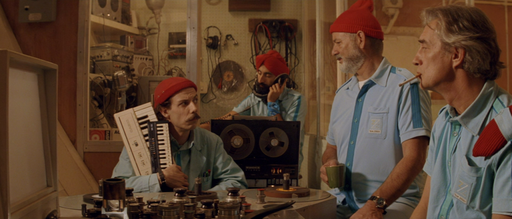
- Muted Blues & Greys (The Royal Tenenbaums) – Melancholy, nostalgia, and dysfunction.
By assigning distinct colors to different characters and settings, Anderson subtly guides the audience’s emotional responses without relying on dialogue.
Themes & Symbolism in His Color Choices
Beyond emotion, Anderson’s use of color reinforces deeper themes in his films:
- Isolation & Nostalgia – The Life Aquatic with Steve Zissou features faded blues and desaturated tones, mirroring Zissou’s loneliness and longing for past glory.
- Childhood vs. Adulthood – The Moonrise Kingdom color palette contrasts vibrant golden yellows (childhood freedom) with muted greens and browns (adult responsibility).
- Power & Corruption – The Grand Budapest Hotel uses pinks and purples for elegance but contrasts them with dark, muted colors in authoritarian scenes, symbolizing the loss of beauty to fascism.
Controversies & Debates: The Aesthetic vs. The Criticism
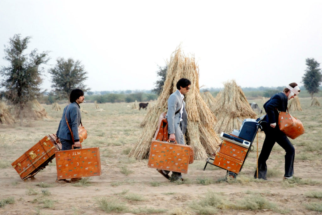
While Anderson’s visual style is widely admired, some critics have questioned whether his meticulous color choices contribute to a form of artificial storytelling that prioritizes aesthetics over substance. Others have raised discussions around Wes Anderson and racism, pointing out that his films are often centered on white protagonists and sometimes exoticize non-Western cultures (The Darjeeling Limited being a notable example).
However, supporters argue that his films exist in a stylized, heightened reality, and that his approach to color and world-building is meant to be symbolic rather than literal.
The Bigger Picture: Why Color Matters in Filmmaking
Wes Anderson’s use of color serves as a lesson for filmmakers on the importance of visual storytelling:
- Color Guides Emotion – The right palette can make an audience feel nostalgia, tension, or joy without a single line of dialogue.
- Symbolism Strengthens Storytelling – Assigning colors to themes and characters adds depth to the narrative.
- Visual Consistency Creates Identity – A distinct color scheme makes a film instantly recognizable (as seen in Anderson’s work).
By understanding and applying these principles, filmmakers can use color as a powerful storytelling tool, much like Anderson does in his meticulously crafted worlds.
Practical Applications for Decorating with Wes Anderson Colors
Home Design: Wes Anderson-Inspired Decor
To bring Wes Anderson decor into your living space, focus on:
- Pastel Walls & Bold Accents – Think soft pinks (The Grand Budapest Hotel), mustard yellows (Moonrise Kingdom), and teal blues (The Life Aquatic).
- Vintage & Mid-Century Modern Furniture – Anderson’s films feature classic, nostalgic pieces with clean lines and unique textures.
- Symmetry & Whimsical Details – His sets are famous for their perfectly balanced compositions; consider arranging furniture symmetrically for a similar effect.
- Art Deco & Retro-Inspired Accessories – Add framed artwork, old-fashioned telephones, and quirky lamps for an authentic touch.
Fashion: Dressing in a Wes Anderson Palette
If you love Anderson’s aesthetic, try incorporating his color schemes into your wardrobe:
- Muted pastels & earthy tones – Soft yellow cardigans, dusty pink skirts, and burnt orange coats echo his movie palettes.
- Classic, timeless silhouettes – A-line skirts, tailored blazers, and vintage dresses reflect the nostalgic fashion of his characters.
- Quirky statement pieces – Think of Margot Tenenbaum’s fur coat (The Royal Tenenbaums) or Suzy Bishop’s pink collared dress (Moonrise Kingdom).
Designing with Wes Anderson Colors
For artists and designers, Anderson’s color grading techniques can be a source of inspiration:
- Use online tools like this LUTs collection to apply Wes Anderson-style color grading to photos and videos.
- Create your own palette using Wes Anderson color palette hex codes, available from various design resources.
- Experiment with film editing software to mimic his iconic look in your own video projects.
Bringing the Wes Anderson Theme into Your Life
From interiors to fashion to digital design, Wes Anderson’s color theory can be applied in creative and unexpected ways. Whether you’re a filmmaker, a decorator, or someone who simply loves vintage aesthetics, his cinematic palettes offer endless possibilities for unique and artistic self-expression.
Comparisons to Other Filmmakers: How Wes Anderson’s Color Palette Stands Out
Wes Anderson vs. Other Filmmakers with Iconic Color Styles
Stanley Kubrick is famous for his use of intense reds, deep blues, and stark contrasts, as seen in The Shining and A Clockwork Orange. His approach is much darker and more psychological compared to Anderson’s whimsical, nostalgic aesthetic.
Guillermo del Toro leans into rich, gothic tones with warm and cool contrasts, creating visually striking films like Crimson Peak and Pan’s Labyrinth. Unlike Anderson, del Toro’s use of color often conveys horror and fantasy rather than playful storytelling.
Denis Villeneuve prefers moody, desaturated sci-fi palettes with deep shadows, as seen in Blade Runner 2049 and Dune. His work is visually stunning but leans towards realism and minimalism, contrasting Anderson’s intricate and theatrical color choices.
Christopher Nolan’s films are known for high-contrast, desaturated realism, particularly in Interstellar and Inception. The Interstellar color palette is dominated by cold blues and greys, emphasizing a sense of isolation, while Anderson’s palettes focus on warmth and harmony.
Baz Luhrmann, in contrast, embraces vibrant hues and over-the-top theatrical compositions in films like Moulin Rouge! and The Great Gatsby. His energetic use of color shares some similarities with Anderson’s playfulness but is far more extravagant and saturated.
Films Like Moonrise Kingdom: Similar Aesthetic & Color Inspiration
If you love the Moonrise Kingdom color palette, with its warm yellows, faded blues, and nostalgic tones, here are some visually similar films to Moonrise Kingdom:
- The Florida Project (2017) – A dreamlike childhood story set against pastel-colored motels.
- Amélie (2001) – A whimsical film with a carefully crafted red-and-green palette.
- Little Miss Sunshine (2006) – Uses warm yellows and earthy tones to tell a heartfelt family story.
- Submarine (2010) – A coming-of-age story with a muted yet artistic color scheme.
- Paddington 2 (2017) – A playful and visually rich film with symmetry and a bright, inviting palette.
These films share Anderson’s love for color-driven storytelling, symmetry, and nostalgic visuals, making them perfect recommendations for fans of his work.
Conclusion
Whether you’re a filmmaker, designer, or simply an admirer of his work, experimenting with Wes Anderson’s color techniques can bring a new dimension to your creative projects. Don’t be afraid to explore the signature hues and symmetrical compositions that define his aesthetic, and use them to express your own stories.
If you are turning your Wes Anderson-inspired project into a video essay or breakdown, a clean voiceover makes a huge difference, and you can generate a professional one from your script with ElevenLabs.
Disclaimer : If you buy something through our links, we may earn an affiliate commission or have a sponsored relationship with the brand, at no cost to you. We recommend only products we genuinely like. Thank you so much.
Blog Label:
- Cinematic Color Techniques
- cinematic colors
- Color Contrast in Cinematography
- color film history
- color grading cinematography
- color grading in wes anderson films
- color in film
- color movies history
- Color Palette in Movies
- color psychology in film
- Emotional Impact of Colors
- film coloring
- filmmaking
- films like moonrise kingdom
- grand budapest hotel color palette
- moonrise kingdom color palette
- wes anderson color
- wes anderson color grading
- wes anderson color palette
- wes anderson decor
- wes anderson theme

Write for us
Publish a Guest Post on Pixflow
Pixflow welcomes guest posts from brands, agencies, and fellow creators who want to contribute genuinely useful content.
Fill the Form ✏