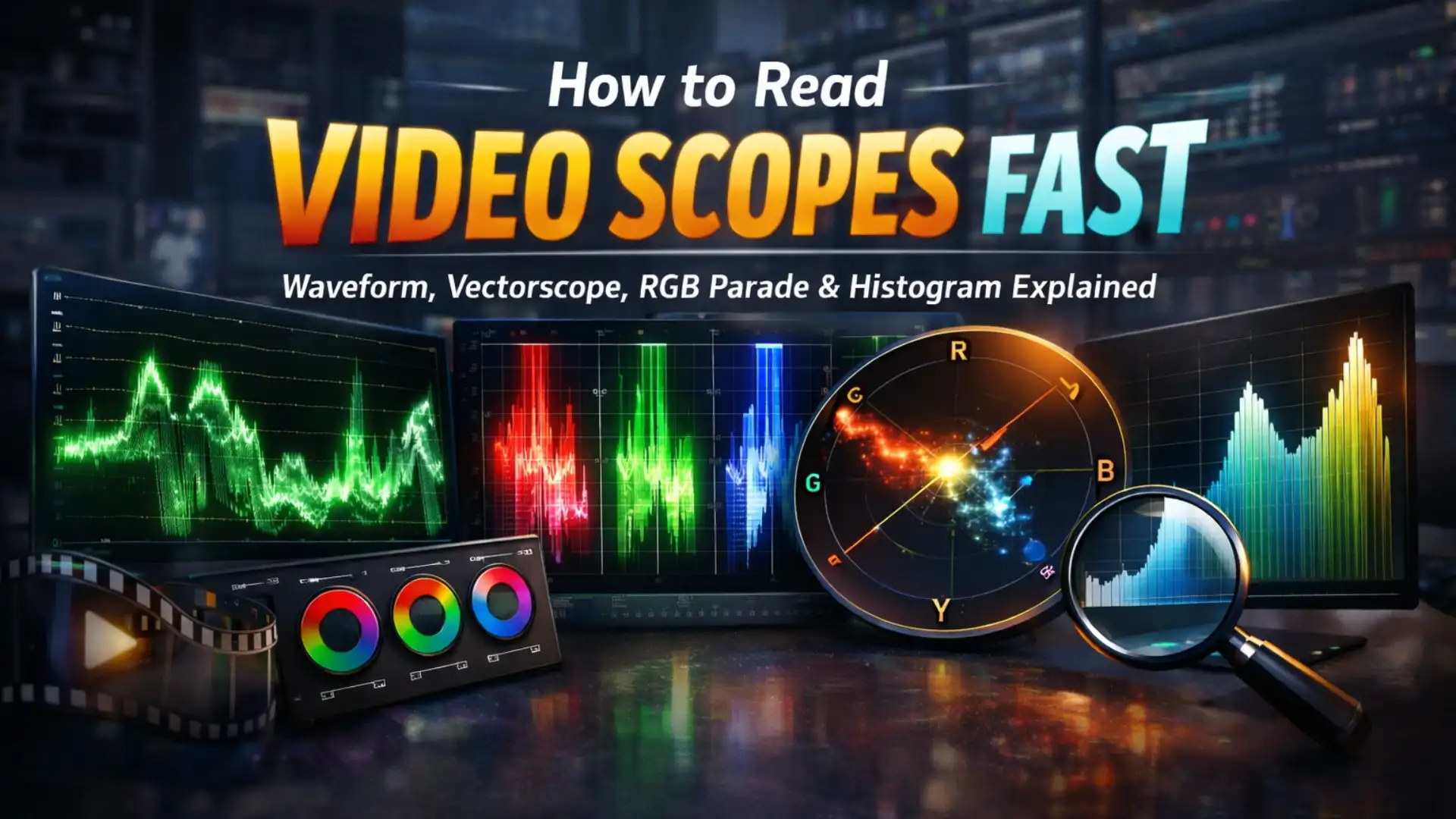
How to Read Video Scopes Fast: Waveform, Vectorscope, RGB Parade and Histogram Explained
- What Are Video Scopes
- The Waveform Monitor - Your Exposure Truth Detector
- The RGB Parade - Color Balance Made Visual
- The Vectorscope - Your Color Compass
- The Histogram - The Big Picture View
- How to Open Video Scopes in Your NLE
- Cheat Sheet - Read Any Scope in Seconds
- 5 Common Scope-Reading Mistakes
- Real-World Scope Workflows for Color Correction
- Waveform vs Vectorscope vs Parade vs Histogram
- Conclusion
(Sound familiar?)
Here is the thing: your eyes adapt to whatever is on screen. Your monitor might not be calibrated. And that overhead office light is silently shifting how you perceive every color in the frame. None of these factors care about your creative intent.
But video scopes do. Scopes never lie, never adapt, never get tired. They give you an objective, mathematical readout of exactly what is happening in your image, whether you are working in Premiere Pro, DaVinci Resolve, Final Cut Pro, or any other NLE.
In this guide, you will learn how to read all four primary video scopes quickly and confidently: the Waveform Monitor, Vectorscope, RGB Parade, and Histogram. By the end, you will be able to glance at your scopes and instantly know if your exposure is off, your white balance is drifting, or your skin tones need attention. No guesswork, no second-guessing your monitor.
Whether you are just getting into color correction vs color grading or you have been grading for years and want to sharpen your scope-reading speed, this guide has you covered. And when you are ready to apply cinematic film looks to your footage, tools like Pixflow’s Film Emulation Pro pack give you authentic Kodak, Fujifilm, and Ilford emulations that you can verify and fine-tune right on your scopes.
Let’s dive in.
What Are Video Scopes (and Why Should You Trust Them Over Your Eyes)?
Why? Because human vision is remarkably unreliable for precise color work:
- Your eyes adapt constantly. Stare at a warm image for 30 seconds, then look at a neutral one. It will look blue. Your brain adjusts to what it sees, making objective evaluation impossible.
- Your monitor might be lying. Unless you have a properly calibrated reference monitor (and recalibrate it regularly), your display is introducing its own color cast, gamma shift, or brightness inaccuracy.
- Ambient light changes everything. The color temperature of your room lighting, the time of day, even the color of your walls all influence how you perceive the image on screen.
Scopes bypass all of these problems. They measure the actual signal values, and those values do not change based on your room, your fatigue, or your monitor’s quirks.
There are about 20 different video scopes out there, but four are essential for everyday color work:
Now let’s break each one down.
The Waveform Monitor: Your Exposure Truth Detector
Here is how to read it:
- The bottom of the scope represents pure black (0 IRE).
- The top represents pure white (100 IRE).
- The left side of the scope corresponds to the left side of your image, and the right side corresponds to the right.
- The height of the trace at any point tells you how bright those pixels are, NOT where they are vertically in the frame.
That last point is crucial and trips up a lot of beginners. If you see a spike near the top of the waveform, it means there are very bright pixels in that horizontal region of the image. It does not mean the bright object is at the top of the frame.
To help you speak more efficiently about waveform values, here are the key ranges:
- Super-black (below 0 IRE): Levels that are “illegal” for broadcast. Some cameras record these, but they contain no visible detail.
- Shadows (0-33 IRE): The dark tones that give your image richness and depth.
- Midtones (33-66 IRE): Where most of your image information lives. Midtones set the emotional intensity and often reflect the time of day.
- Highlights (66-100 IRE): The bright tones that give your image energy and punch.
- Super-white (above 100 IRE): Safe for web, but may be rejected by broadcast quality control.
Some handy reference values to memorize: grass typically sits around 40-50 IRE, and lighter skin tones usually fall between 65-75 IRE. These benchmarks help you quickly gauge if your exposure is in the right ballpark.
What Different Waveforms Tell You
- Underexposed shot: The trace is clustered toward the bottom of the scope. Very little information above 50 IRE.
- Overexposed shot: The trace is clipping at the top (flat line at 100), meaning you are losing highlight detail.
- Low contrast (flat image): The trace occupies a narrow band, typically in the middle. Common with log footage before grading.
- Well-exposed shot: The trace spreads from near 0 to near 100 IRE, utilizing the full dynamic range.
If you are working with log footage, your waveform will look intentionally flat and compressed. That is by design: log preserves maximum dynamic range for grading. Use the waveform to expand that range during your primary correction.
Waveform in Premiere Pro (Lumetri Scopes)
To open the waveform in Premiere Pro, go to Window > Lumetri Scopes. Right-click the scopes panel and select Waveform. You can also switch your workspace to the Color layout, which opens the scopes automatically alongside the Lumetri Color panel.
Two important settings to know:
- Clamp Signal: This toggle (found in the scopes panel wrench menu) hides super-whites and super-blacks from the display. Leave it off. You want to see if your levels are exceeding legal range, not have them hidden from you.
- 8-bit vs Float rendering: If your system can handle it, choose float (32-bit) for the most accurate scope representation.
For a deeper dive into the full Lumetri workflow, check out the Premiere Pro color grading tutorial.
Waveform in DaVinci Resolve
Switch to the Color page, then click the scope icon on the right side of the color toolbar to open the Scopes panel. Select Waveform from the dropdown.
A quick pro tip: click the scopes’ ellipsis (…) icon and set Waveform Scale Style to Percentage. This changes the scale from 0-1023 to 0-100, making it much easier to compare values with other software and industry standards.
Waveform in Final Cut Pro
Open video scopes with Cmd+7 or go to View > Show in Viewer > Video Scopes. Select the Waveform display. Final Cut uses the standard IRE scale, and you can choose between Luma, RGB, and other waveform types.
The RGB Parade: Color Balance Made Visual
Here is how to read it:
- Each channel displays like its own mini-waveform.
- If all three channels are roughly level in the highlights, your white balance is neutral.
- If one channel is higher or lower than the others in a specific tonal range, you have a color cast in that range.
For example, if the blue channel is noticeably higher than red and green in the highlights, your image has a cool (blue) color cast in the bright areas. If the red channel is elevated across the board, the whole image skews warm.
The beauty of the RGB Parade is how intuitively it connects to RGB Curves, which are one of the most popular color correction tools. The workflow is wonderfully direct: you think “less red in the highs,” so you drag the top of the red curve down. You think “more blue in the shadows,” so you drag the bottom of the blue curve up. Each curve adjustment only affects its corresponding channel in the Parade, giving you immediate visual feedback.
Understanding hue, saturation, and luminance at a conceptual level makes reading the RGB Parade even more intuitive, because you can predict how shifting one channel will affect the perceived color of the image.
RGB Overlay Waveform vs RGB Parade
Some NLEs also offer an RGB Overlay waveform, which stacks all three channels on top of each other in a single display. Where the channels overlap perfectly, the trace appears white, indicating a neutral color. Where they separate, you see individual red, green, and blue traces.
The RGB Overlay is great for quickly spotting whether an area is neutral. The RGB Parade is better for precisely comparing channel levels and making targeted corrections. Most colorists default to the Parade for everyday work.
The Vectorscope: Your Color Compass
Here is how to read it:
- The center of the scope represents zero saturation (pure grayscale: black, white, and every shade of gray).
- The farther a trace extends from the center, the more saturated that color is.
- The angle of the trace tells you the hue. Red is roughly at the 11 o’clock position, Blue at 3 o’clock, and Green at about 7 o’clock.
- Small target boxes around the perimeter mark the positions for standard color bar values: R (Red), Mg (Magenta), B (Blue), Cy (Cyan), G (Green), and Yl (Yellow).
For broadcast work, your trace should stay within an imaginary boundary connecting those target boxes. If the trace extends past the targets, your colors are oversaturated and may be rejected by quality control.
The Skin Tone Line: The Secret Weapon
One of the most powerful features of the vectorscope is the skin tone line, a diagonal indicator typically positioned around 10:30 on the scope. This line represents the hue of human skin, and here is what makes it fascinating: it is the same for all ethnicities.
Why? Because what gives skin its color is not the skin itself (dead skin is essentially translucent gray), but the red blood pulsing beneath it. Since all humans share the same blood color, all skin tones fall on or very near the same hue angle on the vectorscope. What changes between ethnicities is the brightness (visible on the waveform), not the hue.
This means you can use the skin tone line as a universal reference point. If your talent’s skin is drifting away from this line, something is off with your color balance.
Skin Tone Reference Values
The Cropping Trick
Sometimes the vectorscope gets busy with lots of colors all at once, making it hard to isolate specific elements. Here is a trick: apply a Crop effect to your clip, cropping everything except the area you want to measure (like a face, a product, or a white wall). The vectorscope will now show only the colors in that cropped region, making it far easier to evaluate. When you are done, simply disable the Crop effect.
If your NLE’s Crop effect has a Zoom option that fills the frame with the remaining pixels, use it. It makes the trace brighter and easier to read.
The Histogram: The Big Picture View
- The left edge represents pure black.
- The right edge represents pure white.
- The height of the curve at any point tells you how many pixels exist at that brightness level.
Here is how to read it quickly:
- Spike pressed against the left edge: Crushed blacks. You are losing shadow detail.
- Spike pressed against the right edge: Blown highlights. You are losing detail in the whites.
- Wide, even spread: Good dynamic range. The image has information across the full tonal spectrum.
- Narrow, concentrated hump: Low contrast. The image appears flat or muddy.
The histogram is useful for quick exposure checks, and it can sometimes reveal small peaks (like a tiny highlight clip) that are hard to spot in the waveform because the affected area is too small. In Premiere Pro, the histogram even shows minimum black and maximum white levels as numbers for each channel, which is a nice detail.
That said, the histogram has a significant limitation compared to the waveform: it does not tell you where in the image the bright or dark pixels are. It only tells you how many pixels exist at each level. The waveform, by contrast, preserves left-to-right spatial information. For most color grading work, the waveform is more actionable. Use the histogram as a complement, not a replacement.
For editors working with different color bit depths, the histogram is also useful for visualizing how much tonal information your footage actually contains. An 8-bit source will show more visible banding in gradients compared to 10-bit.
How to Open Video Scopes in Your NLE (Quick Start Guide)
Premiere Pro
- Go to Window > Lumetri Scopes, or switch to the Color workspace.
- Right-click inside the scopes panel to choose which scopes to display.
- You can show multiple scopes simultaneously (waveform + vectorscope is a popular combo).
DaVinci Resolve
- Switch to the Color page.
- Click the scope icon on the right side of the color toolbar.
- Use the dropdown to select Waveform, Parade, Vectorscope, Histogram, or CIE Chromaticity.
- Set Waveform Scale Style to Percentage in the ellipsis menu for easier reading.
Faster route: press Shift+6 to land on the Color page, then Cmd/Ctrl+Option/Alt+W for scopes; full list in our Color page keyboard shortcuts.
Final Cut Pro
- Press Cmd+7 or go to View > Show in Viewer > Video Scopes.
- Available scopes: Waveform, Vectorscope, Histogram, and RGB Parade.
- Use the scopes popup menu to switch between displays.
Other Software
- Avid Media Composer: Tools > Video Scopes.
- After Effects: You can access scopes through Effect Controls and third-party plugins like Nobe OmniScope.
- DaVinci Resolve Free vs Studio: Both versions include all standard scopes. The Studio version adds some advanced options, but for reading the four primary scopes, the free version has everything you need.
Cheat Sheet: Read Any Scope in Seconds
5 Common Scope-Reading Mistakes (and How to Avoid Them)
1. Thinking the top of the waveform equals the top of the image
This is the number one misconception. The waveform’s vertical axis represents brightness, not vertical position in the frame. Left-to-right corresponds to the image, but up-and-down does not. A bright spike near the top of the waveform just means bright pixels exist in that horizontal region. It says nothing about whether those pixels are at the top, middle, or bottom of the frame.
2. Relying on only one scope
No single scope shows you everything. The waveform tells you nothing about color. The vectorscope tells you nothing about brightness. The histogram does not show spatial information. At minimum, keep a waveform and a vectorscope open simultaneously. Add the RGB Parade when you are doing serious color balance work.
3. Ignoring the skin tone line
Even if you rarely shoot people, the skin tone line on the vectorscope is one of the fastest ways to check if your color balance is natural. If you know where skin should land, you instantly know when something is off.
4. Keeping Clamp Signal on in Premiere Pro
The Clamp Signal toggle hides super-whites and super-blacks from the waveform display. This means you cannot see if your levels are exceeding legal range. Turn it off. You need to see the full picture to make informed decisions.
5. Treating scopes as absolute rules
Scopes are guides, not dictators. A slightly hot highlight can feel more cinematic than a perfectly restrained one. A deliberate color cast sets mood. The key is making intentional choices. When applying creative LUTs like those in Pixflow’s Film Emulation Pro pack, always verify the result on your scopes to confirm you have not accidentally clipped highlights or crushed shadows. But if the grade looks great and the scopes show a slight technical imperfection? Trust the art.
Real-World Scope Workflows for Color Correction
Fixing a Blue Color Cast
- Open the RGB Parade and compare the three channels.
- If the blue channel sits noticeably higher than red and green in the midtones and highlights, you have confirmed the blue cast.
- Open your RGB Curves (or color wheels). Lower the blue curve in the affected range, or raise red slightly to compensate.
- Watch the RGB Parade as you adjust. Your goal is to bring the channels roughly level.
- Verify on the vectorscope: the overall trace should move closer to center, confirming the cast is neutralized.
This workflow pairs naturally with understanding white balance and color temperature. Once you know why a blue cast happens, fixing it on the Parade becomes second nature.
Matching Skin Tones Across Shots
- Apply a Crop effect to isolate just the talent’s face.
- Check the vectorscope: the skin trace should fall on or very near the skin tone line.
- If it is off, adjust hue (usually via the color wheels or Hue vs Hue curve) until the skin trace aligns with the line.
- Switch to the waveform and check the IRE level of the skin. Reference the skin tone table above for appropriate ranges.
- Disable the Crop effect to see the full image.
- Repeat for the next shot, matching both the vectorscope angle and the waveform brightness.
Ensuring Broadcast-Safe Levels
- Check the waveform: nothing should fall below 0 IRE or above 100 IRE.
- Check the vectorscope: the trace should stay within the imaginary boundary connecting the color targets.
- If anything is out of range, use a broadcast limiter effect (available in most NLEs) or manually pull back your levels.
- Re-check both scopes after applying the limiter to confirm compliance.
Waveform vs Vectorscope vs Parade vs Histogram: Which Scope When?
Conclusion
The good news is you only need to understand four tools to handle virtually any color grading situation: the waveform monitor for exposure, the vectorscope for color, the RGB Parade for balance, and the histogram for a quick overview. Together, they give you complete control over your image.
The fastest way to get comfortable with scopes is simple: keep them open while you grade. Watch how the traces respond as you drag a slider or shift a color wheel. Within a few sessions, reading scopes will become instinctive, like checking your rearview mirrors while driving.
Ready to put your scope-reading skills to work? Pixflow’s Film Emulation Pro gives you authentic film emulations with real scans of Kodak, Fujifilm, and Ilford film stocks, complete with LUTs, letterboxes, and grain textures. Apply a cinematic look, verify it on your scopes, and deliver results with confidence. (Your color-grading workflow just leveled up.)
Disclaimer : If you buy something through our links, we may earn an affiliate commission or have a sponsored relationship with the brand, at no cost to you. We recommend only products we genuinely like. Thank you so much.
Blog Label:


Write for us
Publish a Guest Post on Pixflow
Pixflow welcomes guest posts from brands, agencies, and fellow creators who want to contribute genuinely useful content.
Fill the Form ✏