How to Create Cinematic YouTube Intros in Premiere Pro (With Free Templates)
- What Makes a YouTube Intro Feel "Cinematic"?
- How Long Should a Cinematic YouTube Intro Be?
- Method 1: Build a Cinematic Intro from Scratch in Premiere Pro
- Method 2: The Cinematic Logo Reveal
- Method 3: Use Templates for a Faster Cinematic Intro
- Title Card Design Tips That Sell the Cinematic Look
- Make Your Intro Help (Not Hurt) Your Channel
- Common Cinematic Intro Mistakes to Avoid
- Conclusion
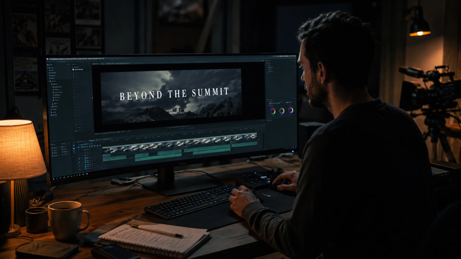
Here’s the good news: that cinematic look isn’t a budget thing. It’s a technique thing, and every technique lives inside Premiere Pro, a tool you already have. Whether you want to build a cinematic YouTube intro completely from scratch or drop in a ready-made template (a pack like CineTitles gives you 29 cinematic titles built for Premiere Pro), this guide walks you through both paths step by step.
And if you’re building a channel as an editor, your intro is one of the highest-leverage assets you’ll ever make. It plays on every single video, which makes it a core part of how you grow a YouTube channel as a video editor. Let’s make it count.
What Makes a YouTube Intro Feel “Cinematic”?
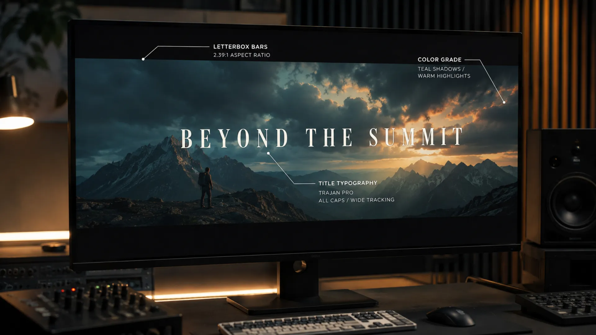
- Letterbox bars. Those black bars at the top and bottom mimic the 2.39:1 widescreen ratio of movies. They’re the fastest “this is cinema” signal there is.
- Typography with intent. Film titles use restrained, confident type: thin all-caps serifs, condensed sans-serifs, generous letter spacing. Never default fonts at default settings.
- A color grade. Lifted blacks, controlled contrast, and a subtle teal-orange push separate graded footage from straight-out-of-camera clips.
- Sound design. Risers, whooshes, and a low boom timed to your title reveal do half the emotional work. Editors love saying the magic is in the bottom half of the timeline, and they’re right.
- Deliberate pacing. Cinematic intros breathe. Shots are cut to the music, movements are smooth, and nothing lingers longer than it needs to.
Keep this list handy. Every technique in this guide exists to deliver one or more of these five ingredients.
How Long Should a Cinematic YouTube Intro Be?
Method 1: Build a Cinematic Intro from Scratch in Premiere Pro
Step 1: Pick your best 3 to 5 shots
Create a new sequence (1920×1080 is fine for most channels) and pull in only your strongest footage: clean movement, good light, clear subject. An intro is a highlight reel, not a recap. Set in and out points with I and O so each clip earns its place.
Step 2: Add the cinematic bars
Two easy options:
- The static letterbox. Add a Crop effect to an adjustment layer above everything, then crop roughly 10 to 12 percent from the top and bottom. Instant widescreen feel.
- The animated open. Search the Effects panel for Barn Doors, drop it on your first clip, and set the direction to vertical in Effect Controls. The frame opens up from black bars like theater curtains, and you can stretch the effect duration to slow it down. It’s a one-effect trick that looks far more expensive than it is.
Step 3: Try the speed-ramp montage trick
Here’s a crowd favorite for travel and vlog intros. Select all the clips from your edit, right-click, and choose Nest to combine them into one giant clip. Hit Cmd/Ctrl+R and crank the speed to 1000 to 1500 percent, so your whole video flies by in seconds. Then open the speed dialog again and switch Frame Sampling to Frame Blending: this blends the frames together and turns choppy fast-forward into smooth, buttery motion. Add a monochrome Lumetri look on top if you want extra drama.
Step 4: Create and animate your title with Essential Graphics
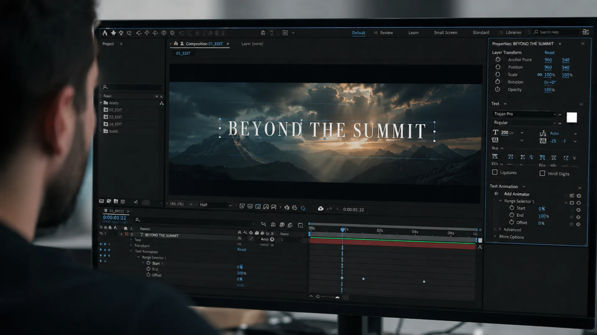
Switch to the Graphics workspace, grab the Type tool, and click into the Program Monitor. Before you animate anything, hold Ctrl/Cmd and drag the text layer’s anchor point to its center. It’s a tiny habit that guarantees your text scales and rotates from the middle instead of a weird corner.
A clean, classic animation to steal:
- Draw a thin vertical line or shape next to your text. In Effect Controls, uncheck Uniform Scale, keyframe the vertical scale from 0 to 100 over about 10 frames, and right-click the last keyframe to apply Ease In.
- Add a mask to your text layer with zero feather, placed right against the line. Keyframe the text’s position so it slides out from behind the line over about 20 frames. The mask makes it look like the text is being revealed rather than just moving.
- Open the animation curve (expand the layer, click the effects button) and pull the bezier handles so the text starts fast and settles gently. Smooth curves are the difference between amateur and pro animation.
Two bonus moves while you’re here: drag the little blue responsive design markers over your intro and outro animations so you can stretch the title’s duration later without breaking the keyframes. And when you’re happy with the design, right-click the layer and choose Export As Motion Graphics Template. Congratulations, you just made your own reusable intro template.
Step 5: Cut to the music and layer the sound design
Find a track that matches your channel’s energy. You can browse licensed music without leaving Premiere: the Essential Sound panel connects to Adobe Stock audio, which includes the Epidemic Sound library. Drop markers (press M) on the beats you feel, and with snapping on, trim your cuts to land exactly on them.
Then layer the sound design: a riser building into your title, a whoosh on the reveal, and a low boom when it lands. Duck the music slightly under each hit. This trio is doing more work in famous intros than any visual effect.
Step 6: Grade it in Lumetri
Open Lumetri Color (Window, then Lumetri Color). If you shot in a log profile, apply the matching log-to-Rec.709 input LUT first. Then: pull contrast up slightly, lift the blacks a touch for that faded film feel, and nudge the shadows toward teal and the midtones toward warmth. Finish with a gentle vignette (try -1.5 to -3) to pull the viewer’s eye to the center of the frame.
Step 7: Add real motion blur with the Transform effect
This is the pro polish most beginners miss. Instead of animating with the default Motion controls, apply the Transform effect from the Effects panel and keyframe scale and position there. Then uncheck Use Composition’s Shutter Angle and type in 180. Premiere now renders motion blur on your animation, and fast movements suddenly look rendered rather than slid around. Combine it with bezier speed curves and your title reveals will feel like they came out of After Effects.
Method 2: The Cinematic Logo Reveal
- Drag your logo (a transparent PNG works best) onto the timeline to create a sequence.
- Apply the Transform effect to the logo layer.
- Move about 15 frames in, then keyframe Scale and Rotation at their final values.
- Jump back to the start and set Scale to 0 and Rotation to several full spins (the tutorial crowd favorite is 8). The logo now spins in as it scales up.
- Set the shutter angle to 180 for motion blur, select both keyframes, right-click and choose Bezier, then squeeze the speed curve so the spin starts explosive and lands soft.
Add a whoosh and a boom, and you’ve got a logo reveal that works as a YouTube bumper, a client deliverable, or a watermark opener. The same recipe works with text, icons, or any imagery.
Method 3: Use Templates for a Faster Cinematic Intro
How to import and customize a MOGRT in Premiere Pro
- Open Window, then Essential Graphics, and click the Browse tab. (Adobe’s own help doc covers this too.)
- To install a downloaded template, click the + (Install Motion Graphics Template) icon at the bottom of the panel and select your .mogrt file.
- Drag the template into your timeline like any clip.
- Select it and open the Edit tab to change the text, fonts, colors, and timing. If the text shows a default font, right-click the template and hit Sync Missing Fonts to pull in the original.
- Many templates include media placeholders: drag your own footage into the placeholder slots and the template rebuilds itself around your shots.
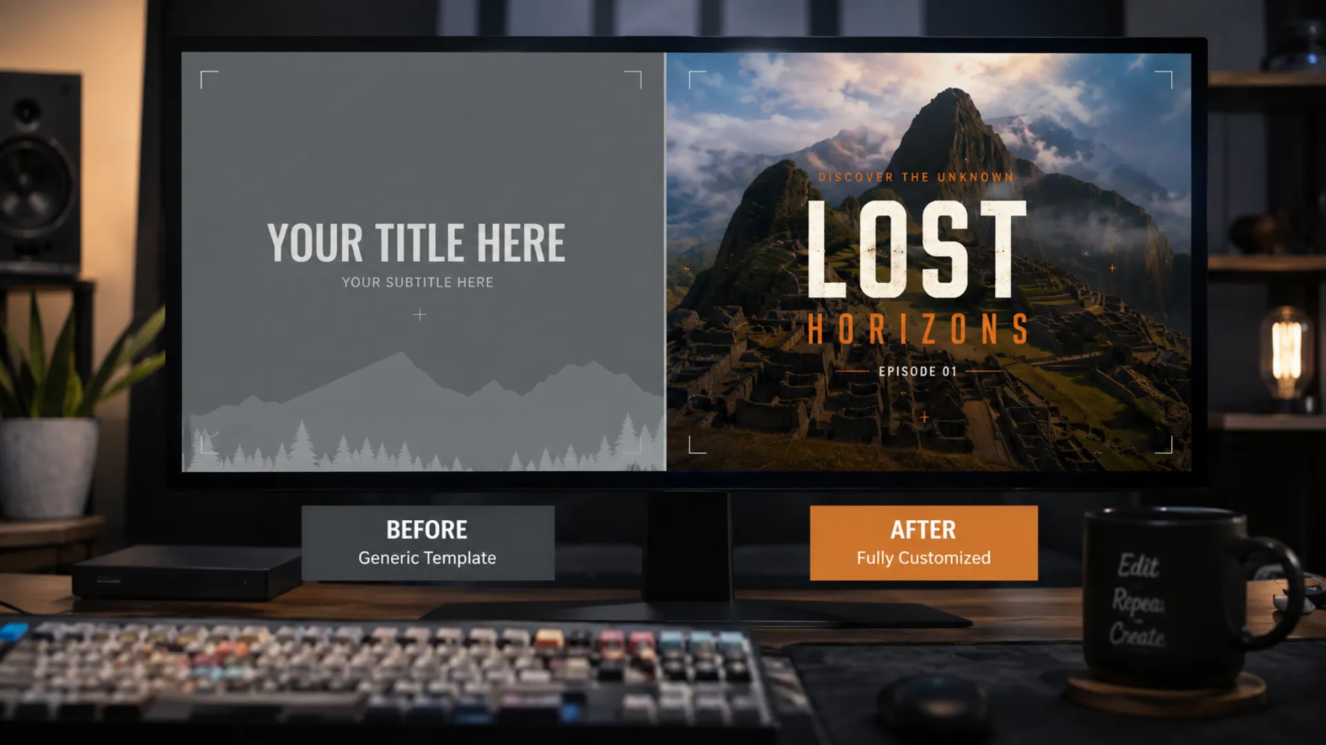
Two customization rules that keep templates from looking like templates: swap the colors to your brand palette (save it in a Creative Cloud Library so every video matches), and change the font to the one you use across your channel.
Where to get free cinematic intro templates
Title Card Design Tips That Sell the Cinematic Look
- Steal like a designer. Search “title cards” on Pinterest for instant inspiration, then apply the 3 percent rule: change any reference by a few deliberate details and it becomes yours.
- Pair font weights, not fonts. Use one family in two weights: a condensed bold or black for the header and the regular weight for subtext. Instant hierarchy, zero clutter.
- Mix a script with a mono or sans. A handwritten script layered over structured type is a classic music-video look that reads as intentional and premium.
- Add film-style subtext. A small line under your title (“a [channel name] production” or an episode number and year, spaced out with tabs) makes a simple card feel like a movie poster. Sites like DaFont have thousands of free-for-personal-use fonts to play with; check the license before commercial use.
- Texture beats sharpness. A tiny Gaussian blur or grain on decorative text takes the digital edge off and makes it feel printed rather than typed.
Make Your Intro Help (Not Hurt) Your Channel
- Keep it consistent. The same intro, same music sting, and same title style across videos builds recognition, which is the whole point of channel branding with templates.
- Deliver on the promise. Your intro should visually match the expectation set by your thumbnail design and your title. A mismatch between packaging and content is one of the fastest ways to lose a click you already won, and it quietly hurts your YouTube SEO too, since watch time feeds ranking.
- Build it once, reuse it forever. Export your finished intro as a MOGRT or a rendered clip and drop it into every project. It’s one of the easiest wins in a YouTube editing workflow that saves you hours.
Common Cinematic Intro Mistakes to Avoid
- Going too long. Past 8 to 10 seconds, your retention graph will show a cliff. Trim ruthlessly.
- Skipping the hook. Never open cold with the intro. Tease the payoff first, then roll it.
- Music louder than meaning. If viewers flinch or reach for the volume, the vibe is gone. Duck the track under any voice.
- Over-styled fonts. Four decorative fonts is a ransom note, not a title card. Two families max.
- A new intro every video. Consistency is what turns an intro into a brand asset.
- No sound design. A silent title reveal feels unfinished no matter how good it looks.
- Forgetting vertical. If you repurpose content, rebuild your intro for 9:16 when you edit YouTube Shorts in Premiere Pro; horizontal intros with letterbox bars die on a phone screen.
Conclusion
And when you’re ready for title cards with serious dramatic weight, the Title Cards Animated Package gives you heavy, impactful, ready-to-customize openers that drop straight into your timeline. Your first eight seconds are about to become your favorite part of the edit.
Disclaimer : If you buy something through our links, we may earn an affiliate commission or have a sponsored relationship with the brand, at no cost to you. We recommend only products we genuinely like. Thank you so much.
Blog Label:


Write for us
Publish a Guest Post on Pixflow
Pixflow welcomes guest posts from brands, agencies, and fellow creators who want to contribute genuinely useful content.
Fill the Form ✏