YouTube Channel Branding: How to Create a Consistent Visual Identity with Templates
- Quick answer (TL;DR)
- What Is YouTube Channel Branding, and Why Does Consistency Matter?
- What Visual Elements Make Up Your Channel's Identity?
- How Do You Create a Brand Style Guide for Your Channel?
- Should Your Thumbnails Look the Same or Be Unique?
- How Can Templates Keep Your Visual Identity Consistent?
- How Do You Stay Consistent Across Long-Form, Shorts, and Other Platforms?
- How Do You Know If Your Branding Is Working?
- Conclusion
Here’s the thing: most creators obsess over editing and upload schedules but treat their visual identity as an afterthought. A random thumbnail style here, a new font there, and suddenly the channel looks like five different people run it.
In this guide, we’re breaking down how to build a consistent visual identity for your channel: the exact sizes, the color and font rules designers actually use, and how templates turn all of it into a repeatable system instead of a weekly design headache.
Quick answer (TL;DR)
YouTube channel branding is the system of visual elements (profile picture, banner, thumbnails, intros, lower thirds, colors, and fonts) that makes your content instantly recognizable. To build a consistent visual identity:
- Define your brand kit: 3 colors (used in a roughly 70/15/15 ratio), 2 fonts, and one logo or face style
- Use the correct sizes: 800×800 profile picture, 2560×1440 banner (1546×423 safe area), 1280×720 thumbnails
- Build reusable templates for thumbnails, intros, end screens, and lower thirds instead of designing from scratch
- Keep a consistent thumbnail framework (same fonts, colors, layout logic) while changing the subject per video
- Audit your channel monthly and track CTR to see if your branding is working
What Is YouTube Channel Branding, and Why Does Consistency Matter?
It matters because YouTube is a recognition game. Viewers scroll fast, and a consistent look lets them spot your video in a crowded feed without reading a single word. Think MrBeast’s saturated color pops or MKBHD’s clean, minimal tech aesthetic. You know their videos on sight.
Consistency also builds on itself. Design studios that work on creator channels report that channels growing steadily over years (instead of spiking and stalling) almost always have a recognizable identity viewers can spot at thumbnail size (Mark Studios).
There’s an algorithmic angle too. Recognition drives clicks from returning viewers, clicks raise your click-through rate, and CTR feeds the recommendation system. Packaging is a multiplier, though. It amplifies videos that already deliver and does very little for ones that don’t.
And if you’re still in the setup phase, start with our pillar guide on how to start and grow a YouTube channel as a video editor, then come back here to build the visual layer. If you’d rather not design everything from zero, a library like YouTube Packs gives you 45 matching branding elements (openers, lower thirds, logo reveals, and title scenes) so your channel looks cohesive from day one.
What Visual Elements Make Up Your Channel’s Identity?
Profile picture and logo
Your channel picture is your smallest but most repeated brand asset. It appears next to every video, comment, and community post, so it has to read clearly at 36 pixels. Use a simple logomark or a clean, well-lit face shot, and keep critical details away from the circular crop’s edges.
Channel banner
The banner is the biggest canvas you get for telling people what your channel is about and when you upload. The classic mistake is designing for the full 2560×1440 canvas. TVs see everything, but phones only show the central 1546×423 strip. Keep your channel name, tagline, and schedule inside that safe zone.
Thumbnails
Thumbnails are the single highest-impact branding asset you have. According to YouTube, 90% of the best-performing videos use custom thumbnails. We cover the design side in depth in our guide to YouTube thumbnail design tips that boost click-through rates, so here we’ll focus on the consistency side (more on that debate below).
Intros, end screens, and outros
A short branded intro (3 to 5 seconds, no longer) works like an audio-visual signature. Anything longer bleeds retention, and retention is the metric YouTube actually optimizes for; our breakdown of YouTube retention editing explains why those first seconds are so unforgiving. For the intro itself, you can build one from scratch in our tutorial on creating cinematic YouTube intros in Premiere Pro. End screens deserve the same treatment: one branded layout, reused every video.
Lower thirds and in-video graphics
Lower thirds, captions, and on-screen callouts are where consistency quietly falls apart, because they’re made per video under deadline pressure. The fix is a preset pack in your brand colors and fonts. Animated YouTube Lowerthirds works in After Effects, Premiere Pro, and Photoshop, and every element’s text and colors are editable, so you set your brand values once and reuse them forever.
Colors and fonts
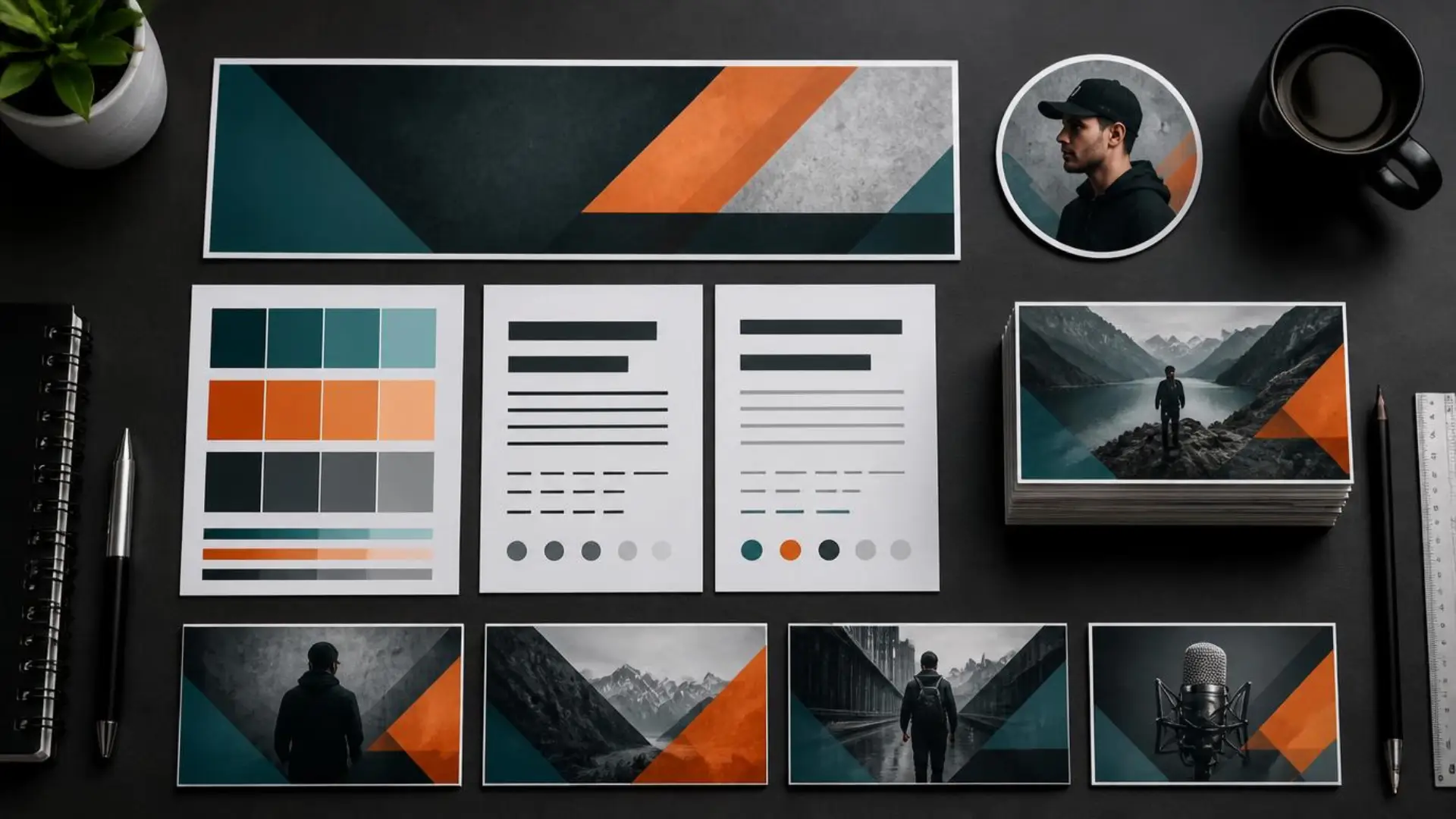
A brand designer who has worked with some of YouTube’s biggest channels shared a rule on r/NewTubers that we love for its simplicity: pick a maximum of three colors and use them in roughly a 70/15/15 split. One dominant color that shows up in most videos and thumbnails, two accents in smaller doses. Pair that with two fonts (one bold display font for thumbnails and titles, one clean font for everything else) and you’ve covered 80% of visual consistency.
How Do You Create a Brand Style Guide for Your Channel?
- Define your channel personality first. Pick two or three adjectives (cinematic and moody, playful and fast, clean and technical) and let every visual decision serve them.
- Lock your color palette. Three colors, 70/15/15 ratio, saved as hex codes. Test your dominant color against YouTube’s white and dark mode backgrounds.
- Choose your two fonts. A bold, highly readable display font for thumbnails, and a simpler companion for lower thirds and end screens.
- Collect your assets. Final profile picture, banner file, watermark, intro, end screen template, and lower third presets, all in one folder (or one Canva or Figma brand kit).
- Write down your thumbnail rules. Face position, text placement, maximum word count, outline and shadow styles.
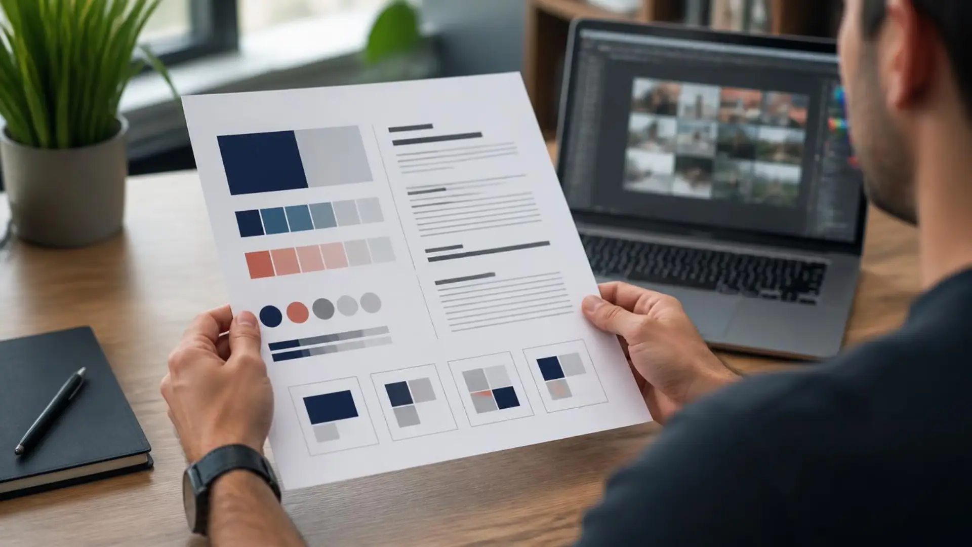
Your one-page brand kit ends up looking like this:
Should Your Thumbnails Look the Same or Be Unique?
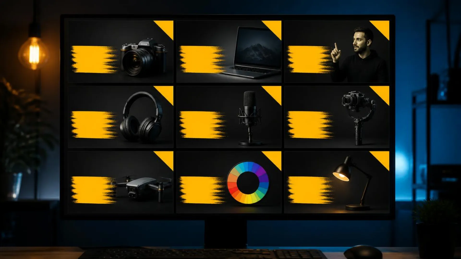
What settles the debate for most channels is a consistent framework. Keep your fonts, color grading, and layout logic fixed, and change the subject, expression, and imagery every video. Viewers should recognize the style instantly while still seeing a fresh image. vidIQ’s analysis of high-performing channels found exactly this pattern: the same collection of fonts, colors, and niche imagery, applied to different designs.
A few framework rules that hold up across niches:
- Pass the shrink test: preview every thumbnail at 160×90 pixels. If the text isn’t readable or the subject isn’t clear, simplify.
- Faces help, but context matters: Search Engine Journal’s review of thumbnail data found faces boost performance in most niches, though results vary, so test rather than assume.
- One idea per thumbnail: a good framework nudges you toward simpler, bolder compositions.
- Test within the framework: YouTube’s built-in Test & Compare tool lets you A/B thumbnail variants without breaking your style.
Series branding is the advanced move: give each recurring series its own accent color or badge within your system, the way TV networks brand shows under one network identity.
How Can Templates Keep Your Visual Identity Consistent?
Templates remove that failure mode. Instead of redesigning assets per video, you make design decisions once and execute them automatically:
- Master thumbnail template: one Photoshop or Canva file with locked brand layers (colors, fonts, logo position) and swappable content layers (subject, text). New thumbnail in minutes, on-brand by default.
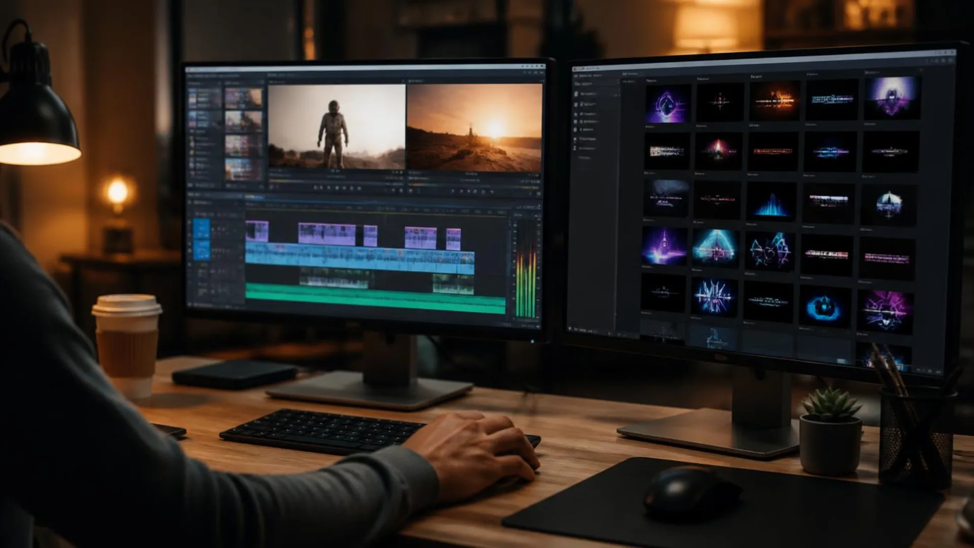
- Motion templates: intros, end screens, transitions, and lower thirds as After Effects or Premiere Pro (MOGRT) presets in your brand colors. Drop them on the timeline, update the text, done.
- Asset library: your brand kit folder with swatches, fonts, watermark, and music cues, synced wherever you edit. (Epidemic Sound makes a good case that audio consistency is part of brand identity too: a recognizable soundtrack style is branding you can hear.)
The workflow payoff is bigger than branding. Templatizing repeat graphics is one of the core moves in our guide to building a YouTube video editing workflow that saves hours every week, because every templated element is a decision you never make twice.
One practical tip: whether you build templates yourself or start from a pre-made pack, customize everything to your brand kit on day one (colors, fonts, logo), save those as your defaults, and never touch the settings again. The template should feel like yours, not like a template.
How Do You Stay Consistent Across Long-Form, Shorts, and Other Platforms?
Beyond YouTube, the rule is simple: same profile picture, same palette, same fonts everywhere your audience might find you (Instagram, TikTok, X, your website). Visual identity travels better than language or format; a viewer who finds you on another platform should never wonder if it’s really you.
A quick quarterly cross-platform audit helps: open every profile side by side and check avatar, colors, and tone. Ten minutes, and it catches drift before your audience does.
How Do You Know If Your Branding Is Working?
- Click-through rate: vidIQ’s benchmark data puts typical CTR around 3 to 4%, with 5 to 7% being strong (vidIQ). Watch your CTR trend for 30 days after any major visual refresh; a sustained lift means the new identity is landing.
- Returning viewers: recognition should grow this number over time. If returning viewership climbs while your style stays fixed, your brand is compounding.
- Impressions vs. views by traffic source: strong branding shows up most in Browse and Suggested traffic, where viewers choose between competing thumbnails.
Give any branding change at least a month of data before judging it, and change one variable at a time so you know what worked. This is especially important for anyone acquiring active YouTube channels, where an existing audience already knows the old look, so changing one element at a time protects the recognition that made the channel worth taking over. We’re publishing a full breakdown of YouTube analytics for video editors that goes deeper into these metrics. And remember that packaging works hand in hand with discoverability: pair your visual system with the fundamentals in our guide to YouTube SEO for video editors.
Conclusion
Better still, the work only has to happen once. Build the system now and every future upload inherits the same recognizable look automatically.
Ready to skip the from-scratch design phase? YouTube Packs bundles 45 fully customizable branding elements (openers, lower thirds, logo reveals, and title scenes in five distinct styles) so you can lock in a cohesive channel look this week. (Your future thumbnails will thank you.)
Disclaimer : If you buy something through our links, we may earn an affiliate commission or have a sponsored relationship with the brand, at no cost to you. We recommend only products we genuinely like. Thank you so much.
Blog Label:

Write for us
Publish a Guest Post on Pixflow
Pixflow welcomes guest posts from brands, agencies, and fellow creators who want to contribute genuinely useful content.
Fill the Form ✏