Framing Rules Beyond the Rule of Thirds: Advanced Composition for Filmmakers
- Why the Rule of Thirds Is Only the Beginning
- Think in Focus and Effect: How Advanced Composition Really Works
- The Golden Ratio, Phi Grid, and Fibonacci Spiral
- The Golden Triangle: Directing the Eye with Diagonals
- Leading Lines and Diagonals
- Negative Space: Composing with Emptiness
- Frame Within a Frame
- Symmetry, Asymmetry, and the Power of Center Framing
- Depth, Layering, and Foreground Elements
- Composition in Motion: What Changes When the Frame Moves
- When to Break Every Framing Rule
- Conclusion
Here’s the thing: the rule of thirds is where composition starts, not where it ends. Painters worked out dozens of ways to guide the eye centuries before the first camera rolled, and the filmmakers you admire borrow from that toolbox in every scene. In this guide, we’re breaking down the advanced film composition techniques that take a frame from technically correct to genuinely cinematic: the golden ratio, the golden triangle, leading lines, negative space, frames within frames, and the art of knowing when to throw the grid away.
This article is part of our complete cinematography techniques guide, so if you want the full visual storytelling picture, that’s your home base. Ready? Let’s go beyond the grid.
Why the Rule of Thirds Is Only the Beginning
There’s a practical reason it dominates film work specifically: editing. When you cut back and forth between two characters in conversation, mirrored thirds compositions feel balanced across the cut. The rule fits the rhythm of coverage, which is exactly why every beginner tutorial leads with it.
But lean on it mechanically and three problems show up fast:
- It struggles with multiple subjects. Which character gets the intersection when three people matter in the scene?
- It assumes a static frame. Once your subject or camera moves, the grid stops answering questions.
- It flattens emotion. A frame that is always “correct” never feels intimate, uneasy, lonely, or overwhelming. Sometimes the story needs wrong.
Painting and drawing solved these problems centuries ago with shapes, diagonals, balance, and negative space. Film is a 2D medium just like painting, so all of it transfers. That’s the toolbox we’re opening below.
One quick note before we dive in: part of what makes a frame feel cinematic is the literal shape of the frame. Widescreen letterboxing changes the geometry every one of these rules operates in. If you want to experiment on existing footage, the Letterbox Film Frame Templates pack gives you 136 overlays in 17 aspect ratios to test framings without recropping a thing.
Think in Focus and Effect: How Advanced Composition Really Works
- Focus: guiding the viewer’s eye to the point (or points) you want them to see
- Effect: creating a feeling in the viewer before a single line of dialogue lands
That’s it. Once you evaluate frames through those two questions, composition stops being a list of rules and becomes a set of decisions.
Here’s the challenge we’re up against. We live in a dynamic 3D world, but our medium is flat. Try it right now: look around the room, find an interesting view, then close one eye. The scene goes flat and a little dull. That flatness is what every frame starts with, and composition is how we fight it.
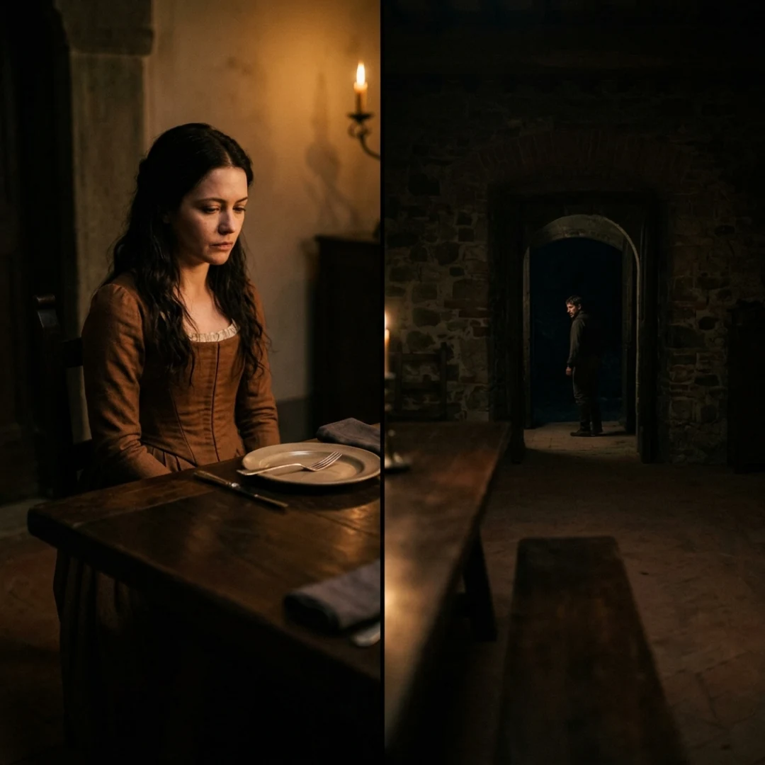
And here’s where effect gets interesting. Picture a drama scene: a wife sits frame left in the foreground at the dinner table, forming an L-shape with the table, while her husband stands small in the background frame right. She dominates the frame. Flip the composition, and he dominates. Balance them equally, and the tension goes quiet. None of these framings is “right.” Each one tells the same scene differently, and that choice is directing. (StudioBinder’s guide to shot composition has great film stills of these positioning techniques if you want more examples.)
Use this table as your quick reference for the rest of the article:
The Golden Ratio, Phi Grid, and Fibonacci Spiral
The golden ratio (about 1.618:1) is a proportion that shows up throughout nature, classical art, and architecture. Applied to framing, it gives you two tools:
- The phi grid: like the thirds grid, but the lines sit closer to the center (a 1 : 0.618 : 1 division instead of equal thirds). Subjects placed on phi lines feel slightly more centered and, to many eyes, more naturally balanced.
- The Fibonacci spiral: a curve that sweeps through the frame and coils in on your focal point, modeling how the eye spirals into an image rather than jumping straight to it.
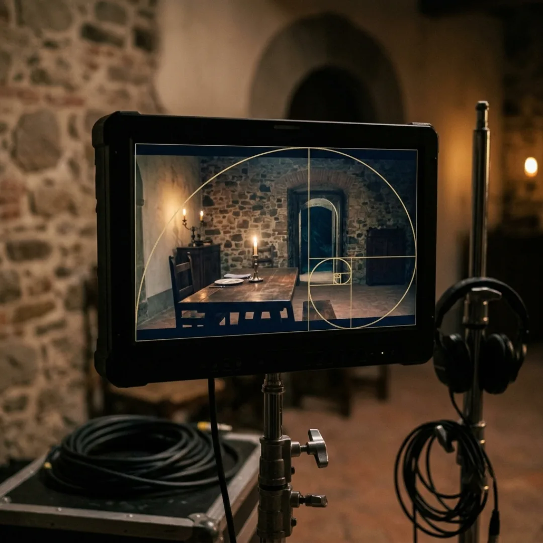
And the question skeptics love: are intricate grids overrated? Partly, yes. Nobody on a working set is aligning shots to a spiral overlay between takes. These grids are training wheels and analysis tools. Study your favorite frames with them, learn why those frames feel good, then trust your calibrated eye on set.
The Golden Triangle: Directing the Eye with Diagonals
Here’s the setup. Draw a diagonal from one corner of the frame to the opposite corner. Then, from each remaining corner, draw a line that meets that diagonal at a right angle. You now have four triangles and two power points where the lines intersect.
Place your primary subject on one intersection and your secondary element (another character, the object being looked at, the threat entering the room) along the opposite triangle. The diagonal becomes a visual rail connecting them, and the audience’s eye travels exactly where you want it to.
This is the go-to structure when you want the audience to look where your character is looking. Character on one power point, the thing they see on the diagonal, and the frame reads instantly even in a fast cut. It’s also your answer for group scenes: instead of fighting over which subject gets a thirds intersection, arrange your characters along the diagonal so the eye sweeps through them in order of importance.
If diagonals feel energetic, that’s the point. Compared to the calm horizontals of a thirds composition, triangle compositions inject movement into even a static shot.
Leading Lines and Diagonals
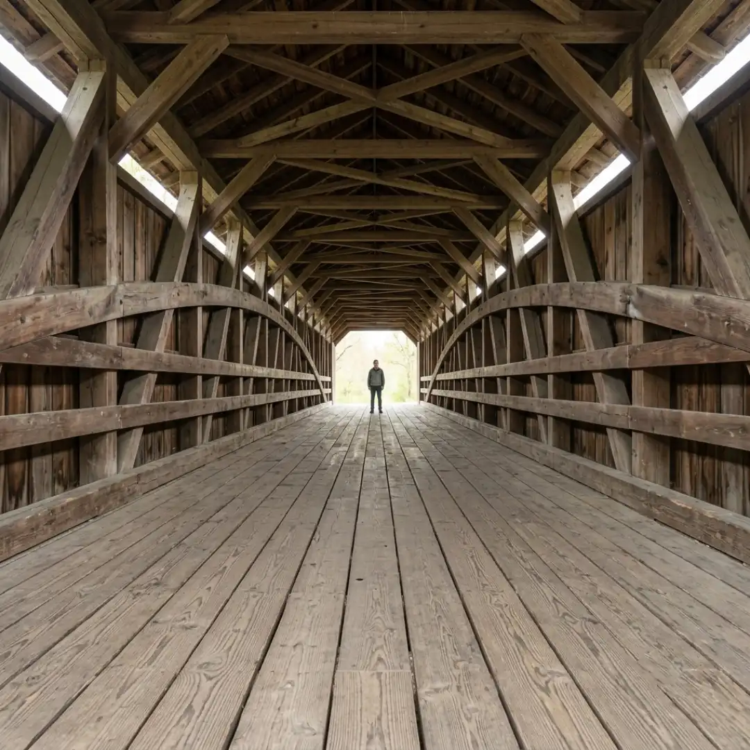
One of our favorite simple examples: a shot framed inside a long covered bridge. The walls, floor, and ceiling beams give you four converging lines, all aiming at the person standing at the far end. Even though the subject is tiny in the frame, your eye can’t land anywhere else. That’s focus achieved with zero dialogue and zero camera movement.
A few ways to level up your lines:
- Stack techniques. That bridge shot combines leading lines with a frame within a frame and a low angle. Advanced composition is rarely one technique at a time.
- Use diagonals for energy. Lines that run parallel to the frame edges feel calm. Lines that cut diagonally feel active and urgent.
- Mind your camera height. Angles change what your lines do: shooting down flattens them, shooting low exaggerates convergence. Our breakdown of high angle shots digs into how perspective changes a frame’s power dynamics.
Negative Space: Composing with Emptiness
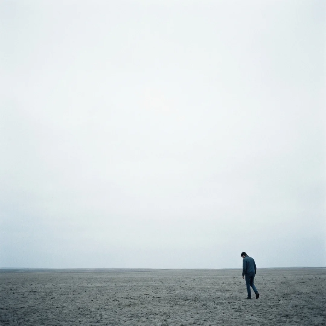
Negative space is the “empty” area of your frame, and it’s one of the most emotionally loaded tools you have. Push your character small into a corner of a wide, empty frame and they instantly read as lonely, vulnerable, or overwhelmed. Give a close-up generous headroom of blank wall and the silence gets heavier.
Negative space earns its place in your toolkit three ways:
- Simplification: an uncluttered frame is effortless to read, so the viewer processes the emotion instead of hunting for the subject
- Isolation: distance between subject and everything else externalizes internal states (loneliness, alienation, freedom, depending on context)
- Anticipation: empty space creates expectation; leave room in the frame and the audience starts waiting for something to enter it
There’s a practical production bonus too: negative space is where titles, lower thirds, and graphics live comfortably. If you compose interviews and YouTube frames with intentional negative space, you’ll never again fight your own footage to place text.
Frame Within a Frame
It does four jobs at once: it hones the eye onto your subject even in a busy frame, it adds context by showing the environment doing the framing, it adds depth by layering the frame element in front of the subject, and it can trap a character. That last one is the storytelling gold. A character framed inside a narrow doorway reads as confined. Shoot them through a window and the audience becomes a watcher. Jacques Tati built entire comedic setpieces out of this in Playtime, with characters boxed into glass offices and cubicles (Shotdeck’s case study on it is worth your time).
And remember that your outermost frame is a frame too. The aspect ratio you shoot in decides how much room every interior frame has to breathe. If you’re fuzzy on when 2.39:1 beats 16:9, our guide to aspect ratios covers exactly that. For a fast way to feel the difference, drop the Letterbox Film Frame Templates over your footage and watch how each ratio changes which compositions work. (Your rough cut just became a framing playground.)

Symmetry, Asymmetry, and the Power of Center Framing
Symmetrical composition mirrors the frame around its center line: think Kubrick’s one-point-perspective corridors or Wes Anderson’s dollhouse frames. Symmetry reads as order, formality, and control, and because perfect symmetry barely exists in real life, it also carries a subtle wrongness that filmmakers weaponize for unease. A perfectly centered character in a perfectly symmetrical hallway feels composed and unsettling at the same time.
Asymmetrical balance is the messier, more human option: the frame is deliberately weighted to one side, and the imbalance means something. Go back to our dinner table scene. Wife large in the foreground L-shape, husband small in the background: she owns the frame while the story says he owns the relationship, and that contradiction creates tension. Flip it, and the frame confirms the power dynamic instead of fighting it. Same scene, opposite meaning, and the only thing that changed was composition.
So when should you center? When the moment demands weight: a character reveal, a confrontation, a declaration. Because centering breaks the pattern of thirds-based coverage, a centered frame lands like a held note. Just make sure it’s a decision, not a default.
Depth, Layering, and Foreground Elements
The easiest win is a foreground element. Shooting in a small room with no background depth? Put something between the camera and your subject: a plant, a door edge, glassware on a table. Even out-of-focus grass at the bottom of the frame instantly adds dimension. A soft foreground also frames and directs: out-of-focus leaves arcing around your in-focus subject act as a natural vignette, and warm orange foliage against a green background adds color contrast that pushes your subject forward. Whether those layers stay soft or sharp is a focus decision, and our depth of field guide breaks down how to control it.
Tone is a compositional layer too. Your contrast ratio (the difference between highlights and shadows) decides how the frame feels before the viewer registers any subject at all. High contrast, with deep shadows against bright highlights, reads as mystery and tension, perfect for reveals. Low contrast feels open, natural, and safe. Sculpting that ratio is lighting work as much as framing work, so pair this section with our guide to lighting for cinematography, and if you’re building your first setups, start with the three-point lighting setup.
Quick depth checklist before you roll:
- [ ] Is there something in the foreground, midground, and background?
- [ ] Do the layers separate (by focus, tone, or color)?
- [ ] Is the eye landing on the layer that matters?

Composition in Motion: What Changes When the Frame Moves
First: montage. You don’t compose one frame, you compose a sequence. A composition that looks unremarkable as a still can be devastating in context, because the cut itself is a compositional tool. Cutting between the wife’s dominant frame and the husband’s dominant frame in a rhythm that accelerates toward the confrontation? That’s composition operating across time. It’s also why your master shot matters so much: it establishes the spatial logic every closer frame plays against.
Second: movement. Your subjects and your camera can move to complete a composition rather than starting inside one. A character walks into the empty third of the frame and the shot resolves. A slow push-in turns a balanced wide into a claustrophobic close-up without a single cut. Different moves carry different meanings, and our guide to the types of camera movement in filmmaking maps them out.
Choreographing actors through your composition is its own craft called blocking, where a frame can transform from balanced to unbalanced as characters move through it. We’re covering that in depth in our upcoming guide to blocking and staging in cinematography.
The practical takeaway: compose for the destination, not just the starting frame. Ask where the shot ends, what the frame looks like at the cut point, and let the journey between those compositions carry meaning.
When to Break Every Framing Rule
Situations where breaking the rules is the right call:
- Heavy motion. Action scenes, handheld work, and verite-style naturalism prioritize capturing the moment over nailing a grid, as Backstage’s rule of thirds breakdown points out. We’ll dig into when rawness beats smoothness in our upcoming piece on handheld vs stabilized shooting.
- Deliberate discomfort. Dead-center framing, crushed headroom, subjects facing out of the frame with no look room: all “wrong,” all powerful when the scene needs unease.
- Subjective POV. When the audience sees through a character’s eyes, composition follows attention, not aesthetics. Frames get messy because perception is messy.
The test is always the same: does this frame serve the story and the emotion of the moment? If yes, the rule loses.
Want to actually get better at this (not just read about it)? Three drills:
- Recompose one scene three ways. Shoot the same simple moment with thirds, then centered symmetry, then heavy negative space. Watch how the meaning shifts.
- Study paintings, not just films. Artists solved 2D composition centuries ago. Ten minutes with an impressionist street scene will teach you more about diagonals than another YouTube tutorial.
- Pause one film scene per week. Screenshot five frames and identify which techniques from the table above are doing the work. It’s the fastest way to move these tools from theory into instinct.
Conclusion
You don’t need all of it in every shot. You need the habit of asking two questions before you roll: where should the eye go, and what should this frame feel like? Answer those on purpose, shot after shot, and your work stops looking framed and starts looking directed.
And when your beautifully composed film needs a title sequence to match, CineTitles gives you 29 cinematic title templates for Premiere Pro, After Effects, and Photoshop, so your opening frames set the tone before your first shot even lands. (Your composition deserves a proper introduction.)
Disclaimer : If you buy something through our links, we may earn an affiliate commission or have a sponsored relationship with the brand, at no cost to you. We recommend only products we genuinely like. Thank you so much.
Blog Label:



Write for us
Publish a Guest Post on Pixflow
Pixflow welcomes guest posts from brands, agencies, and fellow creators who want to contribute genuinely useful content.
Fill the Form ✏