Cinematography Color Temperature: How to Use Warm and Cool Light for Storytelling
- What Is Color Temperature in Cinematography?
- What Do Warm and Cool Light Mean in Visual Storytelling?
- What Color Temperature Should You Film At?
- How Do You Use Warm and Cool Light to Tell a Story?
- How Do You Mix Color Temperatures in One Scene Without Ruining It?
- Should You Create the Temperature Look on Set or in the Grade?
- How Do Famous Films Use Warm and Cool Light?
- What Are the Most Common Color Temperature Mistakes?
- Conclusion: Make Temperature a Storytelling Decision
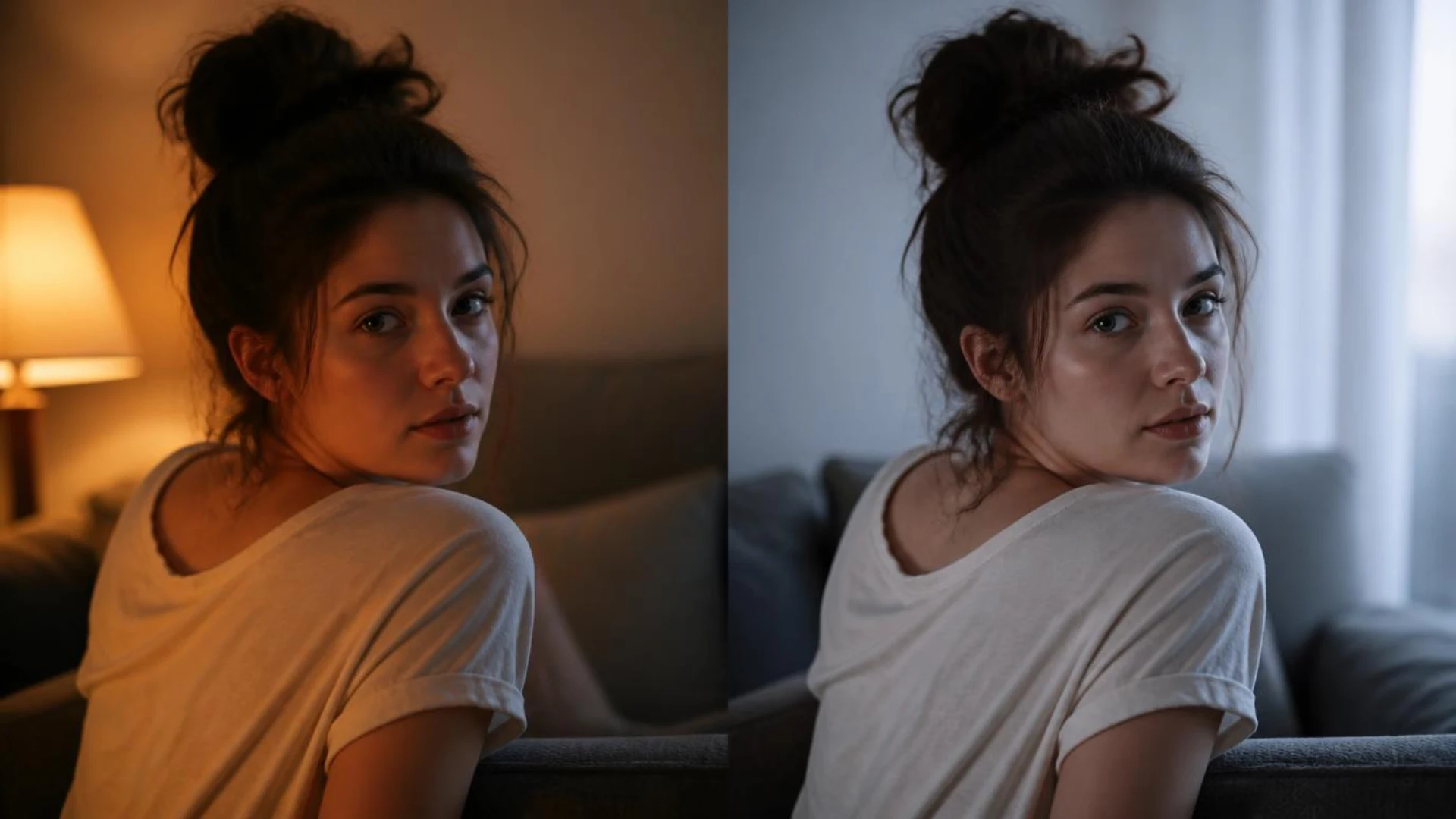
Color temperature is one of the most powerful and least understood tools in cinematography. The same room lit warm reads as safe and nostalgic; lit cool, it reads as lonely and tense. Nothing else in the frame has to change.
In this guide, we’re breaking down how color temperature works, what warm and cool light actually communicate to an audience, and how to use both on set and in the grade. It’s part of our larger cinematography techniques guide, so if you’re building your visual storytelling toolkit from scratch, start there.
TL;DR: Quick Answer
- Color temperature is the warmth or coolness of light, measured in Kelvin (K). Lower Kelvin = warmer, more orange light. Higher Kelvin = cooler, more blue light.
- The two filmmaking standards are 3200K (tungsten, warm) and 5600K (daylight, cool).
- Warm light signals intimacy, nostalgia, comfort, and romance. Cool light signals isolation, tension, sterility, and dread.
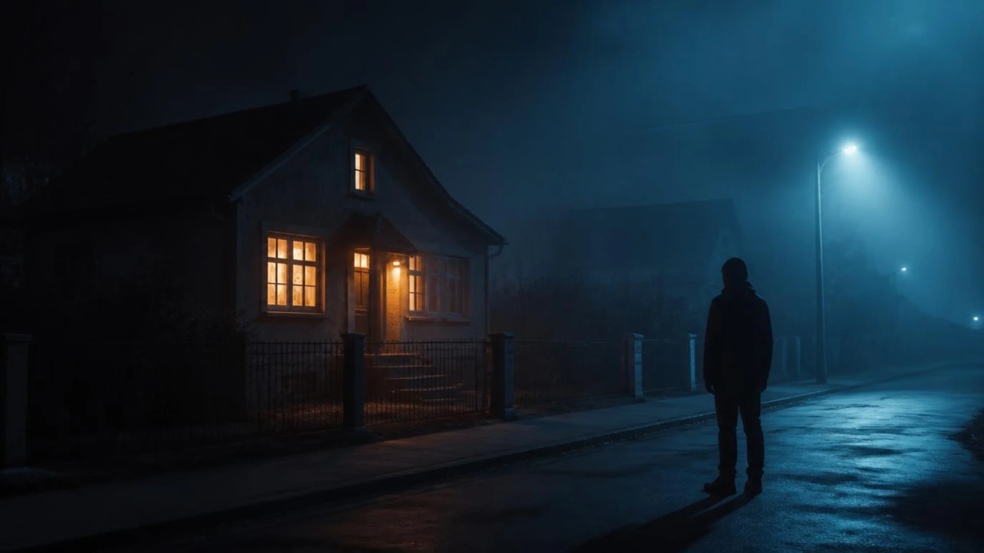
- The strongest storytelling tool is contrast: a warm lamp inside a cool blue night instantly reads as shelter vs threat.
- Set a deliberate base temperature on set, control mixed sources with gels or bi-color LEDs, and refine (don’t rescue) the look in the grade.
What Is Color Temperature in Cinematography?
Here’s the part that trips everyone up: the scale feels backwards. Lower Kelvin values look warmer, higher Kelvin values look cooler. The trick to remembering it is fire: a yellow-orange flame is physically cooler than a blue flame, so “hotter” temperatures produce bluer light. Backstage’s breakdown of color temperature in film is a great primer if you want the physics.
What does the Kelvin scale look like in practice?
Use this color temperature chart as your on-set cheat sheet:
How is color temperature different from white balance?
Color temperature is a property of the light itself. White balance is how you tell your camera what to treat as white. If your lights are at 3200K and your camera’s white balance is set to 3200K, the scene reads neutral. Set the camera to 5600K instead, and that same scene turns golden orange.
That gap between light and camera setting is where the creative play happens, and it’s exactly why we covered the technical side separately in our guide to white balance in video. This post is about the storytelling side: what to do with warm and cool once you can control them.
What Do Warm and Cool Light Mean in Visual Storytelling?
- Warm is not automatically “good” and cool is not automatically “bad.” Warm light can feel suffocating or false (think of a too-cozy home hiding something dark), and cool light can feel honest and calm.
- Context defines the emotion. Atmosfera Mag’s essay on warm and cool lights in cinema shows how directors flip these codes deliberately, using warmth as danger and cold as refuge.
- Consistency builds a world; deviation tells a story. If your whole film lives at 4,300K and one scene suddenly glows amber, the audience knows that moment matters.
This is also where overlays can help sell warmth in post. Dropping a subtle film burn from Real Light Leaks over a flashback adds that organic, golden haze that reads as memory (recorded on an Alexa Mini, so the grain and falloff feel photographic rather than digital).
What Color Temperature Should You Film At?
Is 5600K the default color temperature for filmmaking?
More or less, yes, for daylight scenes. 5600K matches midday sun, so exteriors and window-lit interiors usually start there. There’s a whole r/cinematography discussion about whether 5600K has become “the standard,” and the consensus is worth stealing: match your dominant light source first, then shift for taste.
A practical starting framework:
- Exteriors in sun: shoot at 5600K, let golden hour go warm naturally
- Interiors with practical lamps: shoot at 3200K so bulbs read warm but not radioactive
- Interviews and talking heads: 4,000K to 4,500K is a flattering neutral middle ground
- Creative bias: set the camera 200K to 500K off from your lights to push a scene subtly warmer or cooler in-camera
Is 3000K warm or cool?
3000K is firmly warm: it’s the territory of household “warm white” bulbs and golden hour. 4000K to 4500K is neutral. Once you pass 5000K you’re in cool, daylight-style light. So when a bulb box says “warm white vs cool white,” it’s really saying 2700K to 3000K vs 5000K to 6500K.
If you’re building a lighting kit around this, bi-color LEDs that sweep from roughly 2700K to 6800K give you the whole storytelling range in one fixture. GVM’s color temperature guide for filmmakers has a solid rundown of how to structure that workflow, and our own guide to lighting for cinematography covers how temperature fits into the bigger lighting picture.
How Do You Use Warm and Cool Light to Tell a Story?
1. Contrast within the frame
The single most powerful move in this entire post: put warm and cool in the same shot and let them fight.
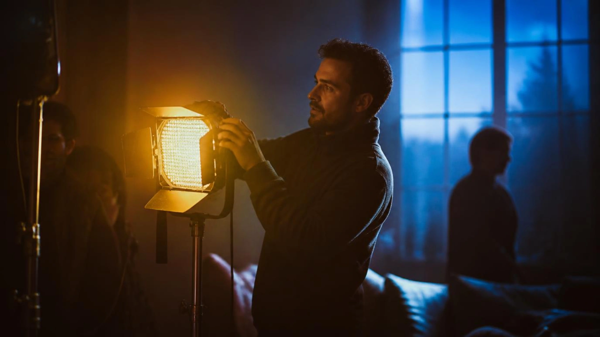
The classic version is the warm window in a cold night. An amber-lit interior glowing against a blue exterior instantly reads as shelter, belonging, home. Reverse it (a character in cool light looking into someone else’s warm room) and you get longing and exclusion without a word of dialogue.
Other in-frame contrast setups that always work:
- Warm key, cool rim: a tungsten-motivated key with a blue moonlight edge separates your subject and adds dimension
- Warm foreground, cool background: pulls the eye and layers depth into the frame, especially combined with a shallow depth of field
- Two characters, two temperatures: light opposing characters warm vs cool to visualize their conflict
2. Character and arc coding
Assign temperatures to characters, places, or emotional states, then shift them as the story evolves. A character’s world might start warm and drain toward blue as they lose everything. A sterile corporate office stays cool until the one scene where human connection breaks through.
The audience never consciously clocks it. That’s the point.
3. Time, memory, and place
Temperature is the fastest way to say “this is a different time” without a title card:
- Flashbacks and memories: warmer, often with soft golden bloom
- The present, cold reality: neutral to cool
- Night vs day: cinema’s “moonlight blue” is a pure convention (real moonlight is nearly neutral), but audiences accept it completely
4. Motivated practicals
Every temperature choice lands better when it’s motivated by a visible source: a bedside lamp, a neon sign, a TV screen, a fire. Practicals justify the color, and they make mixed-temperature frames feel natural rather than graded. Build them into your three-point lighting setup instead of treating them as set dressing.
How Do You Mix Color Temperatures in One Scene Without Ruining It?
The golden rules:
- Pick one dominant temperature (usually your key light) and white balance to it
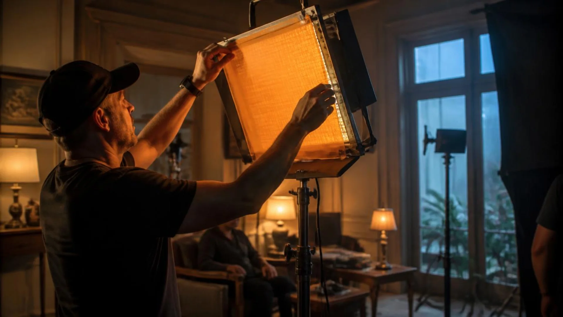
- Decide what every other source should say, then gel, dim, or replace it
- Lock white balance after the lights are set, never before, and never on auto
- Keep the gap intentional: a 1,000K to 2,000K spread between key and accent light reads as cinematic; random spreads read as mistakes
Common situations and how to handle them:
And when you cut between shots with different temperature personalities, hide the seam in motion: a film-burn transition from Luminous Light Leak Transitions uses a flash of warm optical light to bridge a warm scene into a cool one, so the temperature jump feels like a creative beat instead of a continuity error.
Should You Create the Temperature Look on Set or in the Grade?
What only set lighting can do:
- Real in-frame contrast (a warm lamp and cool window produce different light directions, not just different tints)
- Natural falloff and reflections in eyes, skin, and surfaces
- Actor performance: people genuinely behave differently under warm vs cool light
What the grade does best:
- Global temperature shifts and shot matching across a scene
- Split toning: warming highlights while cooling shadows for that layered, expensive look (the famous teal and orange grade is exactly this)
- Rescuing minor white balance misses, especially if you shot log or RAW
If you try to fabricate warm-vs-cool contrast entirely in post from flat, single-temperature footage, you’ll fight halos, muddy skin tones, and that “tinted photo” look. Grade on top of a real foundation instead. If you’re working in Resolve, our DaVinci Resolve color grading guide for beginners walks through the node workflow for exactly this kind of temperature shaping, and PremiumBeat’s color temperature fundamentals is a solid companion on the theory side.
How Do Famous Films Use Warm and Cool Light?
Fargo (1996): cold as a worldview. The Coens drench everything in flat, blue-white winter light. The cold isn’t weather, it’s moral emptiness. The few warm interiors (Marge’s home life) become little islands of decency in a frozen world.
Do the Right Thing (1989): heat you can see. Spike Lee pushes reds, ambers, and warm light until the temperature of the frame matches the rising social pressure of the hottest day of the summer. The film feels like it’s about to combust because visually, it is.
Eyes Wide Shut (1999): warm lies, cool truths. Kubrick contrasts golden interior warmth with that iconic blue window “moonlight,” splitting nearly every frame between comfort and unease. It’s the warm-window-cool-night technique executed at a masterclass level.
The Neon Demon (2016): temperature as transformation. Nicolas Winding Refn tracks his protagonist’s arc through the shift between cool blue innocence and warm-red danger, a semiotic use of temperature that Atmosfera Mag’s essay unpacks beautifully.
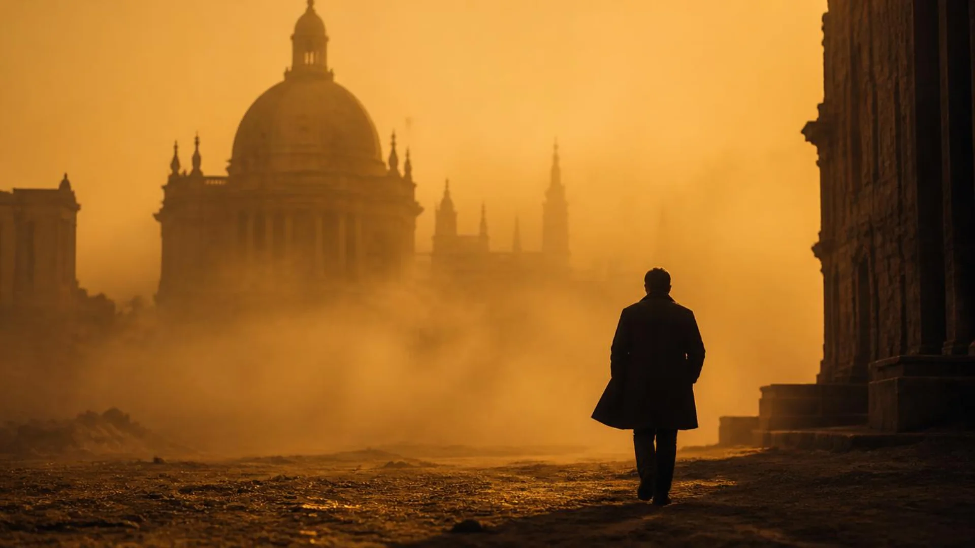
Blade Runner 2049 (2017): temperature as geography. Roger Deakins codes each world by Kelvin: cool grey-blue LA, the irradiated orange haze of Las Vegas, sterile institutional interiors. You always know where you are (and how to feel about it) before a line is spoken. We broke down the full approach in our Blade Runner 2049 cinematography analysis.
Dune: Part Two (2024): warm brutality. Greig Fraser proves warm doesn’t mean cozy: Arrakis’ golden light is oppressive and hostile, while Giedi Prime strips temperature away entirely into inhuman black-and-white. More on that in our Dune cinematography and color palette deep dive.
The takeaway: none of these films use warm and cool as decoration. Temperature is assigned meaning early, and then that meaning is spent at key story moments.
What Are the Most Common Color Temperature Mistakes?
- Shooting on auto white balance. AWB re-guesses every time the frame changes, so your temperature drifts mid-scene and becomes a nightmare to match in post. Set it manually, always.
- Accidental mixing. One forgotten fluorescent tube or uncorrected window will split your skin tones. Audit every source before rolling.
- Temperature without intention. If you can’t say what the warmth or coolness of a scene means, it’s decoration, not storytelling.
- Making everything teal and orange. Split toning is a tool, not a default. If every project has the same grade, temperature stops carrying meaning.
- Ignoring contrast style. Temperature works hand in hand with how hard or soft your contrast is. A warm high-key comedy and a warm low-key thriller are completely different animals (we cover that split in our guide to high key vs low key lighting).
- Forgetting the rest of the frame. Temperature can’t save weak composition. It multiplies choices you’ve already made about framing and composition and even your aspect ratio, it doesn’t replace them.
Conclusion: Make Temperature a Storytelling Decision
Start small on your next project. Pick one scene, assign it a temperature with a clear emotional job, and light for it. Then watch how differently the footage feels before you’ve touched a single grading wheel.
And when you want that warmth to feel truly photographic in post, Real Light Leaks gives you genuine in-camera warm optics captured on an Alexa Mini, ready to drop over any timeline. (Your next flashback sequence will thank you.)
Disclaimer : If you buy something through our links, we may earn an affiliate commission or have a sponsored relationship with the brand, at no cost to you. We recommend only products we genuinely like. Thank you so much.
Blog Label:



Write for us
Publish a Guest Post on Pixflow
Pixflow welcomes guest posts from brands, agencies, and fellow creators who want to contribute genuinely useful content.
Fill the Form ✏